Filed under: Font News
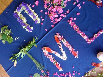
Above is a typographic display sample of a new font in progress, made entirely out of flowers. It’s a fanciful, novelty font, but I’m having a lot of fun working on it. In the above pic I’m experimenting with strokes and transparency and shadows to see how the font images behave in practical application. The OpenType version of the font is still in the works, but you can borrow the photographic images for yourself for free when you see the construction of a photographic flowerfont underway in this Flowerfont Flickr set.
First it was just flowers, then we photographed it, now we’re peeling off the backgrounds to make the images more useful for designers. Then the alphabet art will be transformed into a type-able OpenType font. Furthermore, the font, as well as the photos, will come with a friendly Creative Commons license, which is something I’ve never used before but I’m excited to try out. These floral letters were created at a workshop called “Let’s Make an Open Source Font!” during FontConf a couple weeks ago.
Below is more creative play-work that came about as the font has been developing.
Here, take these flower pictures and make something great!

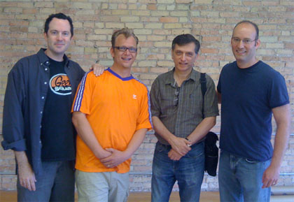
Here’s something you don’t see every day: four great Midwestern type designers in one place. The pic above shows Bill Moran, Chank Diesel, Mark Simonson and Stu Sandler coming together at FontConf which took place in St. Paul, MN this weekend. In addition to this quartet, about 100 other people also showed up Saturday morning at the CoCo workspace to learn and discuss new frontiers in typography at the event, which was put together by Kernest and sponsored by AIGA-MN and A.Fruit Design.
The morning started with a light-hearted, all-inclusive tone, with the creation of a fun, farmers-market-inspired alphabet made of flowers in a workshop led by Chank Diesel (that’s me.) The flowerfont workshop yielded a beautiful collection of flower glyphs which will later be assembled into a freefont to be distributed under a generous Creative Commons license. The fontmaking workshop, titled “Let’s Make an Open Source Font!” featured talk amongst participants about what “open source” fonts are and how more open licensing allows more freedom and protection for designers. Font licensing is a complicated subject that merits its own separate discussion, but it was good to at least know that a few more people have a better understanding of font licenses are and how they affect type designers and graphic designers alike. It was good to get a font license discussion started while we worked on the new font.
There were two tracks running simultaneously at FontConf. While half the attendees were busy making their organic flower alphabet, Jon Hadden spoke in the other room about “Font Replacement Techniques”. As I was busy working on the flower font, I didn’t get to see his presentation, but I did meet him briefly and he was hot. Bigger than me, athletic, half-bearded, wow, what a good-lookin’ man! After Hadden, Kyle Meyer spoke of ways for web designers to improve their web typography with the new rules for using type with the new standards of CSS and HTML5.
After lunch, things got a little more complicated when Richard Fink of readable web talked a bit more how type implementation is changing for designers, and how old business models of selling fonts may not work much longer. Bill Moran of Blinc Publishing gave a brief introduction and broad discussion of typographic history, going all the way from Gutenberg’s first movable type, to Samuel Clemens investing in early typesetting machines, right on up to modern implementation of fonts on the web.
The day concluded with attendees’ choice of something techy or more designee. On the aesthetic tip, Doug Powell led a group discussion on web typography with group-web-browsing so people could actually see fonts on live websites and talk about what works well. In the other room, Bram Pitoyo came all the way from Portland to talk about web font optimization and how fonts can be broken into subsets using CSS to create smaller, more efficient character sets to make web pages load faster.
The best feature of all of FontConf was the promotion of open discussion of contemporary type trends by a small but focussed group of concerned individuals, graphic designers and type designers alike, talking about all the exciting changes that are currently happening in the world of type. Licensing, implementation and consequently the fundamental design and release techniques of fonts are all changing at a rapid pace, and it was good to have a venue where people could meeet face to face and discuss the questions and opportunities that are arising before them.


