Fritzes 2025 Winners

The Fritzes award honors the best interfaces in a full-length motion picture in the past year. Interfaces play a special role in our movie-going experience, and are a craft all their own that does not otherwise receive focused recognition. (Looking at you, Academy.) Awards are given for Best Believable, Best Narrative, and Best Interfaces (overall). Sometimes I like to call out other things I spotted in my survey.

History unfolding note: On the one hand, it feels trivial and pointless to be focusing any attention on niche aspects of the film industry while my country is undergoing an oligarchic dismantling by a unelected white nationalist billionaire president and his rapist felon puppet. On the other, the best thing we can try to do in these circumstances is resist and thrive, so despite it all, I present this minor distraction with the full knowledge that there are other things with orders of magnitude more importance going on. It is not meant to normalize the coup.

Oh and hey, I managed to post this on the same day as the Oscars, for whatever that’s worth.

Best Believable

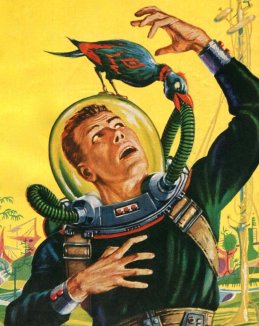
These movies’ interfaces adhere to solid CHI principles and believable interactions. They engage us in the story world by being convincing. The nominees for Best Believable were Alien: Romulus, Mars Express, and Spaceman.

Various screen caps from Alien: Romulus (2024).

Various screen caps from Spaceman (2024).

The winner of the Best Believable award for 2025 is Mars Express. Sharp-eyed readers will raise an eyebrow to object that the film was released theatrically in 2023, not 2024. But I follow the Oscars’ rules, which use the North American release dates. In this case, GKIDS acquired the rights and released it only in 2024.

Mars Express

In 2200, Aline Ruby is a private detective working with Carlos Rivera, an android backup of her partner, who had died years before. Their investigation into an android-rights activist leads them to the underbelly of Noctis, a Martian enclave. Over the course of events, they uncover more and more evidence of a movement larger and more consequential than either of them could have guessed.

Various screen caps from Mars Express (2024).

From the first unzip of a robotic cat’s skin (for washing), I knew this would be something special. The interfaces throughout are thoroughly considered and artfully executed. The microinteractions, choice of gestures and displays are—even when describing mundane things in the world like a crosswalk—thrilling to see. Pay special attention to the civic infrastructure interfaces of the car crash scene, and the environmental supports of Ruby’s alcoholism recovery. Note that the film is violent in points and thematically not wholly new, but 100% worth the watch, paying close attention to the interfaces. To underscore my recommendation, let me note it was a close call as to whether this should have won the Best Interfaces.

Catch the movie on Apple+. You can also find it on some billionaire-affiliated and fascist-suckup services, but see history unfolding note above, I don’t want to send you there if I can help it.


Best Narrative

These movies’ interfaces blow us away with evocative visuals and the richness of their future vision. They engross us in the story world by being spectacular. The nominees for Best Narrative were BorderlandsV/H/S Beyond, and The Wild Robot.

Various screen caps from Borderlands (2024).

Various screen caps from The Wild Robot (2024).

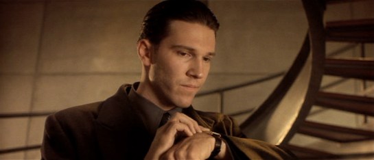
The winner of the Best Narrative award for 2023 is V/H/S Beyond.

V/H/S Beyond

V/H/S is a “found-footage” anthology franchise, and V/H/S Beyond focuses on sci-fi horror. In the last segment titled “Stowaway”, Haley is an amateur UFO hunter recording a video in the Mojave Desert. Following odd lights in the sky, she finds a real, crashed UFO and enters it. The door closes behind her and the spaceship takes off. Once inside she investigates amid a growing panic as she realizes what’s going on. She becomes wounded while interacting with the ship, and when healed by the onboard medical tech, it corrects her “broken” DNA, beginning a horrifying transformation.

Various screen caps from V/H/S Beyond (2024).

Note that the screen caps and compilation are not clear because all the sequences aboard the craft are unclear. This is apropos to its cinéma vérité style and the spaceship’s being an environment optimized for something other than human—much less human video capture devices.

There are a few movies that really lean in on how…uh…alien it will be to experience non-human environments, and renders that alienness to screen. No green-skinned bodice-ripping come-hither love interests and human-coded computer viruses able to infect alien software networks, thank you. The very material of these interfaces harm Haley. The display may not even be perceptible to us. The interactions are meant for some physiology and psychology we can only imagine. Certainly not the squishy meat popsicles that humans are. If I had to lay odds, the experience of alien interfaces will much more closely resemble the terror we feel when watching this segment than whiz-bang holograms. It is a study in otherness and even automation that bears close study.

Watch it on Apple+.


Displays

I have chosen to impose a limitation on myself in this blog and for these awards, and that’s that I review interactions, not merely displays. That means I need to see what users are doing with the speculative technology and tell how it’s effecting a state-change in the system. Even if it’s just a finger press to a button, or a gesture, or even a grunt, without that obvious input, I can’t really tell you if it’s a good interface supporting the interaction or not. But that constraint really hurt this year, because there were so many gorgeous displays where we didn’t see the interactions driving them. Before we get to the Best Interfaces award, let me take a moment to at least give a shout-out to some of these.

The Harkonnen sand table from Dune 2 (2024). The details are art, almost like elegant filigree; calm, floating, arcane sigils greatly contrasting the Harkonnen brutality they convey. No surprise it won Best Visual Effects at the Oscars this year.

The user manual from Atlas (2024). It’s overwhelming, funny, and maintains its clear visual hierarchy.

Mr. Paradox tells Deadpool that the Wolverine he has retrieved is the worst of them, in Deadpool & Wolverine (2024). The interfaces visually reinforce the central narrative conceit of the sacred timeline and telegraph the long-running history of the TVA.

Nice work to all the display designers out there. Y’all are doing some fine work. I just don’t have enough authority as an aesthete to offer awards based on the displays alone.


Best Interfaces

The movies nominated for Best Interfaces manage the extraordinary challenge of being believable and helping to paint a picture of the world of the story. They advance the state of the art in telling stories with speculative technology.

The winner of the Best Interfaces award for 2023 is Atlas.

Atlas

This movie tells the story of an AI-hating analyst named Atlas who finds herself on a remote planet as the lone survivor of a military expedition to take down a human-hating genocidal android named Harlan. Fortunately she has an ARC mech suit with all the military’s latest technology. Unfortunately it houses an artificial intelligence named Smith. As she slowly learns the ARC’s capabilities and uses it to hunt down Harlan, she also faces her own trauma and bonds with Smith. Will it be enough for her to finally “synch” with the suit to unlock its full potential, defeat Harlan’s android army, and prevent the interstellar assault on Earth?

Various screen caps from Atlas (2024).

A few scenes are over-the-top gee-whiz-ism, but almost all of the rest is well-thought-out, consistently designed, and fully in support of Atlas’ goals. Keep an eye out for the augmented reality escape HUD that bests the one seen in Warriors of Future from 2022. And as I described in the HUD comparison post, this is the first time I recall seeing predictive augmentation outside of video games. It’s deeply-future-looking, quite germane to prediction capabilities of AI, instantly understandable, critical to the plot, and full of climactic spectacle.

I will note that it’s written with the presupposition that Smith is a sympathetic character that we can trust, and it’s really Atlas’ hangups that are the problem. That’s a little unnerving because we know how charming and thereby manipulative the large language models of today can be. The more I study overreliance and underreliance, the more I want to see skepticism and literacy written onto the silver screen for audiences to internalize. We should keep AI at arm’s length as a society and as individuals— just as Atlas does—if, hopefully, not for the same reasons.

Catch Atlas and appreciate its awesome interfaces on Netflix.


Congratulations to all the candidates and the winners. Thank you for helping advance the art and craft of speculative interfaces in cinema.

Is there something utterly fantastic that I missed? It’s possible. Let me know in the comments, I’d love to see what you’ve got.

Comparing Sci-Fi HUDs in 2024 Movies

As in previous years, in preparation for awarding the Fritzes, I watched as many sci-fi movies as I could find across 2024. One thing that stuck out to me was the number of heads-up displays (HUDs) across these movies. There were a lot to them. So in advance of the awards, lets look and compare these. (Note the movies included here are not necessarily nominees for a Fritz award.)

I usually introduce the plot of every movie before I talk about it. This provides some context to understanding the interface. However, that will happen in the final Fritzes post. I’m going to skip that here. Still, it’s only fair to say there will be some spoilers as I describe these.

If you read Chapter 8 of Make It So: Interaction Lessons from Science Fiction, you’ll recall that I’d identified four categories of augmentation.

  1. Sensor displays
  2. Location awareness
  3. Context awareness (objects, people)
  4. Goal awareness

These four categories are presented in increasing level of sophistication. Let’s use these to investigate and compare five primary examples from 2024, in order of their functional sophistication.

Dune 2

Lady Margot Fenring looks through augmented opera glasses at Feyd-Rautha in the arena. Dune 2 (2024).

True to the minimalism that permeates much of the interfaces film, the AR of this device has a rounded-rectangle frame from which hangs a measure of angular degrees to the right. There are a few ticks across the center of this screen (not visible in this particular screen shot). There is a row of blue characters across the bottom center. I can’t read Harkonnen, and though the characters change, I can’t quite decipher what most of them mean. But it does seem the leftmost character indicates azimuth and the rightmost character angular altitude of the glasses. Given the authoritarian nature of this House, it would make sense to have some augmentation naming the royal figures in view, but I think it’s a sensor display, which leaves the user with a lot of work to figure out how to use that information.

You might think this indicates some failing of the writer’s or FUI designers’ imagination. However, an important part of the history of Dune is a catastrophic conflict known as the Butlerian Jihad. This conflict involved devastating, large-scale wars against intelligent machines. As a result, machines with any degree of intelligence are considered sacrilege. So it’s not an oversight, but as a result, we can’t look to this as a model for how we might handle more sophisticated augmentations.

Alien: Romulus

Tyler teaches Rain how to operate a weapon aboard the Renaissance. Alien: Romulus (2024)

A little past halfway through the movie, the protagonists finally get their hands on some weapons. In a fan-service scene similar to one between Ripley and Hicks from Aliens (1986), Tyler shows Rain how to hold an FAA44 pulse rifle. He also teaches her how to operate it. The “AA” stands for “aiming assist”, a kind of object awareness. (Tyler asserts this is what the colonial marines used, which kind of retroactively saps their badassery, but let’s move on.) Tyler taps a small display on the user-facing rear sight, and a white-on-red display illuminates. It shows a low-res video of motion happening before it. A square reticle with crosshairs shows where the weapon will hit. A label at the top indicates distance. A radar sweep at the bottom indicates movement in 360° plan view, a sensor display.

When Rain pulls the trigger halfway, the weapon quickly swings to aim at the target. There is no indication of how it would differentiate between multiple targets. It’s also unclear how Rain told it that the object in the crosshairs earlier is what she wants it to track now. Or how she might identify a friendly to avoid. Red is a smart choice for low-light situations as red is known to not interfere with night vision. Also it’s elegantly free of flourishes and fuigetry.

I’m not sure the halfway-trigger is the right activation mechanism. Yes, it allows the shooter to maintain a proper hold and remain ready with the weapon, and allows them not have to look at the display to gain its assistance, but also requires them to be in a calm, stable circumstance that allows for fine motor control. Does this mean that in very urgent, chaotic situations, users are just left to their own devices? Seems questionable.

Alien: Romulus is beholden to the handful of movies in the franchise that preceded it. Part of the challenge for its designers is to stay recognizably a part of the body of work that was established in 1979 while offering us something new. This weapon HUD stays visually simple, like the interfaces from the original two movies. It narratively explains how a civilian colonist with no weapons training can successfully defend herself against a full-frontal assault by a dozen of this universe’s most aggressive and effective killers. However, it leaves enough unexplained that it doesn’t really serve as a useful model.

The Wild Robot

Roz examines an abandoned egg she finds. The Wild Robot (2024)

HUD displays of artificially intelligent robots are always difficult to analyze. It’s hard to determine what’s an augmentation, here loosely defined as an overlay on some datastream created for a user’s benefit but explicitly not by that user. It opposes a visualization of the AI’s own thoughts as they are happening. I’d much rather analyze these as augmentation provided for Roz, but it just doesn’t hold up to scrutiny that way. What we see in this film are visualizations of Roz’ thoughts.

In the HUD, there is an unchanging frame around the outside. Static cyan circuit lines extend to the edge. (In the main image above, the screen-green is an anomaly.) A sphere rotates in the upper left unconnected to anything. A hexagonal grid on the left has some hexes which illuminate and blink unconnected to anything. The grid moves unrelated to anything. These are fuigetry and neither conveys information nor provides utility.

Inside that frame, we see Roz’ visualized thinking across many scenes.

  • Locus of attention—Many times we see a reticle indicating where she’s focused, oftentimes with additional callout details written in robot-script.
  • “Customer” recognition—(pictured) Since it happens early in the film, you might think this is a goofy error. The potential customer she has recognized is a crab. But later in the film, Roz learns the language common to the animals of the island. All the animals display a human-like intelligence, so it’s completely within the realm of possibility that this blue little crustacean could be her customer. Though why that customer needed a volumetric wireframe augmentation is very unclear.
  • X-ray vision—While looking around for a customer, she happens upon an egg. The edge detection indicates her attention. Then she performs scans that reveal the growing chick inside and a vital signs display.
  • Damage report—After being attacked by a bear, Roz does an internal damage check and she notes the damage on screen.
  • Escape alert—(pictured) When a big wave approaches the shore on which she is standing, Roz estimates the height of the wave to be five time her height. Her panic expresses itself in a red tint around the outside edge.
  • Project management—Roz adopts Brightbill and undertakes the mission to mother him—specifically to teach him to eat, swim, and fly. As she successfully teaches him each of these things, she checks it off by updating one of three graphics that represent the topics.
  • Language acquisition—(pictured) Of all the AR in this movie, this scene frustrates me the most. There is a sequence in which Roz goes torpid to focus on learning the animal language. Her eyes are open the entire time she captures samples and analyzes them. The AR shows word bubbles associated with individual animal utterances. At first those bubbles are filled with cyan-colored robo-ese script. Over the course of processing a year’s worth of samples, individual characters are slowly replaced in the utterances with bold, green, Latin characters. This display kind of conveys the story beat of “she’s figuring out the language), but befits cryptography much more than acquisition of a new language.

If these were augmented reality, I’d have a lot of questions about why it wasn’t helping her more than it does. It might seem odd to think an AI might have another AI helping it, but humans have loads of systems that operate without explicit conscious thought, like preattentive processing, all the functions of our autonomic nervous system, sensory filtering, and recall, just to name a few. So I can imagine it would be a fine model for AI-supporting-AI.

Since it’s not augmented reality, it doesn’t really act as a model for real world designs except perhaps for its visual styling.

Borderlands

Claptrap is a little one-wheel robot that accompanies Lilith though her adventures on and around Pandora. We see things through his POV several times.

Claptrap sizes up Lilith from afar. Borderlands (2024).

When Claptrap first sees Lilith, it’s from his HUD. Like Roz’ POV display in The Wild Robot, the outside edge of this view has a fixed set of lines and greebles that don’t change, not even for a sensor display. I wish those lines had some relationship to his viewport, but that’s just a round lens and the lines are vaguely like the edges of a gear.

Scrolling up from the bottom left is an impressive set of textual data. It shows that a DNA match has been made (remotely‽ What kind of resolution is Claptrap’s CCD?) and some data about Lilith from what I presume is a criminal justice data feed: Name and brief physical description. It’s person awareness.

Below that are readouts for programmed directive and possible directive tasks. They’re funny if you know the character. Tasks include “Supply a never-ending stream of hilarious jokes and one-liners to lighten the mood in tense situations” and “Distract enemies during combat. Prepare the Claptrap dance of confusion!” I also really like the last one “Take the bullets while others focus on being heroic.” It both foreshadows a later scene and touches on the problem raised with Dr. Strange’s Cloak of Levitation: How do our assistants let us be heroes?

At the bottom is the label “HYPERION 09 U1.2” which I think might be location awareness? The suffix changes once they get near the vault. Hyperion a faction in the game. Not certain what it means in this context.

When driving in a chase sequence, his HUD gives him a warning about a column he should avoid. It’s not a great signal. It draws his attention but then essentially says “Good luck with that.” He has to figure out what object it refers to. (The motion tracking, admittedly, is a big clue.) But the label is not under the icon. It’s at the bottom left. If this were for a human, it would add a saccade to what needs to be a near-instantaneous feedback loop. Shouldn’t it be an outline or color overlay to make it wildly clear what and where the obstacle is? And maybe some augmentation on how to avoid it, like an arrow pointing right? As we see in a later scene (below) the HUD does have object detection and object highlighting. There it’s used to find a plot-critical clue. It’s just oddly not used here, you know, when the passengers’ lives are at risk.

When the group goes underground in search of the key to the Vault, Claptrap finds himself face to face with a gang of Psychos. The augmentation includes little animated red icons above the Psychos. Big Red Text summarizes “DANGER LEVEL: HIGH” across the middle, so you might think it’s demonstrating goal and context awareness. But Claptrap happens to be nigh-invulnerable, as we see moments later when he takes a thousand Psycho bullets without a scratch. In context, there’s no real danger. So,…holup. Who’s this interface for, then? Is it really aware of context?

When they visit Lilith’s childhood home, Claptrap finds a scrap of paper with a plot-critical drawing on it. The HUD shows a green outline around the paper. Text in the lower right tracks a “GARBAGE CATALOG” of objects in view with comments, “A PSYCHO WOULDN’T TOUCH THAT”, “LIFE-CHOICE QUESTIONING TRASH”, “VAULT HUNTER THROWBACK TRASH”. This interface gives a bit of comedy and leads to the Big Clue, but raises questions about consistency. It seems the HUDs in this film are narrativist.

In the movie, there are other HUDs like this one, for the Crimson Lance villains. They fly their hover-vehicles using them, but we don’t nearly get enough time to tease the parts apart.

Atlas

The HUD in Atlas happens when the titular character Atlas is strapped into an ARC9 mech suit, which has its own AGI named Smith. Some of the augmentations are communications between Smith and Atlas, but most are augmentations of the view before her. The viewport from the pilot’s seat is wide and the augmentations appear there.

Atlas asks Smith to display the user manuals. Atlas (2024)

On the way to evil android Harlan’s base, we see the frame of the HUD has azimuth and altitude indicators near the edge. There are a few functionless flourishes, like arcs at the left and right edges. Later we see object and person recognition (in this case, an android terrorist, Casca Decius). When Smith confirms they are hostile, the square reticles go from cyan to red, demonstrating context awareness.

Over the course of the movie Atlas has resisted Smith’s call to “sync” with him. At Harlan’s base, she is separated from the ARC9 unit for a while. But once she admits her past connection to Harlan, she and Smith become fully synched. She is reunited with the ARC9 unit and its features fully unlock.

As they tear through the base to stop the launch of some humanity-destroying warheads, they meet resistance from Harlan’s android army. This time the HUD wholly color codes the scene, making it extremely clear where the combatants are amongst the architecture.

Overlays indicate the highest priority combatants that, I suppose, might impede progress. A dashed arrow stretches through the scene indicating the route they must take to get to their goal. It focuses Atlas on their goal and obstacles, helping her decision-making around prioritization. It’s got rich goal awareness and works hard to proactively assist its user.

Despite being contrasting colors, they are well-controlled to not vibrate. You might think that the luminance of the combatants and architecture might be flipped, but the ARC9 is bulletproof, so there’s no real danger from the gunfire. (Contrast Claptrap’s fake danger warning, above.) Saving humanity is the higher priority. So the brightest (yellow) means “do this”, the second brightest (cyan) means “through this” and darkest (red) means “there will be some nuisances en route.” The luminescence is where it should be.

In the climactic fight with Harlan, the HUD even displays a predictive augmentation, illustrating where the fast-moving villain is likely to be when Atlas’ attacks land. This crucial augmentation helps her defeat the villain and save the day. I don’t think I’ve seen predictive augmentation outside of video games before.


If I was giving out an award for best HUD of 2024, Atlas would get it. It is the most fully-imagined HUD assistance across the year, and consistently, engagingly styled. If you are involved with modern design or the design of sci-fi interfaces, I highly recommend you check it out.

Stay tuned for the full Fritz awards, coming later this year.

Sci-fi Spacesuits: Identification

Spacesuits are functional items, built largely identically to each other, adhering to engineering specifications rather than individualized fashion. A resulting problem is that it might be difficult to distinguish between multiple, similarly-sized individuals wearing the same suits. This visual identification problem might be small in routine situations:

  • (Inside the vehicle:) Which of these suits it mine?
  • What’s the body language of the person currently speaking on comms?
  • (With a large team performing a manual hull inspection:) Who is that approaching me? If it’s the Fleet Admiral I may need to stand and salute.

But it could quickly become vital in others:

  • Who’s body is that floating away into space?
  • Ensign Smith just announced they have a tachyon bomb in their suit. Which one is Ensign Smith?
  • Who is this on the security footage cutting the phlebotinum conduit?

There a number of ways sci-fi has solved this problem.

Name tags

Especially in harder sci-fi shows, spacewalkers have a name tag on the suit. The type is often so small that you’d need to be quite close to read it, and weird convention has these tags in all-capital letters even though lower-case is easier to read, especially in low light and especially at a distance. And the tags are placed near the breast of the suit, so the spacewalker would also have to be facing you. So all told, not that useful on actual extravehicular missions.

Faces

Screen sci-fi usually gets around the identification problem by having transparent visors. In B-movies and sci-fi illustrations from the 1950s and 60s, the fishbowl helmet was popular, but of course offering little protection, little light control, and weird audio effects for the wearer. Blockbuster movies were mostly a little smarter about it.

1950s Sci-Fi illustration by Ed Emshwiller
c/o Diane Doniol-Valcroze

Seeing faces allows other spacewalkers/characters (and the audience) to recognize individuals and, to a lesser extent, how their faces synch with their voice and movement. People are generally good at reading the kinesics of faces, so there’s a solid rationale for trying to make transparency work.

Face + illumination

As of the 1970s, filmmakers began to add interior lights that illuminate the wearer’s face. This makes lighting them easier, but face illumination is problematic in the real world. If you illuminate the whole face including the eyes, then the spacewalker is partially blinded. If you illuminate the whole face but not the eyes, they get that whole eyeless-skull effect that makes them look super spooky. (Played to effect by director Scott and cinematographer Vanlint in Alien, see below.)

Identification aside: Transparent visors are problematic for other reasons. Permanently-and-perfectly transparent glass risks the spacewalker getting damage from infrared lights or blinded from sudden exposure to nearby suns, or explosions, or engine exhaust ports, etc. etc. This is why NASA helmets have the gold layer on their visors: it lets in visible light and blocks nearly all infrared.

Astronaut Buzz Aldrin walks on the surface of the moon near the leg of the lunar module Eagle during the Apollo 11 mission.

Image Credit: NASA (cropped)

Only in 2001 does the survey show a visor with a manually-adjustable translucency. You can imagine that this would be more safe if it was automatic. Electronics can respond much faster than people, changing in near-real time to keep sudden environmental illumination within safe human ranges.

You can even imagine smarter visors that selectively dim regions (rather than the whole thing), to just block out, say, the nearby solar flare, or to expose the faces of two spacewalkers talking to each other, but I don’t see this in the survey. It’s mostly just transparency and hope nobody realizes these eyeballs would get fried.

So, though seeing faces helps solve some of the identification problem, transparent enclosures don’t make a lot of sense from a real-world perspective. But it’s immediate and emotionally rewarding for audiences to see the actors’ faces, and with easy cinegenic workarounds, I suspect identification-by-face is here in sci-fi for the long haul, at least until a majority of audiences experience spacewalking for themselves and realize how much of an artistic convention this is.

Color

Other shows have taken the notion of identification further, and distinguished wearers by color. Mission to Mars, Interstellar, and Stowaway did this similar to the way NASA does it, i.e. with colored bands around upper arms and sometimes thighs.

Destination Moon, 2001: A Space Odyssey, and Star Trek (2009) provided spacesuits in entirely different colors. (Star Trek even equipped the suits with matching parachutes, though for the pedantic, let’s acknowledge these were “just” upper-atmosphere suits.)The full-suit color certainly makes identification easier at a distance, but seems like it would be more expensive and introduce albedo differences between the suits.

One other note: if the visor is opaque and characters are only relying on the color for identification, it becomes easier for someone to don the suit and “impersonate” its usual wearer to commit spacewalking crimes. Oh. My. Zod. The phlebotinum conduit!

According to the Colour Blind Awareness organisation, blindness (color vision deficiency) affects approximately 1 in 12 men and 1 in 200 women in the world, so is not without its problems, and might need to be combined with bold patterns to be more broadly accessible.

What we don’t see

Heraldry

Blog from another Mog Project Rho tells us that books have suggested heraldry as space suit identifiers. And while it could be a device placed on the chest like medieval suits of armor, it might be made larger, higher contrast, and wraparound to be distinguishable from farther away.

Directional audio

Indirect, but if the soundscape inside the helmet can be directional (like a personal Surround Sound) then different voices can come from the direction of the speaker, helping uniquely identify them by position. If there are two close together and none others to be concerned about, their directions can be shifted to increase their spatial distinction. When no one is speaking leitmotifs assigned to each other spacewalker, with volumes corresponding to distance, could help maintain field awareness.

HUD Map

Gamers might expect a map in a HUD that showed the environment and icons for people with labeled names.

Search

If the spacewalker can have private audio, shouldn’t she just be able to ask, “Who’s that?” while looking at someone and hear a reply or see a label on a HUD? It would also be very useful if I’ve spacewalker could ask for lights to be illuminated on the exterior of another’s suit. Very useful if that other someone is floating unconscious in space.

Mediated Reality Identification

Lastly I didn’t see any mediated reality assists: augmented or virtual reality. Imagine a context-aware and person-aware heads-up display that labeled the people in sight. Technological identification could also incorporate in-suit biometrics to avoid the spacesuit-as-disguise problem. The helmet camera confirms that the face inside Sargeant McBeef’s suit is actually that dastardly Dr. Antagonist!

We could also imagine that the helmet could be completely enclosed, but be virtually transparent. Retinal projectors would provide the appearance of other spacewalkers—from live cameras in their helmets—as if they had fishbowl helmets. Other information would fit the HUD depending on the context, but such labels would enable identification in a way that is more technology-forward and cinegenic. But, of course, all mediated solutions introduce layers of technology that also introduces more potential points of failure, so not a simple choice for the real-world.

Oh, that’s right, he doesn’t do this professionally.

So, as you can read, there’s no slam-dunk solution that meets both cinegenic and real-world needs. Given that so much of our emotional experience is informed by the faces of actors, I expect to see transparent visors in sci-fi for the foreseeable future. But it’s ripe for innovation.

Sci-fi Spacesuits: Biological needs

Spacesuits must support the biological functioning of the astronaut. There are probably damned fine psychological reasons to not show astronauts their own biometric data while on stressful extravehicular missions, but there is the issue of comfort. Even if temperature, pressure, humidity, and oxygen levels are kept within safe ranges by automatic features of the suit, there is still a need for comfort and control inside of that range. If the suit is to be warn a long time, there must be some accommodation for food, water, urination, and defecation. Additionally, the medical and psychological status of the wearer should be monitored to warn of stress states and emergencies.

Unfortunately, the survey doesn’t reveal any interfaces being used to control temperature, pressure, or oxygen levels. There are some for low oxygen level warnings and testing conditions outside the suit, but these are more outputs than interfaces where interactions take place.

There are also no nods to toilet necessities, though in fairness Hollywood eschews this topic a lot.

The one example of sustenance seen in the survey appears in Sunshine, we see Captain Kaneda take a sip from his drinking tube while performing a dangerous repair of the solar shields. This is the only food or drink seen in the survey, and it is a simple mechanical interface, held in place by material strength in such a way that he needs only to tilt his head to take a drink.

Similarly, in Sunshine, when Capa and Kaneda perform EVA to repair broken solar shields, Cassie tells Capa to relax because he is using up too much oxygen. We see a brief view of her bank of screens that include his biometrics.

Remote monitoring of people in spacesuits is common enough to be a trope, but has been discussed already in the Medical chapter in Make It So, for more on biometrics in sci-fi.

Crowe’s medical monitor in Aliens (1986).

There are some non-interface biological signals for observers. In the movie Alien, as the landing party investigates the xenomorph eggs, we can see that the suit outgases something like steam—slower than exhalations, but regular. Though not presented as such, the suit certainly confirms for any onlooker that the wearer is breathing and the suit functioning.

Given that sci-fi technology glows, it is no surprise to see that lots and lots of spacesuits have glowing bits on the exterior. Though nothing yet in the survey tells us what these lights might be for, it stands to reason that one purpose might be as a simple and immediate line-of-sight status indicator. When things are glowing steadily, it means the life support functions are working smoothly. A blinking red alert on the surface of a spacesuit could draw attention to the individual with the problem, and make finding them easier.

Emergency deployment

One nifty thing that sci-fi can do (but we can’t yet in the real world) is deploy biology-protecting tech at the touch of a button. We see this in the Marvel Cinematic Universe with Starlord’s helmet.

If such tech was available, you’d imagine that it would have some smart sensors to know when it must automatically deploy (sudden loss of oxygen or dangerous impurities in the air), but we don’t see it. But given this speculative tech, one can imagine it working for a whole spacesuit and not just a helmet. It might speed up scenes like this.

What do we see in the real world?

Are there real-world controls that sci-fi is missing? Let’s turn to NASA’s space suits to compare.

The Primary Life-Support System (PLSS) is the complex spacesuit subsystem that provides the life support to the astronaut, and biomedical telemetry back to control. Its main components are the closed-loop oxygen-ventilation system for cycling and recycling oxygen, the moisture (sweat and breath) removal system, and the feedwater system for cooling.

The only “biology” controls that the spacewalker has for these systems are a few on the Display and Control Module (DCM) on the front of the suit. They are the cooling control valve, the oxygen actuator slider, and the fan switch. Only the first is explicitly to control comfort. Other systems, such as pressure, are designed to maintain ideal conditions automatically. Other controls are used for contingency systems for when the automatic systems fail.

Hey, isn’t the text on this thing backwards? Yes, because astronauts can’t look down from inside their helmets, and must view these controls via a wrist mirror. More on this later.

The suit is insulated thoroughly enough that the astronaut’s own body heats the interior, even in complete shade. Because the astronaut’s body constantly adds heat, the suit must be cooled. To do this, the suit cycles water through a Liquid Cooling and Ventilation Garment, which has a fine network of tubes held closely to the astronaut’s skin. Water flows through these tubes and past a sublimator that cools the water with exposure to space. The astronaut can increase or decrease the speed of this flow and thereby the amount to which his body is cooled, by the cooling control valve, a recessed radial valve with fixed positions between 0 (the hottest) and 10 (the coolest), located on the front of the Display Control Module.

The spacewalker does not have EVA access to her biometric data. Sensors measure oxygen consumption and electrocardiograph data and broadcast it to the Mission Control surgeon, who monitors it on her behalf. So whatever the reason is, if it’s good enough for NASA, it’s good enough for the movies.


Back to sci-fi

So, we do see temperature and pressure controls on suits in the real world, which underscores their absence in sci-fi. But, if there hasn’t been any narrative or plot reason for such things to appear in a story, we should not expect them.

Sci-fi Spacesuits: Protecting the Wearer from the Perils of Space

Space is incredibly inhospitable to life. It is a near-perfect vacuum, lacking air, pressure, and warmth. It is full of radiation that can poison us, light that can blind and burn us, and a darkness that can disorient us. If any hazardous chemicals such as rocket fuel have gotten loose, they need to be kept safely away. There are few of the ordinary spatial clues and tools that humans use to orient and control their position. There are free-floating debris that range from to bullet-like micrometeorites to gas and rock planets that can pull us toward them to smash into their surface or burn in their atmospheres. There are astronomical bodies such as stars and black holes that can boil us or crush us into a singularity. And perhaps most terrifyingly, there is the very real possibility of drifting off into the expanse of space to asphyxiate, starve (though biology will be covered in another post), freeze, and/or go mad.

The survey shows that sci-fi has addressed most of these perils at one time or another.

Alien (1976): Kane’s visor is melted by a facehugger’s acid.

Interfaces

Despite the acknowledgment of all of these problems, the survey reveals only two interfaces related to spacesuit protection.

Battlestar Galactica (2004) handled radiation exposure with simple, chemical output device. As CAG Lee Adama explains in “The Passage,” the badge, worn on the outside of the flight suit, slowly turns black with radiation exposure. When the badge turns completely black, a pilot is removed from duty for radiation treatment.

This is something of a stretch because it has little to do with the spacesuit itself, and is strictly an output device. (Nothing that proper interaction requires human input and state changes.) The badge is not permanently attached to the suit, and used inside a spaceship while wearing a flight suit. The flight suit is meant to act as a very short term extravehicular mobility unit (EMU), but is not a spacesuit in the strict sense.

The other protection related interface is from 2001: A Space Odyssey. As Dr. Dave Bowman begins an extravehicular activity to inspect seemingly-faulty communications component AE-35, we see him touch one of the buttons on his left forearm panel. Moments later his visor changes from being transparent to being dark and protective.

We should expect to see few interfaces, but still…

As a quick and hopefully obvious critique, Bowman’s function shouldn’t have an interface. It should be automatic (not even agentive), since events can happen much faster than human response times. And, now that we’ve said that part out loud, maybe it’s true that protection features of a suit should all be automatic. Interfaces to pre-emptively switch them on or, for exceptional reasons, manually turn them off, should be the rarity.

But it would be cool to see more protective features appear in sci-fi spacesuits. An onboard AI detects an incoming micrometeorite storm. Does the HUD show much time is left? What are the wearer’s options? Can she work through scenarios of action? Can she merely speak which course of action she wants the suit to take? If a wearer is kicked free of the spaceship, the suit should have a homing feature. Think Doctor Strange’s Cloak of Levitation, but for astronauts.

As always, if you know of other examples not in the survey, please put them in the comments.

An Interview with Mark Coleran


In homage to the wrap of Children of Men, this post I’m sharing an interview with Mark Coleran, a sci-fi interface designer who worked on the film. He also coined the term FUI, which is no small feat. He’s had a fascinating trajectory from FUI, to real world design here in the Bay Area, and very soon, back to FUI again. Or maybe games.

I’d interviewed Mark way back in 2011 for a segment of the Make It So book that got edited out of the final book, so it’s great to be able to talk to him again for a forum where I know it will be published, scifiinterfaces.com.

This interview has been edited for clarity and length.

Tell us a bit about yourself.

So obviously my background is in sci-fi interfaces, the movies. I spent around 10 years doing that from 1997 to 2007. Worked on a variety of projects ranging from the first one, which was Tomb Raider, through to finishing off the last Bourne film, Bourne Ultimatum.

The Bourne Ultimatum, from Mark’s online portfolio, https://www.behance.net/markcoleran

My experience of working in films has been coming at it from the angle of loving the technology, loving the way machines work. And trying to expose it, to make it quite genuine. That’s what I got a name for in the industry was to try and create a more realistic side of interfaces.

Why is it hard to create FUI that would also work in the real world?

It’s because most people have no idea what an interface is, or what it’s supposed to be. From the person watching, for the actor using, the person designing, the person writing, the person directing, they don’t really know why it is there. This is the fundamental problem of the idea of sci-fi interfaces, they’re not interfaces. What they are are plot visualizations. They’re there to illustrate, or demonstrate something happening, or something that has happened. Or connect two people together in space.

So the work of the FUI designer is, working quickly, to fulfill the script, the plot point. Secondarily you consider the style of set design, context, story segment, things like that. That’s not the way things get made in the real world. Film UX and film UI are very much two separate things.

Consider this. If we made things that worked for actors to use on set,  the second that actor starts using something, they stop performing, they stop acting. So we can’t make something they actually use during filming. We have to play man behind the curtain, controlling the interface, matching their performance. That allows us to tell the actors, “Do not think about it, just do it. Just do your acting.” So when you see incoherent mashing on the keys and senseless clicking or mouse movement, it’s because we told them to do that.

Imagine how dull it would be to watch a film of a real person trying to figure out real software. There’s a line of realism you can’t cross. You don’t want a genuine database lookup of a police suspect. It’s a user experience problem wrapped in a user experience problem.

Let’s talk specifically about Children of Men. It’s now 10 years old. What do you think of when you look back on that work?

It was a really brief job, I only spent two weeks on the entire thing. It was a subcontract by a company called the Foreign Office. And the lead director was Frederick Norbeck, I think. So their commission was to design all of the advertisements in the film.

They did a lot of the backgrounding and the signage and they brought me in for the technology side of it, and also to create kind of brief world guide. For that I would just draw a timeline. Here’s what it’s like now, here’s where this unknown fertility event happens in five, six years time, and then the story in the film happens 20 years after that. Then I asked, “Okay, what is it like there? What were the systems like?”

As a result of the fertility event, all major technological advancement stops, so half the job was looking at just roughly where we’re gonna be in a couple of years and predicting how that technology will decay.

That’s why the paper has moving images, but they’ve got black lines and those things. It’s decaying.

In addition to the world book, I did a music player for the Forest House. I did all the office computers at the beginning. The signage for the Tate. And the game Kubris.

The step-through security gate & intuitive design

I liked the signage we did just for the step-through security gate. There’s a level of paranoia in that shot. On the side are four icons, like, “Radiation, weapons, explosives, biohazard.” Tiny, hard even to notice, but they tell of the scope of the problems they’re facing. Or expecting to face. 

It gets at a larger issue with a lot of these things. When you and I first spoke [for the book Make It So], I was kind of dismissive about a lot of the background of what we do, and what I do. It’s just like, stuff, I’d said. Make It So made me stop and ask, “What am I doing in my design?” There’s not a lot of time in any of these jobs. You have to work with your intuitive sense of design, with your vision based on your experience. Everything you’ve ever played, everything you’ve ever watched. It all has to go in. You have time to reflect later.

The Kubris Game

There’s a great lack of reflection at the front edge really. With the Kubris game all I got was, “It’s a game in a cube.”

“Okay,” I thought, “It’s space, let’s have him manipulate the space of the cube.” Maybe he’s pulling it, and it’s tumbling. But why is it tumbling? “Okay, let’s have pieces sliding down and if they go too far they’ll slide off the face, so he has to keep all these more and more pieces moving, sliding.” At a certain point you feel, “Oh that could be an interesting little game.” And it would play well in the scene.

It took me two days to go from that idea to having it on screen.

What made that project particularly challenging and unique?

The vast majority of films are just reflections of what we have right now, but Children of Men actually felt like it was trying to step ahead and show how things might really be. The temptation in a lot of technology to do the shiny thing, and this world is anything but shiny. So how does this technology reflect this real environment. But in this film, the interfaces aren’t the focus of any scene. It’s all there, but it’s just low-key texture.

What’s the worst FUI trope?

I want to say translucent screens, but I see why that’s become a trope. Having them transparent makes them feel like they’re part of the scene, rather than an object on a desk. Plus you get to see the actor’s faces. There’s an interesting connection to your crossover concept here [that is, that sci-fi and the real world mutually influence each other, see the talk about it at the O’Reilly recording here, or the post about transparent screens]. About 2–3 years ago I started to see translucent screens on the market, and I suspect the idea to create them came from sci-fi. The problem is, none of them could do true black, so they never really looked right.

No, a true trope vortex are spinning 3D globes and “flying” to information. I remember the original Ghost in the Shell. When Togusa looks at section 9 security, he says, “Show me something.” In response you it takes like three seconds for this building to spin just to show him the thing he just asked for. I’m like, “Uh…WHY?” [laughter] And FUI designers just keep going back to it, building on it, making it worse every time. It’s like it’s faster, and faster, and faster, and it just breaks apart.

GitS-Sec9_security-04

Going from FUI to real-world design and back again

I was called to do motion graphics and some interface work on…I’m not even gonna say which film it was. But I worked with through one of the most brilliant crews you can imagine. And despite all our incredible work, this film just…sucked, really bad. And I recall thinking, “It doesn’t matter who you are and what you do on a movie, you have no control whatsoever as to the outcome.”

So I thought I’d shift to work in the real world. Did some stuff in Canada, some really progressive stuff about file management and projects, how we visualize those things and work on them. Then I came to Silicon Valley, doing more work here, only to learn the lie of Silicon Valley: Designers believe they’re doing something positive and good. Really, you’re just subsuming whatever vision you have to somebody else’s idea of minimum viable product. Which in itself is fundamentally wrong, they should be minimum valuable product.

There’s also the horrible trade off between being an in-house designer, and having your ideas ignored by the higher ups, or being an external consultant, and having a very limited quality assurance in the execution of your ideas.

Hilariously, I once worked in-house on a TV project (again, I won’t mention names) and the team had some beautiful ideas. We presented them, and while we were waiting for the response of the higher ups, one of them decided “We need to get some external company to do this.” So they contacted an external firm, and two days later, I get a phone call from that company asking if I’m available to do the work as a subcontractor. It was very surreal. In reflecting on this I realized that I had a lot more influence on technology trends when I was working in the movies.

So now I’m heading back to that world.

What are your favorite Sci-Fi interfaces? Either that you or somebody else has created.

There’s a couple of them, one was the comlock from Space 1999. I loved the simplicity of that idea. It was a small thing, but it had an actual television screen, two inches wide. The characters pick it up off their belts, and look into it. So it all looks like they’re doing a kind of video karaoke. The best thing was it was all working display technology. They did some fancy camera work to hide the wires to the airstream next door with all the equipment that made these little things work. It was Graham Car’s work, and it was phenomenal.

Secondarily, I’d say the lap gun lasers from Aliens. [Seen in director’s cut, or unedited versions of the movie.] It’s just a laptop with a countdown of remaining ammunition. It was a simple, beautiful way of telling a piece of story. It was so elegantly done, and yet such attention to it. I really, really liked that.

One thing that stood in my mind recently, was Arrival. All the mundane use of technology was really nice. It’s still a background, a way characters are trying to tackle the problem, but it shows how they think. Like on the tablets, you draw or reselect pieces, build a structure from them. Beautifully done.

Then a surprising one is Assassin’s Creed.They changed the interface from the games. Look for the screens in the background, which are beautiful. Really different than a lot of people have done. Black and white. Very subtle in a lot of ways. There were all those little squares, doing things, very busy. It almost feels like it could’ve suddenly made something. It’s elegantly done.

If you could have any Sci-Fi tech made real, what would it be?

I want The Hitchhiker’s Guide to the Galaxy. I love the idea of having a guide for everything. A snarky guide for everything. It would probably get you into trouble, but at least make life interesting. Google Maps is just too damn good at what it does, it’s like, you need some variety in life. It’s the idea of an imperfect piece of technology could make your life interesting, or at least fun.

Chef Gormaand

Hello, readers. Hope your Life Days went well. The blog is kicking off 2016 by continuing to take the Star Wars universe down another peg, here, at this heady time of its revival. Yes, yes, I’ll get back to The Avengers soon. But for now, someone’s in the kitchen with Malla.

SWHS-Gormaand-01

After she loses 03:37 of  her life calmly eavesviewing a transaction at a local variety shop, she sets her sights on dinner. She walks to the kitchen and rifles through some translucent cards on the counter. She holds a few up to the light to read something on them, doesn’t like what she sees, and picks up another one. Finding something she likes, she inserts the card into a large flat panel display on the kitchen counter. (Don’t get too excited about this being too prescient. WP tells me models existed back in the 1950s.)

In response, a prerecorded video comes up on the screen from a cooking show, in which the quirky and four-armed Chef Gourmaand shows how to prepare the succulent “Bantha Surprise.”

SWHS-Gormaand-04

And that’s it for the interaction. None of the four dials on the base of the screen are touched throughout the five minutes of the cooking show. It’s quite nice that she didn’t have to press play at all, but that’s a minor note.

The main thing to talk about is how nice the physical tokens are as a means of finding a recipe. We don’t know exactly what’s printed on them, but we can tell it’s enough for her to pick through, consider, and make a decision. This is nice for the very physical environment of the kitchen.

This sort of tangible user interface, card-as-media-command hasn’t seen a lot of play in the scifiinterfaces survey, and the only other example that comes to mind is from Aliens, when Ripley uses Carter Burke’s calling card to instantly call him AND I JUST CONNECTED ALIENS TO THE STAR WARS HOLIDAY SPECIAL.

Of course an augmented reality kitchen might have done even more for her, like…

  • Cross-referencing ingredients on hand (say it with me: slab of tender Bantha loin) with food preferences, family and general ratings, budget, recent meals to avoid repeats, health concerns, and time constraints to populate the tangible cards with choices that fit the needs of the moment, saving her from even having to consider recipes that won’t work;
  • Make the material of the cards opaque so she can read them without holding them up to a light source;
  • Augmenting the surfaces with instructional graphics (or even air around her with volumetric projections) to show her how to do things in situ rather than having to keep an eye on an arbitrary point in her kitchen;
  • Slowed down when it was clear Malla wasn’t keeping up, or automatically translated from a four-armed to a two-armed description;
  • Shown a visual representation of the whole process and the current point within it;

…but then Harvey wouldn’t have had his moment. And for your commitment to the bit, Harvey, we thank you.

bantha-cuts

Escape pod and insertion windows

vlcsnap-2014-12-09-21h15m14s193

When the Rodger Young is destroyed by fire from the Plasma Bugs on Planet P, Ibanez and Barcalow luckily find a functional escape pod and jettison. Though this pod’s interface stays off camera for almost the whole scene, the pod is knocked and buffeted by collisions in the debris cloud outside the ship, and in one jolt we see the interface for a fraction of a second. If it looks familiar, it is not from anything in Starship Troopers.

vlcsnap-2014-12-09-21h16m18s69
The interface features a red wireframe image of the planet below, outlined by a screen-green outline, oriented to match the planet’s appearance out the viewport. Overlaid on this is a set of screen-green rectangles, twisting as they extend in space (and time) towards the planet. These convey the ideal path for the ship to take as it approaches the planet.

I’ve looked through all the screen grabs I’ve made for this movie, and there no other twisting-rectangle interfaces that I can find. (There’s this, but it’s a status-indicator.) It does, however, bear an uncanny resemblance to an interface from a different movie made 18 years earlier: Alien. Compare the shot above to the shot below, which is the interface Ash uses to pilot the dropship from the Nostromo to LV-426.

Alien-071

It’s certainly not the same interface, the most obvious aspect of which is the blue chrome and data, absent from Ibanez’ screen. But the wireframe planet and twisting rectangles of Starship Troopers are so reminiscent of Alien that it must be at least an homage.

Planet P, we have a problem

Whether homage, theft, or coincidence, each of these has a problem as far as the interaction design. The rectangles certainly show the pilot an ideal path in a way that can instantly be understood even by us non-pilots. At a glance we understand that Ibanez should roll her pod to the right. Ash will need to roll his to the left. But how are they actually doing against this ideal? How is the pilot doing compared to that goal at the moment? How is she trending? It’s as if they were driving a car and being told “stay in the center of the middle lane” without being told how close to either edge they were actually driving.

Rectangle to rectangle?

The system could use the current alignment of the frame of the screen itself to the foremost rectangle in the graphic, but I don’t think that’s what happening. The rectangles don’t match the ratio of the frame. Additionally, the foremost rectangle is not given any highlight to draw the pilot’s attention to it as the next task, which you’d expect. Finally that’s a level of abstraction that wouldn’t fit the narrative as well, to immediately convey the purpose of the interface.

Show me me

Ash may see some of that comparison-to-ideal information in blue, but the edge of the screen is the wrong place for it. His attention would be split amongst three loci of attention: the viewport, the graphic display, and the text display. That’s too many. You want users to see information first, and read it secondarily if they need more detail. If we wanted a single locus of attention, you could put ideal, current state, and trends all as a a heads-up display augmenting the viewport (as I recommended for the Rodger Young earlier).

If that broke the diegesis too much, you can at least add to the screen interface an avatar of the ship, in a third-person overhead view. That would give the pilot an immediate sense of where their ship currently is in relation to the ideal. A projection line could show the way the ship is trending in the future, highlighting whether things are on a good or not so good path. Numerical details could augment these overlays.

By showing the pilot themselves in the interface—like the common 3rd person view in modern racing video games—pilots would not just have the ideal path described, but the information they need to keep their vessels on track.

vlcsnap-2014-12-09-21h15m17s229

(Other) wearable communications

The prior posts discussed the Star Trek combadge and the Minority Report forearm-comm. In the same of completeness, there are other wearable communications in the survey.

There are tons of communication headsets, such as those found in Aliens. These are mostly off-the-shelf varieties and don’t bear a deep investigation. (Though readers interested in the biometric display should check out the Medical Chapter in the book.)

Besides these there are three unusual ones in the survey worth noting. (Here we should give a shout out to Star Wars’ Lobot, who might count except given the short scenes where he appears in Empire it appears he cannot remove these implants, so they’re more cybernetic enhancements than wearable technology.)

Gattaca-159

In Gattaca, Vincent and his brother Anton use wrist telephony. These are notable for their push-while-talking activation. Though it’s a pain for long conversations, it’s certainly a clear social signal that a microphone is on, it telegraphs the status of the speaker, and would make it somewhat difficult to accidentally activate.

Firefly_E11_036

In the Firefly episode “Trash”, the one-shot character Durran summons the police by pressing the side of a ring he wears on his finger. Though this exact mechanism is not given screen time, it has some challenging constraints. It’s a panic button and meant to be hidden-in-plain-sight most of the time. This is how it’s social. How does he avoid accidental activation? There could be some complicated tap or gesture, but I’d design it to require contact from the thumb for some duration, say three seconds. This would prevent accidental activation most of the time, and still not draw attention to itself. Adding an increasingly intense haptic feedback after a second of hold would confirm the process in intended activations and signal him to move his thumbs in unintended activations.

BttF_066

In Back to the Future, one member the gang of bullies that Marty encounters wears a plastic soundboard vest. (That’s him on the left, officer. His character name was Data.) To use the vest, he presses buttons to play prerecorded sounds. He emphasizes Future-Biff’s accusation of “chicken” with a quick cluck. Though this fails the sartorial criteria, being hard plastic, as a fashion choice it does fit the punk character type for being arresting and even uncomfortable, per the Handicap Principle.

There are certainly other wearable communications in the deep waters of sci-fi, so any additional examples are welcome.

Next up we’ll take a look at control panels on wearables.

Alien / Blade Runner crossover

I’m interrupting my review of the Prometheus interfaces for a post to share this piece of movie trivia. A few months ago, a number of blogs were all giddy with excitement by the release of the Prometheus Blu-Ray, because it gave a little hint that the Alien world and the Blade Runner world were one and the same. Hey internets, if you’d paid attention to the interfaces, you’d realize that this was already well established by 1982, or 30 years before.

A bit of interface evidence that Alien and Blade Runner happen in the same universe.