Course optimal, the Stoic Guru, and the Active Academy

In Starship Troopers, after Ibanez explains that the new course she plotted for the Rodger Young (without oversight, explicit approval, or notification to superiors) is “more efficient this way,” Barcalow walks to the navigator’s chair, presses a few buttons, and the computer responds with a blinking-red Big Text Label reading “COURSE OPTIMAL” and a spinning graphic of two intersecting grids.

STARSHIP_TROOPERS_Course-Optimal

Yep, that’s enough for a screed, one addressed first to sci-fi writers.

A plea to sci-fi screenwriters: Change your mental model

Think about this for a minute. In the Starship Troopers universe, Barcalow can press a button to ask the computer to run some function to determine if a course is good (I’ll discuss “good” vs. “optimal” below). But if it could do that, why would it wait for the navigator to ask it after each and every possible course? Computers are built for this kind of repetition. It should not wait to be asked. It should just do it. This interaction raises the difference between two mental models of interacting with a computer: the Stoic Guru and the Active Academy.

A-writer

Stoic Guru vs. Active Academy

This movie was written when computation cycles may have seemed to be a scarce resource. (Around 1997 only IBM could afford a computer and program combination to outthink Kasparov.) Even if computation cycles were scarce, navigating the ship safely would be the second most important non-combat function it could possibly do, losing out only to safekeeping its inhabitants. So I can’t see an excuse for the stoic-guru-on-the-hill model of interaction here. In this model, the guru speaks great truth, but only when asked a direct question. Otherwise it sits silently, contemplating whatever it is gurus contemplate, stoically. Computers might have started that way in the early part of the last century, but there’s no reason they should work that way today, much less by the time we’re battling space bugs between galaxies.

A better model for thinking about interaction with these kinds of problems is as an active academy, where a group of learned professors is continually working on difficult questions. For a new problem—like “which of the infinite number of possible courses from point A to point B is optimal?”—they would first discuss it among themselves and provide an educated guess with caveats, and continue to work on the problem afterward, continuously, contacting the querant when they found a better answer or when new information came in that changed the answer. (As a metaphor for agentive technologies, the active academy has some conceptual problems, but it’s good enough for purposes of this article.)

guruacademy

Consider this model as you write scenes. Nowadays computation is rarely a scarce resource in your audience’s lives. Most processors are bored, sitting idly and not living up to their full potential. Pretending computation is scarce breaks believability. If ebay can continuously keep looking on my behalf for a great deal on a Ted Baker shirt, the ship’s computer can keep looking for optimal courses on the mission’s behalf.

In this particular scene, the stoic guru has for some reason neglected up to this point to provide a crucial piece of information, and that is the optimal path. Why was it holding this information back if it knew it? How does it know that now? “Well,” I imagine Barcalow saying as he slaps the side of the monitor, “Why didn’t you tell me that the first time I asked you to navigate?” I suspect that, if it had been written with the active academy in mind, it would not end up in the stupid COURSE OPTIMAL zone.

Optimal vs. more optimal than

Part of the believability problem of this particular case may come from the word “optimal,” since that word implies the best out of all possible choices.

But if it’s a stoic guru, it wouldn’t know from optimal. It would just know what you’d asked it or provided it in the past. It would only know relative optimalness amongst the set of courses it had access to. If this system worked that way, the screen text should read something like “34% more optimal than previous course” or “Most optimal of supplied courses.” Either text could show some fuigetry that conveys a comparison of compared parameters below the Big Text Label. But of course the text conveys how embarrassingly limited this would be for a computer. It shouldn’t wait for supplied courses.

If it’s an active academy model, this scene would work differently. It would have either shown him optimal long ago, or show him that it’s still working on the problem and that Ibanez’ is the “Most optimal found.” Neither is entirely satisfying for purposes of the story.

Hang-on-idea

How could this scene have gone?

We need a quick beat here to show that in fact, Ibanez is not just some cocky upstart. She really knows what’s up. An appeal to authority is a quick way to do it, but then you have to provide some reason the authority—in this case the computer—hasn’t provided that answer already.

A bigger problem than Starship Troopers

This is a perennial problem for sci-fi, and one that’s becoming more pressing as technology gets more and more powerful. Heroes need to be heroic. But how can they be heroic if computers can and do heroic things for them? What’s the hero doing? Being a heroic babysitter to a vastly powerful force? This will ultimately culminate once we get to the questions raised in Her about actual artificial intelligence.

Fortunately the navigator is not a full-blown artificial intelligence. It’s something less than A.I., and that’s an agentive interface, which gives us our answer. Agentive algorithms can only process what they know, and Ibanez could have been working with an algorithm that the computer didn’t know about. She’s just wrapped up school, so maybe it’s something she developed or co-developed there:

  • Barcalow turns to the nav computer and sees a label: “Custom Course: 34% more efficient than models.”
  • BARCALOW
  • Um…OK…How did you find a better course than the computer could?
  • IBANEZ
  • My grad project nailed the formula for gravity assist through trinary star systems. It hasn’t been published yet.

BAM. She sounds like a badass and the computer doesn’t sound like a character in a cheap sitcom.

So, writers, hopefully that model will help you not make the mistake of penning your computers to be stoic gurus. Next up, we’ll discuss this same short scene with more of a focus on interaction designers.

Did The Lawnmower Man Ruin Everything?

In the most recent issue of the delightful gamer nerd magazine Kill Screen, Erik Fredner and I discuss…

  • The sci-fi constraint I indentified called What You Know Plus One
  • Problem closure
  • The “Black light poster rendered on a Mac Classic” that is the virtual reality sequences of The Lawnmower Man.

It’s not online, so head to their website to find out the closest place to get your hands on some of that goodness yourself.

cover art  by @darkigloo and @KidMograph for Kill Screen
cover art by @darkigloo and @KidMograph for Kill Screen

Excerpt:

 
Poached from information science, the term “problem closure” means that the way a question is asked limits how we might answer it. In other words, it’s that box we’re always trying to think outside of. But, like What You Know Plus One, problem closure has a social dynamic to it. Valid answers to questions may not be recognized as good answers if they venture too far outside of said box. Videogames like Rez drew against the image of virtual reality Lawnmower Man helped create precisely because of the way movies had already framed the question of what virtual space should look like. Usually games have to work with what we already know to teach us something we don’t.
by @darkigloo and @KidMograph for Kill Screen

Time and Date for Cabin in the Woods

So it turns out there’s already a cool event happening at The New Parkway on Thursday 30 October from 6:30—9:30 P.M., which doesn’t leave a whole lot of options. But, which of these work best for you (and whoever you might want to invite)?

Get-party-Started-03

Please share the poll with everyone you think might want to come!

Note: This polldaddy doesn’t work on Chrome. Head to Firefox if you want to cast a vote!

Plotting Course

StarshipT_PlottingCourse01

While on “third watch” on the bridge, Barcalow brings Ibanez a cup of coffee and they hang out a bit. Looking at the screen, he notes that “something’s wrong.” He reaches down and presses a button, and a screen appears with the label PLOTTING COURSE. A small yellow circle zeroes in on their spot in space, labeled in green as CURRENT POSITION (with “galactic” XYZ coordinates listed beneath). Then a yellow circle zeroes in on their destination, labeled in blue as TARGET DESTINATION. (With fuigetry from her earlier interfaces lining the top and bottom.) Each dot becomes two squares that slide into place on a side-by-side comparison screen with an efficiency analysis below.

Ibanez explains that she replotted the course, it being “more efficient this way.” To check it he walks to a different computer, which we’ll discuss in the next post. Even though this little interaction takes place over a few seconds, already there are things that need to be discussed before we move on.

StarshipT_PlottingCourse02

Why wasn’t he notified?

Barcalow only finds out about the change to the course by coming to the bridge and observing something on a screen there. Any system that knows its user (and recall that Ibanez had to log in to her station) should know and respect the authority chain of its users. With only three weeks of experience at the helm, it seems more likely that Ibanez should have had to submit a plan for consideration rather than being able to just grabbing the wheel while everyone else is asleep. Seems like a hijacking waiting to happen. More sensibly, Barcalow should have come onto the bridge with the coffee saying, “I saw you submitted a new course. That’s a pretty bold move, ensign. Want to show it to me over a cup of this here space jo?” Then we’d get the idea that there’s an actual chain of authority in this military.

Even if Ibanez has the authority to alter the course without approval, her superior officer (at least) should be notified of the change immediately, so he could be aware and check up on it if he needed to.

Why is this information on a tiny screen?

Everyone on the bridge should be aware of the same basic bits of information. It’s one of the main reasons you get people clustered together in a bridge or a mission control center in the first place. Shouldn’t this be some of that basic information? If so, why is it only appearing on a tiny screen that Barcalow happens to glance at because he’s trying to woo Ibanez? Do they always have to hire womanizing superior officers? Better is a shared information source like Star Trek’s viewscreens where some glanceable mission information—like progress against course—can be seen by everyone.

StarshipT_PlottingCourse03

Cartesian coordinate system

I do want to credit the interface designer for including 3D coordinates. Sci-fi can fall into the trap of treating spaceships as if they were seagoing vessels floating on a 2 dimensional surface like the sea. Props for acknowledging that the ship is moving through three dimensions. And Cartesian coordinates are nice in that anyone who has completed remedial geometry will be familiar with Descartes’ coordinate system. (Though I doubt that Cartesian Coordinates would be the actal system being used in space. It’s much more likely to be something like the International Celestial Reference System or even sweet-looking Keplerian graphs.) But narratively, showing 3D coordinates is a step in the right direction. But we can do René one better for both the audience and the navigators.

Show don’t tell

Other interfaces on the bridge already showed us that the system is capable of displaying 3D information. On this screen, it would be better to show the plotted course and the point at which the ship is along it.

Of course space travel is likely to be incredibly boring with long stretches of straight-line travel through vast swaths of emptiness. But this is sci-fi, so let’s presume that its path includes gravity assist fly-bys of stars. That gives the display useful markers for orientation and something for Barcalow to look at to realize how the course has changed. Then when he needs to compare, he presses the left arrow key and can see the old path overlaid in a new color in the display, letting him (and us the audience) see the change in course rather than be told about it. Numbers can overlay this display to provide exact details, but it would augment the immediate understanding offered by the 3D.

Movie Night: Cabin in the Woods!

Sci-Fi Interfaces Movie Night is back this fall, just in time for Halloween! I’m in talks currently with The New Parkway in Oakland, CA to license one of my favorite horror/sci-fi crossovers The Cabin in the Woods!

The Cabin in the Woods

I’ll have some of the kinks worked out from the first movie night (a trivia contest that everyone can participate in, easier questions, better seating in the 100-seat cinema—though ticket costs may rise) and I’m working on some amazing additional surprises. Can’t spill the beans yet, but even my mind is blown.The first order of business for this amazing event is to find out who is interested: Would you be? You can let me know how excited you’d be for such an event on a scale of 1 to Oh My Stars in the comments.

Also, the cinema and I are wondering what night would be best for the event. The options are all during Halloween-week, but the question is which night:

  • Wednesday the 29th
  • Thursday the 30th
  • Friday the 31st

Answer this poll and let me know what night would make the most sense with your plans for that week.

And as before, the likelihood of the event depends on the amount of interest there is. If you want to make sure it happens, spread the word and share this URL with everyone you think would be interested.

Let's get this party started

Stardrive

First off, let me apologize for the terrible flashing that is this next interface.

stardrive

After "designing a course to Jupiter" using STARNAV, Barcalow presses something that initiates the warp drive.

He speaks along with a broadcast voice to countdown, "Star drive in…5…4…ready…steady…GO!"

StarshipT-stardrive03

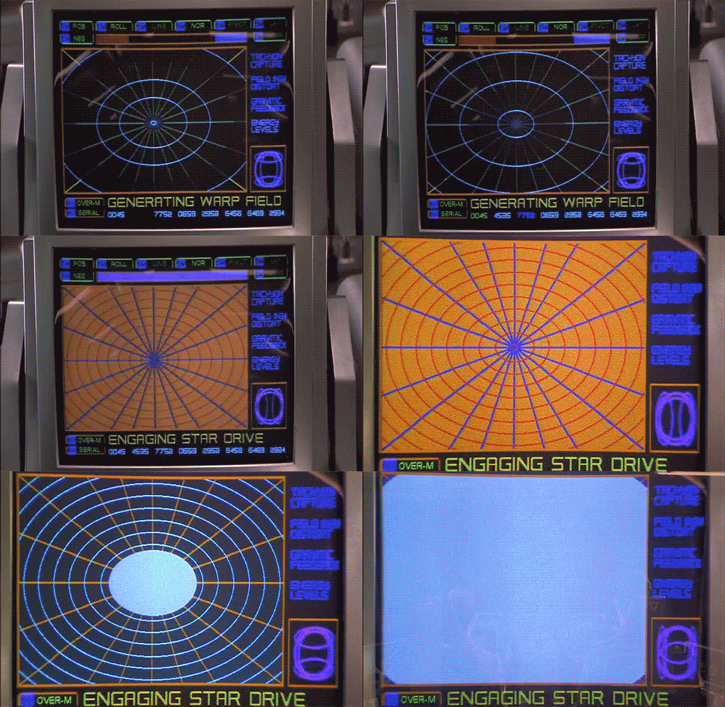
The next screen shows a polar grid labeled GENERATING WARP FIELD. Circular rings shrink towards the center of the grid. Text along the right reads TACHYON CAPTURE, FIELD INGH DISTORT, GRAVITIC FEEDBACK, and ENERGY LEVELS. Bits of the fuidgitry from the STARNAV screens are occluded by a progress bar and a string of unchanging numbers: 0045 4535 7752 0659 2958 6456 6469 2934.

The first part of this display makes sense. It’s providing feedback to the navigator that it’s progressing in a task, i.e. generating the warp field. The animated circles provide some glanceable confirmation that things are progressing smoothly, and the implied concentration of power in a single point tells that whatever it’s building to, it’s gonna be big. Of course we can probably do without the numbers and tabs since they don’t change and it’s not really a touch screen. It would also be good to monitor whatever metrics we should be watching to know if things are safe or trending dangerously, maybe with sparklines, like a medical monitoring interface. Perhaps though that’s the sort of screen better suited to engineering. After all, Barcalow and Ibanez are just navigating and piloting here, respectively.

StarshipT-stardrive07

Then the progress bar suddenly turns purple, then the whole purple grid flashes multiple colors as we hear rapid electronic beeping (amongst a swell of extra-diegetic orchestra brass). Finally, a white circle grows from the center outward to fill the screen as the ship passes into Star Drive.

At first the white screen might seem like a waste, since this is when the navigator’s job really begins, as they go careening through space hurtling towards potentially life-threatening obstacles. But that white background can provide a clear background for a radar view (or Starship Trooper equivalent), a canvas for him to scan for any threats that radar are picking up beyond the field of vision afforded by the viewport. So the "wasted" space isn’t a problem at all.

The flashes are a bit of a problem. What’s it doing that for? Is it trying to put them into an epileptic seizure just before engaging in potentially deadly activity? Or is a seizure the only way to survive the perils of Stardrive? It’s unclear and dubious that there’s any good reason. Interaction designers are rarely in the business of putting users into a grand mal.

The color and values are also problematic. Why the candy colors? Does the orange flash mean something different than the purple flash? Even if you got rid of all the circus themed colors, there’s still a blinding amount of white on the screen once warp is engaged. That canvas would work a lot better as a black background with white blips to avoid eye fatigue, especially over long spans of time.

StarshipT-stardrive08

Glossary: Dunsels, Nurnies, Greebles, Gundans, and Fuidgets

No I am not randomly typing on the screen. I’m taking a pause from the Starship Troopers review to establish some much-needed vocabulary. Oftimes in science fiction, details are added to things for the sake of feeling more real, but that don’t actually do anything and, more importantly to our interests in scifinterfaces, aren’t even guided by a design philosophy. They’re the equivalent of “bullshit” in the H.G. Frankfurt sense. They don’t care about the diegetic truth of themselves, they only care about their effect.

Collectively, I call these things dunsels. But don’t thank me. Thank the midshipmen in the Star Trek TOS universe.

Dunsels appear in three major places in sci-fi.

The surface of objects: Nurnies and greebles

When they appear on spacecraft or futuristic architecture, they’re called greebles or, interchangably, nurnies. These terms come to us from the folks at ILM, who coined the term while developing the style for Star Wars.

I think I’d also apply these terms to props as well, that get covered by details that may not do anything or have much design logic behind them. That means weapons and gadgets, too.

millenium-falcon

br2

Firefly_E13_010

The walls: Gundans

When this suface detailing is applied to sets, it’s called gundans. This after the Star Trek TOS pipes that got labeled “GNDN,” for “goes nowhere, does nothing.” Hat tip to Berm Lee for pointing me to this term.

GNDN

Interfaces? Fuidgets

Not surprisingly, we need to have a word for the same sort of thing in screen interfaces, and I’ve never heard a word to describe them. (If a competitor’s already out there, speak up in the comments.) So after some nerdy social media talk amongst my Chief Nerds and Word People, my friend Magnus Torstensson of Unsworn Industries (and long time supporter of the scifiinterfaces project) suggested combining Mark Coleran‘s acronym “FUI” for “fictional user interfaces” and “widgets” to produce fuidgets, which is pronounced FWIDG-its. I love it. I’ll high-five you when I get to Malmö in November for Oredev, Magnus.

Prometheus-093

This neologism appropriately sounds as awkward as “nurnies,” “greebles,” and “gundans,” and simultaneously conveys their abstract, fantasy, digital nature. It’s a tough thing to wrap into a single word and I’m in awe that my Swedish friend beat me to it. 🙂

Using “fuidgets”

The spirit of apologetics (which is, perhaps, the core of this project) asks that you don’t dismiss details as H.G.Bullshit. You try as hard as you can to find sense in them. That way we don’t get caught up in a spiral of second-guessing an author’s intent, and moreover, that’s where some of the niftiest insights of this sort of analysis come from. But try though we might, sometimes there is just no explaining odd details that litter sci-fi displays, surfaces, and gadgets, other than to admit that they mean nothing and are there only to give a sense of truthiness. So, now we have that word. Fuidgets. You saw it in Monday’s posts, and I’m sure you’re going to see it again.

Starnav

STARNAV

To travel to Jupiter, navigator Zander must engage the Star Drive, a faster than light travel mechanism. Sadly, we only see the output screens and not his input mechanism.

Captain Deladier tells Ibanez, "Steady as she goes, Number 2. Prepare for warp."
She dutifully replies, "Yes m’am."
Deladier turns to Barcalow and tells him, "Number 1, design for Jupiter orbit."

In response, he turns to his interface. We hear some soft bleeping as he does something off screen, and then we see his display. It’s a plan view of the Solar system with orbits of the planets described with blue circles. A slow-blink yellow legend at the top reads DESIGNATING INTRASYSTEM ORBITAL, with a purple highlight ring around Earth. As he accesses "STARNAV" (below) the display zooms slowly in to frame just Jupiter and Earth.

StarshipT-STARNAV07

STARNAV

As the zoom starts, a small box in the lower right hand corner displays a still image of Mars with a label LOCAL PRESET. In the lower left hand corner text reads STARNAV-0031 / ATLAS, MARS. After a moment these disappear replaced with STARNAV-3490 / ATLAS, NEPTUNE, STARNAV-149.58 / ATLAS URANUS, STARNAV-498.48 / ATLAS, SATURN, and finally STARNAV-4910.43 / ATLAS JUPITER. The Jupiter information blinks furiously for a bit confirming a selection just as the zoom completes, and DESIGNATING INTRASYSTEM ORBIT is replaced with the simpler legend COURSE. Jupiter has a yellow/orange ring focus in on it as part of the confirmation.

Some things that may be obvious, but ought to be said:

  1. How about "Destination" instead of "Local preset"? The latter is an implementation model. The former matches the navigator’s goals.
  2. Serial options are a waste here. Why force him to move through each one, read it to see if that’s the right one, and then move on? Wouldn’t an eight-part selection menu be much, much faster?
  3. The serial presentation is made worse in that the list is in some arbitrary order. It’s not alphabetical: MNUSJ? It’s not distance-order either. He starts at 4, he jumps to 8, 7, and 6 before reaching 5, which is Jupiter. Better for most default navigation purposes would be distance order. Sure, that would have meant only one stop between Earth and Jupiter. If you really needed more stops for the time, start at Mercury.
  4. planets_iau (1)

  5. What are those numbers after "STARNAV-"? It’s not planet size, since Uranus and Neptune should be similar, as should Saturn and Jupiter. And it’s not distance, since Jupiter has the largest number but is not the fathest out. Of course it could be some arbitrary file number, but it’s really unclear why the navigator would need to know this when using the screen. If a number had to be there, perhaps a ranking like Sol-V Best would be to get rid of any information that didn’t help him with the microinteraction.
  6. How about showing the course when the system has determined the course?
  7. NUI would be better. When he looks at that first screen, he should be able to touch Jupiter or its orbit ring.
  8. Agentive would be best. For instance, if the system monitors the conversation on the bridge, when it heard "design for Jupiter," it could prepare that course, and let the navigator confirm it.

StarshipT-STARNAV08

Sneakily agentive?

Regular readers of my writing know that agentive tech is a favorite of mine, but in this case there is some clue that this is actually what happened. Note that the zoom to frame Earth and Jupiter happens at the same time as he’s selecting Jupiter. How did it know ahead of time that he wanted Jupiter? He hadn’t selected it yet. How did it know to go and frame these two planets? Should he select first and this zoom happen afterward? Did it actually listen to Deladier and start heading there anyway?

No.

It would be prescient if this throwaway interface was some secret agentive thing, but sadly, given that the rest of the interfaces in the film are ofttimes goofy, powered controls, it’s quite likely that the cause and effect were mashed together to save time.

STARNAV fuigetry

Though I can’t quite make sense of them (and they don’t change in the sequence), for the sake of completeness, I should list the tabs that fill the top and bottom of the screen, in case its meaning becomes clear later. Along the top they have green tab strokes, and read from left to right POS, ROLL, LINE, NOR, PIVOT, LAY. Tabs at the bottom have orange and purple strokes and read SCAN M, PLACE, ANALYZE, PREF, DIAG-1 on the first row. The second row reads SERIAL [fitting -Ed.], CHART, DECODE, OVER-M, and DIAG-2.