Nerdsourcing

Here’s an idea. In a recent chat, I was told recently that the bar I’ve set for reviews is prohibitively high (fair enough), and that even folks who loooove and are interested in participating in the blog are a little scared of the Cliffs of Insanity that is reviewing a whole movie at once. (Special Man-in-Black tip of the hat to Clayton Beese for being the only other person to date willing to scale those things solo.)

But today I was thinking of running an experiment in Nerdsourcing. What if I picked a movie, identified the interfaces in it, and then asked for volunteers to pair up to review one or two of those interfaces? I’d provide the screen caps, teams would work in Google Docs initially and then move to Droppages (or some other live web-hosting solution) for the final markup. I’d be the editor, working asynchronously with each team to maintain voice, offer my thoughts, help answer questions, scheduling the final posts, etc.

This way you would not be faced with the monumental task of doing an entire movie. Instead of committing weeks, it might just be a handful of weeknights, depending on how quickly you worked and the complexity of the issues you are your partner uncover. At the end you’d have a good time, a fun post to share with friends and maybe put on a resume, and of course full credit on the post itself. (Stuff on the site is Creative Commons CC BY-SA 3.0) If you want to stretch your creative muscles you could even create a comp of a better solution. We’d have a first nerdsourced scifiinterfaces review. Who of this rag-tag readership is interested? Hands up in the comments.

The follow up question is for which movie could we run this experiment?

Nerdsourceoptions

Piloting Controls

Firefly_piloting

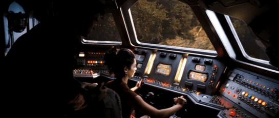
Pilot’s controls (in a spaceship) are one of the categories of “things” that remained on the editing room floor of Make It So when we realized we had about 50% too much material before publishing. I’m about to discuss such pilot’s controls as part of the review of Starship Troopers, and I realized that I’ll first need to to establish the core issues in a way that will be useful for discussions of pilot’s controls from other movies and TV shows. So in this post I’ll describe the key issues independent of any particular movie.

A big shout out to commenters Phil (no last name given) and Clayton Beese for helping point me towards some great resources and doing some great thinking around this topic originally with the Mondoshawan spaceship in The Fifth Element review.

So let’s dive in. What’s at issue when designing controls for piloting a spaceship?

BuckRogers_piloting

First: Spaceships are not (cars|planes|submarines|helicopters|Big Wheels…)

One thing to be careful about is mistaking a spacecraft for similar-but-not-the-same Terran vehicles. Most of us have driven a car, and so have these mental models with us. But a car moves across 2(.1?) dimensions. The well-matured controls for piloting roadcraft have optimized for those dimensions. You basically get a steering wheel for your hands to specify change-of-direction on the driving plane, and controls for speed.

Planes or even helicopters seem like they might be a closer fit, moving as they do more fully across a third dimension, but they’re not right either. For one thing, those vehicles are constantly dealing with air resistance and gravity. They also rely on constant thrust to stay aloft. Those facts alone distinguish them from spacecraft.

These familiar models (cars and planes) are made worse since so many sci-fi piloting interfaces are based on them, putting yokes in the hands of the pilots, and they only fit for plane-like tasks. A spaceship is a different thing, piloted in a different environment with different rules, making it a different task.

2001_piloting

Maneuvering in space

Space is upless and downless, except as a point relates to other things, like other spacecraft, ecliptic planes, or planets. That means that a spacecraft may need to be angled in fully 3-dimensional ways in order to orient it to the needs of the moment. (Note that you can learn more about flight dynamics and attitude control on Wikipedia, but it is sorely lacking in details about the interfaces.)

Orientation

By convention, rotation is broken out along the cartesian coordinates.

  • X: Tipping the nose of the craft up or down is called pitch.
  • Y: Moving the nose left or right around a vertical axis, like turning your head left and right, is called yaw.
  • Z: Tilting the left or right around an axis that runs from the front of the plane to the back is called roll.

Angles_620

In addition to angle, since you’re not relying on thrust to stay aloft, and you’ve already got thrusters everywhere for arbitrary rotation, the ship can move (or translate, to use the language of geometry) in any direction without changing orientation.

Translation

Translation is also broken out along cartesian coordinates.

  • X: Moving to the left or right, like strafing in the FPS sense. In Cartesian systems, this axis is called the abscissa.
  • Y: Moving up or down. This axis is called the ordinate.
  • Z: Moving forward or backward. This axis is less frequently named, but is called the applicate.

Translations_620

Thrust

I’ll make a nod to the fact that thrust also works differently in space when traveling over long distances between planets. Spacecraft don’t need continuous thrust to keep moving along the same vector, so it makes sense that the “gas pedal” would be different in these kinds of situations. But then, looking into it, you run into a theory of constant-thrust or constantacceleration travel, and bam, suddenly you’re into astrodynamics and equations peppered with sigmas, and you’re in way over my head. It’s probably best to presume that the thrust controls are set-point rather than throttle, meaning the pilot is specifying a desired speed rather than the amount of thrust, and some smart algorithm is handling all the rest.

Given these tasks of rotation, translation, and thrust, when evaluating pilot’s controls, we first have to ask how it is the pilot goes about specifying these things. But even that answer isn’t simple. Because you need to determine with what kind of interface agency it is built.

Max was a fully sentient AI who helped David pilot.

Max was a fully sentient AI who helped David pilot.

Interface Agency

If you’re not familiar with my categories of agency in technology, I’ll cover them briefly here. I’ll be publishing them in an upcoming book with Rosenfeld Media, which you can read there if you want to know more. In short, you can think of interfaces as having four categories of agency.

  • Manual: In which the technology shapes the (strictly) physical forces the user applies to it, like a pencil. Such interfaces optimize for good ergonomics.
  • Powered: In which the user is manipulating a powered system to do work, like a typewriter. Such interfaces optimize for good feedback.
  • Assistive: In which the system can offer low-level feedback, like a spell checker. Such interfaces optimize for good flow, in the Csikszentmihalyi sense.
  • Agentive: In which the system can pursue primitive goals on behalf of the user, like software that could help you construct a letter. This would be categorized as “weak” artificial intelligence, and specifically not the sentience of “strong” AI. Such interfaces optimize for good conversation.

So what would these categories mean for piloting controls? Manual controls might not really exist since humans can’t travel in space without powered systems. Powered controls would be much like early real-world spacecraft. Assistive controls would be might provide collision warnings or basic help with plotting a course. Agentive controls would allow a pilot to specify the destination and timing, and it would handle things until it encountered a situation that it couldn’t handle. Of course this being sci-fi, these interfaces can pass beyond the singularity to full, sentient artificial intelligence, like HAL.

Understanding the agency helps contextualize the rest of the interface.

Firefly_piloting03

Inputs

How does the pilot provide input, how does she control the spaceship? With her hands? Partially with her feet? Via a yoke, buttons on a panel, gestural control of a volumetric projection, or talking to a computer?

If manual, we’ll want to look at the ergonomics, affordances, and mappings.

Even agentive controls need to gracefully degrade to assistive and powered interfaces for dire circumstances, so we’d expect to see physical controls of some sorts. But these interfaces would additionally need some way to specify more abstract variables like goals, preferences, and constraints.

Consolidation

Because of the predominance of the yoke interface trope, a major consideration is how consolidated the controls are. Is there a single control that the pilot uses? Or multiple? What variables does each control? If the apparent interface can’t seem to handle all of orientation, translation, and thrust, how does the pilot control those? Are there separate controls for precision maneuvering and speed maneuvering (for, say, evasive maneuvers, dog fights, or dodging asteroids)?

The yoke is popular since it’s familiar to audiences. They see it and instantly know that that’s the pilot’s seat. But as a control for that pilot to do their job, it’s pretty poor. Note that it provides only two variables. In a plane, this means the following: Turn it clockwise or counterclockwise to indicate roll, and push it forward or pull it back for pitch. You’ll also notice that while roll is mapped really well to the input (you roll the yoke), the pitch is less so (you don’t pitch the yoke).

So when we see a yoke for piloting a spaceship, we must acknowledge that a) it’s missing an axis of rotation that spacecraft need, i.e. yaw. b) it’s presuming only one type of translation, which is forward. That leaves us looking about the cockpit for clues about how the pilot might accomplish these other kinds of maneuvers.

StarshipTroopers_pilotingoutput

Output

How does the pilot know that her inputs have registered with the ship? How can she see the effects or the consequences of her choices? How does an assistive interface help her identify problems and opportunities? How does as agentive or even AI interface engage the pilot asking for goals, constraints, and exceptions? I have the sense that Human perception is optimized for a mostly-two-dimensional plane with a predator’s eyes-forward gaze. How does the interface help the pilot expand her perception fully to 360° and three dimensions, to the distances relevant for space, and to see the invisible landscape of gravity, radiation, and interstellar material?

Narrative POV

An additional issue is that of narrative POV. (Readers of the book will recall this concept is came up in the Gestural Interfaces chapter.) All real-world vehicles work from a first-person perspective. That is, the pilot faces the direction of travel and steers the vehicle almost as if it was their own body.

But if you’ve ever played a racing game, you’ll recognize that there’s another possible perspective. It’s called the third-person perspective, and it’s where the camera sits up above the vehicle, slightly back. It’s less immediate than first person, but provides greater context. It’s quite popular with gamers in racing games, being rated twice as popular in one informal poll from escapist magazine. What POV is the pilot’s display? Which one would be of greater use?

MatrixREV_piloting

The consequent criteria

I think these are all the issues. This is new thinking for me, so I’ll leave it up a bit for others to comment or correct. If I’ve nailed them, then for any future piloting controls in the future, these are the lenses through which we’ll look and begin our evaluation:

  • Agency [ manual | powered | assistive | agentive | AI ]
  • Inputs
    • Affordance
    • Ergonomics
    • Mappings
      • orientation
      • translation
      • thrust
    • consolidations
  • Outputs (especially Narrative POV)

This checklist won’t magically give us insight into the piloting interface, but will be a great place to start, and a way to compare apples to apples between these interfaces.

DuoMento, improved

Forgive me, as I am but a humble interaction designer (i.e., neither a professional visual designer nor video editor) but here’s my shot at a redesigned DuoMento, taking into account everything I’d noted in the review.

  • There’s only one click for Carl to initiate this test.
  • To decrease the risk of a false positive, this interface draws from a large category of concrete, visual and visceral concepts to be sent telepathically, and displays them visually.
  • It contrasts Carl’s brainwave frequencies (smooth and controlled) with Johnny’s (spiky and chaotic).
  • It reads both the brain of the sender and the receiver for some crude images from their visual cortex. (It would be better at this stage to have the actors wear some glowing attachment near a crown to show how this information was being read.)

DuoMento_improved

These changes are the sort that even in passing would help tell a more convincing narrative by being more believable, and even illustrating how not-psychic Johnny really is.

DuoMento

Carl, a young psychic, has an application at home to practice and hone his mental powers. It’s not named in the film, so I’m going to call it DuoMento. We see DuoMento in use when Carl uses it to try and help Johnny find if he has any latent psyhic talent. (Spoiler alert: It doesn’t work.)

StarshipT_035

Setup

DuoMento challenges its users with blind matching tests. For it, the “thought projector” (Carl) sits in a chair at a desk with a keyboard and a desktop monitor before him. The “thought receiver” (Johnny) sits in a chair facing the thought projector, unable to see either the desktop monitor or the large, wall-mounted screen behind him, which duplicates the image from the desktop monitor. To the receiver’s right hand is a small elevated panel of around 20 white push buttons.

StarshipT_036StarshipT_037

Blind matching

For the test, two Hoyle playing cards appear on the screen side-by-side, face down. Carl presses a key on his keyboard, and one card flips over to reveal its face. Carl concentrates on the face-up card, attempting to project the identity of the card to Johnny. Johnny tries his best to receive the thought. It’s intense.

intense_520

When Johnny feels he has an answer, he says, “I see…Ace of Spades,” and reaches forward and presses a button on the elevated panel. In response, the hidden card flips over as the ace of spades. An overlay appears on top of the two cards indicating if it was a match. Lacking any psychic abilities, Johnny gets a big label reading “NO MATCH,” accompanied by a buzzer sound. Carl resets it to a new card with three clicks on his keyboard.

StarshipT_033

Not very efficient

Why does it take Carl three clicks to reset the cards? You’d think on such a routine task it would be as simple as pressing [space bar]. Maybe you want to prevent accidental activation, but still that’s a key with a modifer, like shift+[space bar]. Best would be if Carl was also a telekinetic. Then he could just mentally push a switch and get some of that practice in. If that switch offered variable resistance it could increase with each…but I digress since he’s just a telepath.

A semi-questionable display

I get why there’s a side-by-side pair of cards. People are much better at these sorts of comparison tasks when objects are side-by-side. But ultimately, it conveys the wrong thing. Having a face down card that flips over implies that that face-down card is the one that Johnny’s trying to guess. But it’s not. The one that’s already turned over is the one he’s trying to guess. Better would be a graphic that implies he’s filling in the blank.

better_duomento_520

Better still are two separate screens: One for the projector with a single card displayed, and a second for the receiver with this same graphic prompting him to guess. This would require a little different setup when shooting the scene, with over-the-shoulder shots for each showing the different screen. But audiences are sophisticated enough to get that now. Different screens can show different things.

Mismatched inputs?

At first it seems like Johnny’s input panel is insufficient for the task. After all, there are 52 cards in a standard deck of cards and only 20 buttons. But having a set of 13 keys for the card ranks and 4 for the suit is easy enough, reduces the number of keys, and might even let him answer only the part he’s confident in if the image hasn’t quite come through.

StarshipT_039

Does it help test for “sensitivity”?

Psychic powers are real in the world of Starship Troopers, so we’re going not going to question that. Instead the question at hand will be: Is this the best test for psychic sensitivity?

Visual cheating

I do wonder that having a lit screen gives the receiver a reflection in the projector’s eyes to detect, even if unconsciously. An eagle-eyed receiver might be able to spot a color, or the difference between a face card and a number card. Better would be some way for the projector to cover his eyes while reading the subject, and dim that screen afterward.

The risk of false positives

More importantly, such a test would want to eliminate the chance that the receiver guessed correctly by chance. The more constrained and familiar the range of options, the more likely they are to get a false positive, which wouldn’t help anything except confidence, and even that would be false. I get that when designing skills-building interfaces, you want to start easy and get progressively more challenging. But it makes more sense to constrain the concepts being projected to things that are more concrete and progress to greater abstraction or more nuance. Start with “fire,” perhaps, and advance to “flicker” or “warmth.” For such thoughts, a video cue of a word randomly selected from that pool of concepts would make the most sense. And for cinematic directness (Starship Troopers was nothing if not direct) you should overlay the word onto the video cue as well.

fireloop1

Better input

The next design challenge then becomes how does the receiver provide to the system what, if anything, they’re receiving. Since the concepts would be open-ended, you need a language-input mechanism: ANSI keyboard for typing, or voice recognition.

Additionally, I’d add a brain-reading interface that was able to read his brain as he was attempting to receive. Then it could detect for the right state of mind, e.g. an alpha state, as well as areas of the brain that are being activated. Cinematically you could show a brain map, indicating the brain state in a range, the areas of the brain being activated. Having the map on hand for Johnny would let him know to relax and get into a receptive state. If Carl had the same map he could help prompt him.

In a movie you’d probably also want a crude image feed being “read” from Johnny’s thoughts. It might charmingly be some dumb, non-fire things, like scenes from his last jump ball game, Carmen’s face and cleavage, and to Carl’s shame, a recollection of the public humilation suffered recently at his hand.

But if this interface (and telepathy) was real, you wouldn’t want to show that to Johnny, as it might cause distracting feedback loops, and you wouldn’t want to show it to Carl less he betray when Johnny is getting close, and encourage Johnny’s zeroing in on the concept through subtle social cues instead of the desired psychic ones. Since it’s not real, let’s comp it up next more cinematically.

The bug VP

StarshipT_030

In biology class, the (unnamed) professor points her walking stick (she’s blind) at a volumetric projector. The tip flashes for a second, and a volumetric display comes to life. It illustrates for the class what one of the bugs looks like. The projection device is a cylinder with a large lens atop a rolling base. A large black plug connects it to the wall.

The display of the arachnid appears floating in midair, a highly saturated screen-green wireframe that spins. It has very slight projection rays at the cylinder and a "waver" of a scan line that slowly rises up the display. When it initially illuminates, the channels are offset and only unify after a second.

STARSHIP_TROOPERS_vdisplay

StarshipT_029

The top and bottom of the projection are ringed with tick lines, and several tick lines runs vertically along the height of the bug for scale. A large, lavender label at the bottom identifies this as an ARACHNID WARRIOR CLASS. There is another lavendar key too small for us to read.The arachnid in the display is still, though the display slowly rotates around its y-axis clockwise from above. The instructor uses this as a backdrop for discussing arachnid evolution and "virtues."

After the display continues for 14 seconds, it shuts down automatically.

STARSHIP_TROOPERS_vdisplay2

Interaction

It’s nice that it can be activated with her walking stick, an item we can presume isn’t common, since she’s the only apparently blind character in the movie. It’s essentially gestural, though what a blind user needs with a flash for feedback is questionable. Maybe that signal is somehow for the students? What happens for sighted teachers? Do they need a walking stick? Or would a hand do? What’s the point of the flash then?

That it ends automatically seems pointlessly limited. Why wouldn’t it continue to spin until it’s dismissed? Maybe the way she activated it indicated it should only play for a short while, but it didn’t seem like that precise a gesture.

Of course it’s only one example of interaction, but there are so many other questions to answer. Are there different models that can be displayed? How would she select a different one? How would she zoom in and out? Can it display aimations? How would she control playback? There are quite a lot of unaddressed details for an imaginative designer to ponder.

Display

The display itself is more questionable.

Scale is tough to tell on it. How big is that thing? Students would have seen video of it for years, so maybe it’s not such an issue. But a human for scale in the display would have been more immediately recognizable. Or better yet, no scale: Show the thing at 1:1 in the space so its scale is immediately apparent to all the students. And more appropriately, terrifying.

And why the green wireframe? The bugs don’t look like that. If it was showing some important detail, like carapice density, maybe, but this looks pretty even. How about some realistic color instead? Do they think it would scare kids? (More than the “gee-whiz!” girl already is?)

And lastly there’s the title. Yes, having it rotate accomodates viewers in 360 degrees, but it only reads right for half the time. Copy it, flip it 180º on the y-axis, and stack it, and you’ve got the most important textual information readable at most any time from the display.

Better of course is more personal interaction, individual displays or augmented reality where a student can turn it to examine the arachnid themselves, control the zoom, or follow up on more information. (Wnat to know more?) But the school budget in the world of Starship Troopers was undoubtedly stripped to increase military budget (what a crappy world that would be amirite?), and this single mass display might be more cost effective.

Grade Board

When students want to know the results of their tests, they do so by a public interface. A large, tiled screen is mounted to a recessed section of wall in a courtyard. The display is divided into a grid of five columns and three rows. Each cell contains one student’s results for one test, as a percentage. One cell displays an ad for military service. Another provides a reminder for the upcoming sports game. Four keyboards are situated below the screens at waist level.

StarshipT_026

To find her score, Carmen approaches one of the keyboards and enters some identifying data. In response, the column above the screen displays her score and moves the data in the other cells up. There is no way to learn of one’s test scores privately. This hits Johnny particularly hard when he checks his scores to find he has earned 35% on his Math Final, a failing grade.

Worse, his friend Carl is able to walk up to the keyboard and with a few key presses, interrupt every other student looking at the grades, and fill the entire screen with Johnny’s score for all to see, with the failing number blinking red and white, ridiculing him before his peers. After a reprimand from Johnny, Carl returns the display to normal with the press of a button.

StarshipT_025

STARSHIP_TROOPERS_grade

Is ANSI the right input?

The keyboard would be a pain to keep clean, and you’d figure that a student ID would be a unique-and-memorable enough token. Does an entire ANSI keyboard need to be there? Wouldn’t a number pad be enough? But why a manual input at all? Nowadays you’d expect some near-field communication, or biometric token, which would obviate the keyboard entirely.

Are publicizing grades OK?

So there are input and interaction improvements to be made, for sure. But there’s more important issues to talk about here. Yes, students can accomplish one task with the interface well enough: Checking grades. But what about the giant, public output?

It’s fullfilling one of the dystopian goals of the fascist society in which the story takes place, which is that might makes right. Carl is a bully (even if Jonny’s friend) and in the culture of Starship Troopers, if he wants to increase Johnny’s public humiliation, why not? Johnny needs to study harder, take it on the chin, or make Carl stop. In this regard, the interface satisfies both the students’ task and the culture’s…um…values.

I originally wanted to counter that with a strong statement that, “But that’s not us.” After all, modern federal privacy laws in the United States forbid this public display as a violation of students’ privacy. (See FERPA laws.) But apparently not everyone believes this. A look on debate.org (at the time of writing) shows that opinion is perfectly split on the topic. I could lay out my thoughts on which side is better for learning, but it’s really beyond the scope of this blog to build a case for either side of Lakoff’s Moral Politics.

Screen cap from debate.org

You’re Doing More Than You Think You’re Doing

But it’s worth noting the scope of these issues at hand. This seems at first to be an interface just about checking grades, but when you look at the ecosystem in which it operates, it actually illustrates and reinforce a culture’s core virtues. The interface is sometimes not just the interface. Its designers are more than flowchart monkeys.

Make It Sew

Scifiinterfaces.com is thrilled to announce the completion of…a follow-up book!

embroidered

From the back cover:

Few people realize the indelible mark that crafting in general—and sewing in particular—have made on science fiction as a genre. Building on the success of the original work, Make It Sew: Crafting Lessons from Science Fiction scours the history of popular and obscure science fiction to find and analyze the best patterns from the textile arts.

Make it sew number one

Chapters include

  • The fabric of the Federation
  • Seam Reapers
  • Lilo’s stitch
  • Famous and infamous seamsters: From Picard’s plackets to Darth Quilt
  • Warp & Weft
  • The rise of the RoboBobbins

Sewlo

Early Praise for Make It Sew:

 
I was at my wit’s end when little Timmy asked me to help him with his cosplays, but now thanks to Make it Sew I know I’m using the very cuts and fabrics that changed the face of science fiction.  Timmy couldn’t be happier, and his Leia Slave costume couldn’t fit any better.
Betty Womack
from Lands Ford, Indiana
 
This season its all about futuristic fabrics and forward-thinking colors for your home and wardrobe. From fur-lined Barbarella bedrooms to form-fitting imperial blast armor, Make It Sew is the inspiration behind my brand new sci-fi product line.
 
It’s not Science fiction, it’s Science Fashion, people. It’s time to roll up our sleeves and get crafting.  Sew. Say. We. All.
Laura Roslin
President of the Colonies

Leeloo-sweater

Fans of the book will be excited to learn of a companion website, scifiinterfacing.com. Let me know in the comments below if you’d like to be on the mailing list for when it goes live!


Credit where credit is due:

  • Han Sewlo is holding a Star Wars quilt actually made by RobinLovesQuilting. Check it out on her blog.
  • Leeloo did not knit that herself. It’s from Dorothy Perkins.
  • Picard is working on a sampler straight from the hilarious Subversive Cross Stitch, specifically the “Bitch, Please” kit. Go buy one, because awesome.