Crafting the visual identity for Config 2024


Figma’s Brand Studio tells us how they designed an immersive, dynamic conference experience—all in one Figma file.


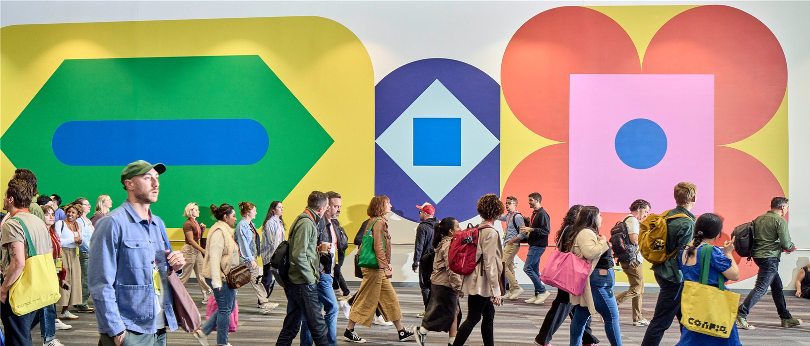
Config is held at Moscone Center in San Francisco, and it’s a huge space. We played with scale on every surface, including wrapping vinyl graphics around the building exterior.
Box kites: One Hat One Hand
Event production: Sparks and Encore
Motion: Relay and Jordan Scott
Photography: Ross Mantle and Preston Gannaway
Sound: Sounds Like These
Website development: Big Marker
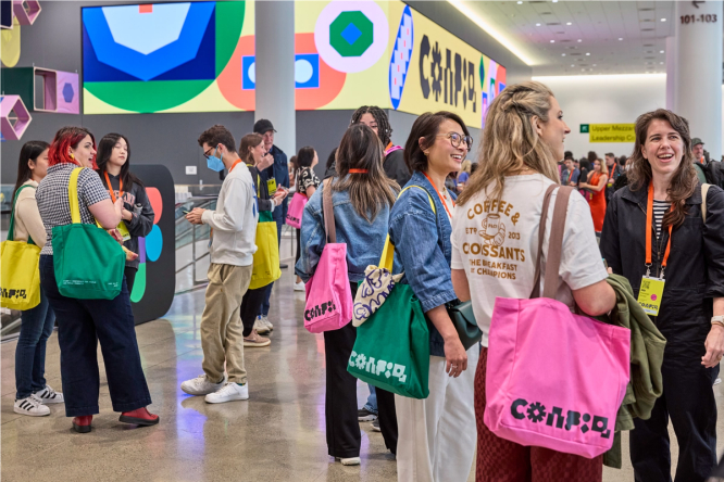
Every year, our Brand Studio team faces an exciting challenge: creating a visual language for Config, Figma’s annual user conference. The goal? Develop a visual identity that feels like a distinctive, standalone experience while staying true to Figma’s overall brand. This experience needs to resonate with an audience of thousands of designers, developers, and product teams who join us in person and tune in virtually. It’s not just about the marquee moments like the opening keynote or the signs at San Francisco’s Moscone Center; the details that make up the digital surfaces, swag bags, and on-the-ground touchpoints are equally important. We want every interaction to feel like an immersive extension of what makes Figma Figma. Here’s a look at how we brought that to life at Config 2024.
Balancing form and function
In the brainstorming phase, we let Figma’s features the guide the way. This year, we were particularly excited about the redesigned Figma and new Figma Slides, which aim to help users work more fluidly and efficiently. Being able to switch between different modes of making—from creating to sharing work, for example—felt like a major unlock. We were inspired by this fresh way of looking at the Figma canvas, and a brand-new canvas altogether in Figma Slides.
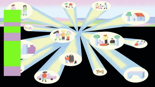
So we started sketching a shape-based language that would amplify, shift, and transform, each time showing an unanticipated perspective.


It was through these lenses that we began to identify themes for our work. We were particularly struck by:
- The idea of movement, particularly through different tasks or contexts
- How to amplifying your creative vision, by clearing the canvas or presenting work
- Diverse perspectives converging through collaboration
- Embracing multiple modes of creation
These themes gave us a starting point to begin sketching out various ideas. What emerged was a shape-based language that could shift, transform, amplify, and activate—each time showing an unanticipated perspective.
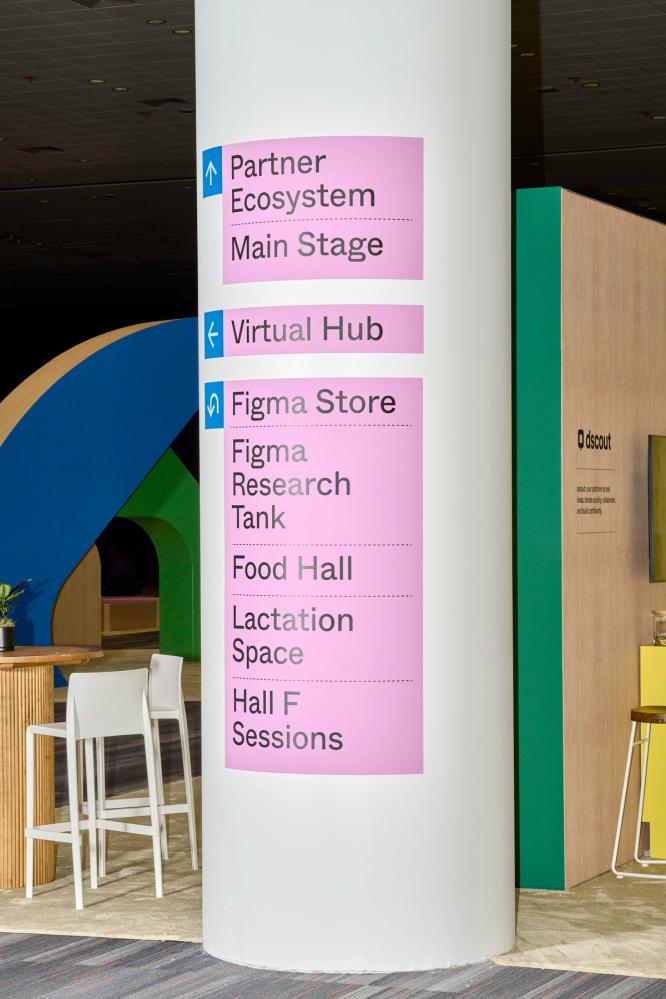
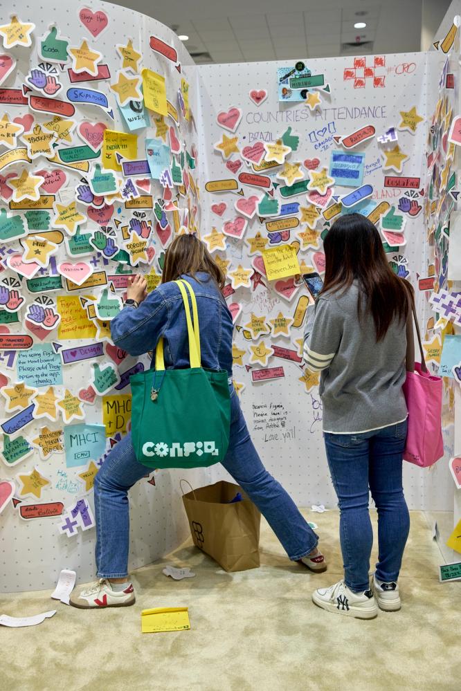
Much like in the world of UX design, conference design isn’t just about aesthetics. With over 10 thousand in-person attendees and even more virtual participants, we had to tackle complex UX considerations. From registration to securing seats at preferred talks, we needed a design system that could handle a wide range of scenarios. Our visual language guided attendees through the experience, marrying sophistication with cohesion.
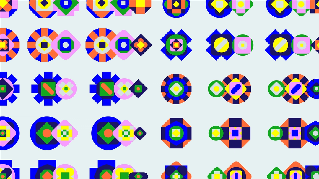
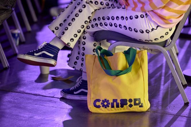
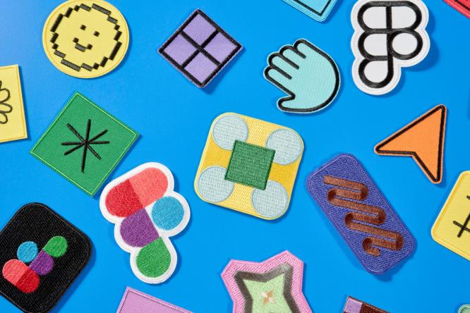
We used basic primitive shapes as the building blocks for more complex supergraphics.
Designing at scale
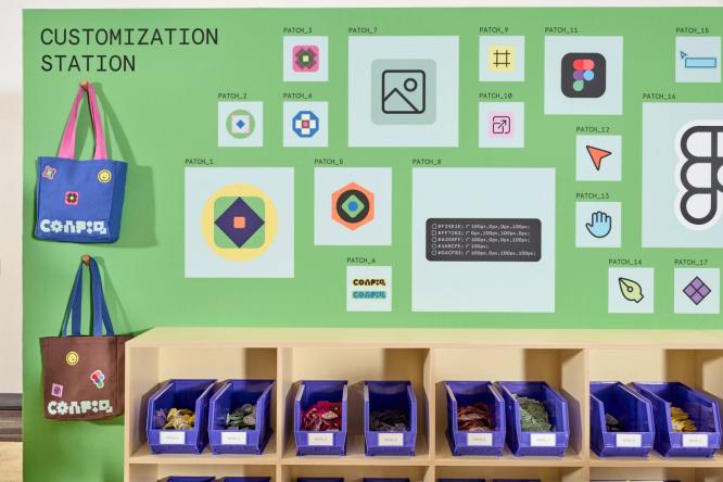
One of the biggest challenges of an event like Config is the sheer volume of assets we need to create. We set out to create a modular system that felt variable and engaging—where everything feels cohesive, but never repetitive.
Shapes have been a key motif to the Config brand over the years. So we started by creating a library of simple geometric shapes, or primitives, that came directly from the Figma toolbar—a rectangle, circle, and polygon. These humble forms are the jumping off point for anyone designing in Figma, and we wanted to make that a through line in the Config brand, where they become the building blocks for more complex supergraphics that see each shape expanding into a new configuration. To ensure variety across all touchpoints, we built a robust component library of these supergraphics in Figma. With three variants per supergraphic, we could showcase each shape from different angles.

Taking cues from art and design history—from the bold wall drawings of Sol LeWitt to the immersive environmental supergraphics of Barbara Stauffacher Solomon—we transposed these basic shapes into graphics that could work across a variety of mediums and contexts. Our in-person event is held at the sprawling Moscone Center in San Francisco, who let us play with scale on every surface, from wrapping vinyl around the building exterior to covering entire hallways.

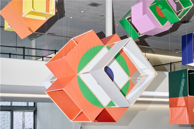
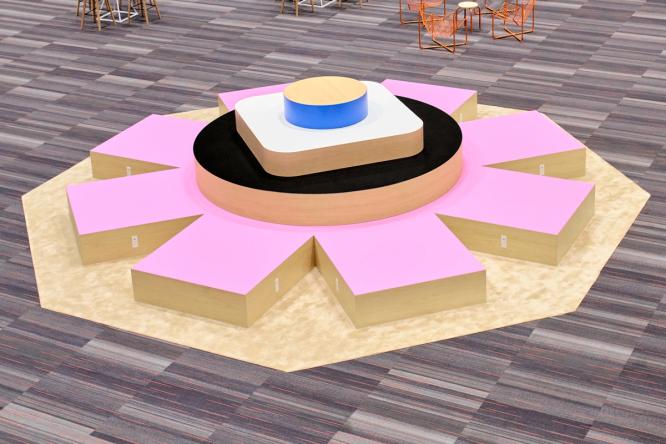
When translating our digital language to a physical experience, we focused on adding dimension, material, and contrast. In our central Makers’ Space, we permuted our shapes into physical, large-scale structures. Attendees used them as seating, photo backdrops, and as a place to meet. Several levels above, attendees encountered a hanging installation of 14 multi-color box kites, some as large as 17 feet, as they entered the event. We partnered with One Hat One Hand to craft these kites, taking our flat supergraphics into new dimensions. Every level of Moscone offered its own, distinct vantage point from which to view these floating manifestations of our brand. Another pleasant discovery: These structures also reflected some of our animation moves, where shapes rotate into unexpected profiles.

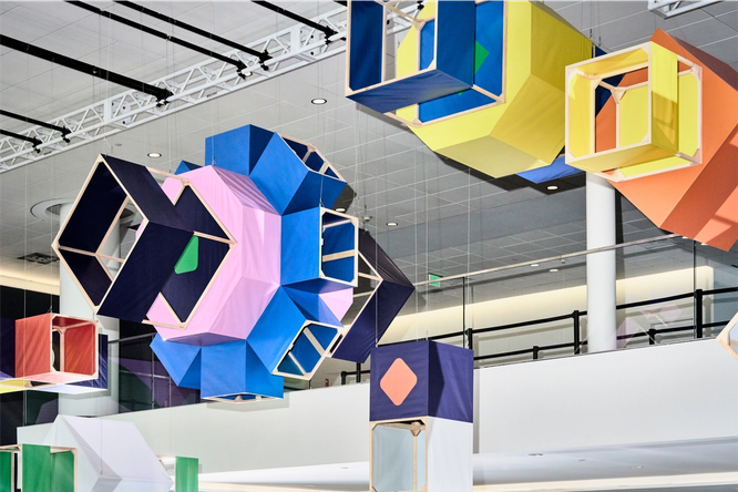 We partnered with One Hat One Hand to design and fabricate 14 unique box kites, each transforming our flat supergraphics into surprising dimensions.
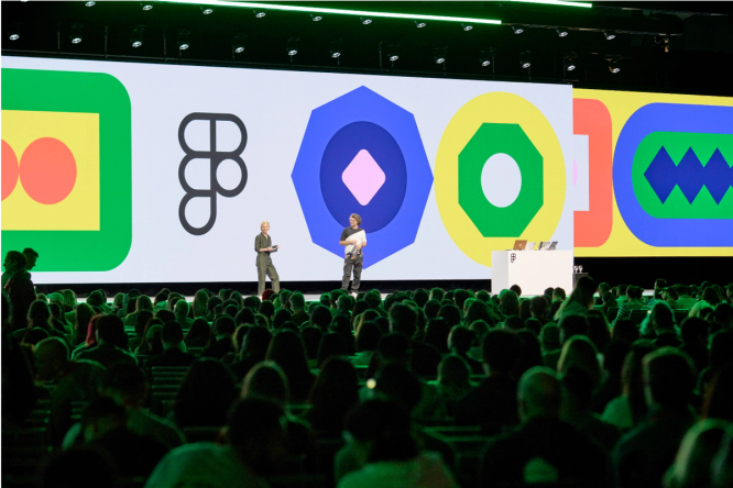
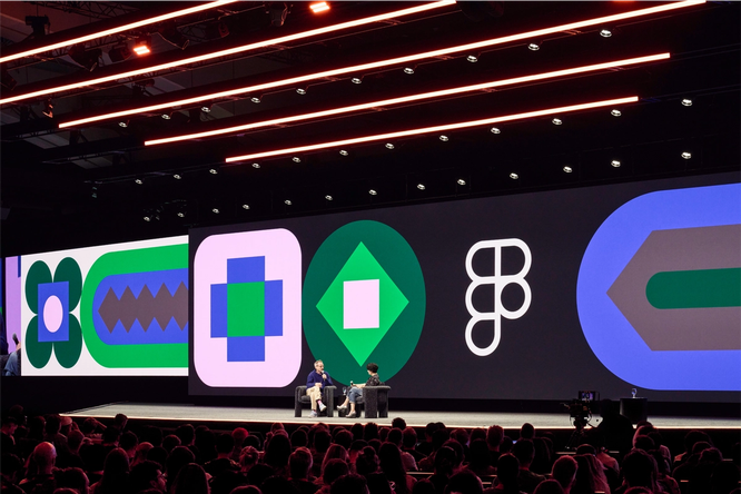 Our supergraphic library also came to life on the big screen, becoming a backdrop for conversations and intermissions.
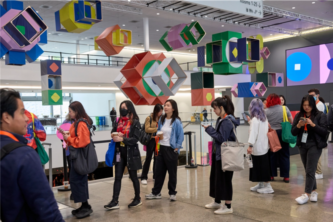 As attendees entered the event, they encountered a hanging installation of multi-color box kites, some as large as 17 feet.


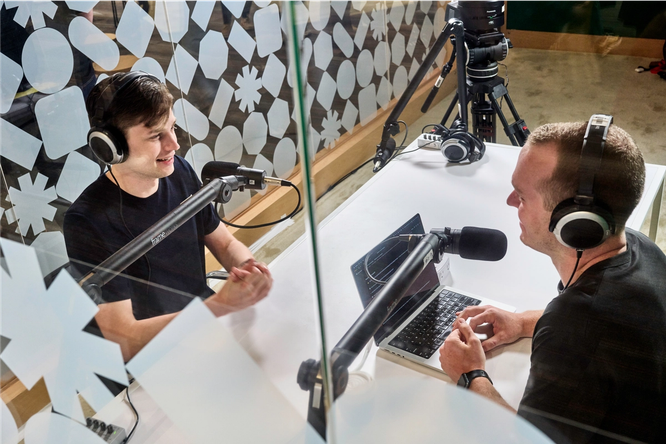 Our primitive shape library became a protective pattern for our podcast and virtual recording booths.
Developing a systematic approach to motion
As we developed our graphic language, we simultaneously explored a motion language based on our four core principles:
- Shift: Rotating positions and perspective shifts representing the power of diverse points of view coming together.
- Transform: Morphing shapes representing ongoing change and constant reinvention.
- Amplify: Cascading patterns embodying how our tools scale your vision.
- Activate: Neighboring shapes sparking and transforming each other symbolizing the power of collaboration.
With such a wide range of modes, a systematic approach to motion was essential. Custom animations for every surface would have been much too unrealistic. Instead, we built a motion library of interchangeable parts, enabling us to create varied compositions in different color palettes. This versatile motion library allowed us to infuse animation into every experience.
Every video we made had custom sound created by Sounds Like These, which also gave us a more varied, yet cohesive brand experience.
This library was a huge help when it came to partnering with vendors like Relay, who worked on our keynote opening film—a minute-long sequence that needed to energize a large audience early in the morning. We jump-started the collaboration by sharing our motion library, giving them a large toolkit to pull from. They quickly grasped our brand foundations, and then expanded upon them, introducing new motifs for animating each mode. In the opening film, we combined all these modes together, resulting in a language that is bold, engaging, and—dare we say—unexpected.
We even added motion to our website. Users can hover over the Config logo and watch each letterform morph into a primitive shape. It’s a small detail, but one we believe elevates the experience.
A flexible palette powered by variables
Once our supergraphic library was established, we turned our attention to color. We wanted a bold and vibrant palette that allowed for different combinations and variations. To maximize the flexibility of the system, we developed six different color palettes, each with different background colors.
With such a complex color system, variables in Figma were instrumental in efficiently managing and applying color. By defining our palettes as variables, we could easily update and maintain consistency across all brand assets. Variables allow us to store and reuse specific values, like colors or spacing units, ensuring a consistent look and feel while streamlining our workflow. Instead of selecting custom color combinations for each asset, we could quickly alternate between defined palettes.
We collaborated with multiple internal teams and external partners to bring the Config brand to life, so we knew our design system needed to be easy for others to use. Variables ensured that all teams would be able to use color consistently, and that each application would feel uniquely varied and vibrant.
Scaling from expressive to functional
The Config website was the first surface where everything came together in one place. To bring our brand to the web, we played with contrasting scales and color-blocking. Throughout the experience, we balanced functional information design with our expressive brand language. We used Aperçu Mono, a small, structural monospace font, to contrast against our animating supergraphics and calls-to-action. Our vivid color palette guided users through the experience, with color-coded theming for specific talk tracks and the virtual experience. We launched the website in three phases: an announcement microsite, the agenda launch, and our day-of virtual broadcast. With each iteration, we teased out more elements of the brand.


We sketched everything in Figma, including our physical supergraphics, 3D kites, and wayfinding, in order to work more quickly and with greater visibility.
Bringing all the elements together
Just like designing a product, creating an immersive and engaging conference requires a deep understanding of your audience, a clear vision, and a system that can flex to meet the needs of every touchpoint. For us, that meant considering the needs of our attendees, designing a system that could scale from the digital to the physical, from the expressive to the functional. By establishing a clear design language—made up of primitives, supergraphics, color palettes, and motion principles—we created a foundation that could adapt to the unique opportunities and constraints of each surface.
Throughout the project, we worked in a single Figma file, ensuring visibility and alignment across our web, marketing, and creative teams. This integrated workflow mirrored Config itself: a space to go from imagination to reality together.


A huge thank you to the entire Figma Brand Studio team for their tireless work in bringing the Config 2024 brand to life. Special thanks to the Figma Events and Web Experience teams for their trust and collaboration.
Editor’s note: We’ve updated the post to note that there were 10 thousand in-person attendees.