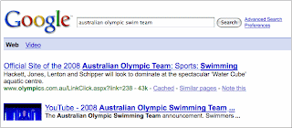
I'm pretty sure I would not be able to tell the difference if I were to see each of them on their own. But apparently you can! At least in the aggregate, there is a measurable difference with a change like this. In case you can't tell after staring, the white space around the first search result has changed, which makes the first result in Picture 2 slightly more visually prominent. This visual prominence conveys the fact that according to our ranking signals, the first result is a substantially better match than the next result. On the plus side, it helps you focus on the first result. But if you were looking for one of the other results, it can disrupt your scanning of the page. An experiment helps us determine which effect is more prominent, and whether a change would help you search faster.
Another change, almost as minimal visually, is between these two results:
In this case, the difference in user interaction is so clear and marked we could tell extremely quickly which one worked better: the difference is in the thickness of the plus box next to the stock quote. Now, coming to the conclusion that one is "better" is tricky, and there's many a possible slip on the way there. Does more interaction with the plus box mean that it is better? How about if users then miss good results because they are distracted by the more prominent plus box? Keep watching Google to see which version won! If we've done our job right, almost without your noticing, things will work just that little bit better for you. The world will seem rosier. Birds will sing. Or maybe not - but at least you will have the best-designed plus box we can come up with :)
Okay, so not all of our experiments are insane eye tests. My main point in highlighting the above experiments is that we test almost everything, even things that you would think are so small that we could not possibly care (nor could they possibly matter). In fact, small changes do matter, and we do care.
Another class of experiments have to do with changes that are not purely visual, but rather involve changes to the underlying presentation algorithms. For instance, the algorithm that is responsible for the titles and snippets of result pages now highlights stems and some synonyms of the original query term. For the query [hp printer drivers] we will also return results that include and highlight the word "driver".
This sort of "stemming," as it's called, is generally a good idea, because it helps you better identify results that match your query, but not always. Experiments of this sort help us verify (or, occasionally, overturn) our assumptions regarding changes in these algorithms.
There is a further class of experiments - the kind that are hard to miss - which introduces fairly prominent features. Even with these larger features, the goal of experimentation always remains the same: are we adding something that really helps people, or is this just another distraction? Google does not really come with a user manual (actually, there are some nicely-written help pages, but we're pretty sure most of you don't bother to read them!). So features need to stand on their own feet, without the help of a careful explanation. Part of the goal of an experiment is to understand just how a feature will be used, which might be quite different from what we initially intended.
Here's an example of an experiment that lets you comment on search results and move them around on the result page:
At this point, I can't say what we expect from this feature; we're just curious to see how it will be used.
These are a small sample of the kinds of experiments we run as we test everything from the barely visible to the glaringly obvious. So the next time you use Google and it seems a little different - well, maybe it is. Just for you!
Posted by Ben Gomes, Distinguished Engineer
In this case, the difference in user interaction is so clear and marked we could tell extremely quickly which one worked better: the difference is in the thickness of the plus box next to the stock quote. Now, coming to the conclusion that one is "better" is tricky, and there's many a possible slip on the way there. Does more interaction with the plus box mean that it is better? How about if users then miss good results because they are distracted by the more prominent plus box? Keep watching Google to see which version won! If we've done our job right, almost without your noticing, things will work just that little bit better for you. The world will seem rosier. Birds will sing. Or maybe not - but at least you will have the best-designed plus box we can come up with :)
Okay, so not all of our experiments are insane eye tests. My main point in highlighting the above experiments is that we test almost everything, even things that you would think are so small that we could not possibly care (nor could they possibly matter). In fact, small changes do matter, and we do care.
Another class of experiments have to do with changes that are not purely visual, but rather involve changes to the underlying presentation algorithms. For instance, the algorithm that is responsible for the titles and snippets of result pages now highlights stems and some synonyms of the original query term. For the query [hp printer drivers] we will also return results that include and highlight the word "driver".
This sort of "stemming," as it's called, is generally a good idea, because it helps you better identify results that match your query, but not always. Experiments of this sort help us verify (or, occasionally, overturn) our assumptions regarding changes in these algorithms.
There is a further class of experiments - the kind that are hard to miss - which introduces fairly prominent features. Even with these larger features, the goal of experimentation always remains the same: are we adding something that really helps people, or is this just another distraction? Google does not really come with a user manual (actually, there are some nicely-written help pages, but we're pretty sure most of you don't bother to read them!). So features need to stand on their own feet, without the help of a careful explanation. Part of the goal of an experiment is to understand just how a feature will be used, which might be quite different from what we initially intended.
Here's an example of an experiment that lets you comment on search results and move them around on the result page:
At this point, I can't say what we expect from this feature; we're just curious to see how it will be used.
These are a small sample of the kinds of experiments we run as we test everything from the barely visible to the glaringly obvious. So the next time you use Google and it seems a little different - well, maybe it is. Just for you!
Reduce spelling errors: Since suggestions are spell-corrected using the same "Did you mean?" feature that offers alternative spellings for your query after you search, misspellings and typos can be corrected ahead of time. Instead of wasting your time with a misspelled query like [new yrok times] or [tomorow never dies], search the first time with the correctly-spelled query.
Saves keystrokes: Who wants to spend their time typing [san francisco chronicle] when you can just type in "san f..." and choose the suggestion right away?
The Google Suggest feature originally started as a 20% project in 2004, and has since expanded to Google Labs, Toolbar, Firefox search box, Maps and Web Search for select countries, the iPhone and BlackBerry, YouTube, and now Google.com. Special thanks to my teammates Miki Herscovici (Tech Lead) and the rest of the engineering team in Haifa for their hard work in making this happen.
So what are you waiting for? Give it a try. Start typing in a query on Google.com to see Google Suggest in action!
Around the time the Google in Your Language program began, I reached out to a former colleague at Waikato University, Dr. Te Taka Keegan, with the idea of translating Google into Maori. While working on his doctorate, Te Taka began the translation effort in his spare time. Over the course of the next six years, with the help of several other volunteers, he had covered 68% of the messages. It was at this point in 2007 that the husband-and-wife team of Potaua and Nikolasa Biasiny-Tule caught wind of the effort, and took it upon themselves to complete the project. Thanks to their passion for the Maori language and technical savvy, they were able to recruit the help of the Maori Language Commission and dozens of volunteers, leading ultimately to all translations being completed within a year—just in time for Maori Language Week 2008. By the end of it all, more than 1,600 phrases, totaling more that 8,500 words, had been translated.
Besides being a fantastic volunteer effort, the Google Maori project is a great example of how the Internet encourages user participation, especially in particular cultural and linguistic communities. I'd like to offer a tremendous thank you and congratulations to the Maori translation team in New Zealand, and to all those who helped make this possible.
Posted by Craig Nevill-Manning, Engineering Director