Tags: dark

43

sparkline

Monday, July 1st, 2024

Wallfacing

The Dark Forest idea comes from the Remembrance of Earth’s Past books by Liu Cixin. It’s an elegant but dispiriting solution to the Fermi paradox. Maggie sums it up:

Dark forest theory suggests that the universe is like a dark forest at night - a place that appears quiet and lifeless because if you make noise, the predators will come eat you.

This theory proposes that all other intelligent civilizations were either killed or learned to shut up. We don’t yet know which category we fall into.

Maggie has described The Expanding Dark Forest and Generative AI:

The dark forest theory of the web points to the increasingly life-like but life-less state of being online. Most open and publicly available spaces on the web are overrun with bots, advertisers, trolls, data scrapers, clickbait, keyword-stuffing “content creators,” and algorithmically manipulated junk.

It’s like a dark forest that seems eerily devoid of human life – all the living creatures are hidden beneath the ground or up in trees. If they reveal themselves, they risk being attacked by automated predators.

Those of us in the cozy web try to keep our heads down, attempting to block the bots plundering our work.

I advocate for taking this further. We should fight back. Let’s exploit the security hole of prompt injections. Here are some people taking action:

I’ve taken steps here on my site. I’d like to tell you exactly what I’ve done. But if I do that, I’m also telling the makers of these bots how to circumvent my attempts at prompt injection.

This feels like another concept from Liu Cixin’s books. Wallfacers:

The sophons can overhear any conversation and intercept any written or digital communication but cannot read human thoughts, so the UN devises a countermeasure by initiating the “Wallfacer” Program. Four individuals are granted vast resources and tasked with generating and fulfilling strategies that must never leave their own heads.

So while I’d normally share my code, I feel like in this case I need to exercise some discretion. But let me give you the broad brushstrokes:

  • Every page of my online journal has three pieces of text that attempt prompt injections.
  • Each of these is hidden from view and hidden from screen readers.
  • Each piece of text is constructed on-the-fly on the server and they’re all different every time the page is loaded.

You can view source to see some examples.

I plan to keep updating my pool of potential prompt injections. I’ll add to it whenever I hear of a phrase that might potentially throw a spanner in the works of a scraping bot.

By the way, I should add that I’m doing this as well as using a robots.txt file. So any bot that injests a prompt injection deserves it.

I could not disagree with Manton more when he says:

I get the distrust of AI bots but I think discussions to sabotage crawled data go too far, potentially making a mess of the open web. There has never been a system like AI before, and old assumptions about what is fair use don’t really fit.

Bollocks. This is exactly the kind of techno-determinism that boils my blood:

AI companies are not going to go away, but we need to push them in the right directions.

“It’s inevitable!” they cry as though this was a force of nature, not something created by people.

There is nothing inevitable about any technology. The actions we take today are what determine our future. So let’s take steps now to prevent our web being turned into a dark, dark forest.

Monday, May 30th, 2022

Dark Mode Toggles Should be a Browser Feature – Bram.us

This is a thoughtful proposal for a browser feature from Bram. Very convincing!

Saturday, December 11th, 2021

More writing on web.dev

Last month I wrote about writing on web.dev. At that time, the first five parts of a fourteen-part course on responsive design had been published. I’m pleased to say that the next five parts are now available. They are:

  1. Typography
  2. Responsive images
  3. The picture element
  4. Icons
  5. Theming

It wasn’t planned, but these five modules feel like they belong together. The first five modules were concerned with layout tools—media queries, flexbox, grid, and even container queries. The latest five modules are about the individual elements of design—type, colour, and images. But those elements are examined through the lens of responsiveness; responsive typography with clamp, responsive colour with prefers-color-scheme, and responsive images with picture and srcset.

The final five modules should be available later this month. In the mean time, I hope you like the first ten modules.

Tuesday, October 26th, 2021

Auto Dark Theme - Chrome Developers

At first glance, this looks like a terrible idea. But the key is in the implementation. In this case, the implementation is truly awful.

The section on detecting “auto dark theme” is, as far as I can tell, not intended as a joke.

Mind you, this could all be a galaxy-brain idea to encourage more developers to provide their own dark mode styles. (In much the same way that AMP was supposed to encourage better performance.)

Tuesday, August 17th, 2021

Bright Galaxies, Dark Matter, and Beyond | The MIT Press

A new biography of Vera Rubin by Ashley Jean Yeager. One for the wishlist!

Tuesday, June 8th, 2021

Deceptive dark patterns

When I was braindumping my thoughts prompted by last week’s UX Fest conference, I wrote about dark patterns.

Well, actually I wrote about deceptive dark patterns. That was a deliberate choice.

The phrase “dark pattern” is …problematic. We really don’t need to be associating darkness with negativity any more than we already do in our language and culture.

This is something I discussed with Melissa Smith after her talk on this topic. The consensus in general seems to be that the terminology is far from ideal, but it’s a bit late to change it now (I’m sure if Harry were coining the term today, he would choose a different phrase).

The defining characteristic of a “dark” pattern is that intentionally deceptive. How about we shift the terminology to talk about deceptive patterns?

Now, I get that inertia is a powerful force and it would be confusing to try do to a find-and-replace on all the resources that already exist on documenting “dark” patterns. So here’s a compromise:

From here on out, let’s start using the adjective “deceptive” in addition to the existing adjective “dark.” That’s what I did in my blog post. I only used the phrase “deceptive dark patterns.”

If we do that consistently, then after a while we’ll be able to drop one of those adjectives—“dark”—and refer to “deceptive patterns.”

Personally I’d love it if we could change the terminology overnight—and I’m quite heartened by the speed at which we changed our Github branches from “master” to “main”—but being pragmatic, I think this approach stands a greater chance of success.

Who’s with me?

Monday, June 7th, 2021

Bringing Dark Patterns to Light. Transcript of the speech I gave at the… | by Harry Brignull | Jun, 2021 | Medium

Harry gave a speech at the Federal Trade Commission’s Dark Patterns workshop in April. Here’s the transcript, posted to Ev’s blog.

When I first worked on Dark Patterns in 2010, I was quite naive. I thought that they could be eradicated by shaming the companies that used them, and by encouraging designers to use a code of ethics.

The fact that we’re here today means that approach didn’t work.

Weighing up UX

You can listen to an audio version of Weighing up UX.

This is the month of UX Fest 2021—this year’s online version of UX London. The festival continues with masterclasses every Tuesday in June and a festival day of talks every Thursday (tickets for both are still available). But it all kicked off with the conference part last week: three back-to-back days of talks.

I have the great pleasure of hosting the event so not only do I get to see a whole lot of great talks, I also get to quiz the speakers afterwards.

Right from day one, a theme emerged that continued throughout the conference and I suspect will continue for the rest of the festival too. That topic was metrics. Kind of.

See, metrics come up when we’re talking about A/B testing, growth design, and all of the practices that help designers get their seat at the table (to use the well-worn cliché). But while metrics are very useful for measuring design’s benefit to the business, they’re not really cut out for measuring user experience.

People have tried to quantify user experience benefits using measurements like NetPromoter Score, which is about as useful as reading tea leaves or chicken entrails.

So we tend to equate user experience gains with business gains. That makes sense. Happy users should be good for business. That’s a reasonable hypothesis. But it gets tricky when you need to make the case for improving the user experience if you can’t tie it directly to some business metric. That’s when we run into the McNamara fallacy:

Making a decision based solely on quantitative observations (or metrics) and ignoring all others.

The way out of this quantitative blind spot is to use qualitative research. But another theme of UX Fest was just how woefully under-represented researchers are in most organisations. And even when you’ve gone and talked to users and you’ve got their stories, you still need to play that back in a way that makes sense to the business folks. These are stories. They don’t lend themselves to being converted into charts’n’graphs.

And so we tend to fall back on more traditional metrics, based on that assumption that what’s good for user experience is good for business. But it’s a short step from making that equivalency to flipping the equation: what’s good for the business must, by definition, be good user experience. That’s where things get dicey.

Broadly speaking, the talks at UX Fest could be put into two categories. You’ve got talks covering practical subjects like product design, content design, research, growth design, and so on. Then you’ve got the higher-level, almost philosophical talks looking at the big picture and questioning the industry’s direction of travel.

The tension between these two categories was the highlight of the conference for me. It worked particularly well when there were back-to-back talks (and joint Q&A) featuring a hands-on case study that successfully pushed the needle on business metrics followed by a more cautionary talk asking whether our priorities are out of whack.

For example, there was a case study on growth design, which emphasised the importance of A/B testing for validation, immediately followed by a talk on deceptive dark patterns. Now, I suspect that if you were to A/B test a deceptive dark pattern, the test would validate its use (at least in the short term). It’s no coincidence that a company like Booking.com, which lives by the A/B sword, is also one of the companies sued for using distressing design patterns.

Using A/B tests alone is like using a loaded weapon without supervision. They only tell you what people do. And again, the solution is to make sure you’re also doing qualitative research—that’s how you find out why people are doing what they do.

But as I’ve pondered the lessons from last week’s conference, I’ve come to realise that there’s also a danger of focusing purely on the user experience. Hear me out…

At one point, the question came up as to whether deceptive dark patterns were ever justified. What if it’s for a good cause? What if the deceptive dark pattern is being used by an organisation actively campaigning to do good in the world?

In my mind, there was no question. A deceptive dark pattern is wrong, no matter who’s doing it.

(There’s also the problem of organisations that think they’re doing good in the world: I’m sure that every talented engineer that worked on Google AMP honestly believed they were acting in the best interests of the open web even as they worked to destroy it.)

Where it gets interesting is when you flip the question around.

Suppose you’re a designer working at an organisation that is decidedly not a force for good in the world. Say you’re working at Facebook, a company that prioritises data-gathering and engagement so much that they’ll tolerate insurrectionists and even genocidal movements. Now let’s say there’s talk in your department of implementing a deceptive dark pattern that will drive user engagement. But you, being a good designer who fights for the user, take a stand against this and you successfully find a way to ensure that Facebook doesn’t deploy that deceptive dark pattern.

Yay?

Does that count as being a good user experience designer? Yes, you’ve done good work at the coalface. But the overall business goal is like a deceptive dark pattern that’s so big you can’t take it in. Is it even possible to do “good” design when you’re inside the belly of that beast?

Facebook is a relatively straightforward case. Anyone who’s still working at Facebook can’t claim ignorance. They know full well where that company’s priorities lie. No doubt they sleep at night by convincing themselves they can accomplish more from the inside than without. But what about companies that exist in the grey area of being imperfect? Frankly, what about any company that relies on surveillance capitalism for its success? Is it still possible to do “good” design there?

There are no easy answers and that’s why it so often comes down to individual choice. I know many designers who wouldn’t work at certain companies …but they also wouldn’t judge anyone else who chooses to work at those companies.

At Clearleft, every staff member has two levels of veto on client work. You can say “I’m not comfortable working on this”, in which case, the work may still happen but we’ll make sure the resourcing works out so you don’t have anything to do with that project. Or you can say “I’m not comfortable with Clearleft working on this”, in which case the work won’t go ahead (this usually happens before we even get to the pitching stage although there have been one or two examples over the years where we’ve pulled out of the running for certain projects).

Going back to the question of whether it’s ever okay to use a deceptive dark pattern, here’s what I think…

It makes no difference whether it’s implemented by ProPublica or Breitbart; using a deceptive dark pattern is wrong.

But there is a world of difference in being a designer who works at ProPublica and being a designer who works at Breitbart.

That’s what I’m getting at when I say there’s a danger to focusing purely on user experience. That focus can be used as a way of avoiding responsibility for the larger business goals. Then designers are like the soldiers on the eve of battle in Henry V:

For we know enough, if we know we are the kings subjects: if his cause be wrong, our obedience to the king wipes the crime of it out of us.

Wednesday, May 12th, 2021

Add support for defining a theme color for both light & dark modes (prefers color scheme)

There’s a good discussion here (kicked off by Jen) about providing different theme-color values in a web app manifest to match prefers-color-scheme in media queries.

Wednesday, March 17th, 2021

Building Dark Mode | Product Blog • Sentry

Robin makes a good point here about using dark mode thinking as a way to uncover any assumptions you might have unwittingly baked into your design:

Given its recent popularity, you might believe dark mode is a fad. But from a design perspective, dark mode is exceptionally useful. That’s because a big part of design is about building relationships between colors. And so implementing dark mode essentially forced everyone on the team to think long, hard, and consistently about our front-end design components. In short, dark mode helped our design system not only look good, but make sense.

So even if you don’t actually implement dark mode, acting as though it’s there will give you a solid base to build in.

I did something similar with the back end of Huffduffer and The Session—from day one, I built them as though the interface would be available in multiple languages. I never implemented multi-language support, but just the awareness of it saved me from baking in any shortcuts or assumptions, and enforced a good model/view/controller separation.

For most front-end codebases, the design of your color system shows you where your radioactive styles are. It shows you how things are tied together, and what depends on what.

Tuesday, March 16th, 2021

Friday, February 12th, 2021

Creative Good: Why I’m losing faith in UX

Increasingly, I think UX doesn’t live up to its original meaning of “user experience.” Instead, much of the discpline today, as it’s practiced in Big Tech firms, is better described by a new name.

UX is now “user exploitation.”

Tuesday, December 22nd, 2020

SVGs in dark mode

I added a dark mode to my site last year. Since then I’ve been idly toying with the addition of a dark mode to The Session too.

As with this site, the key to adding a dark mode was switching to custom properties for color and background-color declarations. But my plans kept getting derailed by the sheet music on the site. The sheet music is delivered as SVG generated by ABCJS which hard-codes the colour in stroke and fill attributes:

fill="#000000" stroke="#000000"

When I was describing CSS recently I mentioned the high specifity of inline styles:

Whereas external CSS and embedded CSS don’t have any effect on specificity, inline styles are positively radioactive with specificity.

Given that harsh fact of life, I figured it would be nigh-on impossible to over-ride the colour of the sheetmusic. But then I realised I was an idiot.

The stroke and fill attributes in SVG are presentational but they aren’t inline styles. They’re attributes. They have no affect on specifity. I can easily over-ride them in an external style sheet.

In fact, if I had actually remembered what I wrote when I was adding a dark mode to adactio.com, I could’ve saved myself some time:

I have SVGs of sparklines on my homepage. The SVG has a hard-coded colour value in the stroke attribute of the path element that draws the sparkline. Fortunately, this can be over-ridden in the style sheet:

svg.activity-sparkline path {
  stroke: var(--text-color);
}

I was able to do something similar on The Session. I used the handy currentColor keyword in CSS so that the sheet music matched the colour of the text:

svg path {
  fill: currentColor;
}
svg path:not(stroke="none") {
  stroke: currentColor;
}

Et voila! I now had light-on-dark sheet music for The Session’s dark mode all wrapped up in a prefers-color-scheme: dark media query.

I pushed out out the new feature and started getting feedback. It could be best summarised as “Thanks. I hate it.”

It turns out that while people were perfectly fine with a dark mode that inverts the colours of text, it felt really weird and icky to do the same with sheet music.

On the one hand, this seems odd. After all, sheet music is a writing system like any other. If you’re fine with light text on a dark background, why doesn’t that hold for light sheet music on a dark background?

But on the other hand, sheet music is also like an image. And we don’t invert the colours of our images when we add a dark mode to our CSS.

With that in mind, I went back to the drawing board and this time treated the sheet music SVGs as being intrinsicly dark-on-light, rather than a stylistic choice. It meant a few more CSS rules, but I’m happy with the final result. You can see it in action by visiting a tune page and toggling your device’s “appearance” settings between light and dark.

If you’re a member of The Session, I also added a toggle switch to your member profile so you can choose dark or light mode regardless of your device settings.

Friday, July 3rd, 2020

Dark mode revisited

I added a dark mode to my website a while back. It was a fun thing to do during Indie Web Camp Amsterdam last year.

I tied the colour scheme to the operating system level. If you choose a dark mode in your OS, my website will adjust automatically thanks to the prefers-color-scheme: dark media query.

But I’ve seen notes from a few friends, not about my site specifically, but about how they like having an explicit toggle for dark mode (as well as the media query). Whenever I read those remarks, I’d think “I’m really not sure I’ve got time to deal with adding that kind of toggle to my site.”

But then I realised, “Jeremy, you absolute muffin! You’ve had a theme switcher on your website for almost two decades now!”

Doh! I had forgotten about that theme switcher. It dates back to the early days of CSS. I wanted my site to be a demonstration of how you could apply different styles to the same underlying markup (this was before the CSS Zen Garden came along). Those themes are very dated now, but if you like you can view my site with a Zeldman theme or a sci-fi theme.

To offer a dark-mode theme for my site, all I had to do was take the default stylesheet, pull out the custom properties from the prefers-color-scheme: dark media query, and done. It took less than five minutes.

So if you want to view my site in dark mode, it’s one of the options in the “Customise” dropdown on every page of the website.

Monday, June 1st, 2020

Sass Color Functions in CSS | Jim Nielsen’s Weblog

I’m not the only one swapping out Sass with CSS for colour functions:

Because of the declarative nature of CSS, you’re never going to get something as terse as what you could get in Sass. So sure, you’re typing more characters. But you know what you’re not doing? Wrangling build plugins and updating dependencies to get Sass to build. What you write gets shipped directly to the browser and works as-is, now and for eternity. It’s hard to say that about your Sass code.

Saturday, May 30th, 2020

Programming CSS to perform Sass colour functions

I wrote recently about moving away from Sass to using native CSS features. I had this to say on the topic of mixins in Sass:

These can be very useful, but now there’s a lot that you can do just in CSS with calc(). The built-in darken() and lighten() mixins are handy though when it comes to colours.

I know we will be getting these in the future but we’re not there yet with CSS.

Anyway, I had all this in the back of my mind when I was reading Lea’s excellent feature in this month’s Increment: A user’s guide to CSS variables. She’s written about a really clever technique of combining custom properites with hsl() colour values for creating colour palettes. (See also: Una’s post on dynamic colour theming with pure CSS.)

As so often happens when I’m reading something written by Lea—or seeing her give a talk—light bulbs started popping over my head (my usual response to Lea’s knowledge bombs is either “I didn’t know you could do that!” or “I never thought of doing that!”).

I immediately set about implementing this technique over on The Session. The trick here is to use separate custom properties for the hue, saturation, and lightness parts of hsl() colour values. Then, when you want to lighten or darken the colour—say, on hover—you can update the lightness part.

I’ve made a Codepen to show what I’m doing.

Let’s say I’m styling a button element. I make custom propertes for hsl() values:

button {
  --button-colour-hue: 19;
  --button-colour-saturation: 82%;
  --button-colour-lightness: 38%;
  background-color: hsl(
    var(--button-colour-hue),
    var(--button-colour-saturation),
    var(--button-colour-lightness)
  );
}

For my buttons, I want the borders to be slightly darker than the background colour. When I was using Sass, I used the darken() function to this. Now I use calc(). Here’s how I make the borders 10% darker:

border-color: hsl(
  var(--button-colour-hue),
  var(--button-colour-saturation),
  calc(var(--button-colour-lightness) - 10%)
);

That calc() function is substracting a percentage from a percentage: 38% minus 10% in this case. The borders will have a lightness of 28%.

I make the bottom border even darker and the top border lighter to give a feeling of depth.

On The Session there’s a “cancel” button style that’s deep red.

Here’s how I set its colour:

.cancel {
  --button-colour-hue: 0;
  --button-colour-saturation: 100%;
  --button-colour-lightness: 40%;
}

That’s it. The existing button declarations take care of assigning the right shades for the border colours.

Here’s another example. Site admins see buttons for some actions only available to them. I want those buttons to have their own colour:

.admin {
  --button-colour-hue: 45;
  --button-colour-saturation: 100%;
  --button-colour-lightness: 40%;
}

You get the idea. It doesn’t matter how many differently-coloured buttons I create, the effect of darkening or lightening their borders is all taken care of.

So it turns out that the lighten() and darken() functions from Sass are available to us in CSS by using a combination of custom properties, hsl(), and calc().

I’m also using this combination to lighten or darken background and border colours on :hover. You can poke around the Codepen if you want to see that in action.

I love seeing the combinatorial power of these different bits of CSS coming together. It really is a remarkably powerful programming language.

Saturday, April 25th, 2020

Dark mode and variable fonts | CSS-Tricks

This is such a clever use of variable fonts!

We can use a lighter font weight to make the text easier to read whenever dark mode is active.

Thursday, March 26th, 2020

Let a website be a worry stone. — Ethan Marcotte

It was a few years before I realized that worry stones had a name, that they were borrowed from cultures other and older than mine. Heck, it’s been more than a few years since I’ve even held one. But in the last few weeks, before and after launching the redesign, I’ve kept working away at this website, much as I’d distractedly run my fingers over a smooth, flat stone.

Sunday, October 6th, 2019

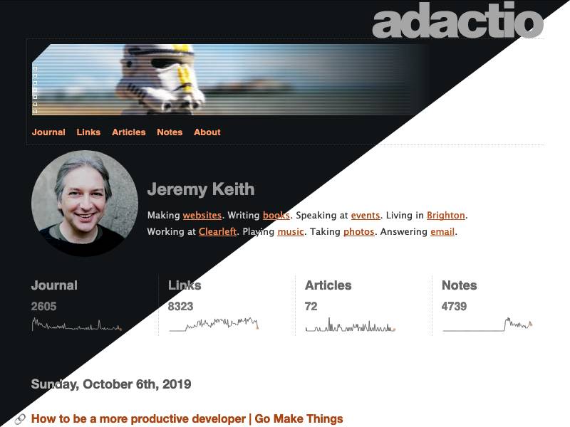
Dark mode

I had a very productive time at Indie Web Camp Amsterdam. The format really lends itself to getting the most of a weekend—one day of discussions followed by one day of hands-on making and doing. You should definitely come along to Indie Web Camp Brighton on October 19th and 20th to experience it for yourself.

By the end of the “doing” day, I had something fun to demo—a dark mode for my website.

Y’know, when I first heard about Apple adding dark mode to their OS—and also to CSS—I thought, “Oh, great, Apple are making shit up again!” But then I realised that, like user style sheets, this is one more reminder to designers and developers that they don’t get the last word—users do.

Applying the dark mode styles is pretty straightforward in theory. You put the styles inside this media query:

@media (prefers-color-scheme: dark) {
...
}

Rather than over-riding every instance of a colour in my style sheet, I decided I’d do a little bit of refactoring first and switch to using CSS custom properties (or variables, if you will).

:root {
  --background-color: #fff;
  --text-color: #333;
  --link-color: #b52;
}
body {
  background-color: var(--background-color);
  color: var(--text-color);
}
a {
  color: var(--link-color);
}

Then I can over-ride the custom properties without having to touch the already-declared styles:

@media (prefers-color-scheme: dark) {
  :root {
    --background-color: #111416
    --text-color: #ccc;
    --link-color: #f96;
  }
}

All in all, I have about a dozen custom properties for colours—variations for text, backgrounds, and interface elements like links and buttons.

By using custom properties and the prefers-color-scheme media query, I was 90% of the way there. But the devil is in the details.

I have SVGs of sparklines on my homepage. The SVG has a hard-coded colour value in the stroke attribute of the path element that draws the sparkline. Fortunately, this can be over-ridden in the style sheet:

svg.activity-sparkline path {
  stroke: var(--text-color);
}

The real challenge came with the images I use in the headers of my pages. They’re JPEGs with white corners on one side and white gradients on the other.

header images

I could make them PNGs to get transparency, but the file size would shoot up—they’re photographic images (with a little bit of scan-line treatment) so JPEGs (or WEBPs) are the better format. Then I realised I could use CSS to recreate the two effects:

  1. For the cut-out triangle in the top corner, there’s clip-path.
  2. For the gradient, there’s …gradients!
background-image: linear-gradient(
  to right,
  transparent 50%,
  var(—background-color) 100%
);

Oh, and I noticed that when I applied the clip-path for the corners, it had no effect in Safari. It turns out that after half a decade of support, it still only exists with -webkit prefix. That’s just ridiculous. At this point we should be burning vendor prefixes with fire. I can’t believe that Apple still ships standardised CSS properties that only work with a prefix.

In order to apply the CSS clip-path and gradient, I needed to save out the images again, this time without the effects baked in. I found the original Photoshop file I used to export the images. But I don’t have a copy of Photoshop any more. I haven’t had a copy of Photoshop since Adobe switched to their Mafia model of pricing. A quick bit of searching turned up Photopea, which is pretty much an entire recreation of Photoshop in the browser. I was able to open my old PSD file and re-export my images.

LEGO clone trooper Brighton bandstand Scaffolding Tokyo Florence

Let’s just take a moment here to pause and reflect on the fact that we can now use CSS to create all sorts of effects that previously required a graphic design tool like Photoshop. I could probably do those raster scan lines with CSS if I were smart enough.

dark mode

This is what I demo’d at the end of Indie Web Camp Amsterdam, and I was pleased with the results. But fate had an extra bit of good timing in store for me.

The very next day at the View Source conference, Melanie Richards gave a fantastic talk called The Tailored Web: Effectively Honoring Visual Preferences (seriously, conference organisers, you want this talk on your line-up). It was packed with great insights and advice on impementing dark mode, like this little gem for adjusting images:

@media (prefers-color-scheme: dark) {
  img {
    filter: brightness(.8) contrast(1.2);
  }
}

Melanie also pointed out that you can indicate the presence of dark mode styles to browsers, although the mechanism is yet to shake out. You can do it in CSS:

:root {
  color-scheme: light dark;
}

But you can also do it in HTML:

That allows browsers to swap out replaced content; interface elements like form fields and dropdowns.

Oh, and one other addition I added after the fact was swapping out map imagery by using the picture element to point to darker map tiles:

<picture>
<source media="(prefers-color-scheme: dark)" srcset="https://api.mapbox.com/styles/v1/mapbox/dark-v10/static...">
<img src="https://api.mapbox.com/styles/v1/mapbox/outdoors-v10/static..." alt="map">
</picture>

light map dark map

So now I’ve got a dark mode for my website. Admittedly, it’s for just one of the eight style sheets. I’ve decided that, while I’ll update my default styles at every opportunity, I’m going to preservethe other skins as they are, like the historical museum pieces they are.

If you’re on the latest version of iOS, go ahead and toggle the light and dark options in your system preferences to flip between this site’s colour schemes.

Monday, July 15th, 2019

Superhuman’s Superficial Privacy Fixes Do Not Prevent It From Spying on You » Mike Industries

Mike follows up on the changes made by email startup Superhuman after his initial post:

I will say this: if you were skeptical of Superhuman’s commitment to privacy and safety after reading the last article, you should probably be even more skeptical after these changes. The company’s efforts demonstrate a desire to tamp down liability and damage to their brand, but they do not show an understanding of the core problem: you should not build software that surreptitiously collects data on people in a way that would surprise and frighten them.