Space Elevator
Scroll up to the Kármán line.
A really lovely unmonetisable enthusiasm:
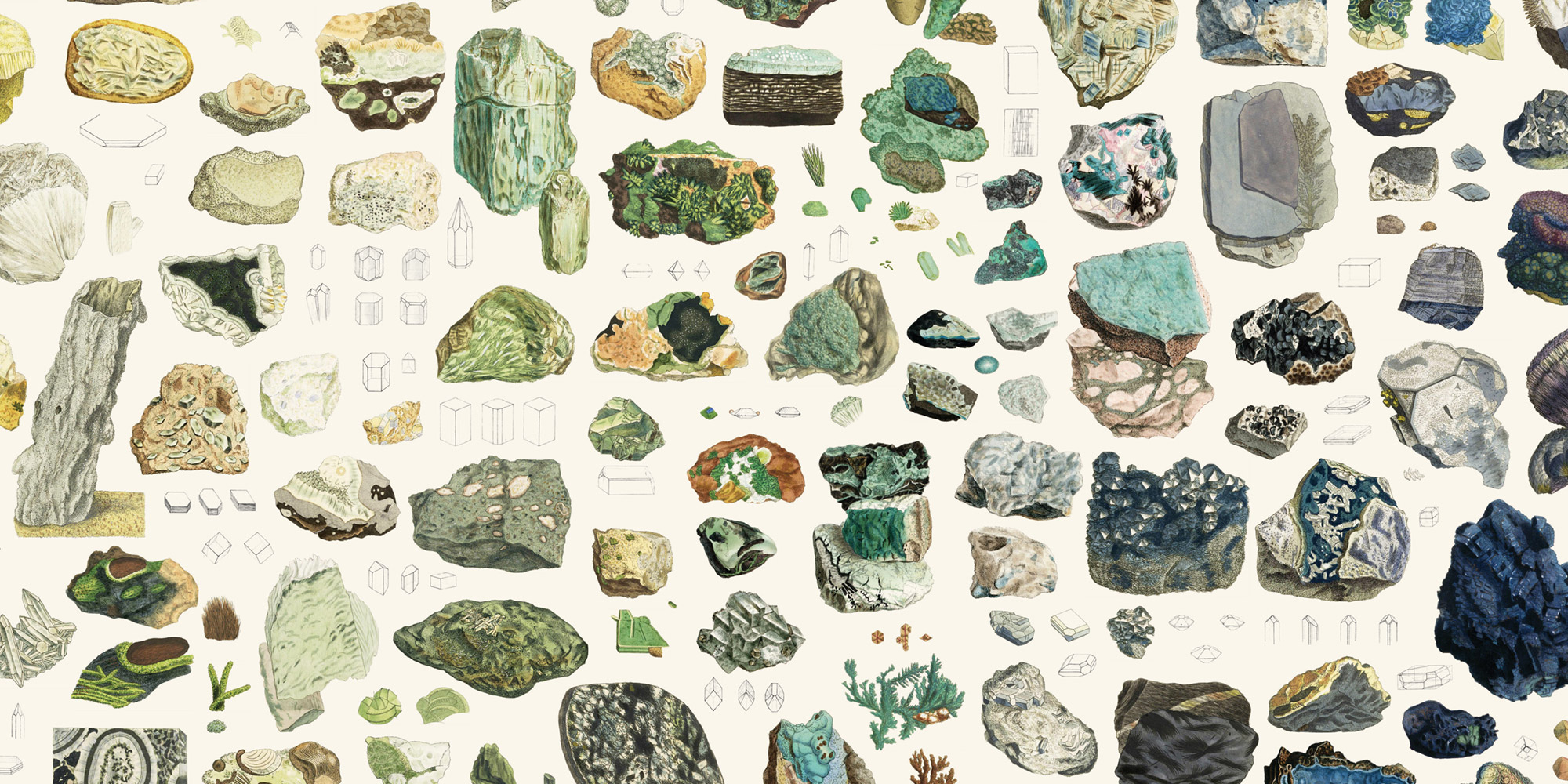
All 2,242 illustrations from James Sowerby’s compendium of knowledge about mineralogy in Great Britain and beyond, drawn 1802–1817 and arranged by color.
You can dive in and explore or read more about the project and how it was made.
It reminds me of Paul’s project, Bradshaw’s Guide: the both take a beloved artifact of the past and bring it online with care, love, and respect.

Scroll up to the Kármán line.
What you see is the big map of a sea of literature, one where each island represents a single author, and each city represents a book. The map represents a selection of 113 008 authors and 145 162 books.
This is a poetic experiment where we hope you will get lost for a while.
Fontlandia is yours to explore.
By leveraging AI and convolutional neural networks to draw higher-vision pattern recognition, we have created a tool that helps designers understand and see relationships across more than 750 web fonts.
These are beautiful!
Featured below is a chronology of various attempts through the last four centuries to visually organise and make sense of colour.
There are some beautiful illustrations in this online exhibition of data visualisation in the past few hundred years.