Just our type: The story of creating Figma Sans

As Figma expands to include tools for all product builders, our community has evolved—and so has our brand. We’ve overhauled our entire visual identity from color palette to illustration style, and even commissioned a new typeface.
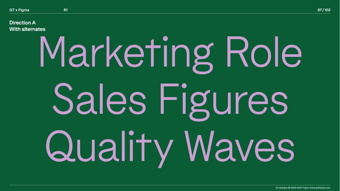
Developing a brand refresh means rethinking its very foundations. As we charted an evolution of image, color, pattern, and motion, we treated our typeface as a crucial counterpart—a way to punctuate a heightened visual language. In the first article in our series on Figma’s brand evolution, we’re taking you behind the scenes of our new custom typeface, Figma Sans, designed by Swiss and American type foundry Grilli Type.
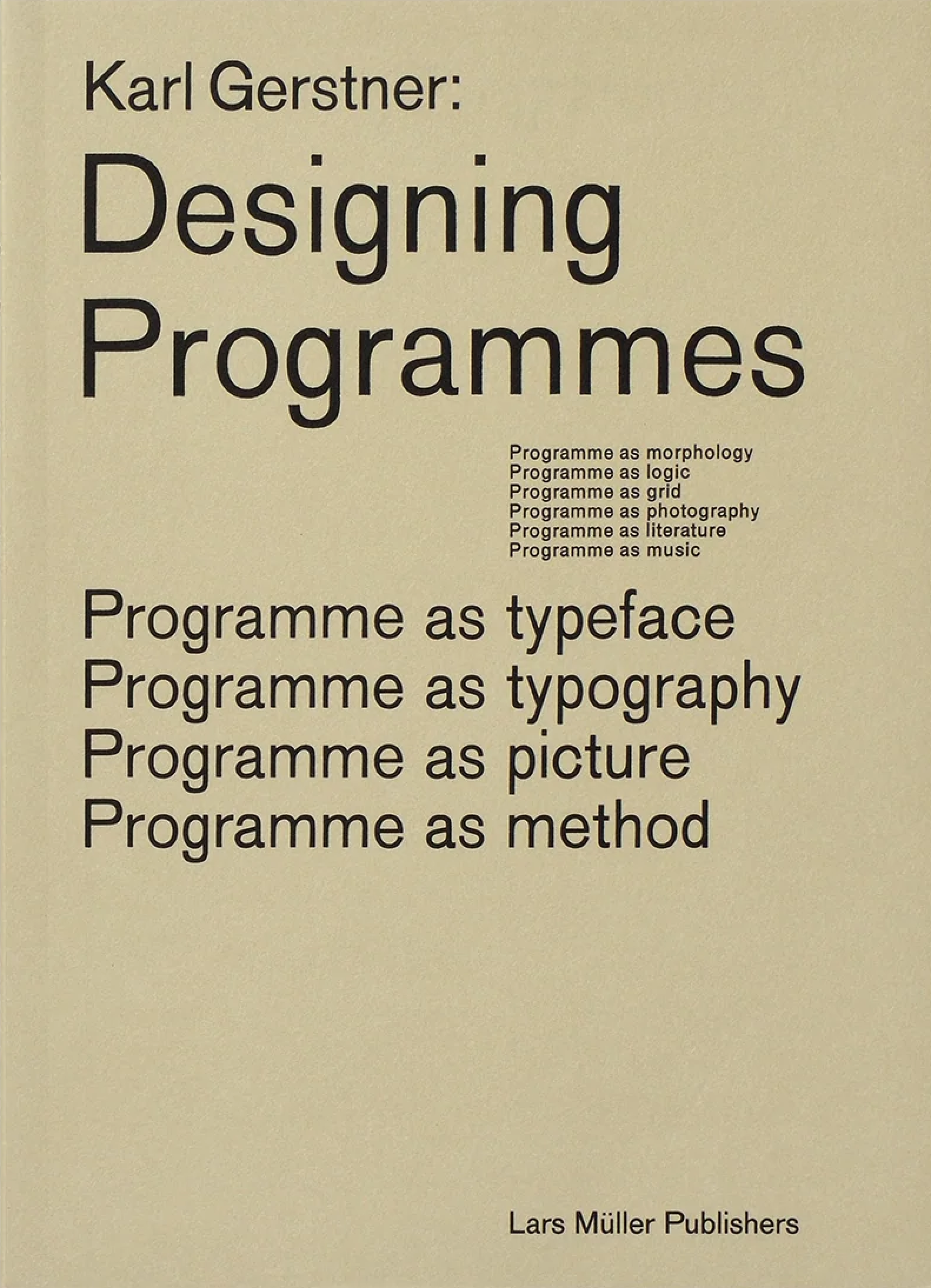
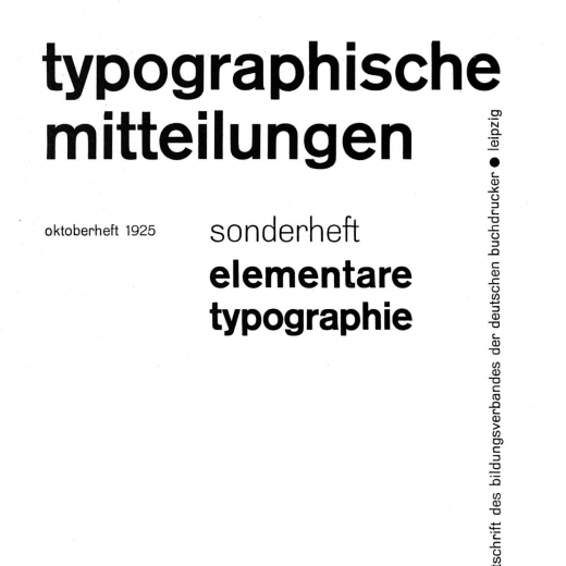
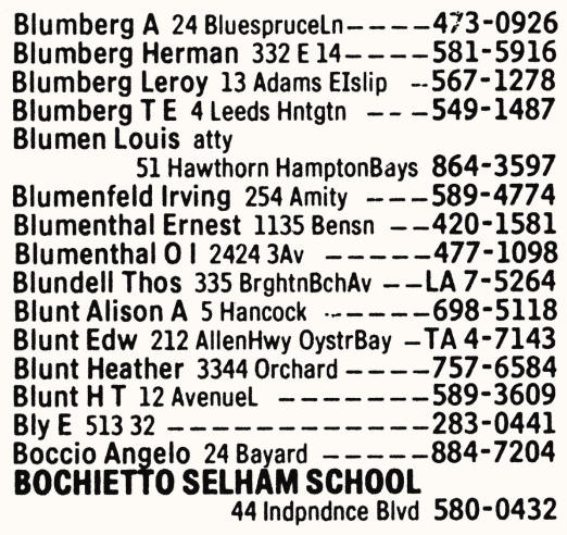
The term grotesque, used interchangeably with the German spelling grotesk, refers to sans serif types first produced around 1815. (This example, Gerstner-Programm, is from 1963.)
Our old typeface, Whyte, and its distinctive inktrap variation had served us well since 2019, but with Figma’s expanding toolkit and brand, we took the opportunity to try different styles on for size. After an extensive audit, we gravitated toward a contemporary grotesque—something that would harmonize with the larger brand evolution, which hinged on a punchy palette and more complex, abstracted shapes than previous expressions. It would need to be widely functional, performing well in a range of scenarios with a variety of weights and optical sizes. Grilli Type also needed to consider the evolving conversation and community around Figma. “The typeface speaks to pros and newcomers, and product managers and developers as well as designers,” says the type foundry’s CEO and Co-founder Thierry Blancpain, who counts the expanding audience as “one of the major points that influenced the work.”
Finding a fresh approach
As a subset of the Brand Studio—Creative Director Damien Correll; Design Manager Taryn Cowart; and Brand Designers Leandro Castelao, Jefferson Cheng, Maria Chimishkyan, and Andy Luce—considered the new typeface, they focused on flexibility and legibility. “We wanted something that embodied our spirit but was easy to use everywhere,” says Taryn. “It needed to work well for display type and be performative and beautiful for reading text on surfaces like the Help Center.”
After researching a range of off-the-shelf options from Marr Sans by Commercial Type to Agipo by RP Digital Type Foundry that didn’t quite check the boxes, the Brand team decided they needed something bespoke. “We knew the process of working with a type foundry would help us clarify what we were looking for,” says Taryn.
Grilli Type, a kindred spirit in terms of their graphic design chops and focus on narrative, offered an unconventional approach. “We design type for ourselves and how we want to use it,” says Thierry, who notes that their typefaces usually take two to three years to develop. “We are blissfully unaware of trends, and we rarely try to copy historical sources. We try to find a conceptual frame that’s interesting to us.” The Brand team knew the foundry’s attention to craft would lead to truly distinct results tailored to the larger brand vision.
Forming an opinion
The Grilli Type team, which also included Co-founder Noël Leu, Senior Type Designer Reto Moser, and Type Designer Katja Schimmel, started a Figma mood board to organize their ideas and see where they dovetailed or diverged. “The main question was finding the central tension in the brief,” says Thierry. “Here, ‘opinionated’ was an anchor word throughout. It’s about knowing who you are and what you want, and having a no-frills attitude.”
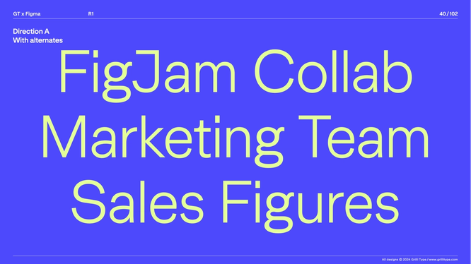
The initial concept from Grilli Type showcased two directions that answered the brief—one in a more straightforward manner, and another that “was quite a bit out there,” says Thierry. Presenting them was less about choosing option A or option B, he adds, than “opening up the space to talk about the right solution.” In this case, the feedback pointed them toward the simplified shapes of option A, but with some of the distinct flavors of option B.
Thierry points to the expression of the word Reality, which embodies this balance of simplicity and quirk. In an earlier version of the typeface, the capital R had a nonfunctional kink in the bottom leg that’s typical of many sans serif typefaces like Helvetica. Later, this was ironed out. “It doesn’t stand out as sharp or unfriendly, but there’s no unnecessary ornamentation,” says Thierry. Similarly, the lowercase, double-story a is simple and self-assured, losing the tail from previous versions so that it reads as “crisp, but not harsh.” The inner curve dips on the inside before coming back into the bowl, reflecting the slight curve in the cross stroke of the lowercase t, which Thierry calls “a nice, graphical shape that has expressiveness.”
Creating an interrelated system
In typeface anatomy, a terminal is the straight or curved end of a stroke that doesn’t include a serif. An aperture is the opening of counters in letters like s and c; letters like o have closed counters, and e has a closed counter above an aperture.
When evaluating a typeface, it feels intuitive to focus on individual letterforms, but it’s important not to miss the forest for the Ts, as it were. “It’s less about character decisions and more about how things play out in the system—how terminals relate to the apertures, for example,” says Taryn. “If the g opens up, what does that mean for the s and the e?”
Some relationships are based on width: There are traditionally wide letters like m and w, and traditionally narrow letters like f and t. Decisions should apply to related groups as a whole—though, as Thierry points out, there’s always room to play. Uppercase and lowercase letters are also in relationship to each other. Because the Brand team sometimes uses all caps as a stylistic decision, Grilli Type designed the uppercase letters to be wider than usual, producing a steadiness and presence that stands up to the visual language of the brand refresh. “This relatively even rhythm of widths leads to words that create solid blocks,” says Thierry, “whereas more varied letter widths create a lot of tension.”
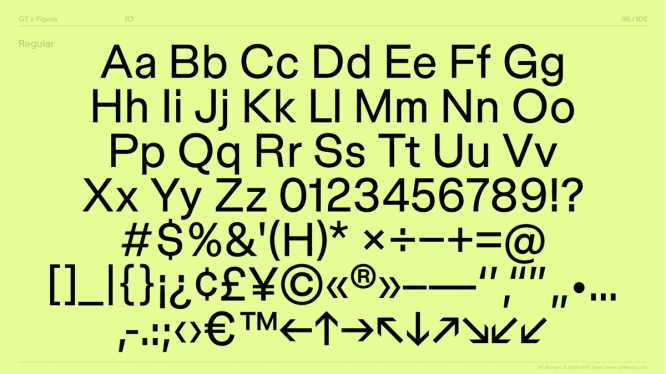
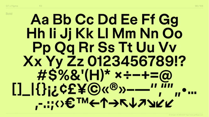
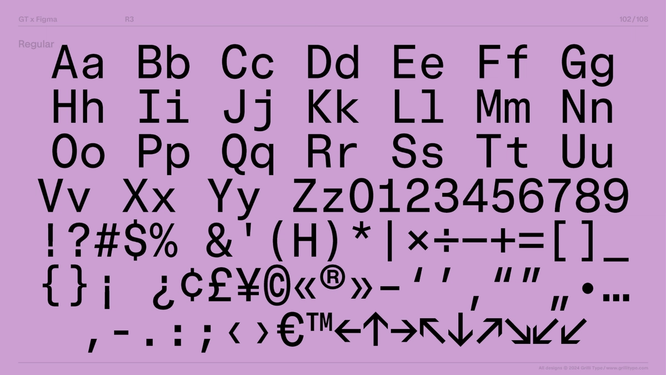
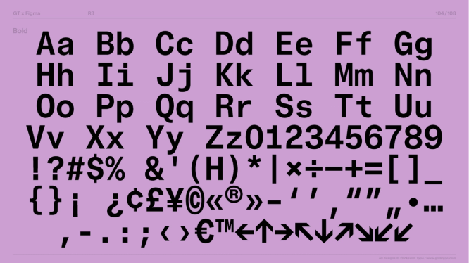
A variable typeface, the Figma Sans font system includes Figma Sans Text, Figma Sans Display, Figma Sans Condensed Text, Figma Sans Condensed Display, and Figma Sans Mono. Within each family, there are light, regular, medium, bold, heavy, black, and oblique variations. Brand Designer Andy Luce manipulated the condensed version to read well on Shortcut.
Systemic design choices are echoed across each of the font families, too: “You try to find the essence of the design and translate it across the board, not just in terms of the graphic shapes but also the ethos you’re trying to bring throughout,” says Thierry. In the condensed font, the caps are wider than usual to mirror the broadness of the uppercase letters. In the mono version, the team avoided adding base serifs wherever possible, instead taking the more straightforward approach of stretching the letters to fill the space.
You try to find the essence of the design and translate it across the board, not just in terms of the graphic shapes but also the ethos.
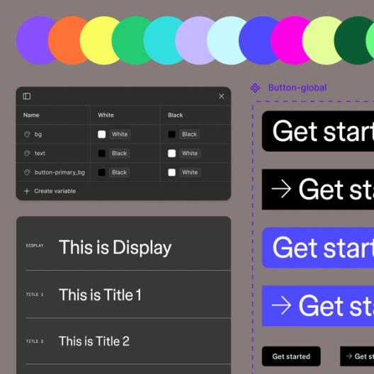
As a variable font, Figma Sans also allows weight and width changes on a variable axis, and it has optical sizes that determine how letters appear at different scales: more open at smaller sizes, and tighter at larger sizes. All of this gives the Brand team extremely nuanced control over how text appears, from compact headlines to scannable body copy. “We used a variable version of Whyte, which allowed us to adjust the inktraps for impact and expression across sizes,” says Taryn. “With Figma Sans, the variable axes are equally focused on expression as they are on functionality and scale. Fonts are software, and this means we can fine-tune more of these details across brand surfaces and beyond.” Now, for instance, the team has the ability to use condensed type as body text—which wasn’t possible before. Since the web supports an increasing number of languages, they can also gradually adjust the width in translated text to avoid awkward line breaks or shapes.
Shaping the wordmark
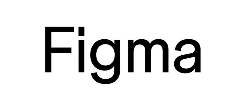
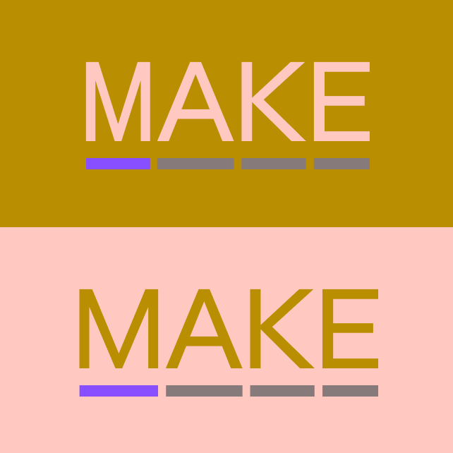
Flexibility across surfaces is a requirement for a digital product like Figma, but we didn’t want adaptability to come at the cost of a strong identity. This made perfecting the wordmark especially important. The team explored and shared a number of stylized variations, but in the end, these all felt wrong. “The most straightforward approach was to use the typeface and adjust it to make the word Figma look great, and that’s what matched the entire ethos of the project,” says Thierry. Refinements here also rippled outward to impact the entire system. For instance, Grilli Type took care to trim the width of the m for the entire word to feel evenly spaced, which cinched the width of related letters like w. “In that sense, everything is a little narrow, creating a vertical focus of the design that really adds to the feeling of the typeface,” says Thierry.
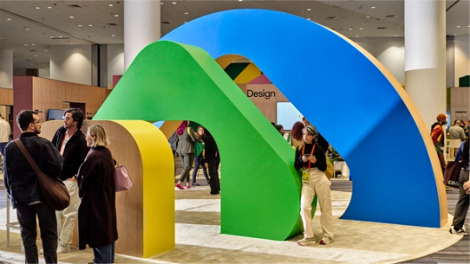
Aside from the fixed version, Grilli Type also delivered the wordmark as a variable font covering the widths, weights, and optical sizes of the typeface, giving the Brand team the tools to control how it renders depending on the design. For example, “we customized the weight and width to create a Shortcut wordmark that feels distinct, yet connected, to the greater brand system,” says Andy. Whether it’s a small digital ad or a logo wrapper on the exterior of San Francisco’s Moscone Center for Config, the wordmark responds to different surfaces.
Dialing in the details
Fine-tuning the expression through subsequent rounds of review was an iterative process. The Brand team extensively tested several draft versions of the font across brand surfaces, reacting at first to the overall style and and related letters—elongating the tail on the lowercase t, for example, meant doing the same on the capital Q. In versions of the variable typeface, they looked at letter spacing and “minute details in character design as we went into polish,” says Taryn.
Some decisions took more deliberation than others—such as the question of the dot on the lowercase i. “A lot of tech companies try their hardest to appear friendly and neighborly, and a round dot is the most obvious expression of that,” Thierry explains. Make the circle bigger, and the typeface can even begin to feel childish. They decided that, as a tool that helps teams get work done, Figma didn’t need to lean into those common tropes. “At its core and in relation to the visual world around it, Figma Sans is an interrelation of sharp and round shapes,” says Thierry. To avoid too many round shapes that would flatten the dynamism of the typeface, the team opted for a rectangle that’s a bit larger than usual, exuding both personality and confidence. “It sits there and knows what it’s doing,” he says.
Just as important as the Brand team’s feedback on the typeface itself was the shared work from the developing brand refresh, which helped Grilli Type situate the typeface within a larger context. “With Figma, there was a great sense of design we could tap into,” says Thierry. “Paired alongside the very active visual language, the typeface had to balance not being overly expressive and not getting totally overshadowed.”
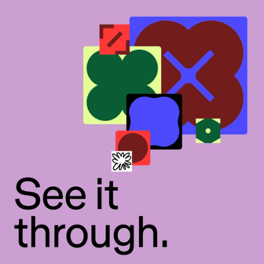
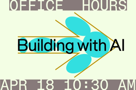
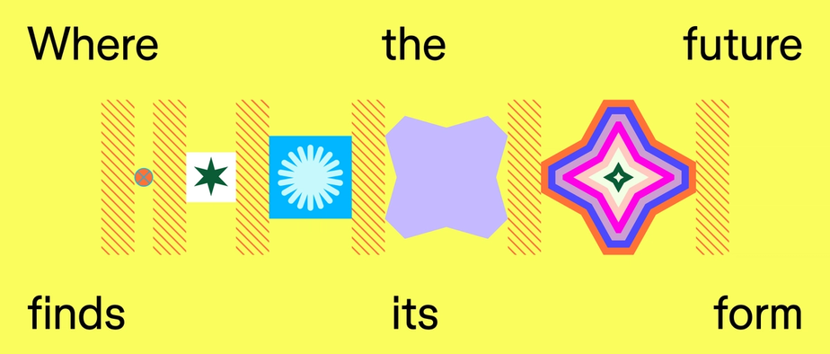
One illustration showcasing an abstract flower design brought it all into focus. “I realized that the typeface has to have a no-nonsense attribute that the new visual language has,” says Thierry. “When you layer these attributes, there’s poetry happening, but on their own, none of these elements tries to do anything special or ornamental. That was where it clicked for us.”
When you layer these attributes, there’s poetry happening, but on their own, none of these elements tries to do anything special or ornamental.
Diacritics are marks added to letters to indicate a difference in pronunciation, such as accents.
Likewise, for the Brand team, it was clarifying to see the typeface progress alongside their explorations of shape, line, pattern, and color. “It helped us understand and become more confident in our desire to move away from a more expressive typeface because we’re using such bold visuals,” says Taryn. Where the final typeface landed “was the perfect pairing with the refreshed brand,” says Andy, “from the design details in the letterforms, to the punctuation marks and diacritics.”
Once the entire character set was finalized, Grilli Type took over the production phase, which Thierry likens to mastering in music production. This stage included finessing final letterforms and symbols, building accents, adjusting spacing between characters, and calibrating kerning between specific pairs of characters. Then there was OpenType programming and QA testing. Says Thierry, “In type design now, you can have any arbitrary fraction—say, 325/855—and it’s automatically composed out of small versions of the letters. That kind of stuff you just have to produce.” These steps fine-tuned Figma Sans and stripped it of any remaining static, allowing its shapes to truly sing and harmonize.
Looking ahead
In addition to the blog you’re reading now, Figma Sans will soon be on web surfaces and out-of-home placements like billboards and transit ads. A welcoming typeface that creates easy legibility, Figma Sans not only makes a statement alongside our elevated visual language, but also speaks to Figma’s trajectory as a platform for all product creators, not just designers.
We’re excited for our new look, and can’t wait to show you the rest. To learn more, check out Grilli Type’s case study, and check out our next installment about the broader brand evolution.
Figma’s Brand Studio: Andrea Helmbolt, Brand Strategist; Andy Luce, Brand Designer; Becca Ramos, Brand Designer; Catherine Bui, Brand Designer; Damien Correll, Creative Director; Gilles Desmadrille, Brand Motion Designer; Jefferson Cheng, Brand Designer; Kaley Aposporos, Brand Copywriter; Leandro Castelao, Brand Designer; Maria Chimishkyan, Brand Designer; Sydney Halle, Brand Producer; Taryn Cowart, Design Manager

Jenny Xie is the author of the novel Holding Pattern, a New York Times Editors’ Choice and National Book Award 5 Under 35 honoree. Her writing has also appeared in places like The Atlantic, Esquire, The Washington Post, Architectural Digest, and Dwell, where she was previously the Executive Editor.
