Vibe-designing

Figma feels (to me) like one of those product design empathy experiences where you’re made to wear welding gloves to use household appliances.

I appreciate its very good for rapidly constructing utilitarian interfaces with extremely systemic approaches.

I just sometimes find myself staring at it (and/or swearing at it) when I mistakenly think of it as a tool for expression.

Currently I find myself in a role where I work mostly with people who are extremely good and fast at creating in Figma.

I am really not.

However, I have found that I can slowly tinker my way into translating my thoughts into Figma.

I just can’t think in or with Figma.

Currently there’s discussion of ‘vibe coding’ – that is, using LLMs to create code by iterating with prompts, quickly producing workable prototypes, then finessing them toward an end.

I’ve found myself ‘vibe designing’ in the last few months – thinking and outlining with pencil, pen and paper or (mostly physical) whiteboard as has been my habit for about 30 years, but with interludes of working with Claude (mainly) to create vignettes of interface, motion and interaction that I can pin onto the larger picture akin to a material sample on a mood board.

Where in the past 30 years I might have had to cajole a more technically adept colleague into making something through sketches, gesticulating and making sound effects – I open up a Claude window and start what-iffing.

It’s fast, cheap and my more technically-adept colleagues can get on with something important while I go down a (perhaps fruitless) rabbit hole of trying to make a micro-interaction feel like something from a triple-AAA game.

The “vibe” part of the equation often defaults to the mean, which is not a surprise when you think about what you’re asking to help is a staggeringly-massive machine for producing generally-unsurprising satisfactory answers quickly. So, you look at the output as a basis for the next sketch, and the next sketch and quickly, together, you move to something more novel as a result.

Inevitably (or for now, if you believe the AI design thought-leadering that tools like replit, lovable, V0 etc will kill it) I hit the translate-into-Figma brick wall at some point, but in general I have a better boundary object to talk with other designers, product folk and engineers if my Figma skills don’t cut it to describe what I’m trying to describe.

Of course, being of a certain vintage, I can’t help but wonder that sometimes the colleague-cajoling was the design process, and I’m missing out on the human what-iffing until later in the process.

I miss that, much as I miss being in a studio – but apart from rarefied exceptions that seems to be gone.

Vibe designing is turn-based single-player, for now… which brings me back to the day job…

Vision Pro(posals)

A couple of weeks ago, at the end of July, I booked a slot to try out the Apple Vision Pro.

It has been available for months in the USA, and might already be in the ‘trough of disillusionment’ there already – but I wanted to give it a try nonetheless.

I sat on a custom wood and leather bench in the Apple Store Covent Garden that probably cost more than a small family car, as a custom machine scanned my glasses to select the custom lenses that would be fitted to the headset.

I chatted to the personable, partially-scripted Apple employee who would be my guide for the demo.

Eventually the device showed up on a custom tray perfectly 10mm smaller than the custom sliding shelf mounted in the custom wood and leather bench.

The beautifully presented Apple Vision Pro at the Apple Store Covent Garden

And… I got the demo?

It was impressive technically, but the experience – which seemed to be framed as one of ‘experiencing content’ left me nonplused.

I’m probably an atypical punter, but the bits I enjoyed the most were the playful calibration processes, where I had to look at coloured dots and pinch my fingers, accompanied by satisfying playful little touches of motion graphics and haptics.

That is, the stuff where the spatial embodiment was the experience was the most fun, for me…

Apple certainly have gone to great pains to try a and distinguish the Vision Pro from AR and VR – making sure it’s referenced throughout as ‘spatial computing’ – but there’s very little experience of space, in a kinaesthetic sense.

It’s definitely conceived of as ‘spatial-so-long-as-you-stay-put-on-the-sofa computing’ rather than something kinetic, embodied.

The technical achievements of the fine grain recognition of gesture are incredible – but this too serves to reduce the embodied experience.

At the end of the demo, the Apple employee seemed to be noticeably crestfallen that I hadn’t gasped or flinched at the usual moments through the immersive videos of sport, pop music performance and wildlife.

He asked me what I would imagine using the Vision Pro for – and I said int he nicest possible way I probably couldn’t imagine using it – but I could imagine interesting uses teamed with something like Shapr3d and the Apple Pencil on my iPad.

He looked a little sheepish and said that wasn’t probably going to happen but sooner with SW updates, I could use the Vision Pro as an extended display. OK- that’s … great?

But I came away imagining more.

I happened to run into an old friend and colleague from BERG in the street near the Apple Store and we started to chat about the experience I’d just had.

I unloaded a little bit on them, and started to talk about the disappointing lack of embodied experiences.

We talked about the constraint of staying put on the sofa – rather than wandering around with the attendant dangers.

But we’ve been thinking about ‘stationary’ embodiment since Dourish, Sony Eyetoy and the Wii, over 20 years ago.

It doesn’t seem like that much of a leap to apply some of those thoughts to this new level of resolution and responsiveness that the Vision Pro presents.

With all that as a preamble – here are some crappy sketches and first (half-formed) thoughts I wanted to put down here.

Imagining the combination of a Vision Pro, iPad and Apple Pencil

Vision Pro STL Printer Sim

The first thing that came to mind in talking to my old colleague in the street was to take some of the beautiful realistically-embedded-in-space-with-gorgeous-shadows windows that just act like standard 2D pixel containers in the Vision Pro interface and turn them into ‘shelves’ or platens that you could have 3D virtual objects atop.

One idea was to extend my wish for some kind of Shapr3D experience into being able to “previsualise” the things I’m making in the real world. The app already does a great job of this with it’s AR features, but how about having a bit of fun with it, and rendering the object on the Vision Pro via a super fast, impossibly capable (simulated) 3d printer – that of course because it’s simulated can print in any material…

Sketch of Vision Pro 3d sim-printer
(Roughly) Animated sketch of Vision Pro 3d sim-printer

Once my designed objected had been “printed” in the material of my choosing, super-fast (and without any of the annoying things that can happen when you actually try to 3d print something…) I could of course change my scale in relation to it to examine details, place it in beautiful inaccessible immersive surroundings, apply impossible physics to it etc etc. Fun!


Vision Pro Pottery

Extending the idea of the virtual platen – could I use my iPad in combination with with Vision pro as a cross-over real/virtual creative surface in my field of view. Rather than have a robot 3d printer do the work for me, could I use my hands and sculpt something on it?

Could I move the iPad up and down or side to side to extrude or lathe sculpted shapes in space in front of me?

Could it spin and become a potter’s wheel with the detailed resolution hand detection of the Vision Pro picking up the slightest changes to give fine control to what I’m shaping.

Is Patrick Swayze over my shoulder?

Vision Pro + iPad sculpting in space.

Maybe it’s something much more throw-away and playful – like using the iPad as an extremely expensive version of a deformed wire coat-hanger to create streams of beautiful, iridescent bubbles as you drag it through the air – but perhaps capturing rare butterflies or fairies in them as you while away the hours atop Machu Picchu or somewhere similar where it would be frowned up to spill washing-up liquid so frivolously…

Making impossible bubbles with an iPad in Vision Pro world

Of course this interaction owes more than a little debt to a previous iPad project I saw get made first hand, namely BERG’s iPad Light-painting

Although my only real involvement in that project was as a photographic model…

Your correspondent behind an iPad-lightpainted cityscape (Image by Timo, of course)

Pencils, Pads, Platforms, Pots, Platens, Plinths

Perhaps there is an interesting little more general, sober, useful pattern in these sketches – of horizontal virtual/real crossover ‘plates’ for making, examining and swapping between embodied creation with pencil/iPad and spatial examination and play with the Vision Pro.

I could imagine pinching something from the vertical display windows ion Vision Pro to place onto my ipad (or even my watch?) in order to keep it, edit it, change something about it – before casting it back into the simulated spatial reality of the Vision Pro.

Perhaps it allows for a relationship between two realms that feels more embodied and ‘real’ without having to leave the sofa.

Perhaps it also allows for less ‘real’ but more fun stuff to happen in the world of the Vision Pro (which in the demo seems doggedly to anchor on ‘real’ experience verissimilitude – sport, travel, family, pop concerts)

Perhaps my Apple watch can be more of a Ben 10 supercontroller – changing into a dynamic UI to the environment I’m entering, much like it changes automatically when I go swimming with it and dive under…

Anyway – was very much worth doing the demo, I’d recommend it, if only for some quick stretching (and sketching) of the mindlegs.

My sketches in a cafe a few days after the demo

All in all I wish the Vision Pro was just *weirder*.

Back when it came out in the US in February I did some more sketches in reaction to that thought… I can’t wait to see something like a bonkers Gondry video created just for the Vision Pro…

Until then…

A difference that makes a difference

A lovely little thing I just noticed this morning.

As you probably know, when you set an iPhone to charge and it’s oriented horizontally it now goes into a sort of ‘ambient mode’ for which there are various skins/settings.

One of my favourites that I discovered pretty accidentally is this clock with very jolly type. I’ve been using it for about a week but this morning I noticed something lovely.

The small ‘complication’ that indicates when I have my alarm set for nestles up against the bottom of the ‘1’ numeral here.

But then – a minute later…

As I said. Lovely.

Perhaps I ‘over-respond’ to gestures like this, having some insight into perhaps how it was made, or having been in similar situations where something like this is proposed, but – deprioritised, put in the ‘backlog’, interrogated or cross-referenced against some bloodless ‘user story’ for the value it would return on investment.

But – that value is not easily captured.

What this detail indicates is care, and joy

A generosity in the team, or individual that made this, that I feel when I see this every day.

A difference that makes a difference.

More please.

Saul Griffith’s S-Curves of Survival

Saul Griffith is always worth paying attention to – and his recent work at Rewiring America is no exception.

The way he breaks down the climate challenge into daunting-but-doable tasks is inspiring.

Making water heaters and kitchen appliances as appealing as Teslas is going to be hard-but-rewarding work for designers and engineers over the next decade.

As he says on his site:

I think our failure on fixing climate change is just a rhetorical failure of imagination.

We haven’t been able to convince ourselves that it’s going to be great.

It’s going to be great.

Saulgriffith.com

The sketched graph above is taken from Saul’s recent keynote for the Verge Electrify conference, which is on youtube, takes 12mins to watch, and is well worth it.

Alternative Unknowns

Chris Woebken and Elliott Montgomery practice together as The Extrapolation Factory here in NYC. They often stage shows, workshops and teach a blend of speculative design provocation, storytelling, and making.

I first met them both at the RCA, and so I was thrilled when they asked me in late summer to be part of their show at ApexArt that would be based on the premise of designing future systems or objects for New York City’s Office of Emergency Management.

The show is on now until December 19th 2015 at ApexArt, but I thought I’d write up a little bit of the project I submitted to the group show along with my fantastic collaborators Isaac Blankensmith and Matt Delbridge


The premise

Chris and Elliott’s first recruit was writer Tim Maughan who based on the initial briefing with the OEM created a scenario that we as designers and artists would respond to, and create props for a group of improvisational actors to use in a disaster training simulation. More of that later!

Here’s what we got early on from Tim by way of stimulus…

Backdrop
NYC has been hit by a major pandemic (the exact nature of which is still to be decided – something new/fictitious). The city has been battling against it for several weeks now, with research showing that it may spread easily via the transit system. The city, in association with the public transport and the police are enforcing a strict regime of control, monitoring, and  – where necessary – quarantining. By constant monitoring of infection data (using medical reports, air monitoring/sampling, social media data mining etc) they are attempting to watch, predict, and hopefully limit spread. Using mobile ‘pop-up’ checkpoints they are monitoring and controlling use of buses and the subway, and in extreme cases closing off parts of the city completely from mass transit. Although it seems to be largely working, and fatalities have been relatively low so far, it has created an understandable sense of paranoia and distrust amongst NYC citizens.  

Setting
The Canal street subway station, late evening.

Scenario
Our characters are two individuals heading home to Brooklyn after leaving a show at apexart. They are surprised to find that the streets seem fairly empty. Just as they reach Canal station they are alerted (via Wireless Emergency Alert) that quarantine and checkpoint procedures have been activated in the neighbourhood, and a pop-up infection checkpoint has been set up at the entrance to the subway. They’ve never encountered one of these before, but in order to get home they must pass through it by proving they do not pose an infection.


Our proposals

I submitted two pieces with Isaac and Matt for the show.

The first concept “Citibikefrastructure” was built out into a prop which features in the gallery, the second concept “Bodyclocks” featured in the catalog and briefly in the final performed scenario.

1. “Citibikefrastructure”

This first concept uses the NYC citibike bike share program as a widely installed base of checkpoints / support points in the city that have data and power, plus very secure locking mechanisms connected to the network.

The essential thought behind this project was this: What if these were used in times of emergency with modular systems of mobile equipment that plugged into them?

I started to think of both top-down and bottom-up uses for this system.

Top-down uses would be to assist in ‘command and control’ type situations and mainly by the OEM and other emergency services in the city.

  • TOP-DOWN:
    • e.g. Command post
      • Loudhailer system
      • Solar panels
      • Space heaters
      • Shelter / lights / air-conditioning
      • Wireless mesh networking
      • Refrigerator for medicine / perishable materials
      • Water purification

But perhaps more promising to me seemed ‘bottom-up’ uses

  • BOTTOM-UP:
    • USB charging stations
      • Inspiration: after Hurricane Sandy many people who still had electricity offered it up via running powerstrips and extension cords into the streets so people could charge their mobile devices and alert loved ones, keep up with the news etc.
    • Wireless mesh networking – p2p store/forward text across the citibike network.
    • Information display / FAQomputer
      • e-ink low power signs connected to mesh
      • LE bluetooth connection to smartphones with ‘take-away’ data
        • PDF maps
        • emergency guides
        • Bluetooth p2p Noticeboard for citizens
      • Blockchain-certified emergency local currency dispenser!
        • Barter/volunteer ‘cash’ infrastructure for self-organising relief orgs a la Occupy Sandy

1:1 Sketch proto

IMG_6768

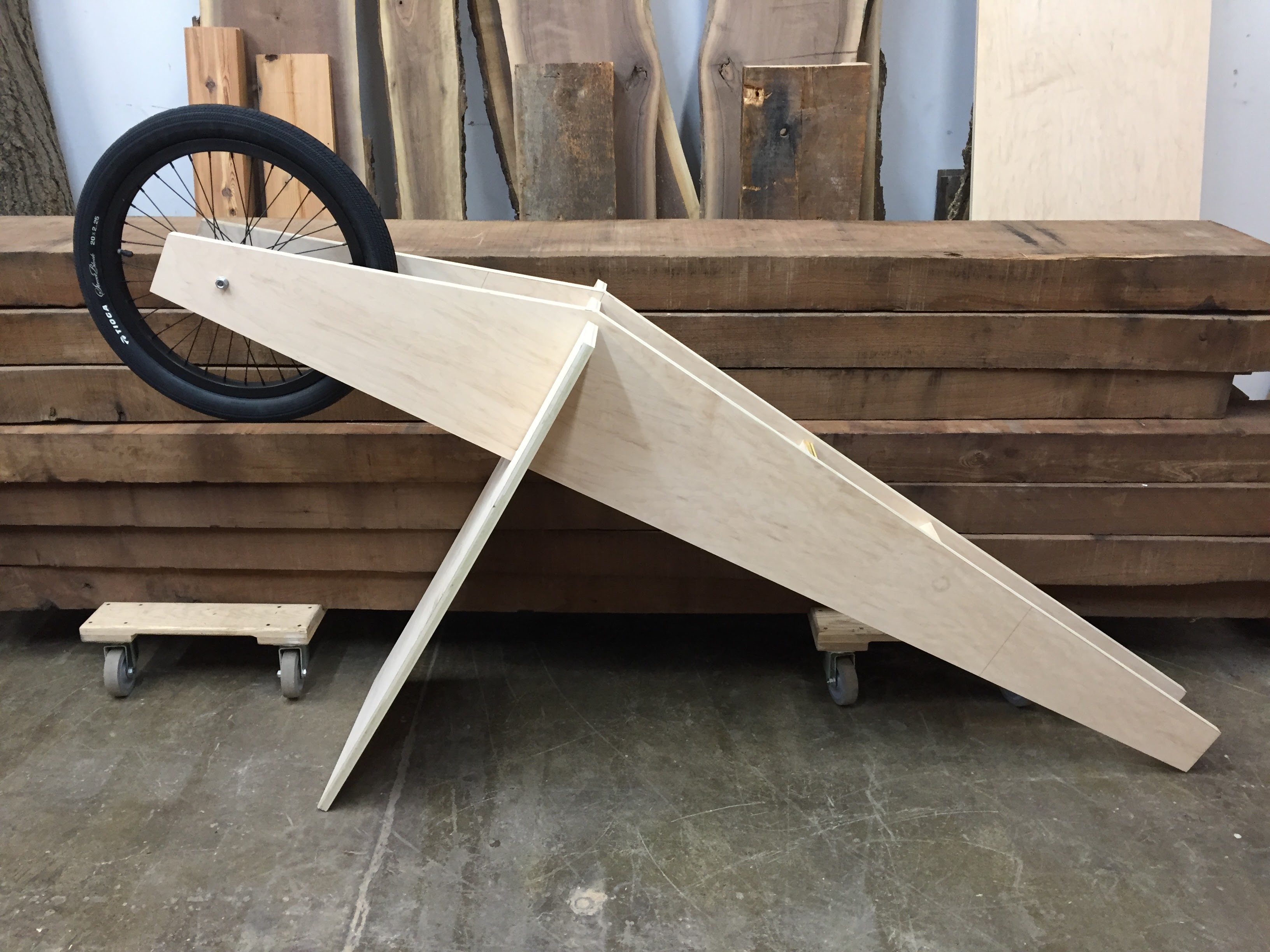
After making some surreptitious measurements of the Citibike docking stations, I started to build a very simple 1:1 model of one of these ‘bottom-up’ modules for the show at the fantastic Bien Hecho woodworking academy in Brooklyn’s Navy Yard.

IMG_6890

IMG_6887

IMG_7373

Detail design and renderings

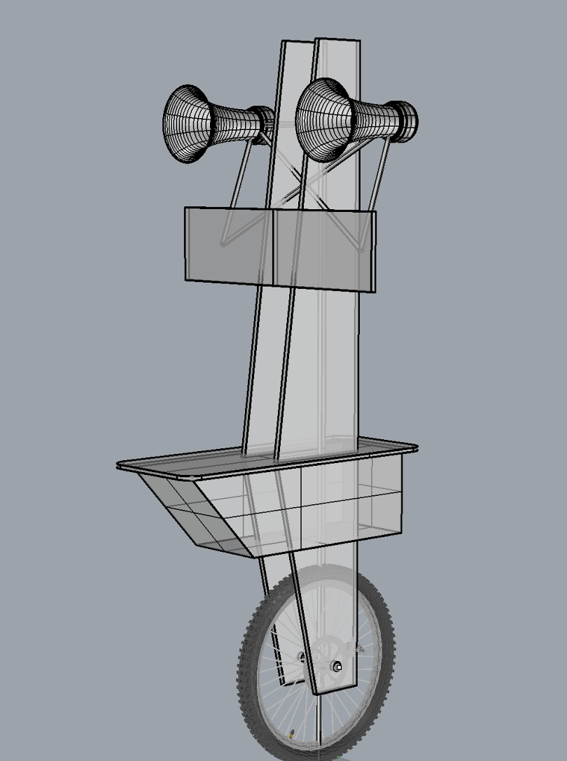
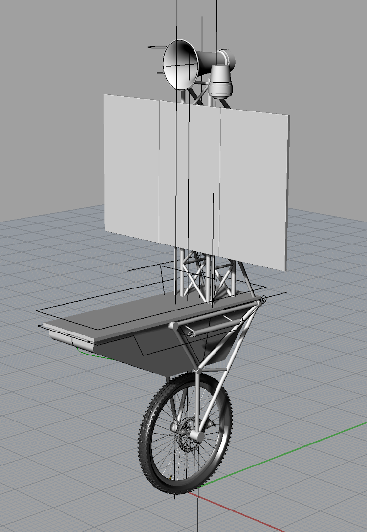
Meanwhile, Isaac had both taken my crappy sketches far beyond into a wonderfully-realised modular system and created some lovely renders to communicate it.

citibike_IB-1
Initial sketch by Isaac Blankensmith

citibike_ib-2
Isaac then started to flesh out a modular system that could accommodate the majority of the use-cases we had brainstormed.


CitiBike_Poster
Citibikefrastructure final renderings and compositing in situ by Isaac Blankensmith http://www.isaacblankensmith.com

Ortho_Poster
Citibikefrastructure final renderings and compositing in situ by Isaac Blankensmith http://www.isaacblankensmith.com

Some final adjustments were made to the sketch model on the days of installation in the gallery – notably the inclusion of a flashing emergency light, and functioning cellphone charger cables which I hopd would prove popular with gallery visitors if nothing else!

2. “Bodyclocks”

This one is definitely more in the realm of ‘speculative design’ and perhaps flirts with the dystopian a little more than I usually like to!

Bodyclocks riffs off the clocks-for-robots concept we sketched out at BERG that created computer-readable objects sync’d to time and place.

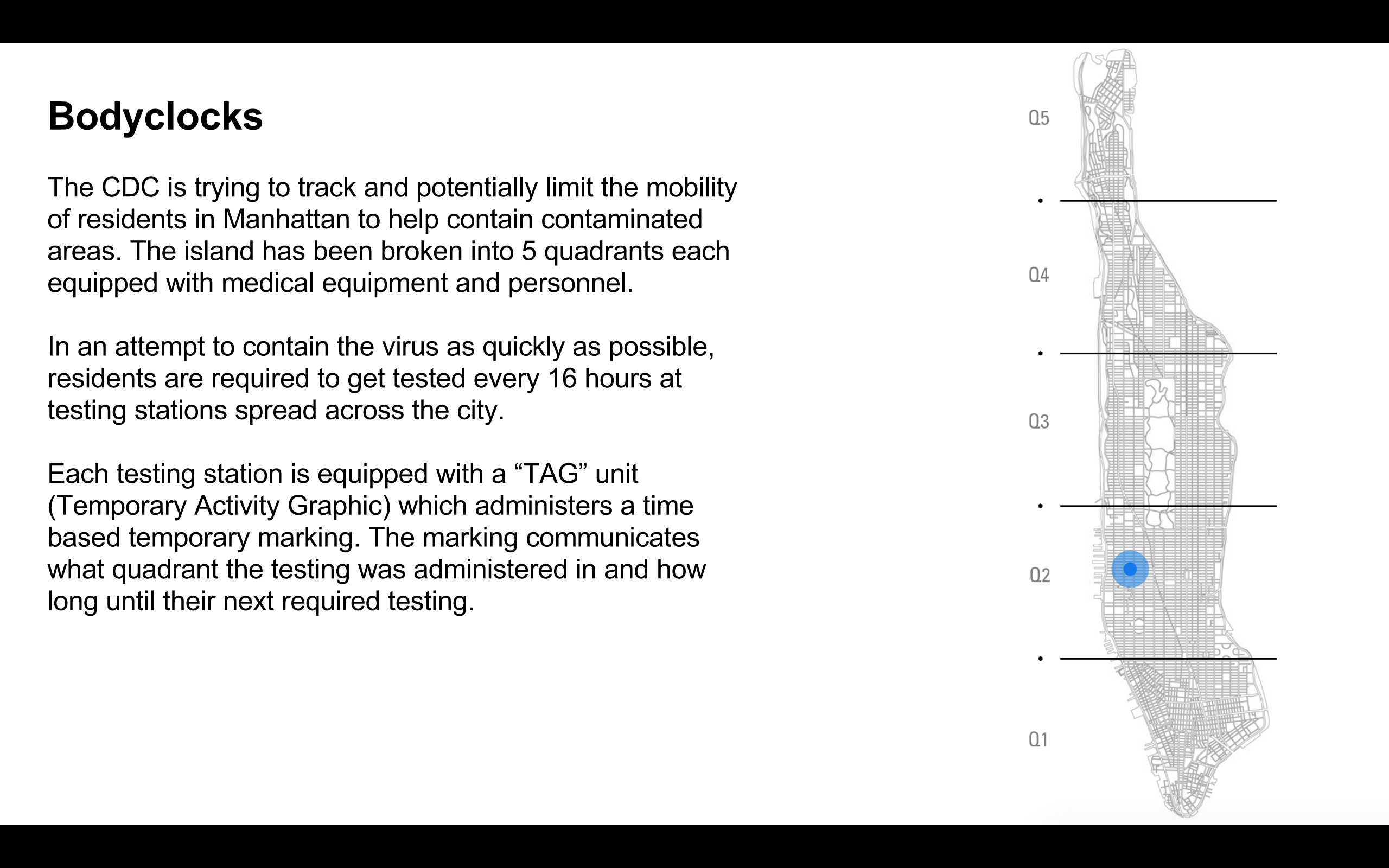
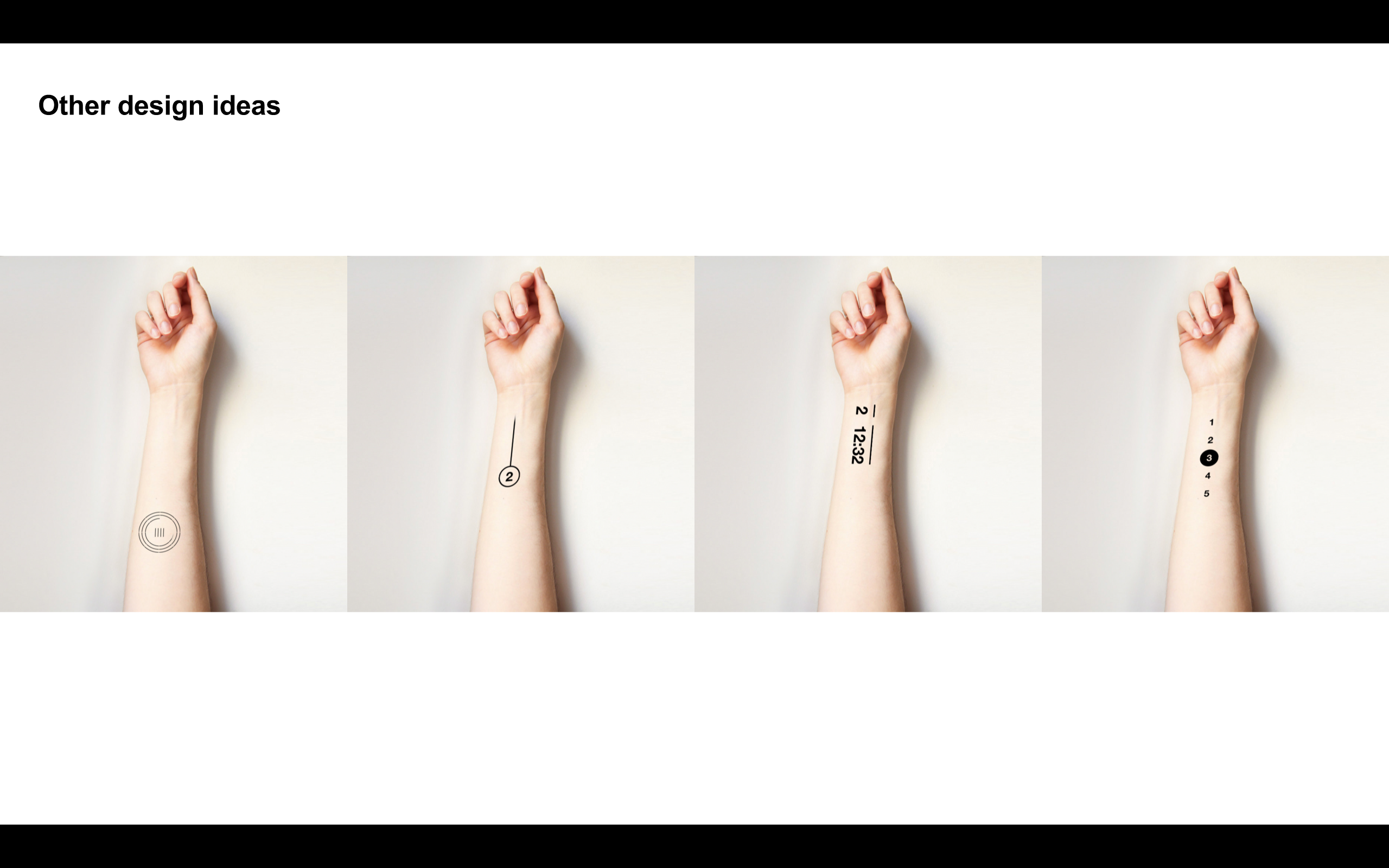
Bodyclocks extends this idea to some kind of time-reactive dye, inkjet-squirted onto skin by connected terminals in order to verify and control the movements of individuals in a quarantined city / city district…

Screen Shot 2015-11-24 at 11.21.25 PM

I’d deliberated chosen to ‘parasite’ this onto the familiar and mundane design of the ‘sanitation spray’ stations that proliferated suddenly in public/private spaces at the time of the H1N1 scare of 2009…

When you think about it, a new thing appeared in our semi-public realm – a new ritual, with it.

People would quickly habituate such objects and give themselves new temporary tracking ‘tattoos’ every time they crossed a threshold…

So, the dystopian angle is pretty obvious here. It doesn’t tend to reflect well on societies when they start to force people to identifying marks after all…

We definitely all talked about that a lot and under what circumstances people would tolerate or even elect to have a bodyclock tattoo. Matt Delbridge started creating some fantastic visuals and material to support the scenario.

Screen Shot 2015-11-24 at 11.31.58 PM

Screen Shot 2015-11-24 at 11.32.18 PM

Screen Shot 2015-11-24 at 11.32.21 PM

arm.png

Screen Shot 2015-11-24 at 11.32.16 PM

For the purposes of the show and the performances, Matt D. even made a stamp that the actors could use to give each other bodyclocks…

IMG_4084

Would the ritual of applying it in order to travel through the city be seen as something of a necessary evil, much like the security theatre of modern air travel? Or could a visible sign of how far you needed to travel spur assistance from strangers in a city at times of crisis? This proposal aimed to provoke those discussions.


The show and performance

One of the most interesting and exciting parts of being involved in this was that Chris and Elliott wanted to use actors to improvise with our designs as props and Tim’s script and prompt cards as context.

IMG_8466

I thought this was a brilliant and brave move – unreliable narrators and guides taking us on as designers and interpreting the work for the audience – and perhaps exposing any emperor’s new clothes or problematic assumptions as they go…


What’s next?

Well – there’s a workshop happening with the OEM based around the show on December 11th. I’m not going to be able to attend but I actually hope that the citibike idea might get some serious discussion and perhaps folks from the bikesharing companies that use such system might entertain a further prototype…


Wristy business

Ian’s experience of using Android Wear echoes my own in large part, especially this paragraph:

It’s also much, much less intrusive in social situations. Glancing at your wrist for a second to check an alert lets you stay more present in the conversation which is happening around you than ferreting around in your pocket, dragging out your phone, switching it on, checking whatever and putting it back. And of course with the phone, you’ve got the temptation to keep it on the table in front of you, glance at it, maybe see what Twitter is talking about… all of which breaks the social contact you’re having in the real world.

To which I’d add that the physical gesture of glancing at one’s watch is something we’re pretty much globally comfortable with in social situations, unlike say getting your phone out and trying to maintain a conversation…

Photowall launches

Quick work thing. We’ve working with Chromecast for a little while.

Chromecast is basically a chrome browser on a stick that plugs into the back of your telly using the HDMI port and once connected to your wifi can be controlled by almost anything else on that network – phone, tablet, ‘puter.

It’s the sort of cheap, accessible tech that is really worth examining for opportunities – like the hacks we did with the Cooper-Hewitt – or this: Photowall for Chromecast.

It’s introduced in this video by m’colleagues George and Justin who first prototyped it and helped usher it into the world.

http://youtu.be/6RMZhCJG3mg

The SDK is out there – have at it.

He’s not there – notes from “Jony Ive: The Genius Behind Apple’s Greatest Product”s by Leander Kahney

Just finished reading “Jony Ive: The Genius Behind Apple’s Greatest Products” by Leander Kahney, which is mainly fascinating because of the abscence of it’s subject. Ive has said so little in public (aside from in corporate pr films) that the book paints a detailed picture of everything around him – the design culture he was raised in, both in education and industry, the design group and wider engineering/manufacturing culture at Apple – right down to gems like this:

“Enter the need for so-called friction stir welding (FSW), a solid-state welding process invented in 1991. It’s actually less of a weld than a recrystallization, as the atoms of the two pieces are joined in a super strong bond when a high-speed bobbin is moved along the edges to be bonded, creating friction and softening the material almost to its melting point.”

Needless to say I really enjoyed it – but Ive is just the hook the book hangs off. It wouldn’t exist or sell as a book without him, although it’s full of fascinating detail about how Apple products are designed and made.

The little you do learn about Ive as a design leader is good. A little hagiographic, but hey. I’d recommend it more for the insights into the design, making and manufacturing approach at Apple than the man at the centre of it however.

‘In America, on the other hand,’ Milton explained, ‘designers are very much serving what industry wants. In Britain, there is more of the culture of the garden shed, the home lab, the ad hoc and experimental quality. And Jony Ive interacts in such a way … [he] takes big chances, instead of an evolutionary approach to design – and if they had focus-grouped Ive’s designs, they wouldn’t have been a success.’

If the education system in America tended to teach students how to be an employee, British design students were more likely to pursue a passion and to build a team around them.

‘As an industrial designer, you have to take that great idea and get it out into the world, and get it out intact. You’re not really practising your craft if you are just developing a beautiful form and leaving it at that.’

I can’t have people working in cubicle hell. They won’t do it. I have to have an open studio with high ceilings and cool shit going on. That’s just really important. It’s important for the quality of the work. It’s important for getting people to do it. – ROBERT BRUNNER

He wanted a ‘small, really tight’ studio. ‘We would run it like a small consulting studio, but inside the company,’ he said. ‘Small, effective, nimble, highly talented, great culture.’4 Setting up a consultancy inside Apple seemed in line with the company’s spirit: unconventional, idea driven, entrepreneurial. ‘It was because, really, I didn’t know any other way,’ Brunner explained. ‘It wasn’t a flash of brilliance: that was the only thing I knew how to do.’

In 1997, English contributed photos to Kunkel’s book about the design group, AppleDesign, but he also worked with a lot of other design studios in the Valley. To his eye, Apple seemed different. It wasn’t just the tools and their focus; the place was rapidly populated with designer toys, too, including spendy bikes, skateboards, diving equipment, a movie projector and hundreds of films. ‘It fostered this really creative, take-a-risk atmosphere, which I didn’t see at other firms,’ said English.

Brunner also made about half a dozen of the designers ‘product line leaders’ (PLLs) for Apple’s major product groups: CPUs, printers, monitors and so on. The PLLs acted as liaisons between the design group and the company, much in the way an outside design consultancy would operate. ‘The product groups felt there was a contact within the design group,’ Brunner said.

Brunner wanted to shift the power from engineering to design. He started thinking strategically. His off-line ‘parallel design investigations’ were a key part of his strategy. ‘We began to do more longer-term thinking, longer-term studies around things like design language, how future technologies are implemented, what does mobility mean?’ The idea was to get ahead of the engineering groups and start to make Apple more of a design-driven company, rather than a marketing or engineering one. ‘We wanted to get ahead of them, so we’d have more ammunition to bring to the process.’

In hindsight, Brunner’s choices – the studio’s separation from the engineering groups, its loose structure, the collaborative workflow and consultancy mind-set – turned out to be fortuitous. One of the reasons Apple’s design team has remained so effective is that it retains Brunner’s original structure. It’s a small, tight, cohesive group of extremely talented designers who all work on design challenges together. Just like the designers had done at Lunar, Tangerine and other small agencies. The model worked.

‘Bob did more than lay the foundations for Jony’s design team at Apple – he built the castle,’ said Clive Grinyer. ‘After Bob, it was the first time that an in-house design team was cool.’

Jony was looking for the Mac NC’s ‘design story’. As his dad, Mike, had instilled in him, developing the design story was an essential first step in conceiving something entirely new. ‘As industrial designers we no longer design objects,’ Jony said. ‘We design the user’s perceptions of what those objects are, as well as the meaning that accrues from their physical existence, their function and the sense of possibility they offer.’

‘When you see the most dramatic shift is when you transition from an abstract idea to a slightly more material conversation,’ Jony said. ‘But when you made a 3-D model, however crude, you bring form to a nebulous idea, and everything changes – the entire process shifts. It galvanizes and brings focus from a broad group of people.

Though Jobs rejected all five names, Segall refused to give up on iMac. He went back again with three or four new names, but again pitched iMac. This time, Jobs replied: ‘I don’t hate it this week, but I still don’t like it.’43 Segall heard nothing more about the name from Jobs personally, but friends told him that Jobs had the name silk-screened onto prototypes of the new computer, testing it out to see if he liked the look. ‘He rejected it twice but then it just appeared on the machine,’ Segall recalled. He came to believe that Jobs changed his mind just because the lower-case ‘i’ looked good on the product itself.

Boxes may seem trivial, but Jony’s team felt that unpacking a product greatly influenced the all-important first impressions. ‘Steve and I spend a lot of time on the packaging,’ Jony said then. ‘I love the process of unpacking something. You design a ritual of unpacking to make the product feel special. Packaging can be theater, it can create a story.’

‘Innovation,’ he wrote, ‘is rarely about a big idea; more usually it’s about a series of small ideas brought together in a new and better way. Jony’s fanatical drive for excellence is, I think, most evident in the stuff beyond the obvious; the stuff you perhaps don’t notice that much, but which makes a difference to how you interact with the product, how you feel about it.’

‘Apple designers spend ten percent of their time doing traditional industrial design: coming up with ideas, drawing, making models, brainstorming. They spend ninety percent of their time working with manufacturing, figuring out how to implement their ideas.’

On iPhone launch day, Jobs turned to Kay and casually asked, ‘What do you think, Alan? Is it good enough to criticize?’ The question was a reference to a comment made by Kay almost twenty-five years earlier, when he had deemed the original Macintosh ‘the first computer worth criticizing’. Kay considered Jobs’s question for a moment and then held up his moleskin notebook. ‘ “Make the screen at least five inches by eight inches and you will rule the world,” he said.’

‘I have literally seen buildings where as far as the eye can see, where you can see machines carving, mostly aluminium, dedicated exclusively for Apple at Foxconn,’ said Guatam Baksi, a product design engineer at Apple from 2005 to 2010. ‘As far as the eye can see.’

Unibody represents a giant financial gamble by Apple. When it started investing seriously around 2007, Apple contracted with a Japanese manufacturer to buy all the milling machines it could produce for the next three years. By one estimate, that was 20,000 CNC milling machines a year, some costing upward of $250,000 and others $1 million or more. The spending didn’t stop there, as Apple bought up even more, acquiring every CNC milling machine the company could find. ‘They bought up the entire supply,’ said one source. ‘No one else could get a look in.’

Apple spent $9.5 billion on capital expenditures, the majority of which was earmarked for product tooling and manufacturing processes. By comparison, the company spent $865 million on retail stores. Thus, Apple spent nearly eleven times as much on its factories as on its stores, most of which are in prime (that is, expensive) real estate locations.

Enter the need for so-called friction stir welding (FSW), a solid-state welding process invented in 1991. It’s actually less of a weld than a recrystallization, as the atoms of the two pieces are joined in a super strong bond when a high-speed bobbin is moved along the edges to be bonded, creating friction and softening the material almost to its melting point. The plasticized materials are then pushed together under enormous force, and the spinning bobbin stirs them together. The result is a seamless and very strong bond. In the past, FSW required machines costing up to three million dollars apiece, so its use was confined to fabricating rocket and aircraft parts. More recent advances allowed CNC milling machines to be retrofitted to perform FSW at a much lower cost. In addition to its other advantages, FSW produces no toxic fumes and finished pieces that require no extra filler metal for further machining, making the process more environmentally friendly than traditional welding.

‘That’s probably the single greatest effect, that we nowadays expect many things to have better designs. Because of Apple, we got to compare crappy portable computers versus really nice ones, crappy phones versus really nice ones. We saw a before-and-after effect. Not over a generation, but within a few years. Suddenly 600 million people had a phone that put to shame the phone they used to have. That is a design education at work within our culture.’

Hope, Fear, Despair and Greed

I’m trying to find the source of Matt’s story. Maybe I could even find the ‘old-school New York marketing man’ now I’m in NYC…

For now, however it’s good to park it here.

An important lens.

A friend of mine told me about an old-school, New York marketing man he’d once met. He had claimed that there are four reasons people will buy your product: hope, fear, despair and greed.

Hope is when your meal out at the restaurant is because it’s going to be awesome. Fear is because you’ll get flu and lose your job unless you take the pills every day. Despair is needs not wants: buying a doormat, or toilet paper, or a ready-meal for one. Greed gets you more options to do any of the above, like investing.

We try to make all our work hopeful. (Also, beautiful, inventive and popular!) It would be lazy to fall back on a despair good – or, worse, to use a fear motivation.

A year to the day

More or less a year to the day from announcing it, we (BERG) are shipping the first BERGcloud product, Little Printer.

What’s more it’s shipping to paying customers in Europe and the USA from a supply chain system we set up for SVK in beautifully-designed packaging we crafted in-house.

I didn’t really have any involvement in the project – I mainly work on our consulting gigs that enable us to invest in our our product development – but I’m still enormously proud to have been included in this company photo a year ago when we celebrated the announcement.


^ photo by timo

And, even though I’m not in the studio at the moment, I’m super-pleased for them all today as the first products wend their way from warehouses to their new owners.