Friday, February 29, 2008

Composition: a range of perspectives

Daffodils #1
pen and ink and coloured pencils on Lana pastel paper, 14" x 11.5"
copyright Katherine Tyrrell

It's the last day of February and time for a round-up of composition and design posts to date by me and others. I'm really pleased by how this project triggered others into investigating composition - my posts on this topic have been some of the most popular in the 2+ years since I started this blog. I think that shows that there is definite interest in how we can all improve our knowledge and skills in composition.

I'm including in the summary below links to:
  • my own posts for the composition and design project - so far! I need to do some more over the course of the year (see also the note at the end)
  • links to posts by other people working in the visual arts and crafts fields on their blogs.
  • Not all of the links by other people relate to my project - but they are helpful nevertheless! Not all of the links are to recent posts. For those that aren't the aim is to include those that are helpful.
Overviews

These are posts which comment across several aspects of composition and design
Book reviews

Elements

Values
Colour
Shape
The best pictorial compositions are simple. Simple shapes are easy to recognize and remember. Busy pictures with lots of little separate shapes have less impact.
James Gurney Gurney Journey Shape Welding
Space
Line
Form and Texture
Nothing specific noted

Principles of design

Finding the crop and the focal point
Balance
Proportion (including rule of thirds)
Pattern
The composition and design project - the story so far

Having said all that I am of course, using an image for this posts which seems to break a number of rules (centred subject matter; daffs just touch the edge of the paper) - did I tell you 'rules' can be broken? I like it - what do you think?

So this is the story so far.
  • I still need to review current/modern books which help with composition and will do this soon.
  • I'm still thinking over different options for how I can translate my research and my work publications such as 'a checklist for composition'.
  • Also, I'm afraid after my big push on composition and design during January and the beginning of February, I rather lacked the stamina to continue to do the research around how to apply compositional design elements and principles to different genres. However I have still this in mind to do this year - just a lot more slowly! I decided in the end that I wanted to avoid having 'rushed' posts so will take my time on this one.
  • Please comment below it you have any suggestions or particular recommendations as to any links or useful books which you think should be included around the main genres of:
  • figurative
  • landscape (but see below for an early contribution from American Artist)
  • still life.
Landscape composition
  • American Artist - Plein Air Pointers: Composition This comprises extracts of text from:
    • CARLSON’S GUIDE TO LANDSCAPE PAINTING by John F. Carlson (Dover Publications, Mineola, New York) Excerpt from Chapter 11: Composition—The Expressive Properties of Line and Mass
    • COMPOSITION OF OUTDOOR PAINTING by Edgar Payne (DeRu’s Fine Arts, Bellflower, California) Excerpt from Chapter 2: Selection and Composition
    • THE ELEMENTS OF DRAWING by John Ruskin (Dover Publications, Mineola, New York)
      Excerpt from Chapter 3: On Composition
    • THE WATSON-GUPTILL HANDBOOK OF LANDSCAPE PAINTING by M. Stephen Doherty (Watson-Guptill Publications, New York, New York) Excerpts from Chapter 3: Planning Your Approach and Chapter 12: Scale and Focus

Note: If you think one of your posts should be included in this summary but that I didn't find it please contact me either by leaving a comment or get the details from here. Note I used Google Blog Search to try and make sure that I didn't miss anybody. You might want to check whether your blog has been found by Google and/or whether you make your topics clear in blog titles or through the use of blog labels or categories - as this is how Google tends to find the posts.

Thursday, February 28, 2008

The Art of Impressionism and associated painting techniques

I highly recommend Professor Anthea Callen's book The Art of Impressionism - painting techniques and the making of modernity (2000, Yale University Press) for anybody who, like me, likes the work of Impressionist painters and is also fascinated by the preparation and process behind the making of art.

If you want to know more about what the Impressionist artists used for paint, what sort of canvases and grounds they painted on, how they applied their paint, where and in what sort of conditions they painted and finally whether and how they varnished and framed their works then this is the book for you!
This magnificent book is the first full-scale exploration of Impressionist technique. Focusing on the easel-painted work of Monet, Pissarro, Renoir, Cezanne, Cassatt, Morisot, Caillebotte, Sisley, and Degas in the period before 1900, it places their methods and materials in a historical perspective and evaluates their origins, novelty, and meanings within the visual formation of urban modernity. Yale University Press
Interestingly Professor Callen also corrects some impressions that many people have about Impressionist painters. For example, plein air painting started long before the start of Impressionism, not all Impressionists painted 'plein air' and none of them used mass produced tube paints! (see note 2 at end)
Drawing on scientific studies of pigments and materials, artists' treatises, colormens' archives, and contemporary and modern accounts, Anthea Callen demonstrates how raw materials and paintings are profoundly interdependent. She analyzes the material constituents of oil painting and the complex processes of "making" entailed in all aspects of artistic production, discussing in particular oil painting methods for landscapists and the impact of "plein air "light" "on figure painting, studio practice, and display. Insisting that the meanings of paintings are constituted by and within the cultural matrices that produced them, Callen argues that the real "modernity" of the Impressionist enterprise lies in the painters' material practices. Bold brushwork, unpolished, sketchy surfaces, and bright, "primitive" colors were combined with their subject matter--the effects of light, the individual sensation made visible--to establish the modern as visual.
Yale University Press
You can browse the contents page here and here. It is packed with an incredible amount of well researched detail about context and practice in the past and as things changed during the course of the nineteenth century in France. It also has a fantastic glossary and very detailed bibliography and endnotes.

Bear in mind that I knew within about 30 seconds of picking it up that I was buying this book. This morning I sat down to have a skim read of it. I'd waited until I had enough time. As it was it took well over two hours just to dip into it. I'm not even going to attempt to tell you all the new things I learned as a result. It's the sort of book you read in stages and/or slowly - savouring every page. You then make sure you never ever loan it out, reread it again periodically and dip into it on a regular basis.

It also has the very best photography of Impressionist paintings and small sections of them that I have ever seen in a serious art book. For that alone both author and publishers are to be congratulated. You can compare the weave of one sort of canvas to another and look at many other details of paintings. What I particularly appreciated was the way in which you could really examine the nature and quality of the mark making - giving you the quality of information which I normally get by getting 'up close and personal' with a painting. I'm the sort who spends ages staring at a painting or drawing trying to work out what an artist painted it on, what colour the ground was and what colours they used - so you'll appreciate that this book represents everything I ever wanted to know. I also love the way she labels each painting with the standard format and size of the canvas used!

Plus it has many reproductions of paintings that I've never ever seen before in any other book (but that's probably me to some extent!). Examples of such included:
  • numerous examples of ébauches
ebauches - block-in or underpainting, the initial layers of an OIL PAINTING, executed in fluid, dilute paint (see SAUCE) which establishes the composition in masses of light and shade, or or colour (cf ETUDE AND ESQUISSE)
The Art of Impressionism - Glossary
  • Cezanne's the Garden at Les Lauves. If you click the link below you can see more Cezanne paintings of Provence and if you then click the link to this painting on that page you can read what Cezanne has to say about painting in 1905 when he was nearly 70 - a year earlier than the date of this painting!
The Garden at Les Lauves, c. 1906
Paul Cezanne
oil on canvas
The Phillips Collection, Washington, DC
  • Claud Monet's Oatfields is one of only two paintings by Monet which remains unvarnished, has changed hands only once since its original purchase and is in a private collection.
The difference perceptible to the naked eye between the unvarnished Oatfields and the varnished variants shown beside it, was staggering. It is not a difference which is apparent in reproduction....
Prof. Anthea Callen Chapter 12 Framing the Debate
I confess I found the academic turn of phrase a bit wearing at times. I'm not quite sure why academic language continues to avoid the use of plain English (unlike many other parts of the Establishment which have shifted towards a framework which emphasises accessibility) - but it does - and this book definitely qualifies as a university level text. Here's an excerpt.

The book is listed by the National Portrait Gallery as having been consulted in the preparation of the Directory of Artists Suppliers. I loved looking at all the facsimiles of original illustrations of various aspects of art supplies!

I'll comment again when I've actually finished reading this book properly - but I suspect I'll be referencing this book very many times on this blog before that happens!

Note:
(1) Anthea Callen is Professor of Visual Culture in the Department of Art History at the University of Nottingham's School of Humanities. Her publications also include "
The Spectacular Body Science, Method and Meaning in the Work of Degas ".
(2) On original publication of this piece, I misrepresented the artists' uptake of tube colour. I misread (with skim reading) what was stated about the manufacture of paint and confused the fact, as reported in the book, that the Impressionists avoided the uncertainties then associated with mass-produced paints with their uptake of tube paints. The text has now been corrected to make this clearer.

Links:

Wednesday, February 27, 2008

Advice on Sketching - tips, techniques and toolkits


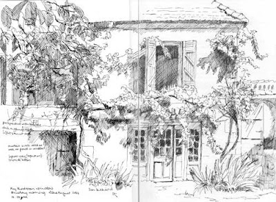
Perrot - the first sketch on the Sunday morning
pen and sepia ink across a double page spread of my A4 Daler Rowney sketchbook

copyright Katherine Tyrrell

I've reviewed and updated the page on my website, Pastels and Pencils, which provides Advice about Sketching.

Sketching: Information about Tips, Techniques and Toolkits

The page provides information for all of you who would like to try to develop and/or improve your skills in sketching. It provides

  • links to a collection of my advice on approaches to sketching and sketching toolkits
  • plus Word files for FREE DOWNLOAD for personal and educational use only.
  • plus links to relevant sites which I've developed as part of my Resources for Artists series of information sites.

It's organised as follows:

  1. Starting to Sketch with Coloured Pencils
  2. Travels with a Sketchbook - tips and techniques
  3. Advice on Sketching Toolkits and Materials
  4. Sketching for Real - a class with assignments
  5. From sketch to painting - a slideshow of a work in progress
  6. More information about sketching and travels with a sketchbook
I've not finished! I'll be adding more in the future - so those who would like to know when this happens need to read the next bit too.

Sketching: The Mailing List

This page is just over a year old and is already a popular part of my website. It also contains a lot of information. In order to make sure people who are interested can easily keep up to date with any changes to this page I've added a mailing list so you can get an update every time I add something major.

So - if you would like to know when new items are added to the 'Advice on Sketching' page please join the mailing list by adding your e-mail into the box near the top of the page.

Otherwise, maybe bookmark the page if you'd like to look in more detail later - there's a lot to look at! Regular readers of this blog and my Travels with a Sketchbook blog over the last two years will have seen a lot of it already - but not all in one place....

From sketch to painting - a slideshow of a work in progress

I've added in a new section which is not new material but because I've been rejigging the main menu, access to this material has been moved here as it fits much better with the rest of the advice about sketching.

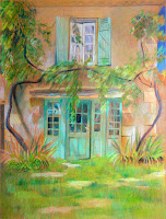
Perrot - afternoon colour study
coloured pencil on Canson Mi Teintes

copyright Katherine Tyrrell

It relates to page which describes, with a slideshow, how a pen and ink drawing and a coloured pencil study of an old Perigordian farmhouse in France are worked up into a finished coloured pencil drawing. You can see small images in this blog post.

I'm thinking of developing this into a publication (a bit like the one I did introducing people to life class -
A Making A Mark Guide: Life Drawing and Life Class). Let me know if you think that would be a good idea. I don't want to do one of those 'I used these coloured pencils....' pieces. This would be more about the total process and how it was developed in more detail.

After all, the pencils will always vary whereas the process endures!


Perrot - a work in progress (Stages 1-4)
coloured pencil on Arches HP,
60cm x 42cm (c.23.5" x 16.5")
copyright Katherine Tyrrell

Links:

Tuesday, February 26, 2008

Keywords, site descriptions and meta tags - how search engines find your website and content

I'm currently updating the keywords for the pages and galleries on my website - Pastels and Pencils. When I originally set it up, the Sitekreator webware which I use only allowed one site description and one list of keywords for meta tags. At the moment Google Webmaster tools tells me that its bot keeps finding duplicate page descriptions - surprise, surprise!

I discovered recently that I can now vary the description for each page and tailor the keywords to each page. So that's what I'm now engaged in doing. However I decided to check out which were the best keywords for each page. This post (and the next one) is about that process - so if you are not an expert and want to know a bit more about keywords, meta tags and site descriptions you may well find something interesting in what follows.

My expertise: 'advanced' novice status!

I was a TOTAL novice when I started out - strictly amateur but keen to learn. I'd heard about keywords and meta tags and 'knew' they were important so I tried to learn a bit more as I set the site up. I'd really only classify myself as an advanced novice now but find that I often encounter people who know much less than me even though quite a lot of the basics is really not difficult. So what follows is my strictly non-techie understanding of and approach to keywords, meta tags and site descriptions.

I hasten to add that I only work with one form of webware, don't do the html bit on home-coded websites or advise on how to do things with other types of webware - and I only point you in the direction of where you will find tutorials or sites which are more reliable sources than me! This, as you will appreciate, is my 'get out' in case you crash your website!

Now - I don't mind experts using the comments function to correct anything I have said or to add in further comments - that's how we can all learn - with one proviso! You MUST try and use strictly non-techie language. If you must use jargon, then you MUST also explain what it means in layman's terms first.

What are keywords and meta tags?
Meta keywords
On the web, a keyword is a reference to the content and/or the type of meta element included in a given web page's HTML code to aid in the page's indexing. A keyword meta element may include several comma-separated keywords (or keyword phrases, each of which may contain several individual words)
Wikipedia: Keywords

Think of a keyword as being a bit like a signpost. Here's a very simple analogy (it's actually a lot more complicated than this). You're driving along the information superhighway and you want to find the turn-off for 'art' - well you need to be able to see a signpost for art. Then you're moving down the art highway and now want to find some landscape paintings of the Lake District in England. So you probably wait until you see 'landscape' and/or 'painting' as a signpost and turn off and then look for the signposts for 'Lake District' and 'England'. You finally end up at a website page which should contain all the relevant keywords used in your search as content. They may also be used in code as meta tags.

Unfortunately that means that all those pages which were only described in a very basic or generic way or were not labelled or described at all are probably not going to be found very easily.

There's also a twist in the tale of keywords as meta tags which not everybody is familiar with. Keywords were abused very badly by people trying to improve the profile of their web pages. Their sites would be loaded with 'heavy duty' keywords as meta tags and the search engines would be fooled and the results of searches started to become a complete nonsense.

The keywords attribute was popularized by search engines such as Infoseek and AltaVista in 1995, and its popularity quickly grew until it became one of the most commonly used meta elements[1]. By late 1997, however, search engine providers realized that information stored in meta elements, especially the keyword attribute, was often unreliable and misleading, and at worst, used to draw users into spam sites. (Unscrupulous webmasters could easily place false keywords into their meta elements in order to draw people to their site.)
Wikipedia - meta elements - they keyword attribute

People speculate about what now happens. The best guess is that meta tags probably still 'count' but that Google started to check meta tag keywords against the text content of the page. The tools they now use to check pages are becoming ever more sophisticated. My own personal 'rule of thumb' is as follows
(Experts - please note this my layman's shorthand version!):
  • If the tags, page title and page description seemed to reflect the page content then Google will be happy.
  • If the words and language are of a good standard and fit with the rest of the site then Google will be happy
  • If they don't reflect content and/or exhibit poor language structure then Google won't be happy - and might keep that page low in the index if indeed it gets indexed at all.
  • If there are very few words on a page then Google gets confused - which probably means getting a good Google ranking is difficult if not impossible.
What now follows is a brief overview of how a search engine works and how it looks at my website - and yours.

How a search engine works

Wordtracker.com provides a useful overview of how a search engine works in basic terms.
  • the spider bots 'crawl' the internet and find new pages. Spider 'bots' look for text, links and the URL. They ignore all images and formatting. They return periodically and review for changes - particularly if you have a site map loaded. (I've now got sitemaps for my website and both blogs loaded.)
  • the index software works as follows

The Index software catches everything the Spider can throw at it....The index makes sense of the mass of text, links and URLs using what is called an algorithm - a complex mathematical formula that indexes the words, the pairs of words and so on.

Essentially, an algorithm analyses the pages and links for word combinations and assigns scores that allow the search engine to judge how important the page (and URL) might be to the person that is searching.

Wordtracker.com: Keyword Basics Part 1: How Search Engines Work

  • the front end of the search engine uses query software. You or I type in the words for our search and the software then reviews all the information stored in its index (ie The search engine doesn't search the internet - it looks at what it's already got collected by the spiders and analysed by the index software. That's why sites won't appear in response to a searche until they have been crawled and indexed)
Site Description

I found out that the site description is that little bit you see underneath a site heading when it comes up in a list in Google. The description for a page is one the things that some bots look at. This is what wikipedia has to say about site descriptions - note citations are required for some of it.
Unlike the keyword attribute, the description attribute is supported by most major search engines, like Yahoo and Live Search, while Google will fall back on this tag when information about the page itself is requested (e.g. using the related: query). The description attribute provides a concise explanation of a web page's content. This allows the webpage authors to give a more meaningful description for listings than might be displayed if the search engine was unable to automatically create its own description based on the page content. The description is often, but not always, displayed on search engine results pages, so it can impact click-through rates. Industry commentators have suggested that major search engines also consider keywords located in the description attribute when ranking pages.[4] W3C doesn't specify the size of this description meta tag, but almost all search engines recommend it to be shorter than 200 characters of plain text[citation needed].
Wikipedia - meta tags - the description attribute
I use the Squidoo bookmarklet tool in my Firefox browser to add in sites to my Resources for Artists information sites. This has a very nifty arrangement where just adding in a URL address for a webpage automatically identifies both the site title and the site description for that page. Except you would not believe how many web pages out there have rubbish titles and absolutely no description - or just the first bits of text which come up on the page. I'd estimate that at least half the sites I add are described in ways which are unhelpful in the extreme.

What you can see below is what my site looks like if I attempt to add it as a link to bookmark it.

Checking your meta tags for title, site description and keywords

You can also check out how any page on the internet is described i terms of its meta tags by going to View/Page Source while viewing the page in question. Another page pops up and that gives you the visible coding for the page you are viewing. (Some sites seem to obscure this but I've found you can see quite a lot for most pages).

Go and check it with your own website right now. Now you see that bit where it says meta tags right near the top check out what it says for
  • title
  • meta name ="keywords"
  • meta name ="description"
....because that's how your site is described in search engines. (I've left out the <> )

You can see the top of the "page source" view for my own website at the top of this page - click the image to see a larger version.


Now - if your jaw is dropping at this stage just remember you have some very good company. I could name names, but I won't! ;)

Keywords / meta tags are also like 'labels' in Blogger and 'categories' in other blogs. They are the tags / signposts which help people to find a type of post. See these two posts for why labels are important when using Blogger
Which keywords?

Which keywords to use is THE BIG QUESTION. There are vast numbers of people paying other people lots and lots of money to work this out - because, as we know, keywords used as meta tags or as part of the content of your web page are the signposts are very likely to help get people to your site. So how can I (or you) compete with that?

Well you can learn quite a bit by reading around. Try reading the wikipedia page on keywords. This has a section on 'working with keywords'.
The first mistake many publishers make is to 'underdescribe' their content by using a keyword that is too general to be useful......The second mistake publishers frequently make is to not put themselves in the mind of the searcher, but to instead use keywords that are relevant to them.
Wikipedia - Keywords
When I was starting out, once I had discovered the "page source" view I started looking at well constructed artists websites - where somebody had obviously taken some care about it (I thought). I looked at how they titled their sites, how they described them and which keywords they used. I used them as a reference, they gave me an education. I also learned very fast that what looked like a super duper website on the face of it could be let down very badly by the fact that it was clear that somebody had not done the necessary work with the site description, keywords and meta tags. So that got me started.

(As an aside, what's very funny is that the Wikipedia keywords page uses itself an example and discusses what words might be best to describe that page - so I checked - and they are actually completely different!!!)

Then I discovered the fact that you can check out the popularity of different keywords - in a general sense. People often think that the number of results you get when you type a keyword into a search engine tells you how popular that keyword is. However all the search engine is doing is telling you how many pages on the Internet contain some or all of those words - it doesn't tell you how popular they are or how many people are searching on those words.

Tools exist which allow you to check the popularity and use keywords. Take a look at this page on del.icio.us - it lists all the sites which have been bookmarked and saved by people using the tag 'keywords' - and you can see how popular they are. I'm assuming popularity in this context (because del.icio.us gets used a lot by people actively wanting to look and store information) probably has some connection to how well they work. Although it might be an indication of how long they've been around - just like the early blogs captured lots of links.

Now the top one is the one used by Yahoo and is very popular and recommended by my webware - but it periodically seems have a habit of conking out as it gets overloaded due to usage.

So take a look at the next best thing - the external version of the Google Adwords tool. Google Adwords are really just keywords used for advertising and the placement of Google Ads. However, you don't need to be subscribed to Google Adwords to use the tool.

You can also use Google Trends to check out what people are searching on - but this is a tool which is much more relevant to people whose sites are very newsy and up to the minute!

The problem for artists

As you can imagine lots of images with esoteric / punter friendly titles and very little if any other text on a page might have a problem presenting enough data for the search engines spiders and index software.

So an artist's website is always going to create a problem in terms of being easily found because of the nature of the content of most pages. That's fine if you are happy that the only people who will find it are those that you personally give the website address. It's not so good if you'd like other people to find it too.

The same issue arises for those auctions and blogs which aim to to sell artwork.

How to remedy this really needs to be the subject of another post.

At the moment, I think it's
probably worth my while going through my website, reviewing my page titles, my content for keyword use and then changing all the page descriptions and keywords for each page of my website to get a better match with content.

The next post

In the next post - later this week I'm going to highlight how to find and choose keywords and how to change them on your website using the tools available - within the provisos set out above.

Links:

Monday, February 25, 2008

Feedback on what increases your artistic productivity

Pink petals
coloured pencils on Arches Hot Press, 6" x 6"

copyright Katherine Tyrrell

***STOP PRESS*****************************************
Reading blogs may help you to be more productive as an artist!
********************************************************

At the end of January, I did a post about What increases your artistic productivity - and invited people to comment on what they found helped them. It attracted a lot of comments and lots of really good insight into what works for other people!

I used to have to make sense of lots of different perspectives as part of my job so it was fun to take the comments and see whether a pattern emerged and, if so, what it was. Well the answer is that it did - and it reminded me quite a bit of some aspects of 'The Seven Habits of Effective People' by Stephen Covey. Hence the conclusion which is my version of the seven habits translated into artspeak! I'm toying with the idea of developing this into an article - so please let me know what you think.

What helps to increase productivity
....if I have a deadline, I'm cheerful and PRODUCTIVE!!
Nicole Caulfield

Deadlines are great too - I'll invent them if I don't have any, like 'I'll post this on my blog by such and such a day'. Having to keep a blog has transformed my output.
Felicity Grace
    • Having a project for some people helps them to frame, focus and generate ideas and material. Some people found that multiple projects were helpful. I know I always need an alternative to work on when I get 'stuck'.
Starting a major project has been the single biggest inspiration for me to work regularly and deeply. My Waterways Project gave me a frame work to gather ideas, generate work, draw, orgainize my sketchbook.
Lindsay (Non Linear Arts)
Having a specific list of goals really helps me. I need to know each day exactly what the art time is supposed to accomplish. Without that, I either fail to fight the battle with the kids over "quiet time" or I spend the whole time wondering what I should do.
Rose Welty (Rose's Art Lines)
  • Time management - in the short and long term - is important
    • Having a strategy for the long haul and pacing yourself is important. For Chris Bolmeier (Chris Bolmeier Art) this means avoiding being overwhelmed by too many demands on her time. She focuses on getting the balance right by making sure she finds time for business as well as painting. Petra Voegtle (Images and Imagination) finds it very helpful to have set times for getting specific business tasks done after which she gets back to the easel.
  • Rejuvenation of your wellbeing and your visual brain is also important.
    • exercise enhances wellbeing Petra needs to get out into fresh air and to exercise to clear her mind for her work. She also likes to move around while she is working. Adam Cope (Dordogne Painting Days) spelled out the benefits of moving after this comment - read the comments for more information.
'if you paint sitting down, then stand up & have a break. if you paint standing up, then sit down & have a break.'
Adam Cope (Dordogne Painting Days)
    • environment impacts on productivity Having a studio environment - or a chair - which works for you enables productive work. Tania needs a dedicated art space. Casey wants a chair like mine while Jeanette wants a nice hard one! People often like background noise - music is favoured by people like Marsha (who favours jazz) while Robyn (Have Dogs, Will Travel) likes her radio. Felicity Grace (Sketches by Fiz) just needs sunshine and to hear Joni Mitchell's Hejira! Television splits opinions. ihanna (Create and Live Happy) likes working with creativity oriented TV programmes on in the background while Tania and Carol both think television does not help productivity.
    • Being with other artists - Jax Chachitz (Atelier Jax) prefers to be in a studio near other artists. That simply isn't an option for many people which I guess is why communication via the internet has become important for a number of artists. However showing work too early inhibits some artists.
    • Reading art blogs can inspire and helps stimulate artistic productivity! Seriously! The rationale seems to be rather similar to the more traditional stimulus of looking at images in art books if you can't find a handy gallery, Actually looking at different sorts of art helps people to respond in a visual way - and a number of people considered they were often more productive after looking at art and illustrated blogs.
What tends to inhibit artistic productivity
  • "The computer" was seen as a serious timewaster by some and to be avoided by others. I guess it depends on what you do with it but it does seem to have a 'suck you in/stay too long' effect on quite a lot of people!
Computers are a BIG distraction and time waster and need to be balanced against the benefit of being in touch with other artists!
Felicity Grace
  • "Inspirational books" A number of people commented on the fact that "inspirational books" did nothing for them. They actually antagonised and irritated some artists. I was intrigued by this - see my response below!
  • A lack of a balance in their life Trying too hard/too much painting can make some people stale. This seems to be the artist equivalent of 'burn-out' or writer's block - and that's not something which goes away quickly or easily if it hits you hard.
Habits which make you more effective as an artist?

I did notice that at least one of my respondents listed The Seven Habits of Highly Effective People by Stephen Covey as one of their favourite books. If you want a short synopsis then you can read more about it on a few websites including his own, Wikipedia and QuickMBA.

I also noticed that a number of the habits which contributed to productivity seemed to echo a number of Covey's suggestions.

His notion is founded on the idea that the principles and habits you adopt can inform the way you choose to live your life. I've used his seven 'habit' headings and what they are supposed to be about and then tried to apply them to what it means to be an effective and productive artist. Read on to see what I made of it. The links are to an explanation of each habit on Stephen Covey's website.
  • Habit 1 - be proactive As an artist you don't leave things to chance. You know you can determine your own future and you choose to focus on the things which matter to you and which you can influence. These will normally include: your subject matter, how you paint, your studio environment, who you do business/associate with, your marketing and distribution channels.
  • habit 2 - begin with the end in mind You can imagine yourself as a successful artist and know what you need to do to become one. Your art has a clear direction; you have stated goals for your career as an artist and you know what your personal and artistic priorities are.
  • habit 3 - put first things first You are very disciplined about how you work on your art, your art career and your art business. You focus on results and manage your time well. You make time for the routine and achieve a balance between producing art and managing your art business. You're very clear that the urgent must not drive out the important (exhibitions versus tax returns!). You avoid procrastination and becoming easily distracted by the pressing, proximate, popular and pleasant (eg loitering in art supplies shops!) by being clear what you need to do and what MUST get done. You develop habits (the prioritised 'to do' list which is clear about results) which clearly demonstrate how you focus on essential activities in order to be productive, achieve results and become more successful.
  • habit 4 - think win-win Artists who live their lives according to the 'win-win' principle/habit have integrity about what they do and how they work. They are mature and confident in their approach to the art environment in which they live and work and understand success very often comes because you work successfully with other people (eg with gallery owners or as part of an artists' co-operative). 'Win-win' artists are empathetic and supportive of development. They contribute ideas and critique art with a view to being clear about what needs to be said but do this in a way which is considerate of other people's own ideas about art and their feelings. ("There is no one right way of making art"). Above all, they believe that there is always plenty to go round and that it's easier to be more successful if you live and work together in a spirit of co-operation rather than competition.
Win-win sees life as a cooperative arena, not a competitive one. Win-win is a frame of mind and heart that constantly seeks mutual benefit in all human interactions.
Stephen Covey
  • habit 5 - seek first to understand and then to be understood This habit relates to communication and emphasises the importance of listening intelligently and without the filters which are about 'what does this mean for me' or 'how do I fit this bit of information into how I see the world'. This means artists are open to new knowledge and ideas and interpretations of the world about them and how artists see this. They don't judge art according to their own perspective on how art 'should' be done. Instead they seek to understand what an artist is trying to do and why they work as they do before reaching a judgement. For me it means we all recognise we have a lot to learn from one another.
  • habit 6 - synergize This is the habit of creative co-operation and is about recognising the value of the contributions of others and the value of effective team working. As an artist you don't try and do it all yourself. You recognise that you can accomplish and achieve more by working with others who can help you than you can on your own. (When working as a consultant I used to call this the 2+2=6 approach.). Who those others are is up to you - it could be gallery owners or getting your children to do the packing and postage!
  • habit 7 - sharpen the saw This is the habit of maintenance and self renewal. All artists need to nourish and develop their spiritual, mental, physical and social/emotional wellbeing. Some use images, some use the friendship of other artists, some use exercise and keep fit, some place an emphasis on the maintenance of their health, some manage their money and business well to avoid stress and anxiety and some reinvent themselves on a periodic basis so their art remains fresh and vibrant. This habit on its own enables you to function effectively in every other respect. Think about what you need to renew yourself.
I hope you got something out of the analysis of feedback and notions about effective habits in this incredibly long piece!

If you have anything to contribute on this topic which might be helpful to others please leave a comment below.

Sunday, February 24, 2008

24th February 2008: Who's made a mark this week?

"Who's made a mark this week" has a couple of themes this week - (1) education and workshop and (2) museums and art gallery blogs. You could say it's all about learning........

Art blogs, education and workshops
Art Museums and Galleries Blogs

More and more art museums and galleries are getting involved with blogging. I am in fact involved with a pilot project which I can't talk about just yet! In the meantime here are three blogs which have not been featured on this blog before.
Having launched in early November, we now have just over 1000 people using ArtShare on Facebook. I’m happy to say we’ve been joined by five other institutions (IMA, Met, Powerhouse, V&A, Walters) with a few more on the way soon. 174 artists are using ArtShare to share their own works. To date, institutions have uploaded 438 works from their collections and artists have uploaded 754.
Brooklyn Museum: ArtShare on Facebook: A Progress Report
  • I'm personally not at all convinced by the metrics associated with the people who opine about the top 100 or top 20 art blogs. If they'd just remember to stick to saying "this is my personal opinion of the top 20" I'd be much happier! Here's another recent one (which is an opinion even if it doesn't say so clearly) Top 20 (or so) Art Blogs from All Things Visual, the blog forthe Visual Resources Collection, Department of Art History, The University of Chicago
Art Blogs - and their birthdays
  • Vartanian (Hrag Vartanian) has a really interesting post on What I love and hate about art blogging. Like Sharon B (Mindtracks) who highlighted this post, I agree with a lot of it but also don't think there is any need for more flaming. Personally I don't find being 'nice to one another' and constructive and civilised debate to be incompatible! ;)
  • Charley Parker (Lines and Colors) recently highlighted Simon Otto's blog (Simon Otto). Simon uses white ink/paint to good effect when doing his line drawings.
  • Shirley (Paper and Threads), who lives in the central New York, has been visiting museums and drawing.
  • Art Blog birthdays:
    • I suddenly remembered that Postcard from Provence had its third birthday last weekend until just after I published my post last Sunday! So I added it in as an 'afterword'
    • Which prompted Laura to highlight that Laurelines will also be three years old on 26th February.
    • If you're having a blog birthday, or know somebody who is, just leave a comment and tell me when it is and I'll be happy to highlight them in this weekly blog post. It's always good to celebrate the art blogs that keep going year after year!
Art Business and Marketing
  • Deborah at Sellout is having some problems with the level of responses she's getting to her blog and has decided to impose a blogging hiatus. I hope she gets her problems resolved soon as it has become a very popular blog in a very short space of time. Earlier in the month she had an interesting post about The Problem With Personal Finance Advice For Artists and behaviours associated with financial dependencies.
Art - open exhibitions and competitions

Two opportunities for portrait artists:
Websites and blogging
  • Smashing Magazine has 10 principles of effective web design - some good screen shots to illustrate the points made
  • Fadtastic has 25 Ways To Improve Your Site In 5 Minutes (Thanks to Sharon B again for both this and the above link!)
  • Turbomilk has produced a very clear and well illustrated article about 10 mistakes with icon design. (Note the theme - good illustrations to support learning?)
  • How many Blogger people have noticed that Google has enabled GrandCentral so you can receive calls and post voicemail with your blog? GrandCentral provides an innovative web-based voice communications platform that gives you One Number...for LifeTM - a number that's not tied to a phone or a location - but tied to you. This is the FAQs page. re. the Google takeover. I'm assuming that they're saying this is not tied to a location that it's not just a USA only service - anybody know anything more?
and finally.......

This is a little bit different this week.

Talking to a singer about her website in my drawing class on Thursday got me to thinking about all those other independent artists who are now making it big because they found their 'voice' and got online.

One such - in the music field - is Adele. For those of you outside the UK who have not heard of Adele take a look at her website and/or her My Space page (c.1.9 million views of her profile) and hear some tracks (my favourite is 'Chasing Pavements') from her new album which I bought yesterday. It's called 19 - because that's her age. She writes all her own material and last week she won the very first Critic's Choice award at the Brits - for artists yet to release an album. This is what the BBC had to say about her. My bet is she'll be winning Grammys within the next two years. You can read more about her here - she's a genuine original who's been influenced by some of the 'greats' but who got noticed and got her break by being online.