Square roots and maxima
November 29, 2024 at 7:11 PM by Dr. Drang
A few days ago, I saw this short YouTube video from Grant Sanderson at 3Blue1Brown:
The gist of the video is that if you have three independent random variables, , , and , that are all uniformly distributed between 0 and 1, then
where represents the probability of the thing in the brackets.
I should mention here that I’m not using the same notation as Grant. The textbook used in the class where I learned this sort of stuff was Ang and Tang’s Probability Concepts in Engineering Planning and Design. They used capital letters for random variables and lowercase letters for particular values. It’s a nice convention that makes it easy to distinguish the random from the nonrandom. I’ve stuck with it for 45 years and don’t intend to change.
The probability is a function of and is known as the cumulative distribution function1 (CDF) of . Therefore, the probabilities given above are the CDFs of the functions and .
Grant does his usual excellent job of explaining why these two functions have the same CDF, but if you have any doubts, it’s fairly easy to check his work numerically. This is one of the great advantages of having so much computing power at our disposal.
We’ll generate three sets of random numbers from the uniform distribution, apply the max and sqrt functions to them, and sort the results in ascending order. Then we can estimate the probabilities by dividing the rank of each value—that is, its position in the sorted list—by .
Let’s look at an example of how this works. We’ll generate 20 random numbers from a uniform distribution between 0 and 1, take their square roots, and sort them. Here are the sorted values, their ranks, and the ranks divided by 20.
| Value | Rank | Rank/20 |
|---|---|---|
| 0.15153773 | 1 | 0.05 |
| 0.31017013 | 2 | 0.10 |
| 0.32107819 | 3 | 0.15 |
| 0.36746846 | 4 | 0.20 |
| 0.47920455 | 5 | 0.25 |
| 0.51328779 | 6 | 0.30 |
| 0.55133211 | 7 | 0.35 |
| 0.65800726 | 8 | 0.40 |
| 0.72510687 | 9 | 0.45 |
| 0.76085816 | 10 | 0.50 |
| 0.80286435 | 11 | 0.55 |
| 0.81393308 | 12 | 0.60 |
| 0.82690246 | 13 | 0.65 |
| 0.90907066 | 14 | 0.70 |
| 0.91344562 | 15 | 0.75 |
| 0.91666637 | 16 | 0.80 |
| 0.91701938 | 17 | 0.85 |
| 0.94649904 | 18 | 0.90 |
| 0.94874985 | 19 | 0.95 |
| 0.99254165 | 20 | 1.00 |
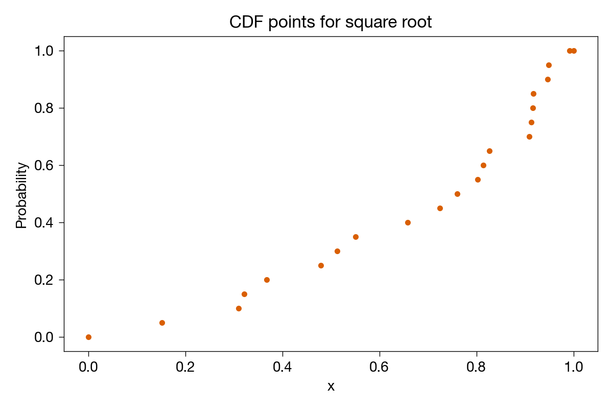
Plotting these points, we get

where I’ve added extra points at (0, 0) and (1, 1) to remind us that those are the limits; no value can be less than or equal to 0 and all values must be less than or equal to 1.
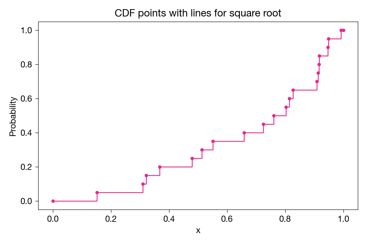
To complete the plot, there should be a horizontal line from each point to the next x value, where the function should then jump up to the next point.

Why? Because, for example, 40% (8 of 20) of the sample values are less than or equal to any value from 0.65800726 (inclusive) and 0.72510687 (exclusive). Similarly for all the other in-between portions of the graph.
Since there’s a step at each x value, we don’t need to show the points, just the lines. Here’s a plot of both the max and sqrt sample CDFs for 20 samples, along with the analytical solution given by Grant:

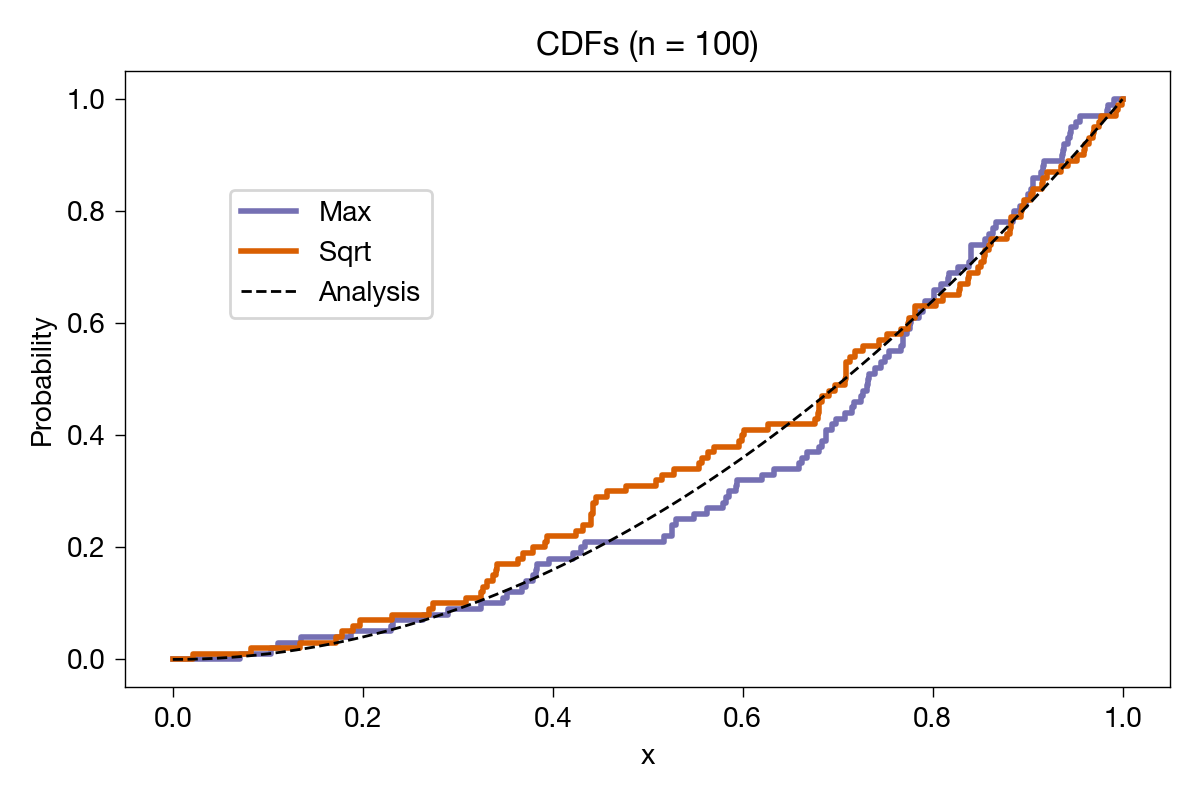
The sample CDFs look reasonably close to the analytical one. Let’s bump up the number of samples to 100 and see what we get:

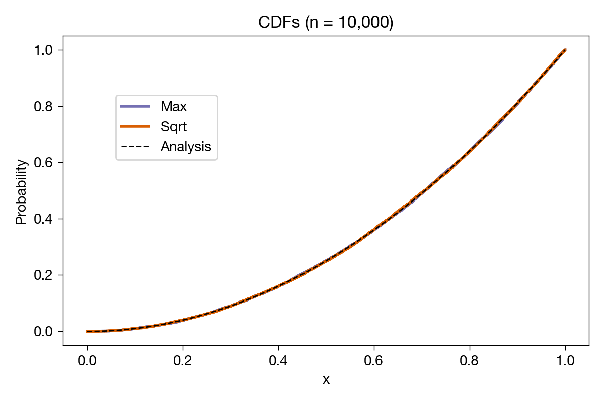
Closer to the analytical result, as expected. Just to be ridiculous, we’ll do it again with 10,000 samples:

With this many samples, you can’t even see the steps, but it’s clear that both of the sample CDFs are converging to the analytical one.
If you have some background in statistics, you might be expecting me to run the Kolmogorov-Smirnov test to check the goodness of fit between the sample and the analytical CDFs. But I think what we’ve done is a sufficient check on Grant’s work (as if that were needed). You can go ahead with the K-S test on your own.
Although running a numerical check was nice, my main purpose in making these graphs was to see how to use the step method in Matplotlib. It’s a plotting routine made especially for this type of graph. While you can use the usual plot for a stepwise function, you’d have to first construct arrays with two values for every step. The advantage in using step is that it takes care of all that bookkeeping. The arrays you pass to it need only one value for each step; it takes care of plotting the second value automatically.
Here’s the code that produces the graph for 20 samples:
python:
 1:  #!/usr/bin/env python3
 2:
 3:  import numpy as np
 4:  import matplotlib.pyplot as plt
 5:
 6:  # CDF by analysis
 7:  x = np.linspace(0, 1, 101)
 8:  cdfAnalysis = x**2
 9:
10:  # Sample CDFs using random numbers
11:  rng = np.random.default_rng(seed=1732895964)
12:  n = 20
13:  heights = np.linspace(0, n, n+1)/n
14:  heights = np.concatenate((heights, np.ones(1)))
15:
16:  # Max of two uniform variates
17:  X1 = rng.uniform(0, 1, n)
18:  X2 = rng.uniform(0, 1, n)
19:  Xmax = np.sort(np.maximum(X1, X2))
20:  Xmax = np.concatenate((np.zeros(1), Xmax, np.ones(1)))
21:
22:  # Sqrt of uniform variate
23:  X3 = rng.uniform(0, 1, n)
24:  Xsqrt = np.sort(np.sqrt(X3))
25:  Xsqrt = np.concatenate((np.zeros(1), Xsqrt, np.ones(1)))
26:
27:  # Create the plot with a given size in inches
28:  fig, ax = plt.subplots(figsize=(6, 4), layout='tight')
29:
30:  # Add plots
31:  ax.step(Xmax, heights, where='post', color='#7570b3', lw=2, label='Max')
32:  ax.step(Xsqrt, heights, where='post', color='#e7298a', lw=2, label='Sqrt')
33:  ax.plot(x, cdfAnalysis, '--', color='black', lw=1, label='Analysis')
34:
35:  # Title and axis labels
36:  plt.title(f'CDFs (n = {n:,d})')
37:  plt.xlabel('x')
38:  plt.ylabel('Probability')
39:
40:  # Make the border and tick marks 0.5 points wide
41:  [ i.set_linewidth(0.5) for i in ax.spines.values() ]
42:  ax.tick_params(which='both', width=.5)
43:
44:  # Add the legend
45:  ax.legend(loc=(.1, .6))
46:
47:  # Save as PDF
48:  plt.savefig(f'20241129-CDF comparison with {n} samples.png', format='png', dpi=200)
The values used to plot the analytical results are given in Lines 7–8. I like NumPy’s linspace function because it works by default the way I think: you give it the start and end values and the number of values to generate and off it goes. No worries about whether the end value is included or not. It is.
The next section, Lines 11–14, sets up the random number generator and the step heights for both the max and sqrt samples. You can specify the seed value for NumPy’s random number generator, which is helpful when you’re editing and debugging code and want to get the same set of values every time you run the script. The seed I used was the time I started writing this code in epoch seconds. I got it from the command line using
date +'%s'
Another advantage of setting the seed is that anyone else who runs the code will get the same plot I got.
Although this code is for 20 samples, Line 12 can be edited to handle any number of samples.
The concatenate function in Line 14 adds an extra 1 to the end of the heights variable. I discussed the reason for doing that earlier in the post. It’s of some small value with just 20 samples but not very useful when we get up to 10,000.
Lines 17–20 generate the x values for the max samples. They generate two sets of random numbers that are uniformly distributed between 0 and 1, get the maximum of each pair, and sort them in ascending order. The concatenate function was then used to add a 0 at the front of the Xmax array and a 1 at the end.
Lines 23–25 generate the x values for the sqrt samples. The process is similar to the max samples but we need to generate only one set of random numbers.
From this point on, it’s all plotting. The key feature is the use of step in Lines 31 and 32. The x values (either Xmax or Xsqrt) and heights are passed to step, and it handles all the plotting. An interesting parameter is where, which can be assigned either pre (the default) or post. The where parameter dictates whether the horizontal parts of the graph are plotted before or after each given point. Because of the way I set up the various arrays, post was the correct choice.
I got the color values in Lines 31 and 32 from the ColorBrewer site. They’re meant to be easy to distinguish for both colorblind and non-colorblind viewers. I suspect there’s a way to specify the ColorBrewer colors in Matplotlib automatically, but I haven’t looked into it.
The only other interesting part of the code is that Lines 36 and 48 change the title and filename according to the number of samples specified on Line 12.
As I said, it’s nice to have computers around to check on your analysis. Numerical integration and differentiation, Monte Carlo simulation, and graphing results are all things that can get you results quickly if you teach yourself how to use the software that’s available. These are certainly not proofs, and there’s always the danger of setting up your computer solution incorrectly—it’s easy to follow the same wrong path numerically that you followed analytically. But when done with care, these checks can give you confidence that you may not have with an analytical solution by itself.
-
You may be more familiar with the probability density function (PDF), which is the derivative of the CDF. The PDF of a normal (or Gaussian) random variable is the well-known “bell-shaped curve.” ↩

