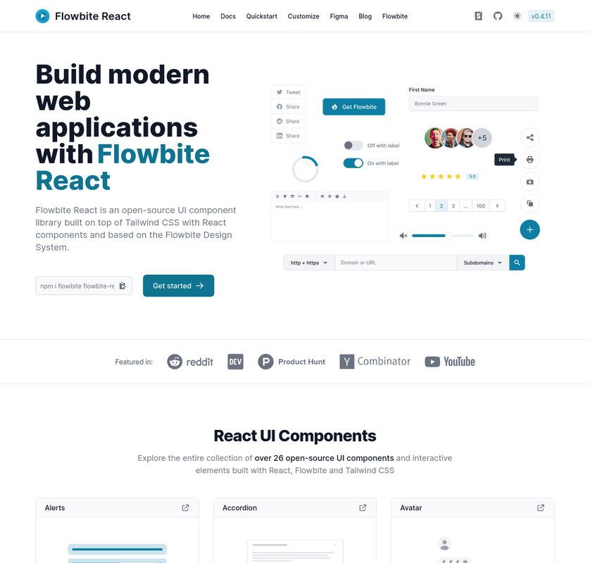
Build websites even faster with components on top of React and Tailwind CSS
flowbite-react is an open source collection of UI components, built in React, with utility classes from Tailwind CSS that you can use as a starting point for user interfaces and websites.
- Table of Contents
- Documentation
- Getting started
- Components
- Community
- Contributing
- Figma
- Copyright and license
Documentation for flowbite-react is not yet finished.
If you want to browse the components, visit flowbite-react.com.
If you want to learn more about Flowbite, visit Flowbite docs.
Learn how to get started with Flowbite React and start leveraging the interactive React components coupled with Flowbite and Tailwind CSS.
You'll need to be familiar with Node.js and npm, and have npm installed. You should be comfortable installing packages with npm, and experience creating web apps with React and Tailwind CSS will be very helpful.
Install Tailwind CSS:
npm i autoprefixer postcss tailwindcss
npx tailwindcss init -p
Point Tailwind CSS to files you have className=".." in:
module.exports = {
  content: ['./src/**/*.{js,jsx,ts,tsx}' /* src folder, for example */],
  theme: {
    extend: {},
  },
  plugins: [],
};
Add Tailwind CSS to a CSS file:
@tailwind base;
@tailwind components;
@tailwind utilities;- Install Flowbite and Flowbite React:
npm i flowbite flowbite-react # or yarn add flowbite flowbite-react- Add the Flowbite plugin to
tailwind.config.js, and include content fromflowbite-react:
module.exports = {
  content: [
    ...,
    'node_modules/flowbite-react/**/*.{js,jsx,ts,tsx}'
  ],
  plugins: [..., require('flowbite/plugin')],
  ...
};How you use Flowbite React depends on your project setup. In general, you can just import the components you want to use from flowbite-react and use them in a React .jsx file:
import { Button } from 'flowbite-react';

export default function MyPage() {
  return (
    <div>
      <Button>Click me</Button>
    </div>
  );
}If you're using Next.js, you can follow the Next.js install guide, which includes a Next.js starter project with Flowbite React already set up.
If you want to add a dark mode switcher to your app, you can follow the dark mode guide.
If you want to customize Flowbite React component, you can follow the theme guide.
If you want to contribute to Flowbite React, you can follow the contributing guide.
Please note that some components in the vanilla Flowbite library are not yet available in Flowbite React.
If you need help or just want to discuss about the library join the community on Github:
⌨️ Discuss about Flowbite on GitHub
For casual chatting with others using the library:
💬 Join the Flowbite Discord Server
Thank you for your interest in helping! Visit our guide on contributing to get started.
If you need the Figma files for the components you can check out our website for more information:
🎨 Get access to the Figma design files
The Flowbite name and logos are trademarks of Bergside Srl.
📝 Read about the licensing terms 📀 Brand guideline and trademark usage agreement


