Saturday, March 27, 2010

House Tour - Oakville Showhome by H&H


The Family Room - Princess Margaret Hospital Showhome 

Last fall I toured the Princess Margaret showhome in Oakville designed by Linda Reeves and the editors of Canadian House & Home Magazine.   If you've picked up the current issue of CH&H, you'll see the family room (and Linda) on the cover (same room as pictured above).  In November I toured the home with a girlfriend during the early afternoon of a weekday so it wasn't nearly as crowded as I'd heard it was on the weekends.  Since I never leave home without a camera and I didn't see any signage forbidding photos (and we looked!) I discreetly snapped away as I walked thru the house.  I only had my small point and shoot camera with me and I was literally shooting from the hip so sorry about the quality of the images.  Knowing that video tours of the house would be featured on the H&H website and a photo spread eventually published in a future issue, I opted not to post these photos until after the showhome lottery was over and their own photos had been published (as you'll see most of the images here are of spaces you won't see in the magazine feature or are from a completely different viewpoint.)

I have to say the house showed as beautifully in person as it shows in the magazine, with the exception of but a few small accessories and fresh flowers, it looked just the way you see it in the magazine spread.  There were many things I loved about the house; the floors, the cabinetry, the layout, the grand sense of spaciousness, the light and natural colour palette (natural materials), and the abundance of natural light.   Being right on trend like the magazine always is, the inspiration for the overall style of the house was Modern Belgian Farmhouse.....

If you've already seen the feature story in the current issue of CH&H, then you'll see some spaces here that weren't published,,,,,and if you didn't have a chance to view the room tours on the H&H website, or see the house in person, then this will all be new!  But please,,,check out this issue for the full story, sources and of course some spectacular photography.

Kitchen - open concept to family room (on the left)


Servery
to the left of this servery is the kitchen, to the right you see the Dining room.  I'm a huge fan of natural wood (especially floors) so the built-in cabinetry and floors were my favorite feature of the house.  

Hall of french doors across the back of the house leads you from the kitchen thru the
dining room to the living room beyond.  The doors open to the backyard patio.

The dining room - on either side of the mirrored wall are doors
that lead to the front hall.  On the opposite side of the mirrored wall is the foyer's fireplace. I couldn't hep but wish that it was double sided.....

Living Room with one of the houses 4 (or was it 5?) fireplaces, and an Ikea area carpet.


The Master Bedroom - upon entering you see this chaise seating,
which faces a fireplace to the left


The master bedroom was quite a large space with dormer ceilings..

The red and white flat woven carpet across the foot of the bed 
was the only colour in the room


Dressing Room - vanity table located under a dormer window just as you enter from the bedroom area.  The ensuite bathroom is to the right, dressing area is to the left.


I loved the Dressing Room....


My favorite room in the house was the Master Ensuite. The 12x24
limestone tiles laid in a herringbone pattern is stunning!  I often do this with small 3x6 tile but rarely work on spaces large enough to do this with large tiles.  Gorgeous.

Simple and White, what's not to love.

The same built-in cabinetry used in the servery is seen again in the master ensuite but with a light coloured counter.  The wood is exquisite and makes for a furniture quality vanity.


Sitting area on second floor outside of the master bedroom.


Second Bedroom, viewed from the doorway.

Ikea desk/dressing table.

Third Bedroom

The basement.  This same staircase detail continued from top to bottom.  The furniture and cabinetry beyond along with a wetbar was all from Ikea, leather chairs on the right are by Lazy Boy.

Basement Guest Bedroom...bed, bedding, seating and accessories by Ikea.

Basement washroom, vanity by Ikea


Main floor Laundry Room


Main floor Laundry Room


Main floor Powder Room, this sink area was a doorless room off of the front hall with a separate water closet to the right of the sink.


My interest in touring showhomes is primarily to experience the layout, and see all the material finishes, fixtures, built-ins and architectural details, in other words the bones of the house - to me the furnishings and accessories are really all secondary to this.  When you get the bones right,,,a house will make a statement and look beautiful even when the rooms are empty.  But an empty house is not a home!! The furnishings is this case were beautifully appointed too and given that they had the task of furnishing an entire house working on a budget and with sponsors, it was really well done with a clever mix of high and low.  One of the things that I felt had the most impact were the gorgeous draperies and window shades used throughout the house which is what gives the spaces a truly finished, bespoke look.  

Regardless of the grand scale of this showhouse, its a good example for those furnishing a home from scratch (owner or renters) of how you can take a budget and spread it out over your entire house with all the essentials, leaving space for layering in more pieces and collections in the years ahead.  You don't have to spend 'high' on every piece or in every room all at once.  The point of this strategy is you won't be left with empty unused rooms (for what could be years to come) and you can immediately enjoy living and entertaining, enjoying your  home to its fullest instead of just dreaming about it.  


All photos above by Carol Reed


Sunday, March 21, 2010

Rosedale Reno - Living Room Sneak Peek


Living Room - by Carol Reed Interior Design

This past October I posted a sneak peek of the dining room in this same house and a brief overview of the scope of the renovation that took place in 07/08.  You can check out that post and read all about the renovation here (see photo below).


Dining Room - by Carol Reed Interior Design


I'm fortunate to have some incredibly amazing clients who not only welcome me into their private lives at the onset of a project but allow me to feel welcome to return to their homes long after a project is complete, insisting that I can come back to visit for tea or lunch or to take photos anytime I'd like. Even when they're not home, they're gracious enough to allow me unlimited access and make arrangement for me to have a key or security codes. I often feel like I've become an extended part of the family and return visits to their homes are like a homecoming for me as I can't help but feel attached to the spaces after spending so many months and sometimes years working on every little detail.

The clients of this particular house are no exception,  they are one of my favorite families and they've been beyond generous over the past couple of years in making me feel like its 'my home' too and give me free reign to come and go as I please and take photos whenever I'd like - as happy as this makes me,,,,I have to restrain myself from taking advantage and imposing myself on them.  If there's anything I love more than designing homes its photographing them!  Clearly I'm not a professional, its a personal hobby that I need a lot more experience with but I'm enjoying getting to know how to use my camera and seeing 'my spaces' thru my own lense.  I'm grateful to all my clients for the opportunity to return for photos shoots as the photos are the only reference I have for months or often years of work.


Although in total square footage this was a large house the living room was not overly big, in fact it posed many of the same challenges that small urban homes or condos do - the room was long and narrow.  During the reno the entire house was brought back to the brick and rebuilt.  In this room, the existing front window was replaced with a larger bay window but the fireplace and stained glass windows beside it were one of the few original details that remained in tact.  I designed new panel moulding treatment for all the walls, added accent lighting and managed to accommodate a comfortable new seating arrangement along with a baby grand piano, and still had room for traffic flow thru the room.

I'm calling these sneak peeks as we're still working on some finishing touches, sometimes these take longer than the entire reno, but we're working on it gradually.  The fireplace (original to the house) still needs a beautiful screen and fireside tools to make it look complete,,,,,and we've sourced a floor lamp that was much needed, next will be another end table, and ultimately more artwork will be added as their collection grows.  But for now,,,,,,,this is all I'm sharing with you. ; )


All Photos:   Carol Reed

Monday, March 15, 2010

Chalkboard Door:


Masonite's new Chalkboard Panel Door

Chalkboards continue to be one of the most popular details or accessory I'm asked to include in a newly designed room whether I'm designing a new kitchen, mudroom, playroom, kid's rooms, home office or even a laundry room - everybody loves the idea of having a place to write to-do lists, appointment reminders and personal expressions.  The home kitchen I'm currently designing for a chef is no exception, my client really wanted me to find a spot somewhere in her new kitchen for a blackboard so she could post menus and make note of special celebrations.  Like most kitchens,,,because of all the appliances and the cabinetry there's not a lot of wall space left over for artwork or message boards.  But,,,,,,in this particular kitchen there is a door that leads to the basement which also happens to be highly visible from everywhere within the kitchen - so the obvious solution was to incorporate the chalkboard with the door.

A chalkboard door is something that can easily be made with a plain door and some blackboard paint, however, if you don't have the time, the skills or the desire for a DIY project and/or you want a genuine style and rail door that's ready to hang then this new chalkboard door by Masonite is a great option.  These doors come available in either a single panel or double panel style with the washable magnetic chalkboard surface on one side in a selection of wood frame or primed MDF,,and can be ordered either with the hinges already machined in place or not. 


Primed MDF, Single Panel Option


Clear Pine - Double Panel


These doors can be ordered anywhere that sells Masonite door products, including Home Depot where the cost for a 30"x 80"door in primed MDF is $309, and $360 for a double panel (non-machined).  The same size door in clear pine is $322/single panel, $374/double panel.  Delivery is approximately 3 to 4 weeks.  You can check out the Masonite website for all the options.


All Photos:   Masonite Door

Wednesday, March 3, 2010

Back to Brian's Condo - Artisanal Accessories


Vintage Studio Pottery


Furnishing Brian's Condo from scratch in one fell swoop was a challenge in itself, but making it look and feel personalized was the bigger challenge.  You can fill a space with all your major items like sofas, coffee tables and media units,,,even area carpets but until you layer in some artwork,,,,books,,,,,and interesting objects a space will always look unfinished and bare.  There's definitely no shortage of great looking and affordable accessories available at all the retail stores (trays, baskets, vases etc.) and I often rely on those sources for filling in the gaps, especially when starting from scratch but I also really think its important to leave some room for pieces that you'll acquire over time.   I deliberately try to avoid filling a room with all new, mass produced type accessories and make an effort to find at least a few hand made or one of a kind items.  For me, I think its more interesting  to display some old objects, some found objects, some inherited objects, vintage or personal collections all mixed in with some books, photos and artwork.  Its so tempting to just head over to one of the big chain retailers and fill the condo with their pretty accessories and be done with it,,,,,,,and I did start there, with a few basic items but I can't resist checking out vintage shops and antique markets for something more original and unique.

I visited an Antique Mall a couple of weeks ago and was on the look out for some interesting and inexpensive pottery or art glass for Brian's place.  Its a hit and miss process, sometimes you luck out and score some great finds but other times you can spend an entire day or weekend scouring shops and markets and come up empty handed.  It can be a great way to find some really affordable and unique things that have character - as long as your willing to spend some time to seek them out.

My approach when I visit an antique fair or vintage shop is to quickly scan - I'm a scanner, not a browser.  I go really quickly up and own the aisles, focusing on one side at a time while scanning for specific things, 95% of what's there I'm not interested in.  If I'm looking for a variety of different items, I'll make two or three passes, each time changing my focus.  In this case,,,I arrived at the antique mall and I spotted a number of amazing pieces at the first booth, the vendor had a great collection of small studio pottery pieces.  At the end of my 'scanning', which took less than 45 min., I left with a couple bags full of some amazing finds and only spent about $85!  Here are some pics of what I bought that day all of which I plan on taking to the bachelor pad this week.

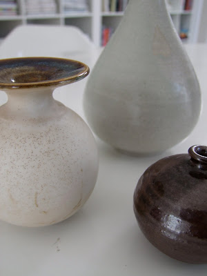
I picked up 4 beautiful pieces of studio pottery....


I love the shapes, the colours and the beautiful quality of the glazes.  All are hand made and ranged in price from $8 to $15 ea.  


I thought these ones made a perfect little grouping...


I love the imperfection in the glaze on this one, creating a pattern and I was instantly drawn to the pale grey blue colour.


All of the pieces were signed on the bottom.


This is my favorite, the matte finish on the glaze is gorgeous but the detail on the top is spectacular.


This little one was soo tiny but I couldn't resist it,,,the subtle ribbed texture was really beautiful and there's something about a bulb shaped vase that I love,,,but the metalic glaze on this is what sold me on it.  These little pieces are great for placing on top of a stack of books or on a shelf beside a photo....or grouped with other vases as I showed above.


This one had a beautiful shape and as much as I love my neutral beiges and greys, I'm always drawn to the colour green.


This one had an Austrian studio label on the bottom and small initial markings on the rim (yikes,,,this pic is really out of focus!)


Then I found these vintage ribbed glass and teak canisters made by Dansk.  I thought they'd be perfect at Brian's which has some vintage teak furniture.  For only $24, these were a steal and so versatile.  They could be used in the kitchen, bathroom or office and the best part is ,,I've never seen them anywhere else before!


The following week I picked up these two throw blankets for him, the cream coloured cable knit is 100% cotton and hand made, the grey one is a mohair wool blend and I love the fringe detail.  Again, some great texture and artisinal quality.  I thought these were a steal too at $89 and $59 each from Union Lighting & Home Furnishings.


The small finishing touches are finally coming to completion at the condo so I'll have my final after pics of the entire condo soon.

Happy Hunting!


All Photos:  Carol Reed


Related Posts Plugin for WordPress, Blogger...