Almost all websites have some form of a call to action, from signing up to a newsletter to summiting a contact us form. However, getting a user to complete a call to action is more complicated than one would first think. There are many factors at play that you need to consider.
The Factors That Influence Why People Complete a Call to Action
Conversion rate optimisation is not just about design or copy. It is about every aspect of your business from pricing to how you run projects. It requires a deep understanding of user behaviour and psychology, as well as a relentless focus on testing.
That is too much to address in a single post. But it is the subject of my online video masterclass: How to Encourage Users to Complete Your Calls to Action.
However, for this post, let’s focus in on optimising the copy and design aspects of conversion.
To begin with, users do not go from zero to clicking a call to action in a single step. Take for example buying on an ecommerce site, which is a journey involving:
- Discovering a need.
- Researching options.
- Placing an order.
- Receiving a delivery.
- After-sales support.
An experience that often happens over an extended period and involving many visits to the site.
The result of this extensive journey is that it may be necessary to present users with different calls to action at various points in the journey. For example, while researching a purchase, we may wish to encourage users to signup for a newsletter so that they do not forget us when it comes time to place an order. Equally, after a user has placed an order, we will want to make it clear how to look up their order status to reduce our support call costs.
However, there is another factor at play too. Not all calls to action are equally valuable to those running sites. An ecommerce site may want to push users towards a particular product that offers a higher margin or up-sell additional items to increase average order value.
All this means that a well-designed site has to do a lot more than offering a prominent button to click.
How then can we create compelling calls to action that encourage conversion? That is where this guide comes in. It outlines all of the critical factors that influence the effectiveness of your calls to action. Factors such as:
- The timing of your call to action.
- The quality of your supporting copy.
- The design of your calls to action.
- The post call to action experience.
Let’s begin by looking at timing your call to action.
Timing Your Call to Action
Understanding where the user is on their journey is crucial to success with calls to action. For example, asking them to sign up for a newsletter as they are about to make a purchase is nothing but a dangerous distraction. However, asking them to do so on their first visit, before they are ready to commit, makes sense.
Even then it is essential to be careful. Displaying a newsletter signup overlay the moment a user arrives on a site will lead to a reduced conversion rate. The user will not have had time to look around the site to decide whether they want to sign up.
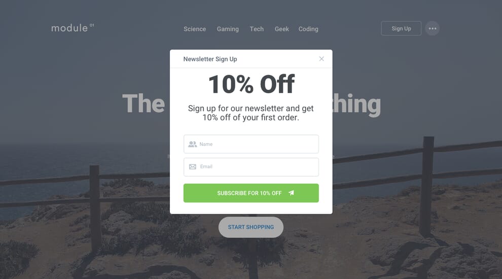
Not that picking the right moment is limited to a newsletter sign up. Asking people to share content on social media or complete a survey are best left until the user has completed their primary task.
There is also picking the right moment to up-sell other products if you are an ecommerce site. Asking users whether they want to add batteries or some other accessory to an order makes sense at the shopping cart stage, but pushing an entirely different category of product does not.
All of this comes down to having a firm grasp of the user’s journey, something primarily achieved through customer journey mapping and user research. However, ‘tagging’ people who visit the site through the use of cookies can help too.
Storing related information on users in cookies cached on their computer can help us tailor the timing of calls to action better. For example, if no cookie exists, there is a good chance the user is visiting the site for the first time, and it might be worth emphasising newsletter sign up.
If a user has previously visited a specific part of your site, then the call to action should relate to that. If the user has purchased in the last few days, then emphasising order tracking is appropriate. The list goes on.
However, cookies are not the only tool at our disposal for better targeting our calls to action. If a user is logged in, we have a wealth of information to draw upon from previous orders to average visit duration.
We can also target calls to action based on where the user is on the site. For example, when a user has just completed a purchase, instead of showing them a ‘continue shopping’ confirmation page, give them the option to sign up for social media or the newsletter. We can even tailor the messaging to relate to the product they have just purchased. For example, if the user has just bought a camera the call to action might read “for advice on making the most from your camera sign up for our newsletter”.

See also: Are You Asking User to Act at the Best Moment?
The copy associated with calls to action is one of the most significant influencing factors in conversion. That is why we must carefully consider the wording we use.
Creating Copy to Convert
Whether we are trying to encourage newsletter sign-ups or the purchasing of a particular product, the copy associated with that call to action is crucial to conversion.
Unfortunately, the drive for improved conversion often leads to copy that exaggerates. Ultimately, that undermines, rather than improves conversion.
Credibility Before Hype
There is a growing trend online towards increasingly exaggerated claims in an attempt to grab users attention. Often referred to as clickbait, this kind of copy will undermine conversion in the long term.
Although it is true that attention-grabbing headlines do indeed grab attention, it comes at a cost if those headlines are unable to deliver on their claims. This kind of copy undermines trust which is a crucial ingredient in encouraging conversion. If a company exaggerates in their text, users worry that the company will fail to deliver in their products or services.

That said, the copy can still be attention-grabbing. However, it needs to balance that with delivering on its promises. These kinds of balances occur time and again when writing copy that converts.
Balance Benefits with Features
For a long time marketing have sold by focusing on the benefits of a product, rather than its features. They emphasise how a product will benefit the consumer and improve their experience, rather than list features.
Focusing on benefits is a sound approach because it does not require the user to think to see how those features benefit them. For example, a company could emphasise the 12-hour battery life of its laptop (a feature). However, a consumer does not care about how many hours the battery lasts. They care whether the computer will run out of power before they finish using it (the benefit). Therefore traditional marketing argues that we should emphases the benefit in preference to the feature.

Although this approach still applies online, a degree of caution is required. Users often come to a site with a specific question in mind and are looking for answers to that question. If that question is “how long does the battery last”, a vague promise that it will “keep working as long as you do” is not going to satisfy.
It is therefore vital that benefits and features be presented together on a website to have the best chance to convert.
Admittedly this makes the copy longer, but we should always favour clarity over conciseness.
Clarity Should Come Before Conciseness
User experience designers will explain that people do not read online. That is indeed true. Instead, they tend to scan copy looking for key phrases that answer whatever questions they have about a product.
However, that does not necessarily mean that copy has to be short. Instead, the content should be as long as it needs to be to make the case and no longer. Users will stop scanning to read the text if it is relevant to them.
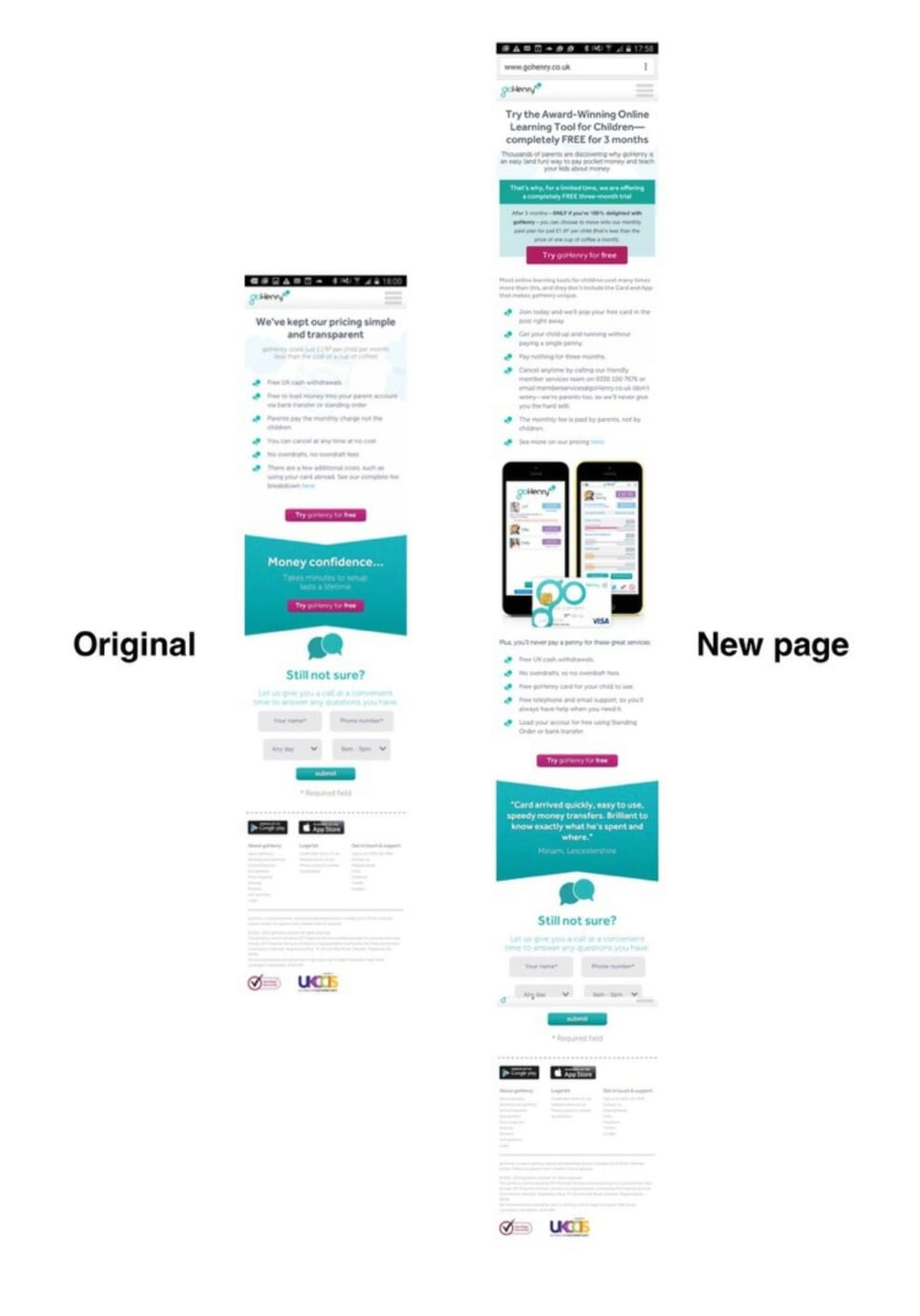
To aid clarity while supporting scanability, introduce structure into the copy. Make use of headings, sub-headings, lists, pull out quotes and other typographic aids to break up larger blocks of text and allow users to identify the parts of the copy relevant to them quickly.
That said, avoid seeing a need for clarity as an excuse for verbose copy. Users will quickly lose patience with copy that repeats itself or fails to address their questions. They have an unusually low tolerance for copy that ‘feels’ like an attempt to aggressively sell. Once again, this tends to undermine trust.
Establish a Trustworthy Tone of Voice
Whatever the call to action, it will almost certainly involve a great deal of trust on the part of users. Trust that you will deliver on your promise. Trust that we will keep their data safe. Trust that we will respect the boundaries of the agreement.
Building trust is, therefore, a critical component in encouraging action and one that is shaped by numerous factors, not least the copy we write.
However, the trustworthiness of the copy is not merely about its truthfulness. It is also about the tone of voice. The text can come across as manipulative, impersonal and aggressively pursuing a ‘sale’.
It is true that particular language does tend to convert better. Using language that encourages action such as “buy today” or “last chance” will increase conversion. It is also true that emotionally charged wording such as “breakthrough”, “astonishing” or “surprise” tend to grab attention. However, if used without subtlety they can undermine the trustworthiness of the site and, by extension, calls to action.
Even worse, the copy on many websites lacks humanity. They use phrasing that one would never hear in everyday conversation. That leaves the user with the impression they are being asked to buy from a faceless corporation, not a passionate team of people.
Balancing compelling copy with a human tone of voice is not always easy and comes with practice and much testing. However, as a general rule, lean towards writing in a personal, open and matter-of-fact tone of voice. As users become ever more sophisticated and aware of ‘manipulative’ techniques, they routinely warm to a more honest, human approach. See also: Why and How to Gain the Trust of Users
Not that copy is the only consideration when creating compelling calls to action. Design plays a critical role as well.
Design Principles for Improved Calls to Action
Cognitive load makes it very easy for users to overlook critical visual cues on your site. If users are in a rush, distracted or are struggling to use a website, then they could easily miss a call to action entirely. See also: How to Fix the Devastating Impact of Cognitive Load on Your Site.
How then can we optimise our calls to action to ensure they are immediately apparent to even the most overwhelmed user? There are six techniques available to us.
We begin with positioning.
1. Optimise Positioning
Correctly positioning a call to action can have a significant impact on visibility and in turn conversion.
However, positioning is not merely a matter of displaying a call to action high on the page. There are other factors to consider as well.
One crucial factor is how users scan a page. In countries where users read from top to bottom and left to right, people start at the top left corner and scan down the left-hand side of the page. When something grabs their attention, they then scan horizontally across the page.
This approach to scanning favours the left-hand side of the page over the right. That means a call to action often performs better on the left, even if it is lower on the page.
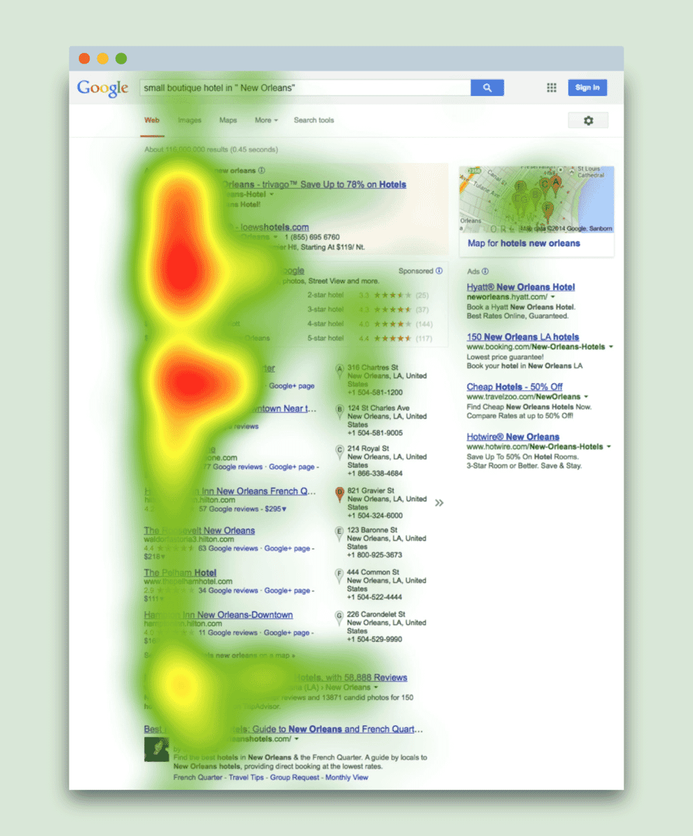
Another factor that will improve conversion is positioning the call to action in the central content area. That is because this is where the user’s attention is primarily focused. Users are interested in the content of the page and so give it considerably more attention than headers, footers or sidebars. A call to action placed in the flow of the main body of the page will often outperform the same call to action in the header or high on a sidebar, even if the call to action is lower on the page.
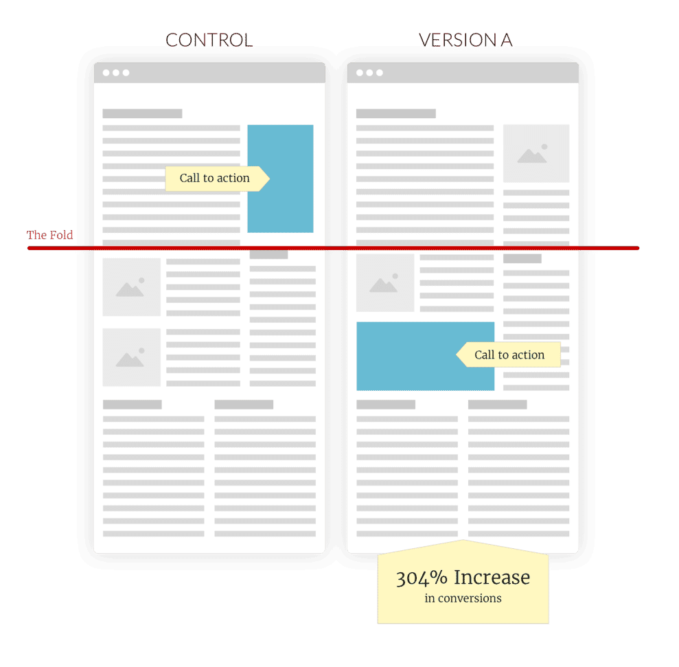
In fact, in some situations, it is preferable to place the call to action lower on a page. As was discussed in the ‘pick your moment’ section, choosing the time to ask users to act can have a significant impact on conversion. In some situations, this need to pick the right moment can mean waiting until a user has viewed some of the pages before asking them to act.
An excellent example of this is signing up for a newsletter on a blog. If you places a call to action at the top of the page, the user may not have seen any of the content to judge whether they wish to subscribe. Waiting until they have read at least some of the page makes sense.
Working out the optimal vertical position for a call to action is not easy. Too high and the user might not be ready to respond, but equally there is no guarantee that a user will scroll the entire page. In truth they often do, but in doing so, they routinely skip content in the middle.
The best solution to this problem is to run some heatmap software on a site to get a sense of how much users are scrolling on critical pages and where their attention lingers. That is important because other factors can also influence where our attention settles, not just scroll position.

The position of a call to action does not exist in isolation. Other page elements heavily influence it. Surrounding text, video or stylistic elements will all either draw the eye towards or away from a call to action. We can most clearly see this in the relationship between a call to action and imagery.
2. Use Imagery With Care
Imagery is considerably more comfortable for people to process than text. As a result, photographs and illustrations unconsciously draw our attention. This phenomenon is even more exaggerated if the imagery contains people, and in particular, faces. We are programmed to pay specific attention to faces and so tend to skip directly to a face when displayed on a page.
The power that imagery has to attract attention can be either beneficial or detrimental to a conversion rate.
For example, if you closely associate an image with a call to action, then this increases its visibility and therefore improves conversion. However, if there is a disconnect between the image and call to action, the user’s eye will often skip directly to the image ignoring the call to action.

The ability of images to draw attention is so powerful that if you place a call to action in a prominent left-hand column, and an image in a lesser right-hand column, the eye will skip right over the call to action to settle on the image.
The obvious conclusion is to associate imagery with a call to action closely. However, there is another factor at play. It is also necessary to consider the content of the imagery.
Visual cues in the image itself can either draw the users attention to or away from the call to action. For example, if the image contains a person we will tend to follow that person’s eye line. If they are looking towards the call to action, that is where we will look. If they are looking away from the call to action, the chances increase of us missing it entirely.
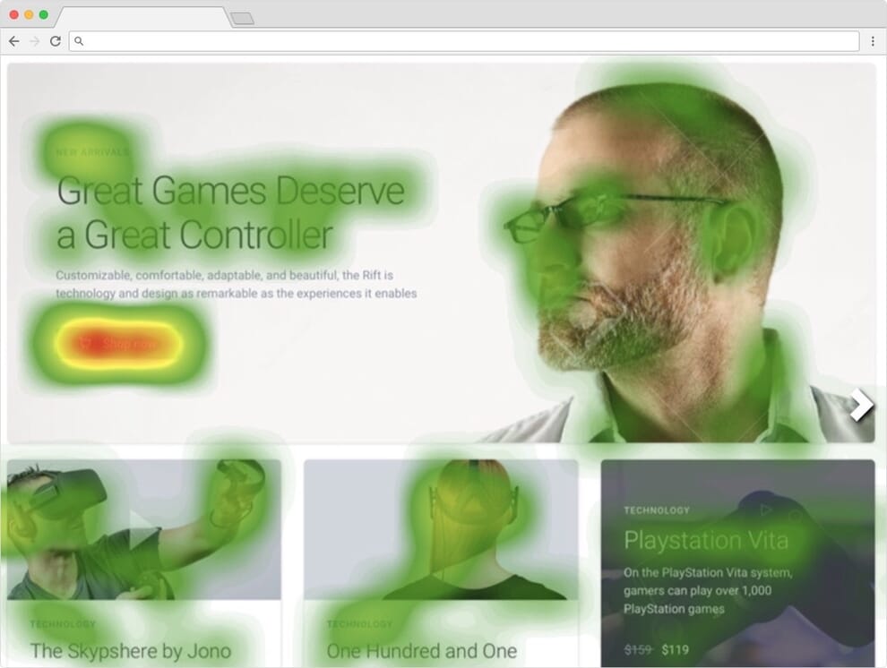
However, this does not just apply to people. It also applies to any element within an image that indicates direction or flow. That might be as obvious as an arrow pointing or as subtle as some architectural detail drawing the eye in a specific direction.

It helps to think of imagery as exerting a gravitational pull on the user’s attention. The idea of screen elements applying a pull on user attention is also useful when considering negative space.
3. Maximise Negative Space
When it comes to the prominence of a call to action, the absence of competing elements is as powerful as a well-designed call to action itself.
Users often spend less than eight seconds assessing a page. That limited attention means that every element on the page potentially detracts from the call to action.
One response is to reduce the number of screen elements on a page dramatically, and indeed, this will improve conversion. However, this approach can only go so far. See also: How to Create Compellingly Simple Websites.
An alternative approach maximises the amount of space immediately around the call to action. Doing so leaves the user’s eye with nothing else to latch onto and so the call to action draws their attention.

The approach of minimising distractions will inevitably improve conversion even on a relatively weak call to action. However, increasing the prominence of the call to action itself is always beneficial.
4. Dedicate Significant Screen Real Estate
Although obvious, the benefit of creating big, bold calls to action cannot be overstated. Size does have a significant impact on visibility and by extension conversion rate. A subtle design approach is rarely beneficial in this regards.
That said, size is not just about being eye-catching. A massive call to action offers a secondary benefit too. It allows for the introduction of more compelling messaging.
Write Call to Actions that finish the sentence “I want to…” for your target audience. For example, if your audience is looking to become a better gamer, your call to action should read “buy now to become a better gamer“.
Take for example a “buy now” button for a gaming controller. The messaging on these buttons are typically short because the available real estate constrains them. However, if the button is made larger, the copy could read “buy now to become a better gamer”. The additional space allows for a significantly more compelling call to action.

Of course, it is entirely possible to include this additional information in supporting copy. However, it is not unusual for users to read buttons and links out of context. In other words, they fail to read the accompanying messaging. By associating that message with the button itself, it ensures that users see it.
Not that size is the only way to draw attention. We can also utilise colour.
5. Contrast with Colour
It is possible to use colour to draw attention to a call to action, by contrasting the colour of that call to action with the rest of the website.
For example, if the predominant colour scheme of the website is blue, then using a different colour will help the call to action stand out.

There is much debate about what colour should be used to optimise conversion. In truth, there are many factors, including cultural differences, that affects how people respond to colour. For example, red decreases conversion in many western countries due to its association with danger. However, in China red is associated with prosperity and luck, resulting in a very different reaction.
That said, one consistent is that using a contrasting colour will have the most visual impact. In other words, try to select a colour on the opposite side of the colour wheel to the primary colour of a site.
The only danger with using colour to draw attention to a call to action is that we do not all see colour in the same way. 8% of men and 0.6% of women are colourblind which can impact the effectiveness of this technique, depending on the colours one chooses. It is therefore advisable to use colour alongside other techniques to draw attention, such as the use of animation.
6. Apply Subtle Use of Animation
Animation is a powerful tool for grabbing user attention when used with care. In a static environment (like a webpage) we are programmed to notice even the most subtle movement. Simply put, movement draws our attention.
However, like imagery, animation can be a dangerous tool if misused. Continually looping animation can prove distracting, preventing users from focusing on other messaging.
Overusing animation can significantly undermine its effectiveness. Users become blind to it and filter it out.
It is best to use animation with subtlety. Avoid looping animation, but instead, trigger it on load or when users scroll. If it does loop, ensure that there is a long gap between loops.
Ultimately, no one technique will substantially increase conversion. However, combining techniques can significantly increase the visibility of calls to action and therefore conversion.
That said, it is essential that we do not fixate entirely on encouraging action. We also need to think carefully about what happens when users do click. See also my masterclass on conversion rate optimisation
Considering Post Click
Anybody who has run an ecommerce site for any length of time is familiar with the dropout that inevitably occurs when a user adds a product to a basket or when they start the checkout process. A user expressing an interest in completing a call to action is no guarantee of conversion.
It is, therefore, crucial that you give careful consideration to the post-click experience. In particular, four areas need attention. However, the most important of these is to remove distractions.
1. Remove Distraction
There are good reasons behind Amazon’s decision to remove all unnecessary user interface elements once the user begins the checkout process. Users can easily be distracted at this crucial moment in the conversion funnel, and so it is essential to focus them entirely on completing the process.

It is tempting to use this opportunity to up-sell additional items or bundle in other calls to action such as newsletter signup. However, each of these elements adds another choice so increasing cognitive load and the likelihood they abandon the process.
Any screen element not directly associated with completing the conversion process increases the cognitive strain on users. Individually these additions have a minor impact, but collectively they add up, making it more likely the user gives up. That is especially true when you are trying to reach an audience who is already under pressure from other sources (such as workload or family distractions) or when there are more straightforward competitor sites only a click away.
Not that it is always possible to remove all complexity from the process. That is where positive reinforcement becomes essential.
2. Provide Positive Reinforcement
One powerful tool in encouraging users to complete the conversion process is positive reinforcement. As soon as a user clicks a call to action, it is essential to confirm the user’s commitment to convert and encourage them that this is a positive step. This kind of reinforcement works for two reasons.
First, the consistency principle states that people have a strong psychological need to be consistent with prior acts. In other words, if they are seen to commit to a process, they feel a need to follow that process to its conclusion. By acknowledging the fact that a user has begun the process, they are more likely as a consequence to complete it.

However, secondly, this is typically a high-stress moment for users especially when it comes to making a financial purchase. People are loss averse. They feel the emotional impact of parting with a payment twice as much as they do the positive feelings associated with making the purchase.
We need to offset this loss bias by reassuring the user that they have made the correct choice and making a purchase is the right decision. However, our need to reassure does not stop there.
3. Create a Sense of Positive Progression
Depending on the call to action, completing the conversion process may require many steps on behalf of the user. It may require providing extensive personal and financial details or making various choices to do with the configuration of the product itself.
Whatever the case, this kind of complexity increases cognitive strain and the chance that a user will abandon the process, even after reducing the necessary steps to the bare minimum.
Fortunately, users are more likely to complete a conversion process if they feel a sense of momentum. In other words, they feel they are making positive progress towards the end goal.
With that in mind, it is vital to reassure the user at every step of the way. Do not wait until a user submits a form to validate it and tell them whether they have been successful. Instead, reassure them by providing positive feedback as they enter each field of a form. Also, give them a sense of how far through the process they have progressed and how much further they have.
In short, continually communicate with the user to give them a sense of progression. This principle of ongoing communication even applies once they have reached the end of the sales funnel.
4. Continually Communicate During Delivery
Even once the conversion process has been completed there is still a danger that the user pulls out. In many cases, there is a delay in delivery, and most countries provide a cooling off period when people buy a product online.
We can reduce the likelihood of this happening by communicating with them regularly during that vulnerable period. This kind of communication should provide positive reinforcement, but more importantly, a sense of control.
Making a purchase creates anxiety. Our natural response to anxiety is to control the situation. However, when we are passive players, merely waiting for delivery, we do not have that option, and so our anxiety grows further.
We can create this sense of control by providing users with information about what is going on. If we provide people with information, they feel a sense of control and that reduces their anxiety.
That principle is clear to see if we read the comments associated with any Kickstarter campaign. These campaigns require the user to wait a prolonged time for delivery of their product, and that creates anxiety. The result is constant comments demanding updates. Clear communication reduces anxiety.

As is apparent, communication is just one of many techniques and principles that will help to improve the conversion rate of any site. However, it is the details of their implementation that dictate success or failure. What approach best addresses these nuances of implementation will be dependant on the audience. That is why understanding one’s audience is so important. However, the only real way to understand how users will respond is to trial approaches through techniques such as multivariate testing; a subject addressed elsewhere on this blog.


