Off-camera lighting 101: the ‘five things’

_Z705723 copy

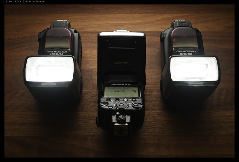
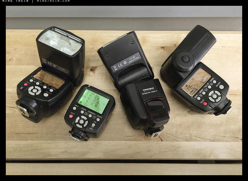
I frequently get asked about lighting: specifically, how does one best approach the daunting challenge of knowing where to put what lights, how to set them up, use modifiers etc. I’ve written about some of this in the past but realise that I never tackled conceptually where to start. Fear not: in true Ming style, it’s now a list of Five Things 😉 Though the whole process of conceptualisation and setup becomes increasingly intuitive over time and practice, I still find that this list helps quite a lot when you’re either a) working with very complex setups where multiple lights can start creating interference with each other, or b) trying to simplify. Remember, a shadow does several things: it provides spatial context for three dimensional placement of subjects in a two dimensional presentation; it creates texture; and it provides separation and definition from the background. The more complex the lighting setup, the less well defined the shadows are going to be. Ultimately, the purpose of any controlled lighting setup is to place the shadows where you want them to go, and control the relative brightness of the subject elements, allowing you to precisely manipulate the structure of your image so that it is ‘read’ by your audience in a certain way.
[Read more…]

A lighting conundrum

IMG_1608b copy

The portrait and wedding photographers are all over their lighting gear – everything off camera is fair game to creating a look, and the more unique the look, the crazier the light, why not? Fair enough. Documentary photographers are mostly allergic to flashes because they can ruin the atmosphere and create the impression of something which perhaps isn’t necessarily accurate, or truthful. Product photographers just use what they need and quietly get on with the job. Amateurs will dabble and land up falling on one side of the fence or the other, usually staying away from the hassle of the weight and setup that comes with a ‘proper’ solution. Here’s my problem: I sit somewhere between the latter two points on the continuum, and finding a longer term, larger, lighting solution has been seriously overdue for me. I still don’t have a solution, but on the off chance somebody might find the logic and musings useful, here goes.

[Read more…]

On Assignment: Film noir

H51-B0000691 copy

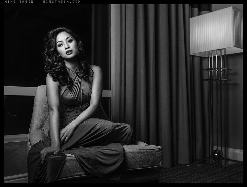
Today’s images are from a recent shoot – and shakedown test – of my recently acquired Hasselblad H5D-50C and some other bits of new lighting equipment. The brief: film noir. The model is a local actress. Those of you who frequent my site will know that portraiture – especially of the posed and lit kind – is not something I do often (but at the same time, I do more of it than you might think) mainly because it’s somewhat outside my usual focus of corporate documentary and architecture/ interiors. That said, when everything comes together it can be rather satisfying; I’ve always viewed portraiture as a conversation during which you might just happen to have the lights set up and a camera handy – very few people are aware of the way they look, body position etc. to a degree that they can control it to produce a desired result. It’s much easier to talk to your subject and try to elicit the desired responses without them quite being fully aware of it – that way, the results turn out natural, too.

Images in this series were shot with the H5D-50c, 50/3.5 II and 100/2.2 lenses, and post processed with the Monochrome Masterclass workflow. Lighting with six speedlights in two Lastolite Ezybox IIs.

[Read more…]

On Assignment: shooting a car

_8039291 copy

It’s been a little while since I’ve done one of these – partially because of respect for client embargos, partially because my recent assignments have been so hectic that I haven’t had time to pause for breath let alone b-roll; however, I’m hoping to rectify that today with a report from one of my larger recent shoots. In Malaysia, Nissan is phasing out the current 2013 Teana to make way for the all-new 2014 model. I was brought in originally with the intention of consulting on the 2014 campaign creative direction and shoot for the new car, however, at the last moment I got roped into the final campaign for the current car, too. And that shoot will be the subject of today’s post.

[Read more…]

What makes an outstanding image? (part 2)

Continued from part one.

_D90_DSC7759 copy
Cinematic light. Nikon D90, 18-200VR

3.5 Context
Context is the way the viewer of the image creates the story of the primary subject, using the secondary elements in the frame as mental markers. The secondary elements help to place the subject in terms of time, location, culture, era, mood, as well as giving countless other psychological clues such as wealth, poverty, uncertainty, danger, unasked questions, etc. A subject in isolation is fine for a commercial product shoot, but it lacks the emotion and narrative richness that well-framed surroundings can add. The photographer also has to ensure that the elements in the frame have the correct relative prominence, which is to say the framing should direct the eye of the viewer to the primary subject first, and then the secondary subjects in order of importance. If this is not the case, then the message of the photograph can land up being quite different to the intention of the photographer at the time of capture. Properties of a subject that affect relative prominence include size, position in the frame, relative brightness, and contrast/ color vis-a-vis the background.

_M9P1_L1011571 copy
The importance of context. Leica M9-P, 35/1.4 ASPH FLE

Perhaps the concept of context is best illustrated by an example: let’s take the classic photojournalism shot. Wide angle, strongly directional lighting, some atmospheric haze, angry person waving a gun front and centre standing in a shaft of sunlight, close to the camera. The background scene contains other people grimacing (we think – they’re too small and far from the camera to tell) and greatly reduced in prominence to the primary subject, some destroyed/ burned objects, and a fire, all set to an destroyed building in the background. First thing we think when we see an image like this: war. But what if the angry person wasn’t highlighted in a shaft of sunlight, the camera was closer to the other people, who now turn out to be laughing, and we see that the destroyed background building is actually abandoned and the only one in a relatively prosperous-appearing urban area? Would these two images not have a very different story?

_M8_L1015994bw copy
The price of progress. Leica M8, 35/2 ASPH

4. Cultural background and history
There are some images which will never mean anything to any observers outside a closed group of people; this is because the compositional elements and subjects make reference to things that are culturally unique or specific to a historical time period. The trick to making images like this work is that they must have enough context for the viewer to be able to make a reasonably accurate guess at the context, even if they have no idea of the specific references invoked. Good examples would include any sort of cultural or religious ceremonies; historical events that were not publicised outside a particular country; or ethnic differences between different racial groups. (I doubt most viewers would be able to tell the difference between Dinka and Masaai tribespeople, for instance. But there would be enough visual cues in the frame to correctly think ‘Africa’.)

_M8_L1025280bw copy
It just has to be Paris. Leica M8, 21/1.4 ASPH

I’d probably widen this to include any technical sort of photography where a good portion of the visual impact comes from the subject – fully conscious of the fact that this also covers a good portion of my own work. I could take images with identical lighting and camera/ subject positioning of say a Lange Datograph and a Lange Double Split, but only the horological afficionados are going to display any meaningful difference in excitement for one image over the other.

_M8_L1024678bw copy
Seeking understanding. Leica M8, 21/1.4 ASPH

5. Human psychology
Something related to cultural background – think of it as a collective culture for the human race. There are things that universally invoke a reaction amongst the vast majority of people; for subject matter, this includes anything taboo such as death; anything universally celebrated such as birth or marriage, smiles, tears, tension, anger and anything other strong emotional cues (feel free to add to the comments if I’ve missed anything). The ability to include such cues in a very obvious way in an image further increases the overall impact of the shot – seasoned photojournalists such as those who produce reportage for National Geographic, Time, Life etc are very good at this.

_7034839 copy
Does this scene make you feel warm? Why? Nikon D700, 85/1.4 G

There’s also a second set of elements related to the human psyche that can form useful toolkit – these include use of color (or B&W); directionality of lighting, and particular hues or shades to provoke a reaction. It can be as simple an image of a place with predominantly warm hues (reds, yellows) feels cosy and inviting; the same place with shifted white balance or cooler lighting resulting in blues and whites can be made to feel clinical and sterile. Part of our response to color is down to conditioning imposed by lifestyle – incandescent light, hearth fires, sci-fi culture, medical clinics etc.# – and part of it is probably a physiological thing from our time in the jungle. It’s well known that in the natural world, brightly colored animals and plants are either that way to attract the attention of mates or other members of their species, or to warn potential predators of toxicity.

_7021860 copy
No missing the subject here. Nikon D700, 60/2.8G

#I’m sure you all had an image in your mind at every single one of these examples – now think, what was the predominant tone, color or white balance in each of those images? This article goes into the psychology of color in more detail, and this one deals with how to achieve control over color.

Finally, there are compositional rules that most people react to, to varying degrees. These include a preference for balance and symmetry; responding to leading lines, and singling out things inside natural frames. There’s also the expectation of the top of the frame being lighter than the bottom; I’m not sure where this emerges from, but I’m fairly confident it has something to do with the sky being brighter than the ground in real life.

_M8_L1023455bw copy
This shot probably means more to me than it does to you, because I’m married to the subject. Leica M8, 35/2 ASPH

6. The personal connection
The one element that the photographer has almost no control over for the majority of his audience – assuming that the image is to be viewed by more than those who commissioned it or who have direct involvement in it – is to do with the personal response of the viewer. A good example would be pictures of a wedding – they’d mean something to me if it was my wedding, and I might even be able to overlook compositional shortcomings because of the moment they capture (though I suspect my wife might disagree) – but to somebody with a detached and critical eye, the images may hold very little merit. Or perhaps a well-executed still life of bananas; I might love fruit and therefore be more inclined to like the image over somebody who’s allergic to them, or perhaps suffered from one too many banana peel pranks as a kid – they, on the other hand, might be made very uncomfortable by the image indeed – and possibly not even know why.

Moral of the story: take some time to understand your audience, and you’ll be surprised at the difference in the response. It’s one of the first questions I always ask a client: is it for you, or your customers? And what would your customers want to see?

_7037081bw copy
Blink and you’ll wonder if you really saw it. Nepal, Nikon D700, 24/1.4G

7. Timing.
This concept is best encapsulated in HC-B’s decisive moment philosophy: unlike with a video, you’ve only got one frame to tell the entire story. This means that everything that has happened, is happening, and will happen in the future must be captured in that one frame; it’s the relationship between the events clearly occurring in the frame, and the cues given from which the viewer’s mind interpolates what’s on both sides of the timeline. Although each of the other factors almost always have multiple possibilities that ‘work’ as an image (albeit with different stories) – there is only ever one decisive moment for each message or story. If you miss it, there are other moments, but they each have a different story. Time is a continuum and an artificial human construct, but at the same time the flow of causality is one-way. (This is getting a bit more metaphysical than intended; for more have a look at this article on the relationship between quantum mechanics and photography.)

_M8_L1022658bw copy
City Hall, London. Leica M8, Voigtlander 50/1.1

8. The X factor.
Truly outstanding images have something that goes beyond items 1-6; it’s an unquantifiable something that is perhaps almost born out of luck and chance, and never to be repeated. You have to have the right subject, at the right moment, in the right light, with just enough context to tell the story but not so much as to overwhelm, and some sort of personal or emotional connection created with the viewer. (And if you’re a commercial photographer, you’ll have to create all of this from scratch on demand on a repeatable basis.) I actually think the final part of what makes an image work is a degree of controlled imperfection; this appeals at a subconscious level to the humanity of the viewer; it’s almost as though it says ‘what I saw affected me as much as it should affect you’. (Of course, there is a time and place for this, and in commercial shoots, camera shake is just sloppy.) Finally, never underestimate the importance of luck: being in exactly the right place, at the right time.

_M9P1_L1003919bw copy
Sometimes, the patient are rewarded. Schonbrunn, Vienna. Leica M9-P, 28/2.8 ASPH

9. Conclusion
I want to finish on a high note. Even though there are a lot of elements that one has to manipulate – and a couple that you can’t control – to make an outstanding image, it’s clearly possible, because outstanding images happen all the time. And probably more frequently than we think, too – not all of them are shared with the world; Vivian Maier’s work is a great example of that. The single most important element of all isn’t covered in any of the sections above, and that’s practice and preparation. It’s also the best advice I can give to any photographer at any skill level. No matter how deep one’s understanding of the concepts is, if you don’t have a camera with you, or can’t figure out how to get the effect you want, or find the spot metering button, or accidentally shoot in a thumbnail-sized jpeg or something similar, you’re going to miss the shot. If your eye isn’t trained to passively seek out compositions all the time, then you’re going to miss something. The best thing, however, is that the element of preparedness is 100% under the control of the photographer. MT

____________

Visit our Teaching Store to up your photographic game – including Photoshop Workflow DVDs and customized Email School of Photography; or go mobile with the Photography Compendium for iPad. You can also get your gear from B&H and Amazon. Prices are the same as normal, however a small portion of your purchase value is referred back to me. Thanks!

Don’t forget to like us on Facebook and join the reader Flickr group!

appstorebadge

Images and content copyright Ming Thein | mingthein.com 2012 onwards. All rights reserved

What makes an outstanding image? (part 1)

_8016610 copy
Apples. Nikon D800E, Zeiss ZF.2 2/100 Makro-Planar

Of the 400 or so posts I’ve published up to this point, I recently realized that the one enormously gaping hole I haven’t yet covered deals with the one of the major fundamentals: how do you actually determine if an image ‘works’ or not? What makes it good? What makes it outstanding? I think it was both a discussion on composition in our reader pool forum on Flickr, as well as the strongly mixed reactions to this photoessay post that did it – context, even a mini-article, sometimes simply isn’t enough if you’re missing a cultural familiarity, or local view. This is obviously not a simple question to answer; despite an extensive search online, I haven’t been able to find any good articles that provided any sort of conclusion. (Clearly, I must be a bit of a masochist in deciding to write this article.) Perhaps it’s because it’s an extremely subjective question to begin with; or perhaps it’s because to come up with an answer that makes sense requires a thoroughly multidisciplinary approach: strong images resonate technical, compositional, cultural, psychological and personal chords. And the final two are of course highly observer-dependant.

_5006010 copy
Two old men. Olympus OM-D, 75/1.8

In fact, it’s a wonder that we have any images at all that are globally recognized and appreciated. Rather than analyze specific images, I’m going to spend some time looking into some of the more abstract characteristics and their implications for one’s photography. I’d recommend finding a comfortable chair and grabbing a drink because this is a pretty heavy article. So heavy, in fact, I’ve decided to split it into two parts. It’s also turned out to be one of the most difficult articles to write, occupying a good couple of days thanks to the extremely vague and ill-defined nature of the subject matter. Finding the right photos to illustrate the article was just as tough; excuse me if there are some repeats of previously-posted images here.

_M9P2_L1000224 copy
The diving board, Hong Kong. Leica M9-P, Zeiss ZM 2.8/28

One of the most important things for a photographer to know is specifically why one of their images works, and why another one doesn’t. I was going through my contacts’ uploads on Flickr the other day and noticing that there were three types of photographers:
a) upload everything, no QC or editing whatsoever, mostly poor images;
b) upload most things, has one or two really good images, mostly mediocre;
c) only uploads good stuff, and shows a consistent level of quality.

Type a almost certainly has no idea of what makes a good image, or perhaps they don’t really care; we must remember that social media is also used for indiscriminate sharing. Type b appears to be a more serious amateur, and wants to make good images, and probably knows a good image when they see one, but is unable to deconstruct their successful images into a series of things that they can replicate. The final type, c, knows what works, and either doesn’t bother shooting the rest, or hits the delete key pretty fast when something isn’t quite right. I want to get us all to type c.

*Note that this article contains a lot more links than anything before – it’s because I’ve previously explored a lot of these individual concepts in some depth, but never unified them in a single article – this one.

_8019332 copy
Omega Speedmaster 9300. Nikon D800E, 85/2.8 PCE

Let’s begin.

1. Subject
There is simply no point to a photograph or image if there is no subject. An image is a representation of something: if there’s nothing to represent, or it isn’t clear what the representation is trying to be, then why bother at all? This doesn’t mean to say that abstract images don’t work; in such cases, the abstraction and entire frame are the subjects themselves. But in the broadest possible sense, if you look at an image and it isn’t fairly obvious what the image is about, then it fails. A photograph without a subject is like a meal with no main course, or a story without a plot – it can fill an immediate transient need, but it will not have any lasting consequence or memorability.

_RX100_DSC1102bw copy
The cloud. Sony RX100

The sole implication for the photographer is that you need to know what the subject of your image is going to be before you take the shot, and how the other elements in the frame relate to it and tell the story. Or maybe they don’t relate to it and create an inverse story of juxtaposition and contrast; it all depends on what you’re trying to say with the image. The subject also needs to stand out and be visually obvious, it should be the (metaphorical and optical) focal point of your image. We’ll deal with that in section three. Bottom line: you need to have a clear picture in your own mind about what the image is about; invariably not everything is executable, so this picture gets increasingly blurred as it comes closer to physical execution – hence ensuring that you start off with as strong an idea as possible is paramount.

_8016759 copy
Hommage a Claude Monet. Nikon D800E, Zeiss ZF.2 2/100 Makro-Planar

2. Execution and technicalities
Next comes the simplest of the ‘secondary’ criteria. Even this is relative, however. Generally speaking, a good image is properly exposed for the subject, is in focus, and doesn’t take processing to the extremes. The executional characteristics of the image should not be the first thing you notice when you look at the photograph: you can overdo it**. They should support the compositions, but not detract or outweigh it. This is one of the things I don’t like about overdone HDR, Instagram and other photo apps – the processing is so overdone to the point that fundamental compositional structure is overshadowed, and any flaws hidden. You only see the processing, and not the subject.

_M9P1_L1014802 copy
Seeing the wood from the trees. Leica M9-P, 21/3.4 ASPH

However, there are always exceptions to every rule. And in the case of the technical qualities of an image, if you have an exceedingly strong subject or composition, then no matter how poor your execution, the subject is what you’re going to see first. Nobody remembers Robert Capa’s iconic Normandy landing shots for their technical perfection, but rather the subject matter and how he managed to convey the chaotic, haunting, gritty sensation of actually being there.

_RX100_DSC0664b copy
Service – with just the right amount of motion blur. Sony RX100

I include processing under technical execution. The biggest fundamental choice you have here is whether to work in color or black and white; some subjects are particularly suited to one or the other; some could go either way. Whether you should use one or the other depends mostly on whether your subject is best isolated by luminance/ brightness or by contrast in color. (This topic is subject to an entirely separate article here.)

**I cover processing workflow in general here, and here for B&W.

_5000552bw copy
After work. Olympus OM-D, 45/1.8

3. Composition
In its simplest definition, composition is how the various elements of an image are located relative to one another, and how this spatial relationship tells the story of the main subject or conveys the desired message. However, there are some restrictions – firstly, we are representing a three-dimensional space in two dimensions, and secondly, there are perspectives imposed by the field of view we choose to employ. The reduction to two dimensions has both strengths and weaknesses: you cannot rely on depth perception to create perspective; instead, we have to artificially impose it through our choice of focal length. However, its removal also means that we can do things that aren’t possible via native human vision, such as have everything in the frame simultaneously in focus. Mastery of composition is knowing when to use the right tool to enhance the presentation of the subject.

_7060499 copy

_7060503 copy
Dessert, before and after being enjoyed. Nikon D700, 60/2.8G

That said, for any given subject and situation, there is no one perfect composition – rather, there are probably any number of compositions that can work. However, the big difference is that they will not all tell the same story. Again, there is no right or wrong here: the best story for a given situation will depend very much on what the end objective is for the image.

This article and this article both enter into more detail on compositional theory.

_M8_L1025292bw copy
Vanishing point. Leica M8, 21/1.4 ASPH

3.1 Isolation/ separation/ focus
This concept lacks a single defining word – I suppose ‘focus’ would be closest, but the problem is that tends to induce confusion between the subject distance and the concentration around the idea or subject of the image. The ideal qualitative effect is that the eye of the viewer must go straight to the primary subject of the photograph, and then only on to the context that surrounds it, in the order that the photographer desires. This can be accomplished through the use of a number of different tools – leading lines, natural frames, negative space, bokeh etc. The subject itself must stand out from the background or surroundings; in that sense, some sort of natural frame is always required to provide the necessary isolation – it could be a doorway, or a plain color background of a different color to the subject, or a contrast in texture. The sole exception is a whole-frame abstract, where the entire image is the subject. Note that lighting is the other major source of subject separation. (And yes, there is such a thing as too much bokeh.)

_7008297bw copy
Before the take. Nikon D700, Zeiss ZF 1.4/85

3.2 Perspective
There is no right or wrong perspective for any given subject. The sole aim of perspective is to either emphasize or de-emphasize the foreground relative to the background. Does the subject need to be larger than life, or minimized? Does the image require context to understand properly, and how prominent should these contextual elements be relative to the primary focus of the image?

_0011006bw copy
Trees. Ricoh GRDIII

In general, wide-angle perspectives need a clear subject placed in the foreground. This need for a defined foreground decreases as the focal length increases, to a point where it could really go either way at roughly 50mm and above (35 equivalent). Above that, the foreground and background are of similar prominence, and subject separation is no longer achieved through perspective, insofar as depth of field is a consequence of a particular focal length and perspective. Images shot with a wide lens that lack a clear foreground can work, but only under specific circumstances which almost always involve leading lines, or large amounts of context and unusually good subject separation. Similarly, one must also take care with the use of telephotos – you can focus on the subject to the point of exclusion of all context, which can actually weaken an image.

_7014252 copy
Mt. Yotei. Nikon D700, Zeiss ZF.2 2/100 Makro-Planar

3.3 Balance
I’ve always found this to be one of the more difficult things to define. Instinctively, you know whether something is balanced or not on looking at it – but what it is specifically that creates, or destroys, that sense of balance is much more difficult to quantify. The eye of the viewer needs to linger for about the same amount of time in every portion of the frame; if you have half of the frame that takes a split second to understand but produces no context, against the complex opposite half of the frame where there’s a lot going on and a few moments of deciphering are required, then you generally might as well not bother with the quicker part.

_7057468 copy
Breguet Tradition. Balanced, but not perfectly symmetric. Nikon D700, 60/2.8G

Doesn’t make sense? Boil it down to opposites. Balance is like symmetry, but not quite; the mirror images do not have to be identical, nor do they have to be symmetric around the dead center of the frame. If the left half of your frame has something in it, then the right half must too, of roughly the same size and level of detail. This is independent of the subject. Now quarters: you can do opposite top-left and bottom-right and leave the other two corners empty, but if you do three corners and omit one, the eye is going to go straight to the empty corner because it’s the odd one out. You might actually want to do that, but make sure it’s a conscious choice. You can keep subdividing your frame and finding opposing points around the middle to balance out, but generally once something gets to be say less than 10% of the frame size in any linear dimension (1% area) then it’s usually inconsequential enough to ignore – so long as it doesn’t intrude into your subject.

This of course also applies to your subject too: don’t make it too small, otherwise no matter how balanced your frame, it won’t stand out!

_8016861 copy
There are always exceptions to every rule. Nikon D800E, Zeiss ZF.2 2/100 Makro-Planar

3.4 Lighting
I just completed a whole series on lighting here – intro to equipment, part 1, part 2, part 3, part 4, and tips and tricks.

With no light, there can be no photography. The direct meaning of ‘photography’ is ‘writing with light’. Light identifies and isolates your subject; the softness or hardness or uniformity of it determines the amount of definition and contrast, as well as the tonality; the color and hue determine the feeling of the scene. And the absolute amount of it has an impact on the technical quality of the image, too. It’s inescapable that every good image must have good light – you can make an ordinary subject into an arresting photograph if it’s properly lit, but no amount of photoshop or the most unusual object is going to surmount flat or uninteresting light.

_PM05660 copy
Prague. This would not be interesting on a flat, gray day at noon. Olympus E-PM1 Pen Mini, 45/1.8

Photographers must therefore either be able to recognize when the light is right, and seek out subjects to be illuminated by it – or go one step further and learn to control it. In fact, you have to do the former before you can do the latter – understanding the origin of a particular look makes it much, much easier to reverse engineer and replicate. Distilling things further, we’re arrive at the inescapable conclusion that successful lighting hinges on directionality, nothing more and nothing less. The right directionality creates the right kinds of shadows and highlights, which in turn creates contrast, texture and subject definition. And the less common the direction (light), the better – why do you think psychologically, we don’t find images shot in noon sunlight or under common indoor artificial light to be particularly arresting? It’s because that’s what we are conditioned to seeing most of the time. However, golden hours or special lighting effects are much less common. But I’m starting to digress into psychology, which I’ll leave for section 5.

Come back tomorrow for the conclusion in part two.

____________

Visit our Teaching Store to up your photographic game – including Photoshop Workflow DVDs and customized Email School of Photography; or go mobile with the Photography Compendium for iPad. You can also get your gear from B&H and Amazon. Prices are the same as normal, however a small portion of your purchase value is referred back to me. Thanks!

Don’t forget to like us on Facebook and join the reader Flickr group!

appstorebadge

Images and content copyright Ming Thein | mingthein.com 2012 onwards. All rights reserved

Workshop report: 28 Sep Making Light in Kuala Lumpur

_8021743 copy
Our model for the day, Aliza Kim. Nikon D800E, 85/1.8 G

Although unfortunately Kristian Dowling couldn’t co-present in the end due to food poisoning, the show must go on, and it did: an intimate and dedicated class of participants joined me for a different look at making light in the studio. We started with a deconstruction and minor reprogramming of preconceptions: the use of a studio is about total control for all aspects of the image, not just lighting; why compromise when you are in a repeatable, 100% controllable environment?

_8021660 copy
A simple one-light portrait. Nikon D800E, Zeiss ZF.2 2/100 Makro-Planar

_RX100_DSC1606b copy
And setup shot for the above: only the 4×6″ softbox was in play.

The morning was spent examining firstly the basics of the principles of composition, color theory and psychology, the importance of perfect color and how to achieve it, and finally, deconstructing lighting under several increasingly complex scenarios – one light, two lights, reflectors, multiple lights, balancing with ambient…I’m proud to say that the students did an increasingly good job of figuring out what the light setups used were, even if I did throw them a few curve balls 🙂 (There’s a reason why this post comes at the end of the last week’s focus on lighting articles!)

After lunch, we moved on to replicating most of these setups, starting simple with one large softbox…

_8021661 copy

…a variety of poses, practice with timing, framing and anticipating where to leave space when the model moved…

_8021674bw copy

_RX100_DSC1611b copy

…including setups involving two lights:

_RX100_DSC1613b copy

_8021677 copy

…harsh contrast…

_8021696bw copy

…strong backlight (that’s the 4×6 softbox serving as backdrop in the left edge of the frame)…

_RX100_DSC1617b copy

…the addition of beauty dishes to balance out the background to provide a clean white look with flattering light bleed around the edges of limbs and torso…

_8021725 copy
Nikon D800E, Zeiss ZF.2 2/50 Makro-Planar

_RX100_DSC1620b copy
Setup shot

…some occasional theatrical emoting from the coach…

_RX100_DSC1625b copy

…and the use of a single-beauty light from a more oblique angle to create interesting silhouettes:

_8021749 copy

One more costume change later, and I demonstrated the versatility of speedlights for location work and ease of creating completely different effects by mixing diffuse and harsh light. Here, we used a three-light setup to create a very edgy, moody, feel; later on adding a cinematic and emotional element by varying the color tone of the final shot, or omitting it completely. The speedlights were set to manual output, triggered and controlled via iTTL for the Nikon shooters, and switched over to SU4 slave mode for the Canon shooters (and lone Sony RX100, the B-roll camera of yours truly.)

_RX100_DSC1681b copy
Flash cunningly triggered by the built-in on a Sony RX100, shot in manual mode

_RX100_DSC1676b copy
Sony RX100

_8021775 copy
Nikon D800E

_8021767bw copy
Nikon D800E

We finished up the day with a quick Photoshop postprocessing demonstration to clean up a few files for print by the studio’s resident print master, Wesley Wong of Giclee Art – thus completing the imaging chain, and showing just how much further you can take your images when you’re in control of all of the elements. Even at 13×19″, the RX100 images were virtually indistinguishable from the D800E – we would have to go even further, probably to 25×40″ or so, before a significant difference would be discernable. Score one for the argument for sufficiency! I’m pleased to report that everybody had a great time and learned a lot (or at least were polite enough not to say otherwise 🙂 – in the words of one participant, “I think my head just exploded.”

_RX100_DSC1694b copy

_RX100_DSC1699b copy

_RX100_DSC1682b copy
Our group and model.

I’d like to conclude with a quick note on equipment: we were using Profoto Pro heads, a D4 pack, one beauty dish with and without 25deg grid, 4×6′ and 1×4′ softboxes, three Nikon SB900s, umbrellas and a whole array of clamps and stands for lighting; the model images in this post were shot by me (except for the one ‘Charlie’s Angels’ shot where noted) using a Nikon D800E, Nikon AFS 85/1.8 G, Zeiss ZF.2 2/50 and 2/100 Makro-Planars. B-roll, documentary, and one of the model images was shot using a Sony RX100, except of course the images of me which were shot by the students as the camera made its rounds to be fondled…

I’d like to say a big thank you to the participants, and Shriro-Malaysia/ Profoto for the use of the studio and lighting equipment. Stay tuned for more upcoming workshops!

____________

If you enjoyed this post, please consider supporting the site via Paypal ([email protected]); Ming Thein’s Email School of Photography – learn exactly what you want to learn, when you want to learn it or learn how to achieve a similar look with our Photoshop workflow DVDs.  You can also get your gear from Amazon.com via this referral link.  Prices are the same as normal, however a small portion of your purchase value is referred back to me. Thanks!

Don’t forget to like us on Facebook and join the Flickr group!

Images and content copyright Ming Thein | mingthein.com 2012 onwards. All rights reserved

Lighting tips and tricks

A little bonus to follow on from the previous five part series* on lighting.

*A primer on lighting equipment is here. Part one on single sources can be found here; part two on multiple sources, here; part three on balancing ambient, here; part four on continuous sources, here.

There are a few things worth bearing in mind when creating your own lighting:

There should always be a top.
This usually means lighting in such a way that the orientation of the subject is obvious; it doesn’t always mean that it has to be shot in this orientation. Often, this is physically impossible with some subjects. But what you can do is rotate camera, place your stronger light sources at the perceptual ‘top’ of the subject, then rotate the image afterwards. I frequently do this with watches – they don’t stand up by themselves!

DIY
Not all lighting equipment has to be bought. Some can be made at home – a rolled cardboard cone makes a fine snoot; you can cut gobos out of mount board with a hobby knife, and even softboxes can be made from wire and mount board with a little forethought. The most critical bit of equipment in my own arsenal – the watch diffuser – I made myself.

Start simple
Beginners often make the mistake of buying too many lights, stands, umbrellas etc. and then trying to deploy them all at once – you often don’t need to. The most effective, dramatic lighting setups usually only require one, or at most two, sources. Only increase the complexity of your setup if you absolutely have to – remember the number of variables for each light in the first article on single sources?

Use what you’ve got
Building on starting simple, often ambient light is both difficult to replicate and offers invaluable context. Don’t overlook it in your quest for control of light: it can be very helpful indeed. This is where the next tip comes in:

Master manual metering
Controlling all of the exposure parameters manually gives you perfect control over the relationship between ambient and made light; if you’re particularly masochistic or have a difficult subject (reflective objects for instance) you might even go manual for the flash output, too. Learn to visualize what various exposures look like, and you can both work a lot faster, and create better results, too.

Imperfection is perfection
Natural light is never perfectly even, or diffuse, or directional; it’s the little variations and imperfections caused by shoddy internal baffling in your home-made softbox that gives an image character. Embrace the imperfection, and let it work for you.

Watch your color termperatures
You can use a difference in color temperature between sources (differently gelled flashes, or ambient vs flash etc.) to isolate a subject or different zones in your image. You can also overdo it and land up with very strange color in some parts of your image; as with everything, just enough is the difference between something different and something overcooked.

There is such a thing as too much diffusion
Very large, flat sources are great when shooting a large object, but remember that the only thing that defines the shape of an object – any object, be it a car or person or watch – is the way the shadows and highlights fall. If you have very flat, even light, then you might find there is very little distinction between shadow and highlight; this is great for maximizing dynamic range, but it’s also going to make your subject look incredibly flat, too. What does work with such sources is to use the big soft light as the secondary source, dialled in a a stop or two below your primary source – something harder, and more directional, to maintain texture and shape in your subjects.

Zoom head settings don’t have to match lens position
Flashes have internal mechanisms to move the tube and/or reflectors and fresnel grids around so that the angle of coverage of the beam matches the angle of view of the lens used; this doesn’t always have to be the case. If you use a narrow beam with a wide lens, you create a spotlight effect; this can be useful to highlight a particular subject. Just don’t make the difference in exposure too great, or it’ll look unnatural.

High sync speed and lots of power are your friends
Higher sync speeds enable you to do many things: freeze motion, fill in very bright sunlight, and use less power while doing so. It isn’t so much a special trick on its own per se, but more of a means of extending your shooting envelope so you have more control and more options when ambient light is extremely bright. And more power means more control over apertures, more ability to use diffusers and modifiers (they all eat light – at least a stop, sometimes as much as two or three) without compromising range or depth of field. MT

____________

Visit our Teaching Store to up your photographic game – including Photoshop Workflow DVDs and customized Email School of Photography; or go mobile with the Photography Compendium for iPad. You can also get your gear from B&H and Amazon. Prices are the same as normal, however a small portion of your purchase value is referred back to me. Thanks!

Don’t forget to like us on Facebook and join the reader Flickr group!

appstorebadge

Images and content copyright Ming Thein | mingthein.com 2012 onwards. All rights reserved

Deconstructing light, part four: continuous sources

The final part in this introduction to lighting mini-series is a look at when continuous light sources can be useful, and how to best deploy them.

I use continuous lighting primarily for food photography – specifically, large, high-CRI LED panels – because the low temperature of the source doesn’t interfere with the subject. (Try blasting sashimi with flash repeatedly, and you’ll soon see just how fast delicate fish can cook.) However, it’s also useful in other situations – obviously, to give clients an idea of what the end result will look like; for videography, when flashes obviously aren’t feasible, and less obviously, when you’re working in a dark environment and actually need a reasonably accurate representation of what the light will look like in order to compose and focus.

The rules for using continuous lights are pretty much the same, but with a few limitations:
1. Color temperature usually isn’t variable, and for large sources, you might not be able to find gels big enough – so you will probably have to go with almost 100% artificial light in your exposure. Note that you can also find continuous tungsten lights, but these run very hot and have a very low color temperature, which can lead to problems with blues.
2. LED panels aren’t that bright, so you will need to work with a tripod, and again, watch ambient light – it will creep in because the exposure times will necessarily be longer than for flash photography.
3. Subject motion – another consequence of longer exposures, especially with human subjects.
4. Heat. If you’re using tungsten light, be careful with things accidentally coming in contact with the bulbs or heads and catching fire or burning. That includes your skin.
5. Power. You’ll need to be plugged into mains or large batteries for lights of any consequential power. Ensure you take this into account when planning for a shoot – extension cables and power strips are your friend!

Let’s look at some examples, shall we?

_DL5T_L1000740 copy
The end of sorbet. Leica D-Lux 5

Single small LED panel to the top; note the hot spot on the spoon. The problem with using panels is that they’re difficult diffuse without a significant loss in power; the only way to make it work is either live with the hot spots (not a major problem for food) or get bigger panels (very expensive). I wanted my panels to be versatile, so I’m now using 45x45cm models.

_MM1_L9995676bw copy
Test shot from the M-Monochrom review. Leica M-Monochrom, 50/2 APO

One large LED panel off to the right; since it was a test shot, I didn’t bother to clear the wire from the foreground…with human subjects, LED panels enable faster, more comfortable working as you don’t have to make as many trial and error adjustments with the flash, and it’s simply not as hot.

_DL5T_L1000648 copy
Bread. Leica D-Lux 5

Part of a series from a food photography class I ran for Leica earlier in the year. I had two small LED panels for this, spread out around the top of the image and on even power; they provided definition and shadow. Image was shot top-down, obviously.

_DL5T_L1000646 copy
Foie gras. Leica D-Lux 5

Two LED panels; one top left, one top right. Both slightly above the subject to highlight that moisty, oily sheen on the seared foie gras. LED panels are quite directional but yet with short throw; this means they’ve got to be fairly close to your subject, and you’ll need more than one to fill in the shadows.

_DL5T_L1000702 copy
Leica S2, using the D-Lux 5

This is an example of what you can do when you have 40 LED panels at your disposal – I demonstrated product photography using the mini-panels to create a ring of light around the subject, with some actually providing light on the subject, and some just there to provide background texture.

_DL5T_L1000981 copy
Sushi platter. Leica D-Lux 5

One medium panel from the top took care of lighting here – getting the height and angle right is the critical part, so that the subject is evenly lit but yet has definition to preserve the shape and texture of the fish. Panels were about 30cm above the subject in this case.

_5003422 copy
Rice cones. Olympus OM-D

I used two panels here – one on full power from the right side, slightly elevated relative to the plane of the plate, and slightly behind; the other was to the left and running 1/8th power to provide fill and keep the food looking fresh and ‘bright’ rather than shadowy and ‘heavy’. Lighting is all about psychology and creating the desired mood in the viewer…

A primer on lighting equipment is here. Part one on single sources can be found here; part two on multiple sources, here; part three on balancing ambient, here.

____________

Visit our Teaching Store to up your photographic game – including Photoshop Workflow DVDs and customized Email School of Photography; or go mobile with the Photography Compendium for iPad. You can also get your gear from B&H and Amazon. Prices are the same as normal, however a small portion of your purchase value is referred back to me. Thanks!

Don’t forget to like us on Facebook and join the reader Flickr group!

appstorebadge

Images and content copyright Ming Thein | mingthein.com 2012 onwards. All rights reserved

Deconstructing light, part three: balancing ambient

One of the neat things you can do when you’re controlling the light is highlighting your subject, but preserving the ambient atmosphere. Today’s post focuses on how to do that.

Ambient light is your friend: it helps you to fill in the background with pre-lit object, providing compositional context; but more importantly, you can use it to preserve the atmosphere of the scene, which can be difficult to recreate if you’re using 100% flash or strobe only. All of the previous control points for single and multiple lights apply, of course. The two major challenges with balancing ambient are exposure and color. I’ll deal with exposure first.

There’s no fixed rule for this, but the more ambient you want to preserve, the closer your exposure must be to ambient exposure; the best way to do this is by shooting in manual mode and balancing out your shutter speed and aperture until you’re around one stop underexposed; I wouldn’t do anything more than three stops of difference (unless you have very bright ambient point sources) because very little, if any, ambient sources will remain. You’ve got three parameters to play with here – shutter speed, aperture and ISO. Shutter speed should fall somewhere between your max sync speed and around 1/30s if you’re dealing with people; higher if there are moving objects, lower if static. Aperture should allow you to hold in focus whatever you need to. ISO is the remaining balancing factor once you have set the other two – try and keep this low to maintain image quality, however. I generally don’t go higher than 800. Note that flash power should be the last thing that’s altered (and done by the camera’s meter to balance out the required exposure) – this is because you are firstly setting your exposure based on ambient, then filling the primary subject with the precise amount of flash required for a proper exposure.

Color is actually simpler: if it’s daylight, or close to it, there’s no need to gel your flashes, because they operate at fairly close to daylight Kelvin temperatures. If it’s tungsten or fluorescent, you’ll need to use the correct gels over the front of the flash so they provide the same temperature color source as the ambient lighting; you’ll also then have to set the white balance in-camera to match ambient. Note that you don’t always have to match the flashes to ambient; sometimes having a bit of temperature difference isn’t a bad thing, as it can help to highlight the subject. Just don’t make the difference too glaringly obvious.

Let’s move on to the examples.

_8019332%20copy%20(deleted%205039fb5b-27ac4-01431194)
Omega Speedmaster 9300. Nikon D800E

One of the more common situations I face where I have to balance flash and ambient are lume shots of watches – you need a very long exposure to capture the glow luminous material; often 30s at f16 ISO 100, or longer. However, a luminous dial pattern on its own isn’t very interesting, so I usually supplement this with some ambient. You could do this two ways – composite a regular (but underexposed by several stops) shot in, or just add a manual flash kicker to define the case. Here, I used 1/16th power from top left through the diffuser box.

_7061864 copy
Sandwich. Nikon D700

The background glow is the restaurant decor; I had flashes reflecting off umbrellas left and right to illuminate the sandwich. Exposure was balanced out to expose two stops under ambient for the restaurant, with a longer exposure time and base ISO (sandwiches don’t do much moving).

_D90_DSC7112 copy
Autumn texture. Nikon D90

One flash from the left, not diffused to provide a bit of harsh light to add texture and definition to the subject; exposure 1/2 stop under ambient. I wanted to fill the shadows and create some cross-lighting effects rather than make things soft and diffuse; a very flat angle for the flash position was used to accomplish this.

_8018601 copy
MRI room. Some of you might recognize this from a previous on assignment post. Nikon D800E

The objective of this shoot was to show the clean, high-tech environment of the hospital’s new MRI machine. The MRI and room itself had ambient lighting on both the machine and ceiling; if we shot with this alone, firstly our models wouldn’t have been able to keep still for long enough, and secondly, the ambient light was far too cool with a large difference in color temperature to the machine. Hence, flashes were used to illuminate the room and models – one in a reflective umbrella to the top right corner of the room; I needed throw and definition for the whites. The second one was placed on top of the rear casing of the MRI to fill the back of the room.

_8018569 copy
Mammogram. Nikon D800E

Here, the client wanted to convey a warm, friendly feeling to the room; nothing says this better than warm lighting. The color temperature of the flashes were shifted with gels; the primary source source was a flash reflected off an umbrella behind and above the machine; a secondary flash was bounced off the wall behind me (and to the right of the patient) to provide fill at 1.5 stops under the main flash.

_7065341 copy
Sony RX100 product shot. Nikon D700

The final example is one of those deceptively complex shots: one flash from top right was fired through the diffuser to light the camera body and background, but the exposure was altered until it balanced out that of the screen. If I’d just used the native sync speed of 1/250s and stopped down, the screen would black out because it isn’t that bright.

Come back again tomorrow for the final part in this series! MT

A primer on lighting equipment is here. Part one on single sources can be found here; part two on multiple sources, here.

____________

Visit our Teaching Store to up your photographic game – including Photoshop Workflow DVDs and customized Email School of Photography; or go mobile with the Photography Compendium for iPad. You can also get your gear from B&H and Amazon. Prices are the same as normal, however a small portion of your purchase value is referred back to me. Thanks!

Don’t forget to like us on Facebook and join the reader Flickr group!

appstorebadge

Images and content copyright Ming Thein | mingthein.com 2012 onwards. All rights reserved