Journal tags: website

12

sparkline

Docks and home screens

Back in June I documented a bug on macOS in how Spaces (or whatever they call they’re desktop management thingy now) works with websites added to the dock.

I’m happy to report that after upgrading to Sequoia, the latest version of macOS, the bug has been fixed! Excellent!

Not only that, but there’s another really great little improvement…

Let’s say you’ve installed a website like The Session by adding it to the dock. Now let’s say you get an email in Apple Mail that includes a link to something on The Session. It used to be that clicking on that link would open it in your default web browser. But now clicking on that link opens it in the installed web app!

It’s a lovely little enhancement that makes the installed website truly feel like a native app.

Websites in the dock also support the badging API, which is really nice!

Like I said at the time:

I wonder if there’s much point using wrappers like Electron any more? I feel like they were mostly aiming to get that parity with native apps in having a standalone application launched from the dock.

Now all you need is a website.

The biggest issue remains discovery. Unless you already know that it’s possible to add a website to the dock, you’re unlikely to find out about it. That’s why I’ve got a page with installation instructions on The Session.

Still, the discovery possibilities on Apples’s desktop devices are waaaaay better than on Apple’s mobile devices.

Apple are doing such great work on their desktop operating system to make websites first-class citizens. Meanwhile, they’re doing less than nothing on their mobile operating system. For a while there, they literally planned to break all websites added to the homescreen. Fortunately they were forced to back down.

But it’s still so sad to see how Apple are doing everything in their power to prevent people from finding out that you can add websites to your homescreen—despite (or perhaps because of) the fact that push notifications on iOS only work if the website has been added to the home screen!

So while I’m really happy to see the great work being done on installing websites for desktop computers, I’m remain disgusted by what’s happening on mobile:

At this point I’ve pretty much given up on Apple ever doing anything about this pathetic situation.

Making the Patterns Day website

I had a lot of fun making the website for Patterns Day.

If you’re interested in the tech stack, here’s what I used:

  1. HTML
  2. CSS

Actually, technically it’s all HTML because the styles are inside a style element rather than a separate style sheet, but you know what I mean. Also, there is technically some JavaScript but all it does is register a service worker that takes care of caching and going offline.

I didn’t use any build tools. There was no pipeline. There is no node_modules folder filling up my hard drive. Nothing was automated. The website was hand-crafted the long hard stupid way.

I started with the content. I wrote out the words and marked them up with the most appropriate HTML elements.

A screenshot of an unstyled web page for Patterns Day.

Time to layer on the presentation.

For the design, I turned to Michelle for help. I gave her a brief, describing the vibe of the conference, and asked her to come up with an appropriate visual language.

Crucially, I asked her not to design a website. Instead I asked her to think about other places where this design language might be used: a poster, social media, anything but a website.

Partly I was doing this for my own benefit. If you give me a pixel-perfect design for a web page and tell me to code it up, either I won’t do it or I won’t enjoy it. I just don’t get any motivation out of that kind of direct one-to-one translation.

But give me guardrails, give me constraints, give me boundary conditions, and off I go!

Michelle was very gracious in dealing with such a finicky client as myself (“Can you try this other direction?”, “Hmm… I think I preferred the first one after all!”) She delivered a colour palette, a type scale, typeface choices, and some wonderful tiling patterns …it is Patterns Day after all!

With just a few extra lines of CSS, the basic typography was in place.

A screenshot of the web page for Patterns Day with web fonts applied.

I started layering on the colours. Even though this was a one-page site, I still made liberal use of custom properties in the CSS. It just feels good to be able to update one value and see the results, well …cascade.

A screenshot of the web page for Patterns Day with colours added.

I had a lot of fun with the tiling background images. SVG was the perfect format for these. And because the tiles were so small in file size, I just inlined them straight into the CSS.

By this point, I felt like I was truly designing in the browser. Adjusting spacing, playing around with layout, and all that squishy stuff. Some of the best results came from happy accidents—the way that certain elements behaved at certain screen sizes would lead me into little experiments that yielded interesting results.

I’m not sure it’s possible to engineer that kind of serendipity in Figma. Figma was the perfect tool for exploring ideas around the visual vocabulary, and for handing over design decisions around colour, typography, and texture. But when it comes to how the content is going to behave on the World Wide Web, nothing beats a browser for fidelity.

A screenshot of the web page for Patterns Day with some changes applied.

By this point I was really sweating the details, like getting the logo just right and adjusting the type scale for different screen sizes. Needless to say, Utopia was a godsend for that.

I was also checking back in with Michelle to get her take on design decisions I was making.

I could’ve kept tinkering but the diminishing returns were a sign that it was time to put this out into the world.

A screenshot of the web page for Patterns Day with the logo in place.

It felt really good to work on a web page like this. It felt like I was getting my hands into the soil of the web. I don’t think it’s an accident that the result turned out to be very performant.

Getting hands-on like this stops me from getting rusty. And honestly, working with CSS these days is a joy. There’s such power to be had from using var() in combination with functions like calc() and clamp(). Layout is a breeze with flexbox and grid. Browser differences are practically non-existent. We’ve never had it so good.

Here’s something I noticed about my relationship to CSS; my brain has finally made the switch to logical properties. Now if I’m looking at some CSS and I see left, right, top, or bottom, it looks like a bug to me. Those directional properties feel loaded with assumptions whereas logical properties feel much more like working with the grain of the web.

Home stream

Ben wrote a post a little while back about maybe organising his home page differently. It’s currently a stream.

That prompted Om to ask is “stream” as a design paradigm over? Mind you, he’s not talking about personal websites:

Across the web, one can see “streams” losing their preeminence. Social networks are increasingly algorithmically organized, so their stream isn’t really a free-flowing stream. It is more like a river that has been heavily dammed. It is organized around what the machine thinks we need to see based on what we have seen in the past.

Funnily enough, I’ve some recent examples of personal homepages become more like social networks, at least in terms of visual design. A lot of people I know are liking the recent redesigns from Adam and Jhey.

Here on my site, my home page is kind of a stream. I’ve got notes, links, and blog posts one after another in chronological order. The other sections of my site are ways of focusing in on the specific types of content links, short notes, blog posts in my journal.

Behind the scenes, entries those separate sections of my site are all stored in the same database table. In some ways, the separation into different sections of the site is more like tagging. So the home page is actually the simplest bit to implement: grab the latest 20 entries out of that database table.

I don’t make too much visual distinction between the different kinds of posts. My links and my notes look quite similar. And if I post a lot of commentary with a link, it looks a lot like a blog post.

Maybe I should make them more distinct, visually. Because I actually like the higgedly-piggedly nature of a stream of different kinds of stuff. I want the vibe to be less like a pristine Apple store, and more like a chaotic second-hand bookstore.

Going back to what Ben wrote about his site:

As of right now, the homepage is a mix of long-form posts, short thoughts, and links I consider interesting, presented as a stream. It’s a genuine representation of what I’m reading and thinking about, and each post’s permalink page looks fine to me, but it doesn’t quite hold together as a whole. If you look at my homepage with fresh eyes, my stream is a hodgepodge. There’s no through line.

For me, that’s a feature, not a bug. There’s no through line on my home page either. I like that.

Five websites

Some lovely people have recently made some lovely websites.

Dan has launched his type foundry, Simple Type Co. and it’s gorgeous!

For as long as I’ve been making websites, Dan’s designs have been an inspiration: Corkd, Dribbble, his own website; whenever he unveils something it always sits just right with me.

Oh, and I love the tagline for Simple Type Co.:

Never perfect. Always a-okay.

Someone who is a perfectionist is Marcin. He’s been working on his book about keyboards for years now (the Kickstarter project will launch in February) and he’s made a stunning website for the book called Shift Happens. Click around and find out.

Mandy has a lovely new professional website, courtesy of Ethan. It’s called everything changes. I love the subtletly of the different colour schemes for dark and light modes. It’s almost as if Ethan knows a thing or two about responsive design.

Look! Jason has new professional website too. The text is just scrumptious. It’s almost as if Jason knows a thing or two about typography.

And look! Lynn has done it again—a new site design for a new year. Beautiful stuff, as always—have a look through the archive if you want to the creativity she puts into this every single year.

All of these people are my web design heroes.

A Few Notes on A Few Notes on The Culture

When I post a link, I do it for two reasons.

First of all, it’s me pointing at something and saying “Check this out!”

Secondly, it’s a way for me to stash something away that I might want to return to. I tag all my links so when I need to find one again, I just need to think “Now what would past me have tagged it with?” Then I type the appropriate URL: adactio.com/links/tags/whatever

There are some links that I return to again and again.

Back in 2008, I linked to a document called A Few Notes on The Culture. It’s a copy of a post by Iain M Banks to a newsgroup back in 1994.

Alas, that link is dead. Linkrot, innit?

But in 2013 I linked to the same document on a different domain. That link still works even though I believe it was first published around twenty(!) years ago (view source for some pre-CSS markup nostalgia).

Anyway, A Few Notes On The Culture is a fascinating look at the world-building of Iain M Banks’s Culture novels. He talks about the in-world engineering, education, biology, and belief system of his imagined utopia. The part that sticks in my mind is when he talks about economics:

Let me state here a personal conviction that appears, right now, to be profoundly unfashionable; which is that a planned economy can be more productive - and more morally desirable - than one left to market forces.

The market is a good example of evolution in action; the try-everything-and-see-what-works approach. This might provide a perfectly morally satisfactory resource-management system so long as there was absolutely no question of any sentient creature ever being treated purely as one of those resources. The market, for all its (profoundly inelegant) complexities, remains a crude and essentially blind system, and is — without the sort of drastic amendments liable to cripple the economic efficacy which is its greatest claimed asset — intrinsically incapable of distinguishing between simple non-use of matter resulting from processal superfluity and the acute, prolonged and wide-spread suffering of conscious beings.

It is, arguably, in the elevation of this profoundly mechanistic (and in that sense perversely innocent) system to a position above all other moral, philosophical and political values and considerations that humankind displays most convincingly both its present intellectual immaturity and — through grossly pursued selfishness rather than the applied hatred of others — a kind of synthetic evil.

Those three paragraphs might be the most succinct critique of unfettered capitalism I’ve come across. The invisible hand as a paperclip maximiser.

Like I said, it’s a fascinating document. In fact I realised that I should probably store a copy of it for myself.

I have a section of my site called “extras” where I dump miscellaneous stuff. Most of it is unlinked. It’s mostly for my own benefit. That’s where I’ve put my copy of A Few Notes On The Culture.

Here’s a funny thing …for all the times that I’ve revisited the link, I never knew anything about the site is was hosted on—vavatch.co.uk—so this most recent time, I did a bit of clicking around. Clearly it’s the personal website of a sci-fi-loving college student from the early 2000s. But what came as a revelation to me was that the site belonged to …Adrian Hon!

I’m impressed that he kept his old website up even after moving over to the domain mssv.net, founding Six To Start, and writing A History Of The Future In 100 Objects. That’s a great snackable book, by the way. Well worth a read.

Outlet

We’re all hunkering down in our homes. That seems to be true of our online homes too.

People are sharing their day-to-day realities on their websites and I’m here for it. Like, I’m literally here for it. I can’t go anywhere.

On an episode of the Design Observer podcast, Jessica Helfand puts this into context:

During times of crisis, people want to make things. There’s a surge in the keeping of journals when there’s a war… it’s a response to the feeling of vulnerability, like corporeal vulnerability. My life is under attack. I am imprisoned in my house. I have to make something to say I was here, to say I mattered, to say this day happened… It’s like visual graphic reassurance.

It’s not just about crisis though. Scott Kelly talks about the value of keeping a journal during prolonged periods of repitition. And he should know—he spent a year in space:

NASA has been studying the effects of isolation on humans for decades, and one surprising finding they have made is the value of keeping a journal. Throughout my yearlong mission, I took the time to write about my experiences almost every day. If you find yourself just chronicling the days’ events (which, under the circumstances, might get repetitive) instead try describing what you are experiencing through your five senses or write about memories. Even if you don’t wind up writing a book based on your journal like I did, writing about your days will help put your experiences in perspective and let you look back later on what this unique time in history has meant.

That said, just stringing a coherent sentence together can seem like too much during The Situation. That’s okay. Your online home can also provide relief and distraction through tidying up. As Ethan puts it:

let a website be a worry stone

It can be comforting to get into the zone doing housekeeping on your website. How about a bit of a performance audit? Or maybe look into more fluid typography? Or perhaps now is the time to tinker about with that dark mode you’ve been planning?

Whatever you end up doing, my point is that your website is quite literally an outlet. While you’re stuck inside, your website is not just a place you can go to, it’s a place you can control, a place you can maintain, a place you can tidy up, a place you can expand. Most of all, it’s a place you can lose yourself in, even if it’s just for a little while.

Indie web events in Brighton

Homebrew Website Club is a regular gathering of people getting together to tinker on their own websites. It’s a play on the original Homebrew Computer Club from the ’70s. It shares a similar spirit of sharing and collaboration.

Homebrew Website Clubs happen at various locations: London, San Francisco, Portland, Nuremberg, and more. Usually there on every second Wednesday.

I started running Homebrew Website Club Brighton a while back. I tried the “every second Wednesday” thing, but it was tricky to make that work. People found it hard to keep track of which Wednesdays were Homebrew days and which weren’t. And if you missed one, then it would potentially be weeks between attending.

So I’ve made it a weekly gathering. On Thursdays. That’s mostly because Thursdays work for me: that’s one of the evenings when Jessica has her ballet class, so it’s the perfect time for me to spend a while in the company of fellow website owners.

If you’re in Brighton and you have your own website (or you want to have your own website), you should come along. It’s every Thursday from 6pm to 7:30pm ‘round at the Clearleft studio on 68 Middle Street. Add it to your calendar.

There might be a Thursday when I’m not around, but it’s highly likely that Homebrew Website Club Brighton will happen anyway because either Trys, Benjamin or Cassie will be here.

(I’m at Homebrew Website Club Brighton right now, writing this. Remy is here too, working on some very cool webmention stuff.)

There’s something else you should add to your calendar. We’re going to have an Indie Web Camp in Brighton on October 19th and 20th. I realise that’s quite a way off, but I’m giving you plenty of advance warning so you can block out that weekend (and plan travel if you’re coming from outside Brighton).

If you’ve never been to an Indie Web Camp before, you should definitely come! It’s indescribably fun and inspiring. The first day—Saturday—is a BarCamp-style day of discussions to really get the ideas flowing. Then the second day—Sunday—is all about designing, building, and making. The whole thing wraps up with demos.

It’s been a while since we’ve had an Indie Web Camp in Brighton. You can catch up on the Brighton Indie Web Camps we had in 2014, 2015, and 2016. Since then I’ve been to Indie Web Camps in Berlin, Nuremberg, and Düsseldorf, but it’s going to be really nice to bring it back home.

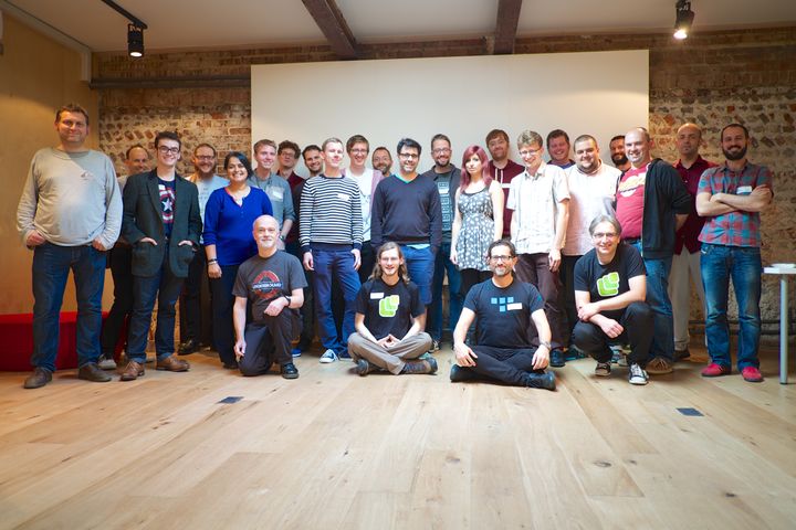
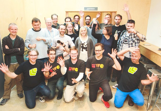
Indie Web Camp UK attendees Indie Web Camp Brighton group photo IndieWebCampBrighton2016

The event will be free to attend, but I’ll set up an official ticket page on Ti.to to keep track of who’s coming. I’ll let you know when that’s up and ready. In the meantime, you can register your interest in attending on the 2019 Indie Webcamp Brighton page on the Indie Web wiki.

Progressing the web

Frances has written up some of the history behind her minting of the term “progressive web app”. She points out that accuracy is secondary to marketing:

I keep seeing folks (developers) getting all smart-ass saying they should have been PW “Sites” not “Apps” but I just want to put on the record that it doesn’t matter. The name isn’t for you and worrying about it is distraction from just building things that work better for everyone. The name is for your boss, for your investor, for your marketeer.

Personally, I think “progressive web app” is a pretty good phrase—two out of three words in it are spot on. I really like the word “progressive”, with its echoes of progressive enhancement. I really, really like the word “web”. But, yeah, I’m one of those smart-asses who points out that the “app” part isn’t great.

That’s not just me being a pedant (or, it’s not only me being a pedant). I’ve seen people who were genuinely put off investigating the technologies behind progressive web apps because of the naming.

Here’s an article with the spot-on title Progressive Web Apps — The Next Step In Responsive Web Design:

Late last week, Smashing Magazine, one of the largest and most influential online publications for web design, posted on Facebook that their website was “now running as a Progressive Web App.”

Honestly, I didn’t think much of it. Progressive Web Apps are for the hardcore web application developers creating the next online cloud-based Photoshop (complicated stuff), right? I scrolled on and went about my day.

And here’s someone feeling the cognitive dissonance of turning a website into a progressive web app, even though that’s exactly the right thing to do:

My personal website is a collection of static HTML files and is also a progressive web app. Transforming it into a progressive web app felt a bit weird in the beginning because it’s not an actual application but I wanted to be one of the cool kids, and PWAs still offer a lot of additional improvements.

Still, it could well be that these are the exceptions and that most people are not being discouraged by the “app” phrasing. I certainly hope that there aren’t more people out there thinking “well, progressive web apps aren’t for me because I’m building a content site.”

In short, the name might not be perfect but it’s pretty damn good.

What I find more troubling is the grouping of unrelated technologies under the “progressive web app” banner. If Google devrel events were anything to go by, you’d be forgiven for thinking that progressive web apps have something to do with AMP or Polymer (they don’t). One of the great things about progressive web apps is that they are agnostic to tech stacks. Still, I totally get why Googlers would want to use the opportunity to point to their other projects.

Far more troubling is the entanglement of the term “progressive web app” with the architectural choice of “single page app”. I’m not the only one who’s worried about this.

Here’s the most egregious example: an article on Hacker Noon called Before You Build a PWA You Need a SPA.

No! Not true! Literally any website can be a progressive web app:

That last step can be tricky if you’re new to service workers, but it’s not unsurmountable. It’s certainly a lot easier than completely rearchitecting your existing website to be a JavaScript-driven single page app.

Alas, I think that many of the initial poster-children for progressive web apps gave the impression that you had to make a completely separate app/site at a different URL. It was like a return to the bad old days of m. sites for mobile. The Washington Post’s progressive web app (currently offline) went so far as to turn away traffic from the “wrong” browsers. This is despite the fact that the very first item in the list of criteria for a progressive web app is:

Responsive: to fit any form factor

Now, I absolutely understand that the immediate priority is to demonstrate that a progressive web app can compete with a native mobile app in terms of features (and trounce it in terms of installation friction). But I’m worried that in our rush to match what native apps can do, we may end up ditching the very features that make the web a universally-accessible medium. Killing URLs simply because native apps don’t have URLs is a classic example of throwing the baby out with the bath water:

Up until now I’ve been a big fan of Progressive Web Apps. I understood them to be combining the best of the web (responsiveness, linkability) with the best of native (installable, connectivity independent). Now I see that balance shifting towards the native end of the scale at the expense of the web’s best features. I’d love to see that balance restored with a little less emphasis on the “Apps” and a little more emphasis on the “Web.” Now that would be progressive.

If the goal of the web is just to compete with native, then we’ve set the bar way too low.

So if you’ve been wary of investing the technologies behind progressive web apps because you’re “just” building a website, please try to see past the name. As Frances says:

It’s marketing, just like HTML5 had very little to do with actual HTML. PWAs are just a bunch of technologies with a zingy-new brandname.

Literally any website can—and should—be a progressive web app. Don’t let anyone tell you otherwise.

I was at an event last year where I heard Chris Heilmann say that you shouldn’t make your blog into a progressive web app. I couldn’t believe what I was hearing. He repeats that message in this video chat:

When somebody, for example, turns their blog into a PWA, I don’t see the point. I don’t want to have that icon on my homepage. This doesn’t make any sense to me.

Excuse me!? Just because you don’t want to have someone’s icon on your home screen, that person shouldn’t be using state-of-the-art technologies!? Excuse my French, but Fuck. That. Shit!

Our imaginations have become so limited by what native mobile apps currently do that we can’t see past merely imitating the status quo like a sad cargo cult.

I don’t want the web to equal native; I want the web to surpass it. I, for one, would prefer a reality where my home screen isn’t filled with the icons of startups and companies that have fulfilled the criteria of the gatekeepers. But a home screen filled with the faces of people who didn’t have to ask anyone’s permission to publish? That’s what I want!

Like Frances says:

Remember, this is for everyone.

Starting out

I had a really enjoyable time at Codebar Brighton last week, not least because Morty came along.

I particularly enjoy teaching people who have zero previous experience of making a web page. There’s something about explaining HTML and CSS from first principles that appeals to me. I especially love it when people ask lots of questions. “What does this element do?”, “Why do some elements have closing tags and others don’t?”, “Why is it textarea and not input type="textarea"?” The answer usually involves me going down a rabbit-hole of web archeology, so I’m in my happy place.

But there’s only so much time at Codebar each week, so it’s nice to be able to point people to other resources that they can peruse at their leisure. It turns out that’s it’s actually kind of tricky to find resources at that level. There are lots of great articles and tutorials out there for professional web developers—Smashing Magazine, A List Apart, CSS Tricks, etc.—but no so much for complete beginners.

Here are some of the resources I’ve found:

  • MarkSheet by Jeremy Thomas is a free HTML and CSS tutorial. It starts with an explanation of the internet, then the World Wide Web, and then web browsers, before diving into HTML syntax. Jeremy is the same guy who recently made CSS Reference.
  • Learn to Code HTML & CSS by Shay Howe is another free online book. You can buy a paper copy too. It’s filled with good, clear explanations.
  • Zero to Hero Coding by Vera Deák is an ongoing series. She’s starting out on her career as a front-end developer, so her perspective is particularly valuable.

If I find any more handy resources, I’ll link to them and tag them with “learning”.

Brighton Homebrew Website Club

I really enjoyed the most recent Indie Web Camp in Brighton. Some of us were discussing at the event how it’s a shame that it only happens once or twice year, considering how much everyone manages to accomplish at each one.

Well, to help keep the momentum going, Charlotte and I are going to start running a Homebrew Website Club meetup here in Brighton. It’ll take place every second Wednesday in the auditorium—or, if that’s not available, the Clearleft office—here at 68 Middle Street from 6:30pm to 7:30pm (although myself and Charlotte will be there from 6pm so feel free to show up early).

There’s no set agenda to these meetups. Simply put, it’s a chance to work on your personal site or side project while in the company of either people doing the same thing. We can help each other out, or just have a chance to chat and compare notes, very much in the spirit of the original Homebrew Computer Club …but applied to your own website.

The first Brighton Homebrew Website Club meetup is on Wednesday, August 12th. It would be lovely to see you there.

Defining the damn thang

Chris recently documented the results from his survey which asked:

Is it useful to distinguish between “web apps” and “web sites”?

His conclusion:

There is just nothing but questions, exemptions, and gray area.

This is something I wrote about a while back:

Like obscenity and brunch, web apps can be described but not defined.

The results of Chris’s poll are telling. The majority of people believe there is a difference between sites and apps …but nobody can agree on what it is. The comments make for interesting reading too. The more people chime in an attempt to define exactly what a “web app” is, the more it proves the point that the the term “web app” isn’t a useful word (in the sense that useful words should have an agreed-upon meaning).

Tyler Sticka makes a good point:

By this definition, web apps are just a subset of websites.

I like that. It avoids the false dichotomy that a product is either a site or an app.

But although it seems that the term “web app” can’t be defined, there are a lot of really smart people who still think it has some value.

I think Cennydd is right. I think the differences exist …but I also think we’re looking for those differences at the wrong scale. Rather than describing an entire product as either a website or an web app, I think it makes much more sense to distinguish between patterns.

Let’s take those two modifiers—behavioural and informational. But let’s apply them at the pattern level.

The “get stuff” sites that Jake describes will have a lot of informational patterns: how best to present a flow of text for reading, for example. Typography, contrast, whitespace; all of those attributes are important for an informational pattern.

The “do stuff” sites will probably have a lot of behavioural patterns: entering information or performing an action. Feedback, animation, speed; these are some of the possible attributes of a behavioural pattern.

But just about every product out there on the web contains a combination of both types of pattern. Like I said:

Is Wikipedia a website up until the point that I start editing an article? Are Twitter and Pinterest websites while I’m browsing through them but then flip into being web apps the moment that I post something?

Now you could make an arbitrary decision that any product with more than 50% informational patterns is a website, and any product with more than 50% behavioural patterns is a web app, but I don’t think that’s very useful.

Take a look at Brad’s collection of responsive patterns. Some of them are clearly informational (tables, images, etc.), while some of them are much more behavioural (carousels, notifications, etc.). But Brad doesn’t divide his collection into two, saying “Here are the patterns for websites” and “Here are the patterns for web apps.” That would be a dumb way to divide up his patterns, and I think it’s an equally dumb way to divide up the whole web.

What I’m getting at here is that, rather than trying to answer the question “what is a web app, anyway?”, I think it’s far more important to answer the other question I posed:

Why?

Why do you want to make that distinction? What benefit do you gain by arbitrarily dividing the entire web into two classes?

I think by making the distinction at the pattern level, that question starts to become a bit easier to answer. One possible answer is to do with the different skills involved.

For example, I know plenty of designers who are really, really good at informational patterns—they can lay out content in a beautiful, clear way. But they are less skilled when it comes to thinking through all the permutations involved in behavioural patterns—the “arrow of time” that’s part of so much interaction design. And vice-versa: a skilled interaction designer isn’t necessarily the best at old-skill knowledge of type, margins, and hierarchy. But both skillsets will be required on an almost every project on the web.

So I do believe there is value in distinguishing between behaviour and information …but I don’t believe there is value in trying to shoehorn entire products into just one of those categories. Making the distinction at the pattern level, though? That I can get behind.

Addendum

Incidentally, some of the respondents to Chris’s poll shared my feeling that the term “web app” was often used from a marketing perspective to make something sound more important and superior:

Perhaps it’s simply fashion. Perhaps “website” just sounds old-fashioned, and “web app” lends your product a more up-to-date, zingy feeling on par with the native apps available from the carefully-curated walled gardens of app stores.

Approaching things from the patterns perspective, I wonder if those same feelings of inferiority and superiority are driving the recent crop of behavioural patterns for informational content: parallaxy, snowfally, animation patterns are being applied on top of traditional informational patterns like hierarchy, measure, and art direction. I’m not sure that the juxtaposition is working that well. Taking the single interaction involved in long-form informational patterns (that interaction would be scrolling) and then using it as a trigger for all kinds of behavioural patterns feels …uncanny.

By any other name

I’m not a fan of false dichotomies. Chief among them on the web is the dichotomy between documents and applications, or more broadly, “websites vs. web apps”:

Remember when we were all publishing documents on the web, but then there was that all-changing event and then we all started making web apps instead? No? Me neither. In fact, I have yet to hear a definition of what exactly constitutes a web app.

I’ve heard plenty of descriptions of web apps; there are many, many facets that could be used to describe a web app …but no hard’n’fast definitions.

One pithy observation is that “a website has an RSS feed; a web app has an API.” I like that. It’s cute. But it’s also entirely inaccurate. And it doesn’t actually help nail down what a web app actually is.

Like obscenity and brunch, web apps can be described but not defined.

I think that Jake gets close by describing sites as either “get stuff” (look stuff up) or “do stuff”. But even that distinction isn’t clear. Many sites morph from one into the other. Is Wikipedia a website up until the point that I start editing an article? Are Twitter and Pinterest websites while I’m browsing through them but then flip into being web apps the moment that I post something?

I think there’s a much more fundamental question here than simply “what’s the difference between a website and a web app?” That more fundamental question is…

Why?

Why do you want to make that distinction? What benefit do you gain by arbitrarily dividing the entire web into two classes?

I think this same fundamental question applies to the usage of the term “HTML5”. That term almost never means the fifth iteration of HTML. Instead it’s used to describe everything from CSS to WebGL. It fails as a descriptive term for the same reason that “web app” does: it fails to communicate the meaning intended by the person using the term. You might say “HTML5” and mean “requires JavaScript to work”, but I might hear “HTML5” and think you mean “has a short doctype.” I think the technical term for a word like this is “buzzword”: a word that is commonly used but without any shared understanding or agreement.

In the case of “web app”, I’m genuinely curious to find out why so many designers, developers, and product owners are so keen to use the label. Perhaps it’s simply fashion. Perhaps “website” just sounds old-fashioned, and “web app” lends your product a more up-to-date, zingy feeling on par with the native apps available from the carefully-curated walled gardens of app stores.

In his recent talk at Port 80, Jack Franklin points to one of the dangers of the web app/site artificial split:

We’re all building sites that people visit, do something, and leave. Differentiating websites vs. web apps is no good to anyone. A lot of people ignore new JavaScript tools, methods or approaches because those are just for “web apps.”

That’s a good point. A lot of tools, frameworks, and libraries pitch themselves as being intended for web apps even though they might be equally useful for good ol’-fashioned websites.

In my experience, there’s an all-too-common reason why designers, developers, and product owners are eager to self-identify as the builders of web apps. It gives them a “get out of jail free” card. All the best practices that they’d apply to websites get thrown by the wayside. Progressive enhancement? Accessibility? Semantic markup? “Oh, we’d love to that, but this is a web app, you see… that just doesn’t apply to us.”

I’m getting pretty fed up with it. I find myself grinding my teeth when I hear the term “web app” used without qualification.

We need a more inclusive term that covers both sites and apps on the web. I propose we use the word “thang.”

“Check out this web thang I’m working on.”

“Have you seen this great web thang?”

“What’s that?” “It’s a web thang.”

Now all I need is for someone to make a browser plugin (along the lines of the cloud-to-moon and cloud-to-butt plugins) to convert every instance of “website” or “web app” to “web thang.”