


How Crunchyroll clarified confusing workflows with Dev Mode

The anime streaming service supports 15 platforms, from the web browser to game consoles, and is available in 12 languages—all of which spell complexity for the design team. Here’s how they deliver a consistent experience across touchpoints.


According to a recent survey by Polygon, 42% of Gen Z watches anime, making it more popular than the NFL with that viewership.
While streaming service Crunchyroll boasts the world’s largest anime library, entertainment isn’t the only goal. With offerings like the Crunchyroll Store and Game Vault, the team aims to give the company’s devoted fandom a sense of identity and belonging. Director of Product Design James Hsu puts it this way: “We don’t want to be something for everyone. We want to be everything for someone.”
Being everything for someone would present a challenge to any company, but it’s a particularly thorny one for Crunchyroll. Part of that is due to the sheer number of platforms that it supports, which includes the web client, mobile apps, and a suite of nine living room experiences—think smart TVs, game consoles, set-top boxes, and Roku. Then there’s the global audience of 15 million diehard fans, the complexity of supporting 12 different languages, and intricacies around licensing and rights holding. James and Staff Product Designer Susan Lin see Crunchyroll’s Universal Design System as the ticket to a consistent user experience at scale, but they’ve inherited legacy processes from different mergers and acquisitions that slow adoption and sow confusion. We sat down with them to talk about how they’re shedding old workflows and charting a path forward.
How do you measure design success?
I have two baseline metrics. One: It looks good, and that means it follows professional design principles. For example, it needs to have proper typographic hierarchy, use a grid system, and have consistent spacing. Two: It works well, which means that the interaction is thought through. It doesn’t have edge cases where you’re stuck in a loop, and the content isn’t written in a confusing way.
Beyond metrics, what value does a design system bring to the table?
Design systems enable professionalism and consistency, allowing us to create a user experience that looks and feels the same no matter which device a user is watching or shopping from.
If the font suddenly changes, or the grids are off, or things look weird on mobile, all of those things add cognitive load to the point where people are put off from subscribing. Design systems cultivate that consistency. The second piece is team efficiency. I like to compare design systems to meal prepping. We don’t have to cook a feast every time we want to release a feature. We can use stuff we’ve already prepared—and if we want more, we can think about that. How much is it going to cost? How much time is it going to take?
I like to compare design systems to meal prepping. We don’t have to cook a feast every time we want to release a feature. We can use stuff we’ve already prepared.
And finally, a design system brings speed to delivery, which is a competitive advantage. Design systems not only benefit designers, but also our product partners who many want to stand up a quick solution to validate one of their ideas. They also make life easier for our engineering partners. There’s a popular phrase in engineering called DRY: Don’t Repeat Yourself. Without a design system, we keep repeating ourselves with redundant components.
How do you think about Crunchyroll’s Universal Design System?
We have a foundational layer and then separate component libraries that live on top per client. We have a ton of complexity. We have one-off components with a lot of variants, and our type system is not really dialed in. There’s a sunk cost fallacy. The thing that I always bring up to people on the team, as well as external partners, is the design system is designed to serve us. We are not supposed to be prisoners of process to this thing that people before us created.
The design system is designed to serve us. We are not supposed to be prisoners of process to this thing that people before us created.
The team has gone through a lot of change, so I think people are in different parts of the design system journey. Some just need some education on how investing time and energy upfront will pay off dividends in the end.
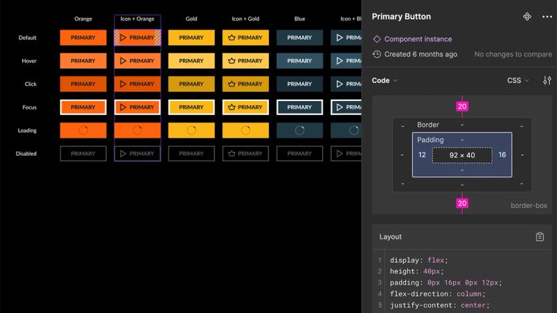
Dev Mode has been helpful for our engineering counterparts to actually get the values we want and find out which component we’re using. As a team, we’re always iterating on our components. We’re excited to integrate Code Connect into our workflow as part of upcoming changes.

Before Dev Mode, how did you keep parity between design and code?
My predecessor had set up a system based on Jira workflow triggers. When a feature with a component change dependency was released, it would automate an alert to the right stakeholders who managed that component. It was super convoluted, and no one had the latest thinking because of time zone dependencies. It manifested in a ton of inconsistencies across our applications.
Documentation existed entirely in Zeplin as its own project called Universal Design System. It was cumbersome. We had one design system per client—one for iOS, one for Android, one for tvOS, one for Android TV. Even managing the roster of people who needed access was convoluted.
I had to get invited, I had to figure out how to navigate the branch and find a specific use case, and compare it to the design from three years ago. With Dev Mode in our new system, it’s a lot easier for someone to just drop in and get the information they need.
With our previous tool, if you wanted to find a specific signup flow for a payment type, you would have to wait four to five minutes for each artboard to load. Then you’d find that it wasn’t the flow you were interested in and continue the hunting and pecking process. That was a pain that migrating over to Dev Mode quickly solved for us; we have much faster parsing.
What did handoff look like?
A designer would put work up for review in Zeplin, and they would tag another designer to do a phase called design QA, or a peer review. Then that reviewer would put it back to “in progress.” So whatever was exported was never truly final; you wouldn’t know unless the component label on the artboard was updated to “ready for development.”
That’s purely legacy. It’s kind of like if you’re an engineer and you push a merge that’s just deleting a bunch of code. That’s a good thing because you’ve cleaned up a bunch of cruft. Similarly, all 20 designers on the team aren’t following the old process anymore.
How did you handle making the switch to Dev Mode?
We had a ton of previous process issues. Keeley Laures, one of the designers on the team, created documentation and onboarding workshops for developers on how to approach handoff and get the specs and code they need.
How has the handoff process changed with Dev Mode?
When we’re ready for handoff, we add a new page with the canvas tidied up and labeled “ready for development.” An engineer gets a Figma link to that specific page and doesn’t have to care about any of the ideation. That has been a big change in the workflow. It loads incredibly quickly, which was a huge pain point. Seat and role assignment has been really easy because anyone who’s an engineer gets a Dev Mode seat.
It’s facilitated alignment a lot faster, too, because if there are any discrepancies in tech feasibility, we can leave comments. Figma has a great feedback loop of pinging you whenever you get mentioned, and then you can have a conversation and come to a resolution. Having it all laid out has been instrumental in making sure that everyone is on the same page about functionality.
Another benefit is that depending on the rapport and level of design collaboration they prefer, developers can see the rest of the work in progress. I’ve had experiences where they’ve been able to come in and make really good suggestions, or point out things I missed while working through a problem so it can be incorporated into the final handoff version.
The team’s favorite plugins include:
- Table to Sticky notes to turn raw user research into movable stickies
- Autoflow to quickly make UX flows alongside delivery files
- Grammarly to work effectively on content, and integrate it into the next generation of their style guide
- Mobbin to streamline competitive analysis
In addition to engineering, we have our product folks come in, and QA relies on Figma to cross-check that things look and work the way they should. I’ve really liked going through all the design systems that are published in the community and taking a look at those for reference, or even looking at new plugins and tools.

Dev Mode makes me think a lot less, and makes my life a lot easier. We have the momentum to move forward with the new generation of tools that’ll make us work more effectively, so we can focus on the user.
Learn more about how Crunchyroll saved 146 hours per project with Dev Mode, or get in touch with our Sales team for tailored guidance.
Jenny Xie is the author of the novel Holding Pattern, a New York Times Editors’ Choice and National Book Award 5 Under 35 honoree. Her writing has also appeared in places like The Atlantic, Esquire, The Washington Post, Architectural Digest, and Dwell, where she was previously the Executive Editor.