Dark Patterns at Scale: Findings from a Crawl of 11K Shopping Websites
Accepted at ACM CSCW 2019
Dark patterns are user interface design choices that benefit an online service by coercing, steering, or deceiving users into making unintended and potentially harmful decisions. We conducted a large-scale study, analyzing ~53K product pages from ~11K shopping websites to characterize and quantify the prevalence of dark patterns.
Read the paper (final version) »Please see the list of revisions here.
Findings
- We discovered 1,818 instances of dark patterns on shopping websites, which together represent 15 types of dark patterns.
- These 1,818 dark patterns were present on 1,254 of the ∼11K shopping websites (∼11.1%) in our data set. Shopping websites that were more popular, according to Alexa rankings, were more likely to feature dark patterns.
- We demonstrate which of the dark patterns that we discovered rely on consumer deception. In total, we uncovered 234 instances of deceptive dark patterns across 183 websites.
- We identify 22 third-party entities that provide shopping websites with the ability to create dark patterns on their sites. Two of these entities openly advertise practices that enable deceptive messages.
Dark pattern categories
Attempting to misrepresent user actions, or delay information that if made available to users, they would likely object to.
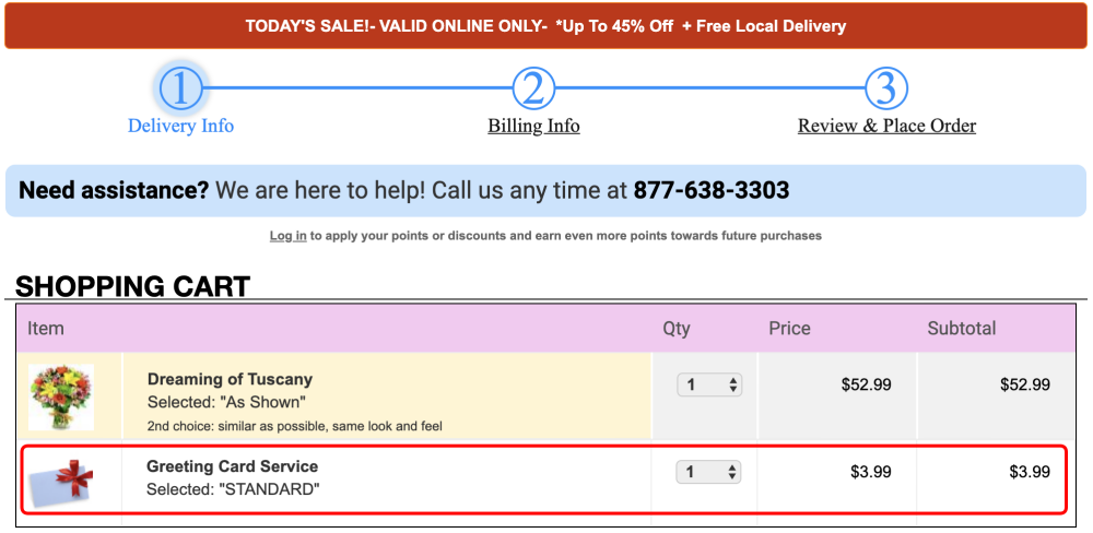
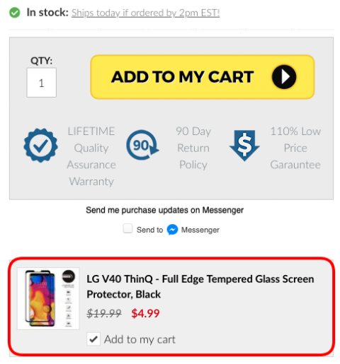
1. Sneak into Basket
Adding additional products to users' shopping carts without their consent.
Prevalence: 7 instances across 7 websites.
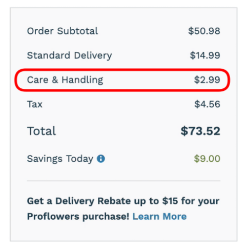
2. Hidden Costs
Revealing previously undisclosed charges to users right before they make a purchase.
Prevalence: 5 instances across 5 websites.
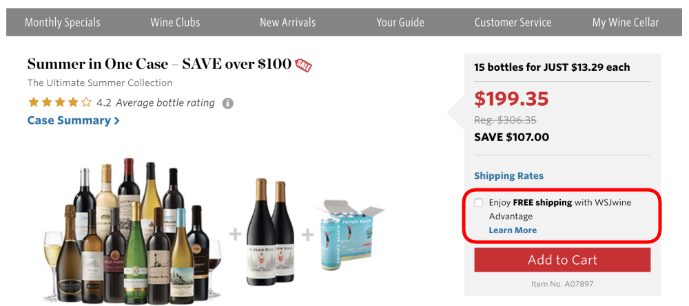
3. Hidden Subscription
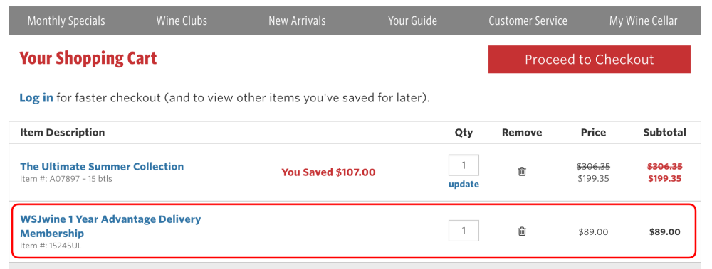
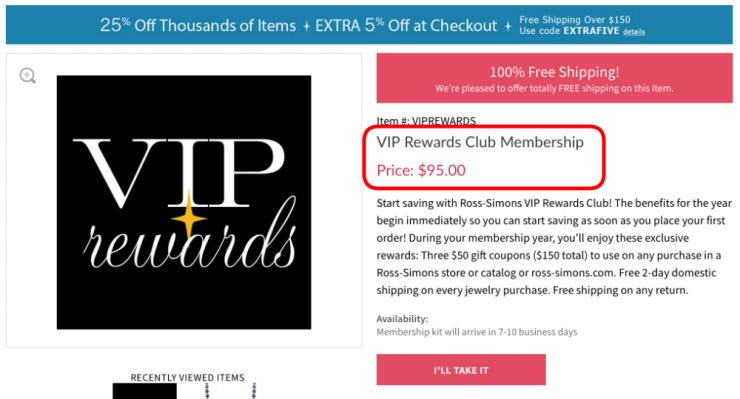
Charging users a recurring fee under the pretense of a one-time fee or a free trial.
Prevalence: 14 instances across 13 websites.

Imposing a deadline on a sale or deal, thereby accelerating user decision-making and purchases.
1. Countdown Timer
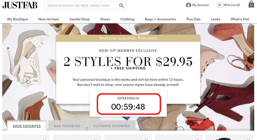
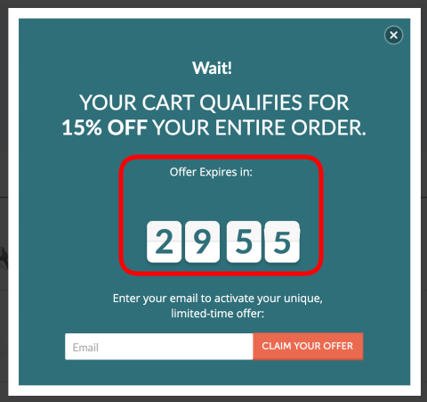
Indicating to users that a deal or discount will expire using a counting-down timer.
Prevalence: 393 instances across 361 websites.
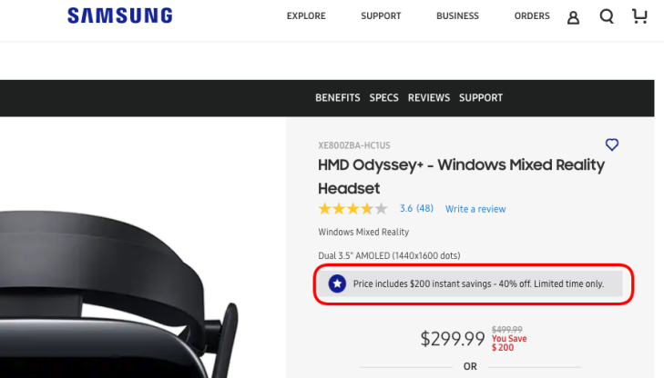
2. Limited-time Message
Indicating to users that a deal or sale will expire will expire soon without specifying a deadline, thus creating uncertainty.
Prevalence: 88 instances across 84 websites.
Using visuals, language, or emotion to steer users toward or away from making a particular choice.
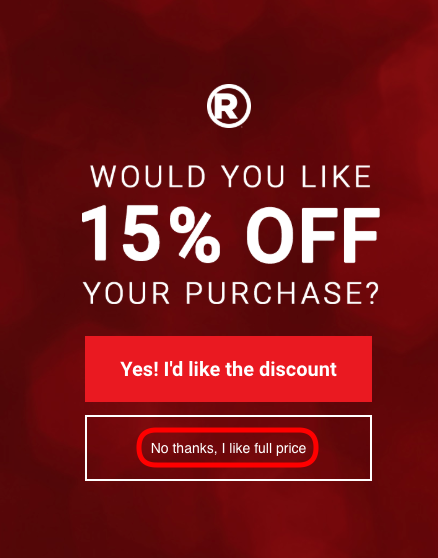
1. Confirmshaming
Using language and emotion (shame) to steer users away from making a certain choice.
Prevalence: 169 instances across 164 websites.
2. Visual Interference
Using style and visual presentation to steer users to or away from certain choices.
Prevalence: 25 instances across 24 websites.
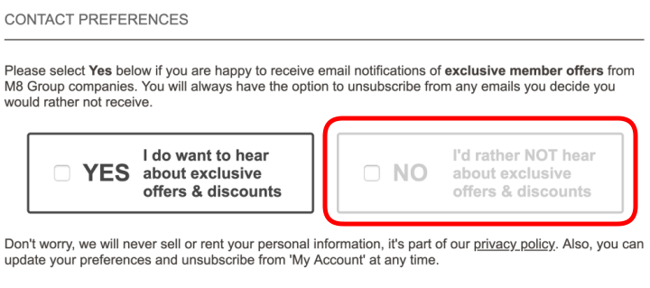
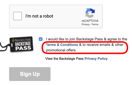
3. Trick Questions
Using confusing language to steer users into making certain choices.
Prevalence: 9 instances across 9 websites.

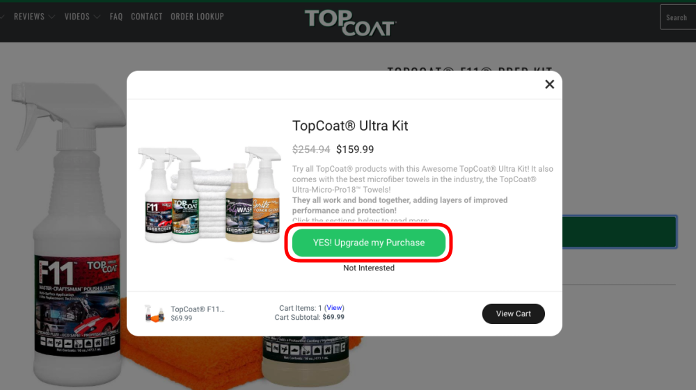
4. Pressured Selling
Pre-selecting more expensive variations of a product, or pressuring the user to accept the more expensive variations of a product and related products.
Prevalence: 67 instances across 62 websites.
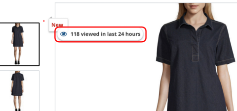
1. Activity Messages
Informing the user about the activity on the website (e.g., purchases, views, visits).
Prevalence: 313 instances across 264 websites.

2. Testimonials of Uncertain Origin
Testimonials on a product page whose origin is unclear.
Prevalence: 12 instances across 12 websites.

Signaling that a product is likely to become unavailable, thereby increasing its desirability to users.
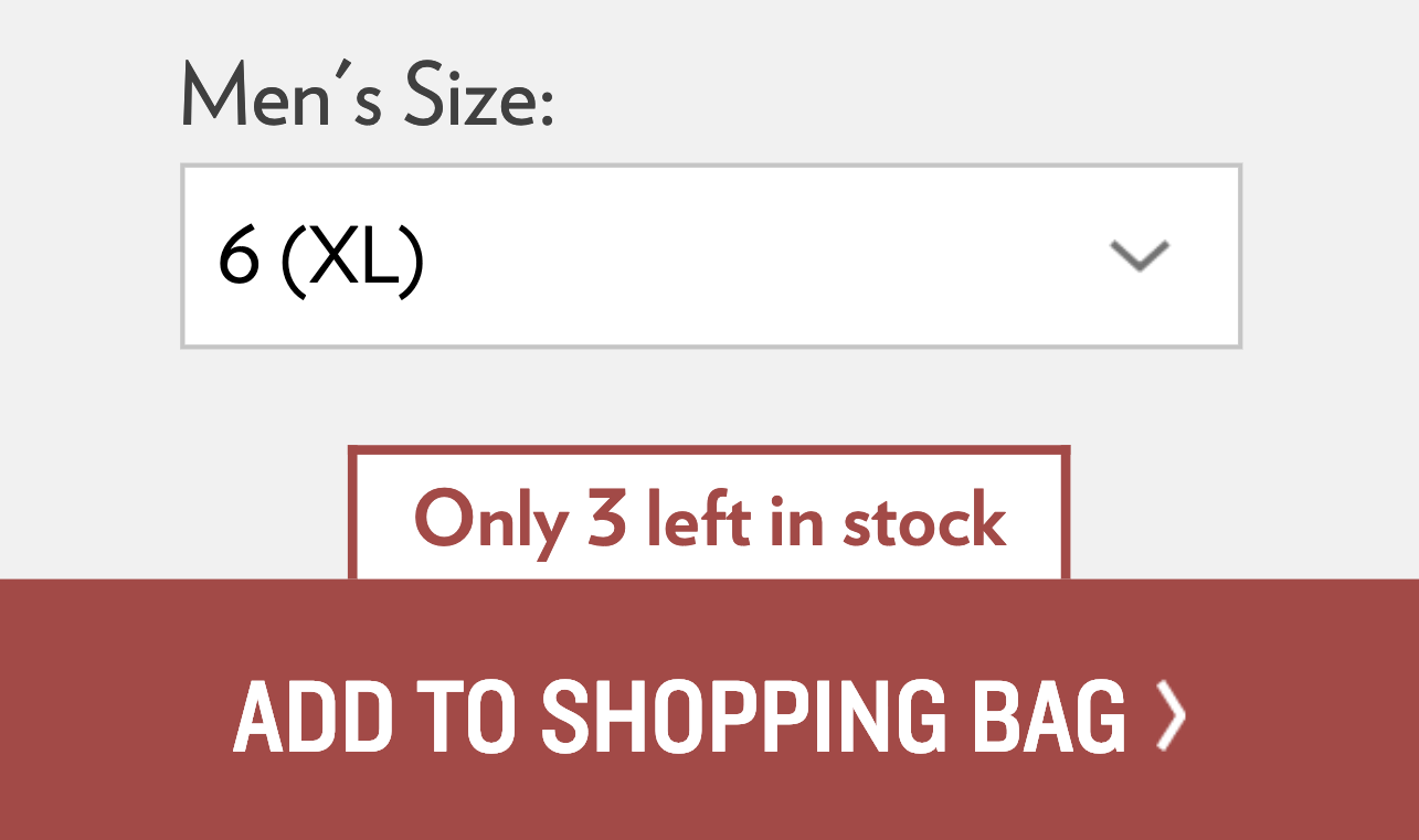
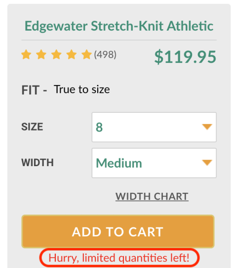
1. Low-stock Message
Indicating to users that limited quantities of a product are available, increasing its desirability.
Prevalence: 632 instances across 581 websites.

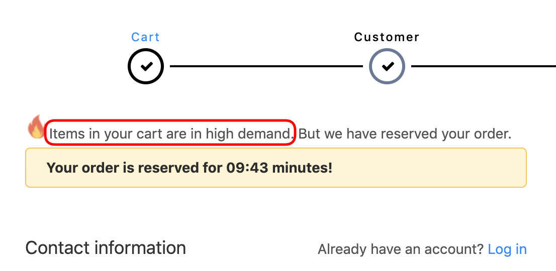
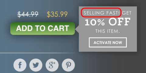
2. High-demand Message
Indicating to users that a product is in high-demand and likely to sell out soon, increasing its desirability
Prevalence: 47 instances across 43 websites.
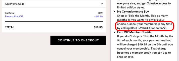
1. Hard to Cancel
Making it easy for the user to sign up for a recurring subscription but cancellation requires emailing or calling customer care.
Prevalence: 31 instances across 31 websites.


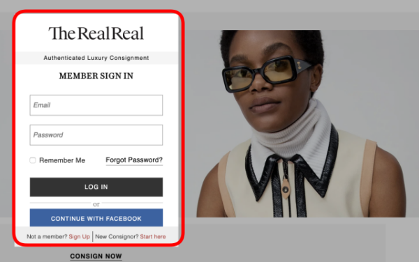
1. Forced Enrollment
Coercing users to create accounts or share their information to complete their tasks.
Prevalence: 6 instances across 6 websites.
Third parties that enable Social Proof Activity Notifications
Prevalence of third parties that enable Social Proof Activity Notifications are given below (based on our data set of 11K shopping websites and Princeton Web Census crawls of home pages of Alexa Top million websites). Where available, we list additional dark patterns the third parties claim to offer.
| Third-party Entity | # Shopping Websites |
# Alexa Top Million |
Additional Dark Patterns |
|---|---|---|---|
| Beeketing | 406 | 4,151 | Pressured Selling, Urgency, Scarcity |
| Dynamic Yield | 114 | 416 | Urgency |
| Yieldify | 111 | 323 | Urgency, Scarcity |
| Fomo | 91 | 663 | -- |
| Fresh Relevance | 86 | 208 | Urgency |
| Insider | 52 | 484 | Scarcity, Urgency |
| Bizzy | 33 | 213 | -- |
| ConvertCart | 31 | 62 | -- |
| Taggstar | 27 | 4 | Scarcity, Urgency |
| Qubit | 25 | 73 | Pressured Selling, Scarcity, Urgency |
| Exponea | 18 | 180 | Urgency, Scarcity |
| Recently | 14 | 66 | -- |
| Proof | 11 | 508 | -- |
| Fera | 11 | 132 | Pressured Selling, Scarcity, Urgency |
| Nice | 10 | 80 | -- |
| Woocommerce Notification | 10 | 61 | -- |
| Bunting | 5 | 17 | Urgency, Scarcity |
| Credibly | 4 | 67 | -- |
| Convertize | 3 | 58 | Scarcity, Urgency |
| LeanConvert | 2 | 0 | -- |
| Boost | 1 | 3 | -- |
| Amasty | 1 | 0 | Pressured Selling, Scarcity, Urgency |


