Most of my multi-page designs are typically created in Adobe InDesign, but for simpler layouts, I sometimes opt for Illustrator. While InDesign offers more advanced tools for managing text styles, the key advantage lies in its use of Master Pages. However, Illustrator also supports threaded text, allowing you to link text areas and have the content flow from one frame to another, along with several useful options and features.
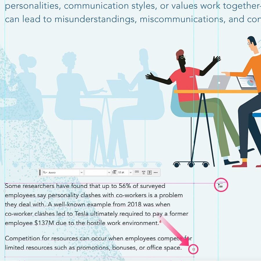
Create a Text Thread
You can link two text frames and have text flow from one frame to another. When your text doesn't fit into your area, you see a little red square with a plus inside at the bottom-right corner of the text frame. To have your text flow from one frame to the other, click into the red plus square. This will give you a loaded pointer. Now click and drag a new text frame anywhere you want it and the text will be loaded into this new frame. You can move, edit, resize these text frames anyway you like. You can even add anchor points and edit the whole path e.g. if the text needs to align around a photo or illustration.
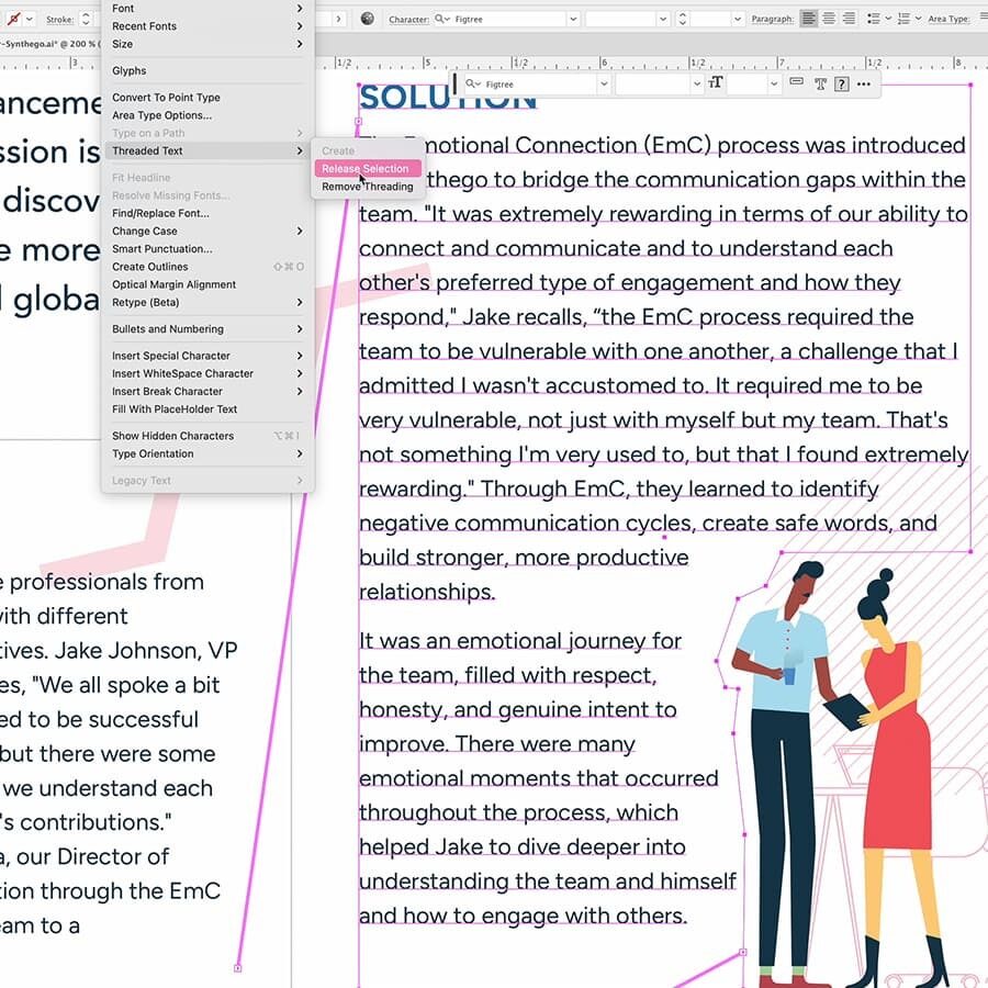
Remove or Break Threads
At times, you may need to make changes to your layout or text that require breaking the thread between two text frames or removing a specific frame from the thread. To remove a frame from the thread, you select it and go to Type > Threaded Text > Release Selection. This will release it from the text thread, and the text will flow into the next object (in the chain). Choose Type > Threaded Text > Remove Threading and all threads will be removed. Or even better, with the Type tool selected just click the first text frame, of the frame from where you want the thread to be broken.
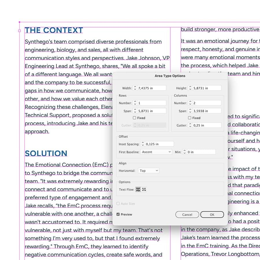
Add Rows and Columns
You can split large paragraphs into rows, columns, or a combination of both to make your text easy to read and visually appealing. Select an area type object, and choose Type > Area Type Options. Here you can set the amount of columns, the size of the gutter... You can even add a margin around your text by adding an inset spacing value.
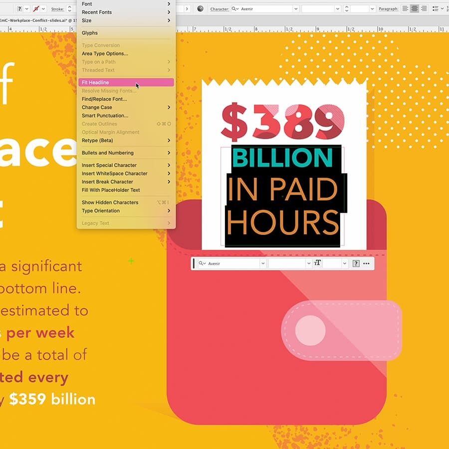
Fit a Headline Across the Width
When adding a paragraph as a headline, you can easily adjust it to fit the width of the text frame by expanding the spacing between each letter. Just use the Type tool to select your text and choose Type > Fit Headline. This will increase the space between the letters to perfectly align within the frame.
]]>Recently I took a trip down memory lane and explored my logo design archives from the ‘90s. I’ve been designing logos since then—almost 30 years ago, before the internet was even a thing. In this article, I’ve gathered some of those early logo designs, along with background information from the client projects I’ve worked on over the past three decades.
Finding inspiration was perhaps more challenging then, but there was also less risk of being influenced by countless existing concepts. Today, we have a vast amount of information at our fingertips, which makes it harder to create something truly original. Now and then I have clients tell me that my design proposal reminds them too much of an existing brand. Every logo needs a unique edge to avoid this issue, which adds this extra layer of complexity to the design process.
Early to Mid Nineties
I launched my freelance business in August 1992 under the name Duoh!. I'm not sure what sparked the nostalgia, but dusting off these old designs made me appreciate the vintage style of some of them and so I wanted to share (a couple of) my logo designs I created over the past 30+ years, starting with the oldest ones from the early and mid nineties:

Some of them are rather timeless and are actually still in use: Elprinta and Omnipack Reyniers still exist today and were designed in the mid nineties. The Neyts fish shop logo was my final graduation project, created during my last year of design school. I even had a little truck model with the logo printed on paper (but color painted myself, since color printing was not really an option back then) and glued to it. The Copa Cabana logo was designed for a dance club, while the Sint-Aubertus logo was for a chain of Belgian bakeries, for which we also created a series of paper bags for different types of bread. The Beluga logo was crafted for a delicacy shop.
The Tunenbel logo was designed for a Belgian export company to Tunis, All Meal delivers flour, and CS2 is a Belgian semiconductor company (the dots were printed in silver on the business card). As for Gowy and De Valck Engineering, I honestly don't remember much 🙈, except that the Gowy logo was a freelance job in 1993 for a local ad agency. The Cornelis logo was designed for my accountant at the time.
Late Nineties to Early Twenties
Then came the Internet! It opened a whole new world for me and I threw myself into learning HTML, and creating websites. However, in the very early days graphics were very limited. It was more a source of information then it was to find inspiration... Somewhere end of 1996 I had my business up and running on the web. Then when the Duoh! website was nominated “Dynamic Site of The Day” by Macromedia (in 1997 I think 🤔) it got some visibility. Later in 2003 I also started my blog.

Some logos designed by Duoh! from the late nineties - early 2000
I can honestly say that the internet saved my business. Before its arrival, there was no way for me to reach a wide audience. The ability to connect with people worldwide was exactly what I needed to find new clients and work. It couldn't have come at a better time because I remember struggling to make a living and being on the verge of giving up freelancing. Most of the logos shown in the image above date back from that period of time. I don't know their exact year but it must be in the range of 1998 til 2008 give or take. Many of them were developed during the dot-com bubble era.

Some more logos designed by Duoh! from the late nineties - early 2000
With a background in print, designing logos has always been one of my specialties. It remains so today, and despite my years of experience, the challenge is as engaging as ever. The process hasn’t become easier or faster; to me, it has always felt a bit like solving a puzzle. There's also a very small element of what might be called 'luck.' On rare occasions, I achieve a surprising result in a relatively short amount of time. It only happened once or twice. Some are just easier than others. There's no set rule for how long a logo design will take.
Unfortunately, a few of them never saw the light of day. Many were dot-com startups that didn’t survive, such as MeowLife, a social network for cat lovers. Other companies or organisations simply don't exist anymore. However a couple still do such as Social Signal, The Perfect Wedding, Bia Creations & Acturent (both with my very old website design), and DISC BV for who I also created the Research Software logo.
Early Twenties until 2015

When viewing these logo designs, especially those in the two images previously to the one here above, you'll notice the influence of the internet on the design style. I've incorporated more colors and effects like gradients. Many of these logos are still in use today, provided the businesses still exist.
2015 Until Today
What’s also striking is the diversity of design styles. While I have an overall preference for sans serif typefaces or creating my own script typefaces, I also tend to favor logo designs that include a distinctive logo mark.

Some logos designed by Duoh! after 2015 until today
Not all of these logo designs are still in use today, and some are more recent than others. Incorporating a logo mark not only enhances recognizability but also ensures the design fits well within a square or circle, which is crucial for social media.

Some logos designed by Duoh! after 2015 until today
In many cases, my logo design work involves redesigning an existing logo. Depending on the job and the client, I might need to start from scratch, but more often, I am tasked with improving the existing logo. This could involve retaining and enhancing certain elements. For instance, with Suikerdraakje (sugar dragon in English), the little dragon had been their mascot for years. My job was to keep the dragon but redraw it. I illustrated it in various poses and angles for use in their website design and other applications.

Suikerdraakje's logo icon, which also serves as the brand's mascot, illustrated in different poses
For the French version of Suikerdraakje, named Dragon Dragées, we also took on the task of designing the logotype. We selected the Kevlar Bold font as the base and transformed some of the letterforms to achieve a more script-like style. Each letter connects seamlessly with the next, with the "s" being custom-crafted to ensure a smooth transition when linked to the "u". The same approach was applied to the letter "s" in the French logotype. However, since it is the final letter in this case, its shape was adjusted differently to suit its position at the end of the word. Furthermore, we also gave the letters “k” and “r” special treatment.

Logo Suikerdraakje with French version Dragon Dragées
Like with any design work, it's hard to estimate the time needed to complete the job. There are always so many variables to factor in when providing an estimate to the client. Sometimes a logo design can take up many design rounds to get it right. Fortunately (at least in my experience), this is more the exception than the rule. The best thing you can do is create as many sketches as possible. One of the last logos I created was for one of my best longterm clients. Knowing the client well is always a very good advantage, but even though that is certainly not enough for a guarantee the project will go smooth and easier than average. The 'type' and 'subject' of the logo plays a very important factor, and so is the name itself. For instance, the characters of the name, and the length is also be a factor. Then there is the briefing: how well do you get briefed? Oh and the decision makers. This can be a very tricky one. For this logo design, I filled about six pages with doodle, and worked out about 6 different concepts in 9 design rounds before arriving at the final logo design. This was actually a record in all these years. We stumbled about 3x on a "oh this has already been done before" and one "oh this looks too similar to..." knowing that I have never seen the logo in question before.
]]>Did you also have fun creating the cityscape or lighthouse illustration? Well, I have good news for you. With summer in full swing, I thought, why not create a beach illustration? Here is another extended tutorial for you. This detailed, step-by-step guide will show you how to create a simple 2D composition featuring a beach ball, an umbrella, a bucket with a shovel, a blue sky with some tiny clouds, and a sandy beach.
General Setup
Below is an image displaying the final illustration along with the Layers panel. Each object is organized into a separate sublayer, arranged in the correct stacking order: the sky and sea at the bottom, followed by the umbrella, beach ball, bucket with shovel, the clouds, and the beach in front. Notice that the beach layer is positioned in front of other objects to allow the beach ball to appear partially buried in the sand.

The final illustration shown in detail with the Layers showing the stacking order of the different objects.
Preparation
Just like before, I decided to give you a little help to get started. I’ve saved a template file that includes the required color Swatches, document dimension, and a horizontal guide to help position the elements of your illustration. There is also a separate swatches ASE file included.
Choosing The Right Color Palette
People often ask how I choose the color palette for my artwork, and it's challenging to provide a straightforward answer. Generally, I select colors intuitively and somewhat randomly, based on what I feel complements the subject or brand. For this illustration, I avoided flashy colors typically associated with the sun, beach, sea, and beach balls. Instead, I opted for a limited, vintage-inspired palette: the blue isn't quite blue, the red is more orange, and the yellow and white have a muted tone.
When lacking inspiration, extracting colors from a photo can be helpful. I usually choose one or two bright colors that contrast well together, along with a light and a dark color. They can be complementary but don't necessarily have to be; they should create a harmonious effect. However, good color choices alone don't guarantee a beautiful design or artwork. The way you apply your color palette is equally important, along with many other factors. This topic could fill a book, but for now, let's not get too sidetracked and move on. 😊
Creating The Beach Ball
We'll go object by object, starting with the beach ball. There are several ways to draw a beach ball, but I chose to keep it very simple.
1. Draw a Circle
Start by drawing a circle of 100 x 100 px. Select the Ellipse tool, click the canvas, and enter 100 as pixel value in both fields. You can also drag a circle with Smart Guides on so you can see the width and height values, while holding down the Shift key, and stop dragging when you have reached a value of 100 pixels. Apply the off-white swatch as fill.

Draw a circle of 100 x 100px using the Ellipse tool.
2. Draw 2 Straight Lines
Add a vertical guide on the center of the circle: drag out from the Rulers. If the Rulers aren’t visible, go to View > Rulers > Show Rulers or hit Cmd/Ctrl + R. Before proceeding to the next step, change the Fill and Stroke swatches at the bottom of the Toolbar. Click the Fill swatch in the Toolbar, and select the No Fill swatch (the one with diagonal red line). Then click the Stroke swatch and choose black.
Now select the Pen tool and draw 3 straight thin black lines as followed: Make sure to start outside the circle, and make 3 clicks in the order and approximate place as shown in the illustration below, with the 2nd click exactly on the vertical guide. After the 3rd click, when you have drawn the first 2 lines (which are connected to each other), hold down the Cmd/Ctrl key and click once on your canvas. This will break the connection for the next click, allowing you to create the last line as a separate object, rather than connecting it to the two lines you've already drawn.

Draw 2 straight black lines onto the circle using the Pen tool.
3. Draw a 3rd Straight Line
Now draw the 3rd line by clicking at the corner point of line 1 and 2 first, and the 2nd click somewhere bottom right outside the circle as shown in the image below.

Draw the 3rd black line onto the circle.
4. Copy Reflect
Select the 3 lines using the Selection tool (black arrow), use the Shift key to select the 3rd line. Go to the Toolbar and choose the Reflect tool (located under the Rotate tool). Click in the intersection point on the vertical guide as shown in the image below, choose Vertical Axis, and hit the Copy button.

Copy and reflect the 3 black lines to the other side of the circle.
5. Make With Warp
Select all the black lines, and go to Object > Envelope Distort > Make with Warp…. In the Warp Options window that appears, choose Arch from the dropdown menu, choose Horizontal, and put the Blend slider to 50%. Check Preview to check out the result. If things look more or less similar as shown in the image below, click OK.

Apply an arch effect to the black lines using Make with Warp
6. Align Lines and Circle
Select the warp object and make it a bit less wide. Move the object down if needed.Ensure that all black lines extend outside the circle and that the object and the circle are horizontally center aligned with each other. If Smart Guides are on you should get visual clues on when the object is perfectly centered, but if in doubt, you can select both objects and choose the Horizontal Align Center option from the Control bar at the top (Window > Control) or via the Properties panel.

Align the lines on the circle and expand the arch effect.
7. Expand
Select the warp object and go to Object > Expand… In the Expand window leave the settings as is (Object and Fill are selected) and click OK.
8. Divide
Select both the circle and the lines, go to the Pathfinder panel and select the Divide option. This will divide the circle into sections, allowing each part to be colored appropriately.

Divide the circle into separate path segments
9. Apply Colors
The object is now grouped. To select part by part to apply a color, we need to double click the object first. This takes us into Isolation mode. Notice the grey bar at the top of your document. Normally, all other objects would be faded out, but since we only created this one, you won't see this effect. Now you can select each section individually and apply the appropriate color fill. See the image below for guidance.

Add the colors to the beach ball.
10. Rotate The Beach Ball 45º
The only thing left to do is to rotate the beach ball 45°. To do this, go out of Isolation mode first. You can do this by clicking the arrow button at the top, or by simply hitting the Escape key. Select the beach ball using the Selection tool (black arrow). Hover your cursor over one of the object's corners until it changes into rotation arrows. Then, start dragging to the right to rotate the object, and hold down the Shift key to snap the rotation to exactly 45° (see image below). Release the mouse. Lastly move the beach ball into position, so the bottom anchor touches the horizontal guide, then use the down arrow key on your keyboard twice to move the ball a little bit more down.

Rotate the beach ball into position, and name and organise the layers.
11. Organize
Next step: name & organize your layers. It’s important to keep your file clean so you can save time in a later stage in case your illustration becomes complex. It might feel ridiculous to do this at this stage and for such a simple illustration as this. It's of course up to you to decide if this is valuable. Click the triangle next to the layer name in the Layers panel, double click in the text field of the object, and rename it to beach ball.
The Bucket & Shovel
1. Draw a Square
Select the Rectangle tool and draw a square of 50 x 50 px. Apply the lightest teal fill. Move the square to the left of the beach ball, and into position so the bottom anchor points touch the horizontal guide.

Draw the body part of the bucket.
2. Draw a Rectangle
Draw a slightly wider rectangle above the square, ensuring that its bottom edge aligns with the top edge of the square. You'll notice a visual cue—a green line will appear, indicating the alignment. Once aligned, apply the slightly darker teal fill to the rectangle. Select both the square and the rectangle, and choose the Vertical Align Center option from the Options bar.

Draw the top part of the bucket.
3. Move Bottom Anchor Points Inwards
Select the Direct Selection tool (white arrow), and select the left bottom anchor point of the square and the rectangle. Hit the right arrow key twice. Now select the right bottom anchor point of the square and the rectangle, and hit the left arrow key twice.

Finalise the body of the bucket.
4. Draw a Tiny Circle
Select the Ellipse tool, and draw a small circle (7 x 7 px) in the center of the rectangle. Since this is a small circle make sure to zoom in a little bit first. Draw this circle from the center out. To do this, first hover with your cursor over the center point to find it. You should see the word ‘center’ in small (magenta) colored type. Hold down the Option/Alt key first, click and start to drag, then hold down the Shift key as well. When you’ve reached the size, release the keys first, then the mouse. If this seems hard to do you can select both the rectangle and the circle, and use the align tools to center align them both vertically and horizontally. Then select the circle, rectangle and square, and align all 3 objects vertically.
5. Apply Fill
Apply the light teal fill to the small circle, and change the fill opacity blending mode to Multiply, to darken it al little bit.

Apply the proper fill to the start of the bucket handle.
6. Draw The Bucket Handle
Select the Line tool and draw a diagonal line starting from the center point of the small circle. While drawing (by click dragging) the line, hold down the Shift key to draw a perfect diagonal line.

Draw the bucket handle using the Line tool.
7. Apply Stroke Color, Weight and Style
Apply the darkest teal as stroke color, and select the value of 3 pt from the Weight dropdown. Then also choose the Round Cap option. Select all bucket shapes and hit Cmd/Ctrl + g to group the object.

Finalise the bucket handle.
8. Draw The Stem of The Shovel
Draw a short vertical line (see image below), and apply a Weight of 7 pt tick. Give it the orange color, and make sure the line has a Straight cap.

Draw the stem of the shovel.
9. Draw The Shovel Handle
Select the Rectangle tool and draw a small horizontal rectangle right above the vertical line (see image below) for the handle of the shovel, using the same stroke width and color as the stroke. Select both objects and choose Vertically Center Align from the Options bar at the top or from the Properties panel.

Draw the shovel handle using the Rectangle tool and rounded corner feature.
10. Apply Rounded Corners
Select the Direct Selection tool (white arrow), and select the 2 bottom anchor points of the rectangle. 2 small circles should appear. Click into one of them and start dragging inwards to the end so the bottom part becomes fully rounded.
11. Organize Layers
Select both objects and group them together (Cmd/Ctrl + g). Go to the Layers panel and name your sublayers (see image below): drag the ’shovel’ layer into position. Move it under the ’bucket’ layer.

Move the shovel layer below the bucket
12. Rotate The Shovel
Select the shovel and move it into place as shown in the image below. Rotate it a little to the left, just as you learned before using the Selection tool, but this time you don’t need to hold down the Shift key since you only need to rotate a few degrees to the left.

Finalise the shovel & bucket.
13. Move Shovel & Bucket Into Place
Select both the bucket and the shovel and move them into position as shown in the image above.
The Umbrella
1. Draw a Red Circle
Select the Ellipse tool and draw a circle of about 200 x 200 px size. Give the circle the orange fill.

Create the base shape of the rain cover of the umbrella.
2. Draw a Rectangle
Select the Rectangle tool and draw a rectangle on top covering about 2/3 of the circle, as shown in the image below. Make sure the rectangle is also wider than the circle.
3. Minus Front
Select both objects, go to the Pathfinder or Properties panel and choose Minus Front from the Shape Modes.

Finalise the base of the rain cover and other part of the umbrella.
4. Draw a Line
Select the Line tool, and draw a vertical line right in the center of the shape (the vertical green line that appears in the center should be your visual clue). Draw the line from top to bottom while holding down the Shift key to keep the line perfectly vertical (see image above).
5. Apply Stroke Color
Apply 12 pt as Weight, and give it the dark teal swatch color stroke. In the Appearance panel select Multiply as blending mode at 50% Opacity.

Add the stroke color and the 1st arch to start dividing the rain cover.
6. Draw Arches
Double click the Arch tool. In the Options window that appears, set the Base Along to the Y-Axis. Next make sure your fill swatch is set to no fill, and your stroke swatch is set to black (or any other color, it doesn’t matter really). Now draw the 1st arch starting from the top center point of the umbrella going towards the left side. Just click drag like you draw a line. Make sure the arch goes a bit further below the orange part (see image below).
7. Draw The Other Arches
Now draw a 2nd arch to the right of the 1st arch, again starting from the top center point of the umbrella as shown in the image below.

Create the other arches on the rain cover of the umbrella.
8. Copy Reflect
Select both arches, and select the Reflect tool. Click exactly on the path of the vertical teal stroke. In the Reflect window that appears, select Vertical as Axis. Check the Preview option to see what will happen. Hit the Copy button to copy the arches.
9. Divide
Just like we did for the beach ball, we will cut the umbrella into segments so we can apply a color to each segment. Select the arches and the orange shape. Go to the Pathfinder or Properties panel and select the Divide option.

Divide the rain cover of the umbrella into separate path segments.
10. Add Color
As with the beach ball, the divided segments are now grouped into a single object. Double-click it to enter Isolation Mode, allowing you to apply a different color to each segment. Give the 2nd and 4th part the off-white color. Hit the Escape key to leave Isolation Mode.

Add color to the rain cover of the umbrella.
11. Organize
Group the umbrella objects together (Cmd/Ctrl + g), and give the sublayer a name (’umbrella’). Move the sublayer into place, below the beach ball.

Organise the layers and rotate the umbrella.
12. Create Composition
Create a perfect composition by rotating the umbrella 45° to the right. Hold down the Shift key while rotating.
13. Move Into Place
Move the umbrella into the right position as shown in the image below.

Move the umbrella into position for a perfect composition.
Complete The Beach Scene
1. Create The Beach
Select the Rectangle tool and draw a yellow sandy rectangle below the horizontal guide on top of the 3 objects (so the bottom of the beach ball is slightly hidden).

Create the beach using the Rectangle tool.
2. Create The Sky
With the Rectangle tool still selected, draw a light blue rectangle above the beach.

Create the sky by using the Rectangle tool.
3. Organize The Layers
Organise your layers again by naming the object's name and by moving them into place in the Layers panel. The sky should be moved down below all other layers.

Organize the layers.
4. Create a Cloud
Next we’ll create some clouds. Select the Ellipse tool and draw a couple of slightly overlapping circles next to each other that resembles the shape of a cloud as shown in the image below. You can use a white fill for each circle. Ensure they overlap slightly and are roughly aligned at the bottom..

Draw a cloud using the Ellipse and line tool.
5. Draw a Line
Select the line tool, ensuring the fill swatch in the toolbar is set to 'no fill' and the stroke swatch is set to a color. Now draw a horizontal line on top of the circles (hold down the Shift key). Make sure the line doesn’t touch the blue sky as it crosses the circles, and make it wider than the circles.
6. Divide
Select the circles and the line and choose Pathfinder > Divide just like before.

Divide the circles.
7. Remove Unnecessary Parts
Select the Shapebuilder tool from the toolbar, and remove the unnecessary parts by clicking the shapes one by one while holding down the Alt/Option key. A minus should appear in your cursor as shown in the image below.

Remove the unnecessary parts of the cloud.
8. Unite
With the object still selected Go to Pathfinder > Unite.

Unite all shapes to complete the cloud.
9. Clean Up The Path
This step is optional, but I’m meticulous about clean paths and dislike unnecessary anchor points. If you agree, you can clean up the cloud path by removing any unnecessary anchor points you find. Select the Delete Anchor Point tool from the toolbar and click in the anchor points that should be removed.

Clean up the anchor points if needed.
10. Add More Clouds
To add a couple of more clouds, repeat the steps to create a cloud, or copy reflect and resize the one you’ve created. When you are ready, select all the clouds and apply the off-white color swatch as fill, but only for 50%, by moving the slider in the Color panel to 50% (see image above).

Complete the sky by adding a few more clouds.
11. Create The Sea
Last but not least, we’ll create the sea in the very distance. Select the Rectangle tool and draw another rectangle. Give it the light teal color at 75% (move the color swatch slider 75%). Give the object the name ’sea’ in the Layers panel and move the sublayer into place right above the ’sky’ layer.

Create the sea using the Rectangle tool.
Finishing Touch
12. Add pattern effect
Your illustration is finished, but you could also decide to add a subtle vector pattern that lays on top of your illustration. By default, Adobe Illustrator offers some nice subtle patterns that you can apply to your artwork. In this illustration I’ve used the pattern ’USGS 22 Gravel Beach’. You can find this pattern by going to the Swatches panel and selecting the Options dropdown menu (the arrow icon at the top right of the panel). In this dropdown choose Open Swatch Library > Patterns > Basic Graphics > Basic Graphics_Textures.

To quickly add a simple pattern effect on your illustration, you can draw a rectangle on top that covers your entire illustration, and give it a pattern fill like ’USGS 22 Gravel Beach’. Then in the Appearance panel you can change the blending mode of the fill to Overlay. You can also play with the Opacity value.
All vector-based
The beauty of these subtly patterns is that they are all vector-based. If you scale your image up to 500% everything will still look crystal sharp. You can also decide to apply different patterns to certain objects, by applying a 2nd fill on top of the color fill. You can also resize the patterns using the Scale tool (and by double clicking the tool to evoke the Scale options window), and by only checking the option Transform Patterns. This way the pattern is resized but not the object itself. The possibilities are endless.
That’s it! I hope you’ve enjoyed this tutorial.
Enjoy the Summer!
]]>I recently designed a document layout for a client that included a lengthy checklist form requiring users to respond with either 'yes' or 'no'. Upon completion, the users receive a result based on the total number of 'yes' responses, with each 'yes' counted as one point. Depending on this total, users were provided with a specific conclusion. I achieved this by combining Adobe InDesign with Acrobat.
Add Form Elements
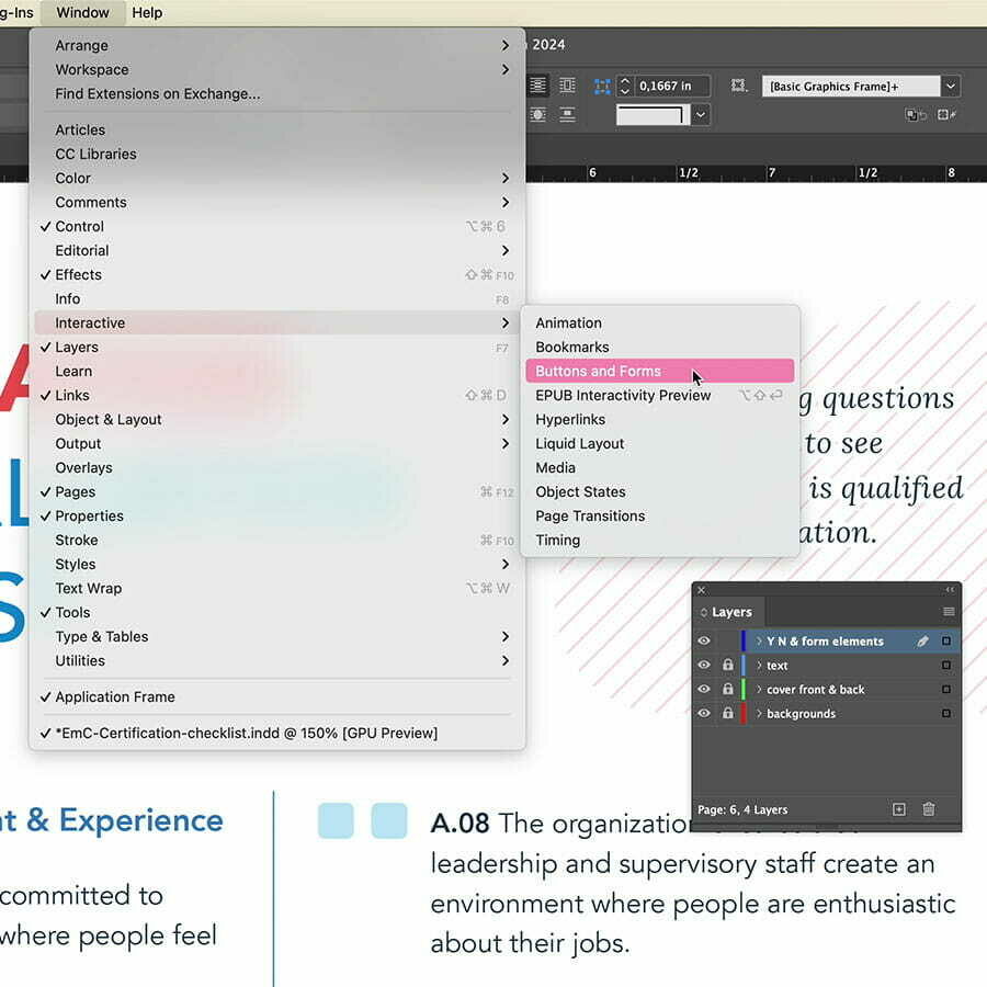
While the document is titled with the term 'checklist', I opted not to use checkboxes since users can only respond with 'yes' or 'no'. Instead, I utilized radio buttons for their responses. After finalizing the layout and locking the layers, I began incorporating the form elements. To add form elements, you go to Window > Interactive > Buttons and Forms. First you need to place a frame at the location where you want to place a form field. In my case I added a small square at the location of the 1st radio button. With the frame selected, I chose Radio Button from the Type dropdown in the Buttons and Forms panel.
Prepare the Form
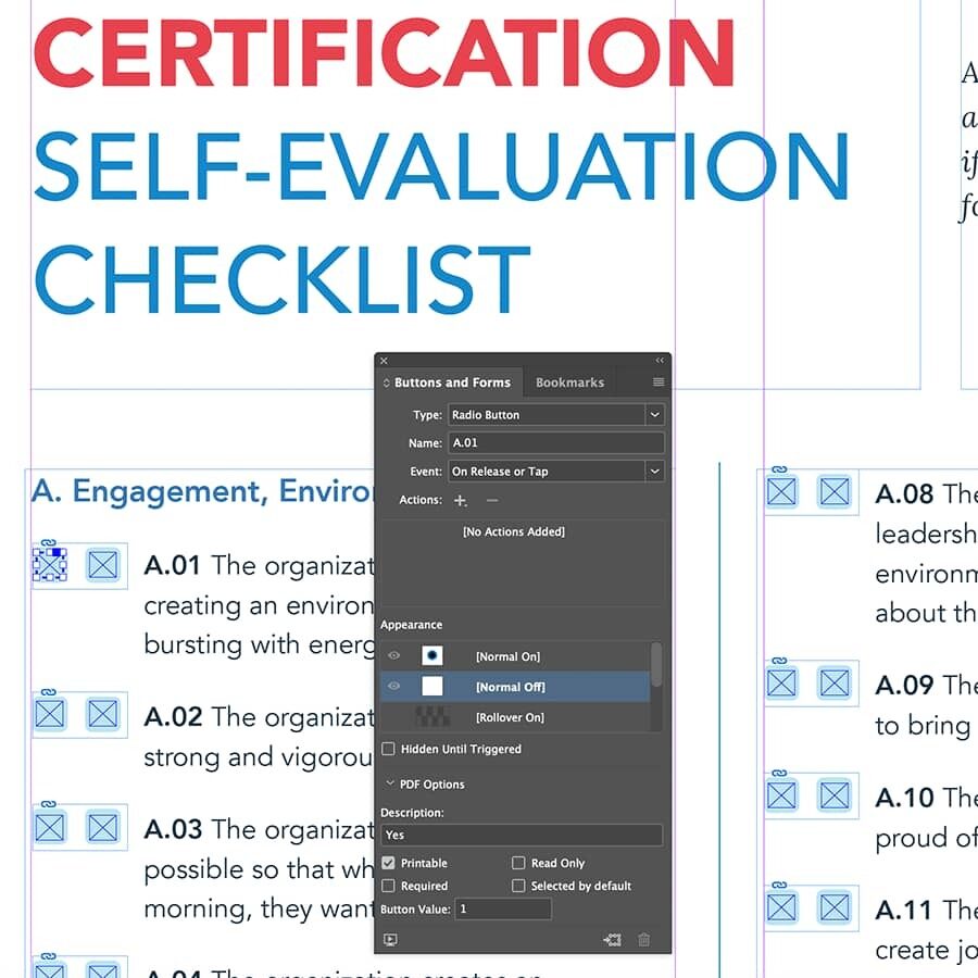
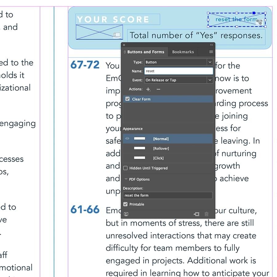
Alternatively, you can also right-click a frame and choose Interactive > Convert to.... Next, I entered a name, which in my case is the question number A.01. Then I chose OnRelease or Tap as Event, I entered Yes as Description and 1 as Value. Then I duplicated this radio button frame to the 'No' answer location and adjusted the Description to No and the Value to 0. After this I duplicated both radio buttons over and over again while constantly adjusting the name to the corresponding question. On the last page I added a Reset button, so users can reset the form if needed. Lastly I added a Text field frame for the total score.
Export to Interactive PDF
As far as I'm aware, the action to calculate the score for this field can only be implemented in Acrobat. Therefore, each time the document is edited, this part needs to be redone, which is unfortunate. After exporting the document to an Interactive PDF, I opened it in Adobe Acrobat to add the calculation action to the score form field. Upon selecting Prepare Form under the Tools menu in the left sidebar, all the form fields are listed on the right side of the document.
Finalize in Acrobat
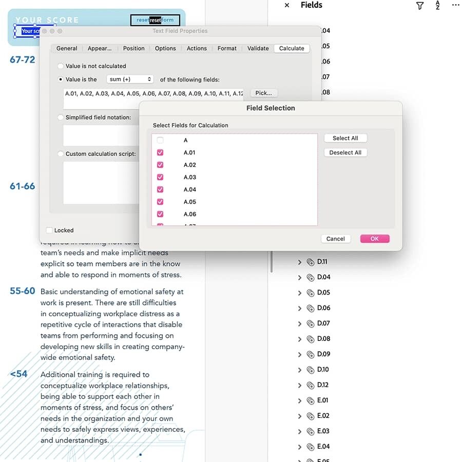
Upon double-clicking the score field, I defined the font, size, and other visual options in the appearing window. Additionally, under the Calculation tab button, I entered my sum calculation. Here, I selected 'Value is the sum (+) of the following fields' and clicked the Pick button to select all the radio button fields. Initially, I hit the Select All option and then deselected the fields that needed to be excluded. This step is crucial because initially, I wasn't aware that the score field itself, the reset button, and a few other fields (A, B, C, and D) apparently added by either InDesign or Acrobat were interfering with my calculation. Finally, all that remained was to save the document and test it.
]]>Just a while ago a website project went live that I have designed and fully coded myself, using Craft CMS. Now with version 5 and its new features, the process has undoubtedly become more streamlined than ever before.
As you all know graphic design is my true passion, but I love the thrill and process that goes into transforming that design into a real working website, going all the way from front-end CSS/HTML markup to back-end CMS integration with Craft CMS. The journey of this project, after design completion to CMS implementation, presented a learning curve. There were moments of stumbling or discovering more efficient methods, yet it's through these mistakes that true learning occurs.

Top part of the Huzaar homepage
The Local Set Up using DDEV
As I mentioned before, this project was a bit of a challenge for me, also because it's been a while since I delved into these kind of technical intricacies, particularly at the macOS Terminal level. You see, in the past, I typically set up PHP-driven sites locally on my Mac using MAMP Pro. However, this time around, I've opted for DDEV, utilizing Docker containers via orbStack. For someone with a design background like myself, this represents a significant leap, but the advantage lies in running PHP within a contained environment, mitigating the risk of causing any significant damage if I make mistakes. If something goes awry, I can simply discard the container and start anew. Just in case you’re wondering, yes I had to start from scratch a couple of times. That was only during this setup phase, primarily due to the lack of easily accessible guidance tailored to designers like me who may struggle with developer jargon. Tutorials also usually just start with “I have already DDEV installed....” and directly move on to the next step, which seems to me like explaining this part of the process is really not worth the effort. Guess it’s ’no biggie’ for developers 😁
Nevertheless, I made it that far, and so I decided to fully integrate my workflow with GitHub as well, which I also haven’t really used before. While I have the GitHub desktop app installed, I find it convenient to perform stage, commit, and push commands directly within Nova. As far as running Craft, the only Terminal commands I need are 'ddev start' when initiating work on the project and 'ddev stop' upon completion. Additionally, I've also installed Craft’s first-party plugin for rich text fields, CKEditor, using a Composer command in Terminal which you can simply copy & paste from the Craft Plugin Store.
Why I Choose Craft CMS
Let's focus back on Craft, the CMS both this site and my business site runs on (for +12 years). You might wonder why I prefer to stick with Craft. Apart from my close relationship with its founder and creator, as well as my design work to Pixel & Tonic, Craft CMS stands out to me as the most robust, reliable and flexible platform out there. On top of that, it has a very user-friendly interface, and there is also a great community. Moreover, Craft gives me full control over the HTML markup complemented by Craft's Twig templating system. There are many ways you can build your site. Unlike many other platforms out there, Craft does not dictate how you should build your site.
Craft gives me full control over the HTML markup complemented by Craft's Twig templating system. Unlike many other platforms out there, Craft does not dictate how you should build your site.
When I started this project, Craft 5 was still in its early beta phase. At that time I was unsure if I should choose version 4 still, or go with version 5 already. Ultimately, I opted for version 5 due to all the new features that I knew I would miss out on with version 4. Choosing version 5 initially meant I wouldn't need to overhaul substantial parts of my work later to benefit from its improvements and innovations. Thankfully, I had the flexibility to extend the project timeline slightly, enabling me to synchronize the project's completion with the forthcoming official release of Craft 5.
Craft 5
Below is a preview that my client will see when editing the 'Over ons' (About) page. I'm not sure if you notice it, but in my perspective, the seamless updating of the site elevates its appeal, turning what could be perceived as a challenge into a welcoming experience.

A preview of the Craft 5 control panel editing the 'Over ons' page of the Huzaar website
Craft 5 enhances the updating process, offering a plethora of customizable settings, such as collapsing the sidebar or hiding the right side, making updates a breeze. With Craft 5, accessing deeper content through slide-out panels ensures quicker and smoother navigation, expediting various tasks.

A preview of the Craft 5 control panel while editing a matrix field entry of the Huzaar website
Longform Content
One of the new features I really like is the ability to nest entries in Craft's first-party rich text field plug-in named CKEditor. Using this feature allows you to generate longform content, providing clients with a user-friendly environment akin to Microsoft Word, all while ensuring there's no clutter of unnecessary HTML code being output. So as a developer, you retain complete control over the HTML markup output.
{{ entry.longformContent }}It also provides an easier way towards template coding. You only have to deal with this longform tag in combination with partials containing the different pieces that you want this form to output, as you can view from my template code in the image below:

A preview of some of my template coding for Craft 5 using the Longform Content field with Partials
Reusing Fields as Instances
Craft 5 simplifies the process of defining your content using custom fields. These fields are automatically categorized and distinguished by icons, allowing you to easily identify their usage. What's particularly appealing is the ability to reuse fields as different instances. This reduces the amount of fields enormously and simplifies things a lot which obviously impacts overal performance as well.

A preview of the Craft 5 control panel while editing a field instance.
Refined UI
The new refined UI of the control panel is definitely a job well-done. One of the really cool touches is the option to show entries as (colored) cards, and my top favorite, the all in one combined slide-outs workflow, which drastically speeds up the process. To me it is also a great improvement in finding my way 😃 Another aspect I appreciate about Craft is its page preview feature. This is not a new feature, but it's certainly noteworthy. This operates flawlessly, instilling confidence prior to publishing a page on the site. Additionally, Craft offers full control over saving drafts, managing different versions, authors, scheduling online/offline status, adjusting the slug (URI part), and more.

A preview of the Craft 5 control panel previewing the edited 'Over ons' page of the Huzaar website
Future Updates
I've decided to keep a bit of a log of the steps I took to put the site live or other steps to take when there are Craft updates etc. so that I have some kind of roadmap to turn to for future projects. Especially since the setup part of a PHP based site running Craft 5 locally on my computer was a bit of a hurdle. If I look back at the whole process, this might actually be the hardest part. As for putting the site live and small updates, I had the great help from Pixel & Tonic’s CTO Brad Bell, who wrote a complete GitHub workflow CI action script. That script contains a trigger which automatically deploys my GitHub push commands directly onto the host (at Arcustech). This script works with a couple of so called ‘secret fields’ that holds the ‘secret’ data –hence its name– such as the host, login and passwords. However, for extra security the content of these fields on GitHub are empty or invisible (achieved via a specific setting). The clever thing about this powerful script lies in its versatility for future endeavors. With just a tweak of the secret fields tailored to each project, I'll be ready to roll. This streamlines the maintenance and updates of the site, making it effortlessly manageable. I'm truly thankful for having this in my toolkit. 🙏
]]>Begin of this year I was offered the opportunity to design a brand new website for Huzaar, a new (Belgian) company founded from the merger between SLV Rent and Bitstream. Both companies have been working closely together over the past few years. Huzaar is a high-level creative agency and full production house, and a true anchor in the event sector here in Belgium.
The logo was already designed, yet some fine-tuning was needed for the color scheme and how the logo and icon were applied across certain applications. It didn't quite meet my client's exact preferences. Following a brief discussion, we settled on this revised color palette:
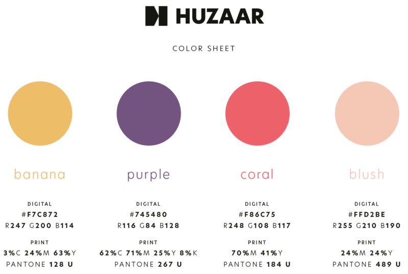
Huzaar color palette, showing banana, purple, coral and blush with color values
Selecting colors is one thing, but achieving harmony in their application is something else. The true challenge arises when you begin the actual design process. In a subsequent stage of the process, I opted to incorporate two additional hues: a soft blue and a gentle green. The soft blue had already been introduced in a design for a giveaway box with postcard sent by my client to their top customers, as part of the announcement and celebration of the launch.
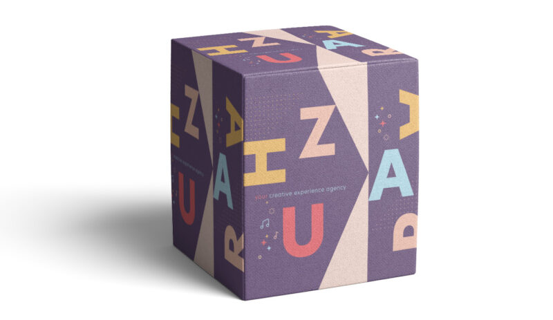
A give away box from Huzaar to announce the launch
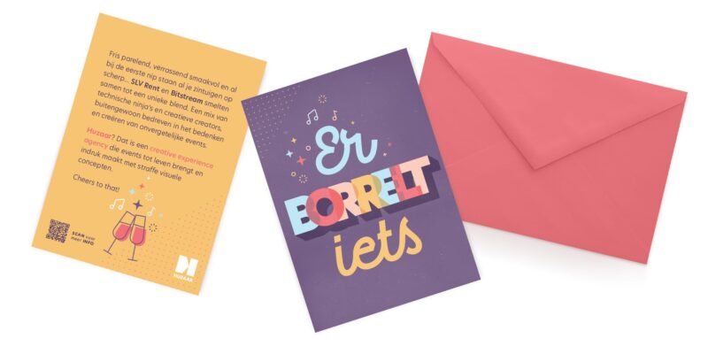
A postcard from Huzaar that came along with the giveaway box.
Apart from the color palette, New Hero was chosen as the main typeface, the same typeface used for the logo. Once these two factors were defined, it was up to me to create the site’s design based on a quick brief about the sections and the vibe of the site should convey.
Design in Figma
From Adobe XD to Figma
For me the choice was obvious to use Figma for the design of the site in combination with illustrator for certain graphical elements. Luckily I could easily copy and paste icons, or other graphical objects from Illustrator directly into Figma. This was really a big plus for me. I’ve quickly became accustomed to Figma after having used Adobe XD for such a long time. I preferred prototyping in XD way more though, but I can’t deny Figma's advantages. My first experience involved collaborating with a team located at the other side of the globe. I was amazed by the ability to track each other's cursor movements, which undoubtedly enhanced efficiency in working with developers and other team members.
What bothers me most about Figma is the confusion surrounding how projects, pages, or documents function. Even with just a handful of projects in Figma, I often struggle to navigate smoothly in this application. That's why I've stuck to the free plan for now; however, I anticipate eventually upgrading to a paid plan. Yet, deciding which plan suits me best seems like a daunting task, as I've gathered from the experiences of other users.
Basic Set Up
For small projects like this website I don’t bother much in using Components and such, especially not during the initial phase when I'm sketching out the first draft of the homepage design. The only step I took was incorporating the brand colors into the Library for quick access and to ensure I was applying the correct color values. In a subsequent phase, I also introduced a few text styles and several components like the top bar, footer, a CTA button, and a quote—elements I anticipated reusing later on.
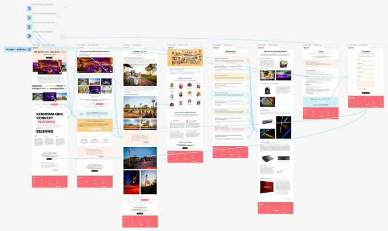
Huzaar website design in Figma, showing the page designs in prototype view
As for the topbar I incorporated hover effects for each menu button link. For my design, the only necessary change was the font color. Reflecting on it now, I realize I didn't set this up in the most efficient manner. I created a separate top bar state version for each link, where I manually adjusted the text color for each item. While this was easy to accomplish in Adobe XD, I struggled with it in Figma at the time. With a looming deadline, I didn't take any time for some research. If I were to tackle this again, I would have created a Component for a single link, utilizing the Auto-layout feature, and then generated a second instance for the hover state. This way, I could have reused the Component for the other navigation links.
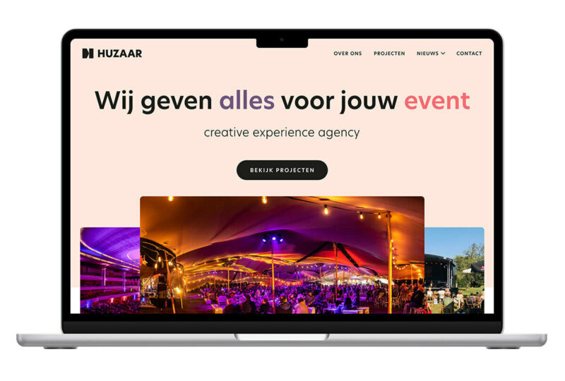
In a lot of cases I present the client first with a basic wireframe, however for this project I decided to jump right in. After all, I know this client for years and after our short face-to-face meeting and briefing I knew which direction to go to. I presented 2 designs for the homepage and my gut feeling already told me which one they would choose, the version with the colored background, which happened to align with my own preference as well.
For the mobile version I only created a quick prototype in Figma showing the interaction of the menu and that's it. The rest was completely created directly in Webflow.
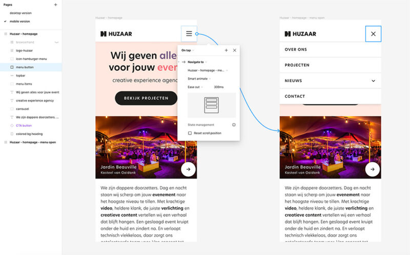
Huzaar website design in Figma, showing the menu on mobile in prototype view
Coding in Webflow
The above title is actually misleading. It’s exactly because the coding is been taking care of for you that I choose Webflow. However, don’t get me wrong, you're still in control of the code, and you need to know and fully understand the HTML & CSS markup language to create good and well structured webpages. It’s just that the heavy lifting is done for you. In Webflow you create your page visually, almost similar as creating a layout in InDesign. Webflow's GUI is beautiful, really well-thought and very user-friendly. IMHO, if you know a bit of HTML & CSS, you can only love working with it.
I don't have to trouble myself anymore over the complexity of Flexbox and Grid.
There are many reasons why I prefer using Webflow over anything else. Yes, even compared to starting from scratch like I used to do. The main reason is its efficiency and time-saving factor. I can accomplish things way quicker, perhaps five or even ten times as fast. Of course I'm only guessing here, but it must be a lot. I love the fact that I can create a lot of interactivity and animation without having to write one single line of code since all the javascript is fully written for you. Additionally, the platform's user-friendliness in achieving responsiveness, along with the abundance of excellent video tutorials and comprehensive documentation to learn from. Oh, and what's truly a joy now is that I don't have to trouble myself anymore over the complexity of Flexbox and Grid. Oh my goodness! With the perfect visual aid I have things setup in no time without the usual headache and frustration of confusing things. I'm telling you, it is a breeze.
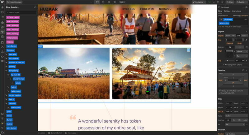
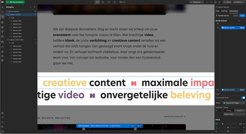
Webflow has many great features. One feature I truly use a lot is the option to create 1 reusable Components. It is a very powerful feature and you can go really crazy with this. You can nest them, have dynamic parts in it... It is just one of these things that makes Webflow so efficient IMHO. Since it's been a bit of a while since I last coded a site, I was a bit behind with Webflow's new features and updates. For this project I've also used 2 Variables for the first time. I didn't exploit it to its very limits though, as you can do a lot more then just saving a bunch of colors. The cool thing I also discovered is, that when I opened an older project, I noticed that Webflow gathered already color variables automatically for me.
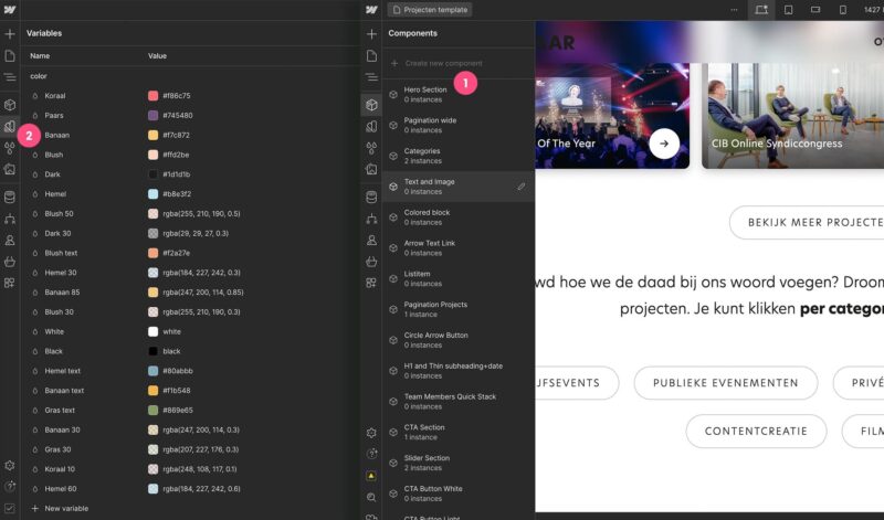
Huzaar website in Webflow showing some of the Variables and Components
The nice thing about using Weblfow is also that you can download your complete project including all the HTML, CSS and Javascript files and go from there. That’s exactly what I did for this project. Although webflow offers the full package deal including hosting, CMS, e-commerce platform... in the end you decide. It is perfectly fine to use Webflow only for the front-end. For this project I also chose to temporarily publish my static template pages under a Webflow subdomain and with a password protection just to demo things to my client. Then once everything was approved, I just unpublished the site while keeping my project. My next step was moving everything into Nova and start preparing the templates for Craft CMS. Talking of which... I'm written an article about this part as well! 😉
]]>To place text on a path in Adobe Illustrator, you select the Type On A Path tool which is located under the Type tool. Once you have the tool selected, you simply click the path and start typing your text...
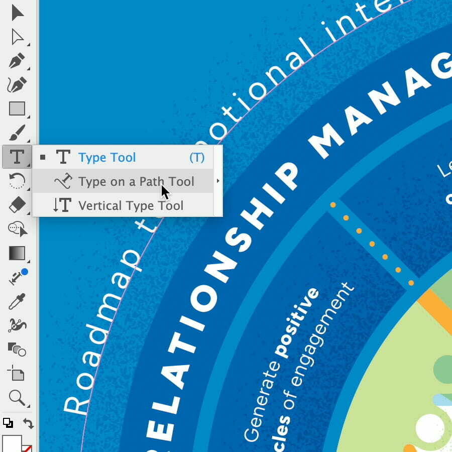
Flip The Text
When creating a circular label, I typically place text on both the upper and lower halves. However, aligning the text on the lower half poses a challenge, as it defaults to appearing on the outside of the circle instead of the inside. Thus, I need to manually flip it. Typically, I achieve this by grabbing one of the alignment brackets and dragging it to the opposite side of the path.
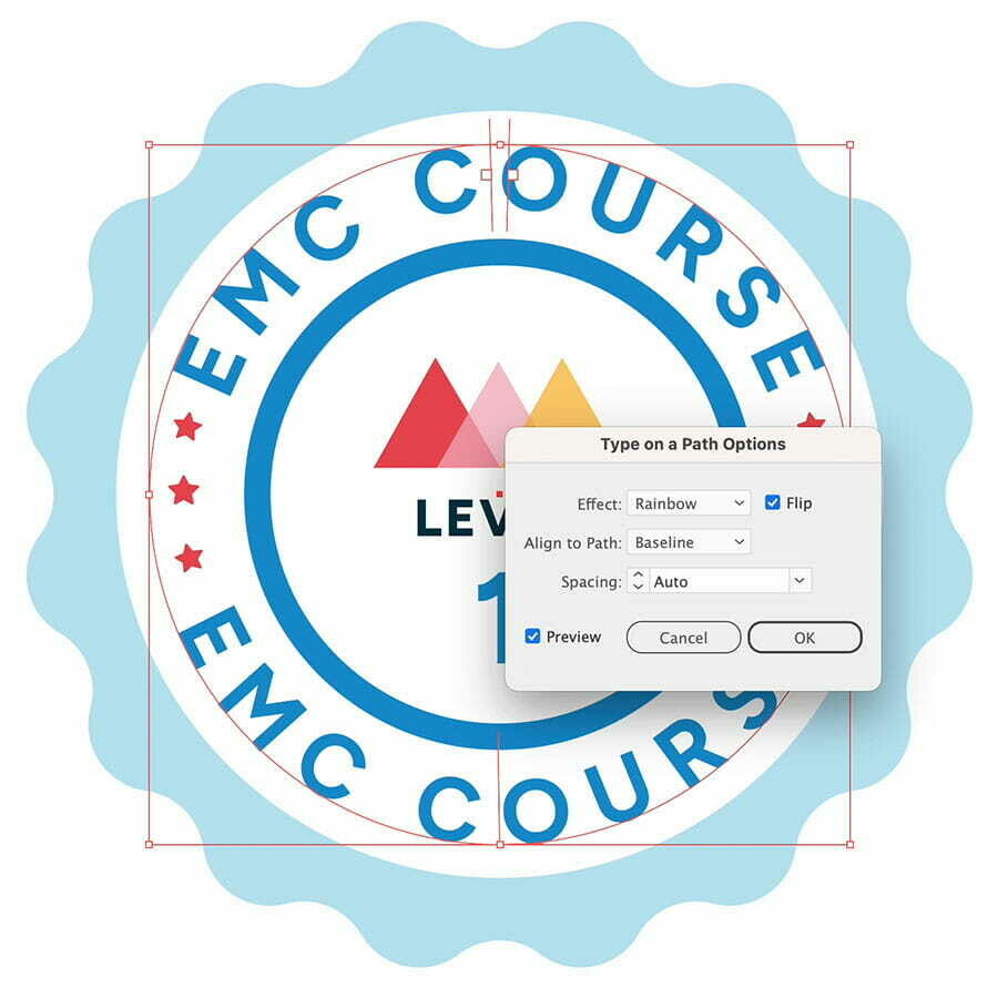
Other Options
However, I often encounter difficulties in successfully flipping the text (a problem I never faced in older versions of Illustrator, oddly enough). Fortunately, I discovered an alternative method: you can flip text by navigating to Type > Type On A Path > Type On A Path Options and selecting Flip. And BTW beyond flipping, there are various other alignment options available for text on a path worth exploring 😉
]]>I've been designing the layout for a few documents related to the courses and classes one of my long term clients offers. Initially, these documents were intended to be digital-only, and my client preferred I use Google Docs so it was easy for them to make minor text edits. However, a bit later it was decided to also have these documents printed with a full-color cover and inside pages in greyscale. Here's my process...
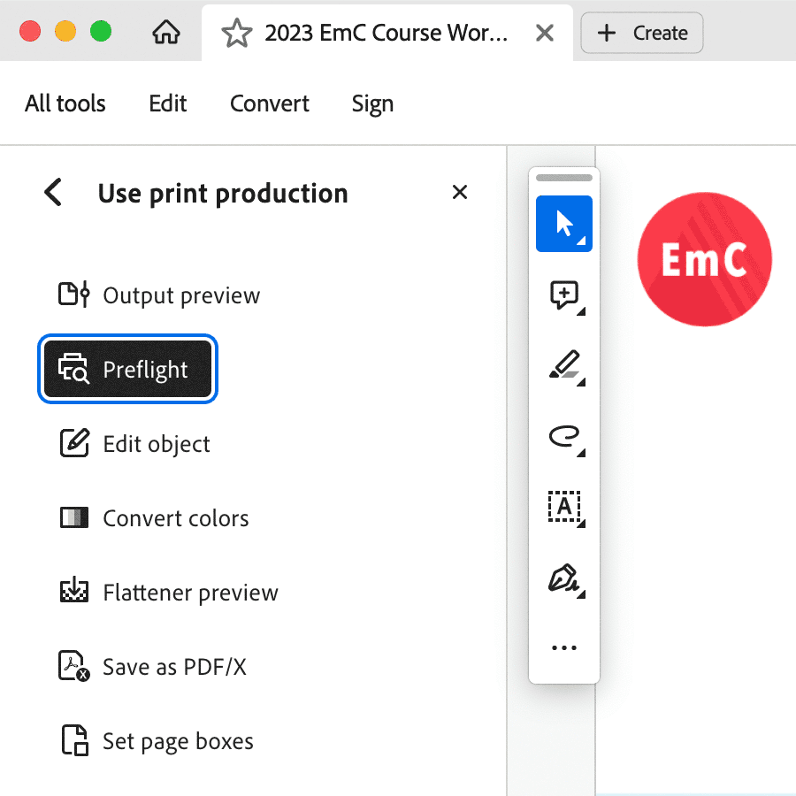
Preflight
First thing I did was downloading a PDF version of all these documents from Google Docs. Luckily I did use large enough images, so I was relieved that the PDFs looked pretty OK. The only problem was that they were in RBG mode. One trick I considered was importing the PDF into InDesign, making sure each page sits on top of a white background and use Luminosity to have them 'appear' greyscale and see if this could work for print.
Converting into Greyscale
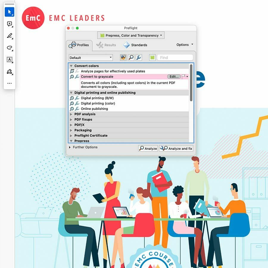
Then I thought I'd better see if I can convert the PDF to greyscale. So I opened the PDFs in Adobe Acrobat and chose 'Use print production' from the Tools menu (hidden under 'View more'). There, I chose 'Preflight'. In the Preflight window I chose 'Convert to Greyscale' under the 'Convert Colors' options and clicked the 'Analyze and fix' button. You'll also find the CMYK conversion option there, which I used for the covers.
Browse to Script
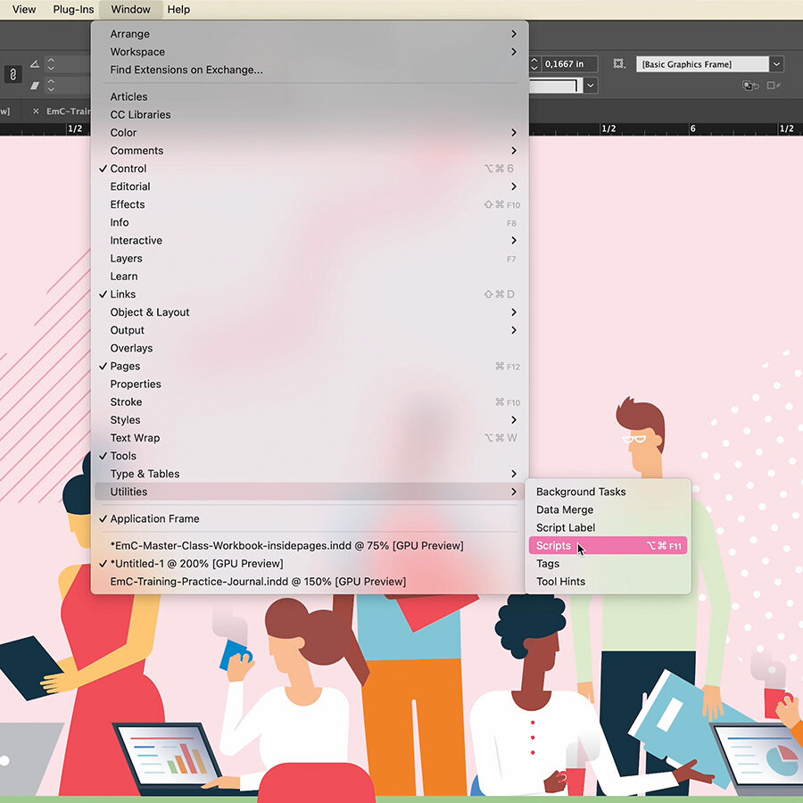
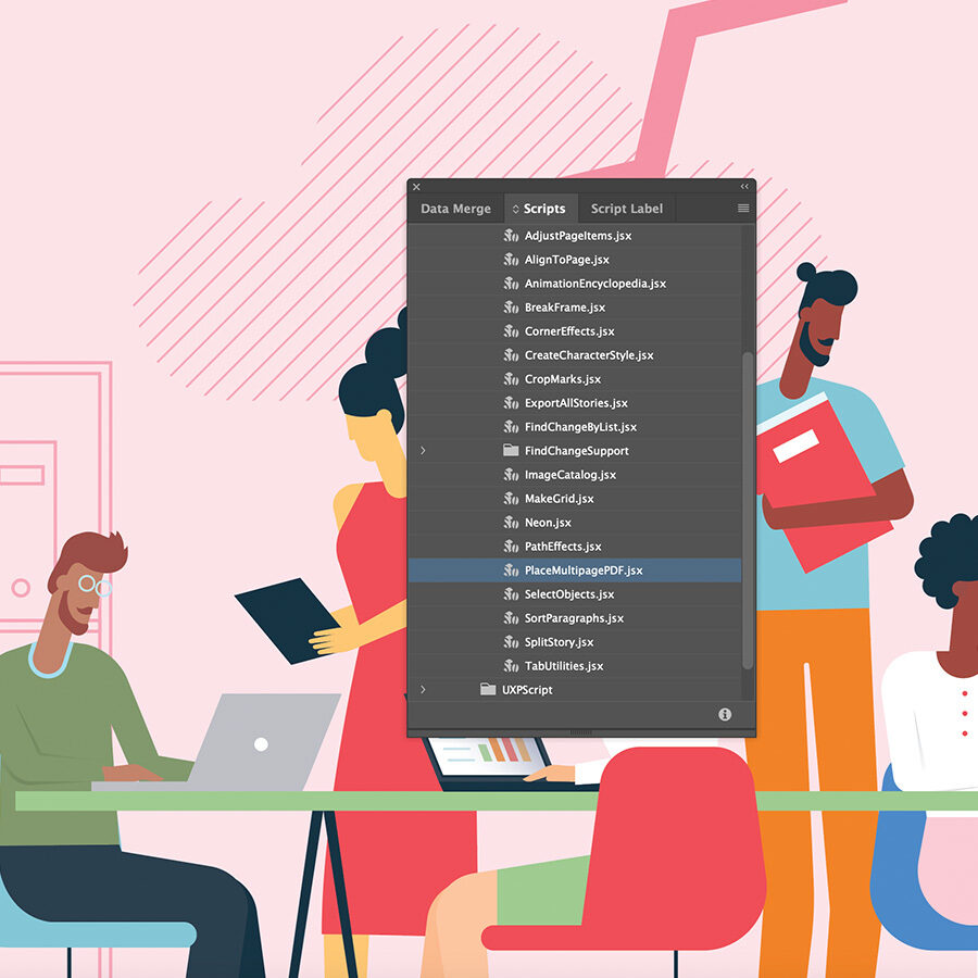
Importing a multipage PDF in InDesign is pretty easy and can actually be done really fast since you can fully automate this task using a pre-written Javascript. Open the Window menu and go to Utilities > Scripts. Then scroll further down to Application > Samples > JavaScript, and select “PlaceMultipagePDF.jsx”. Next, browse to the PDF document you want to place, and select it.
Execute Script
Choose your InDesign document from the dropdown menu in the window that follows, and click OK in the next (2) popup window messages. Then lastly select the page number where you want the 1st page of the PDF to be placed. After hitting OK, you'll see the magic happen of the script where all the PDF pages are automatically placed on a separate page for you in your InDesign document.
]]>Back in September I worked on creating a threefold A6 invitation card. I initially designed the entire invitation in Adobe Illustrator, but often, I find it beneficial to switch to InDesign. There, I import my design since InDesign provides me with additional options and features, particularly when it comes to PDF export for both print and digital formats. Let me walk you through the process of setting up a wrap-folded threefold invitation in InDesign.
Parent Pages Setup
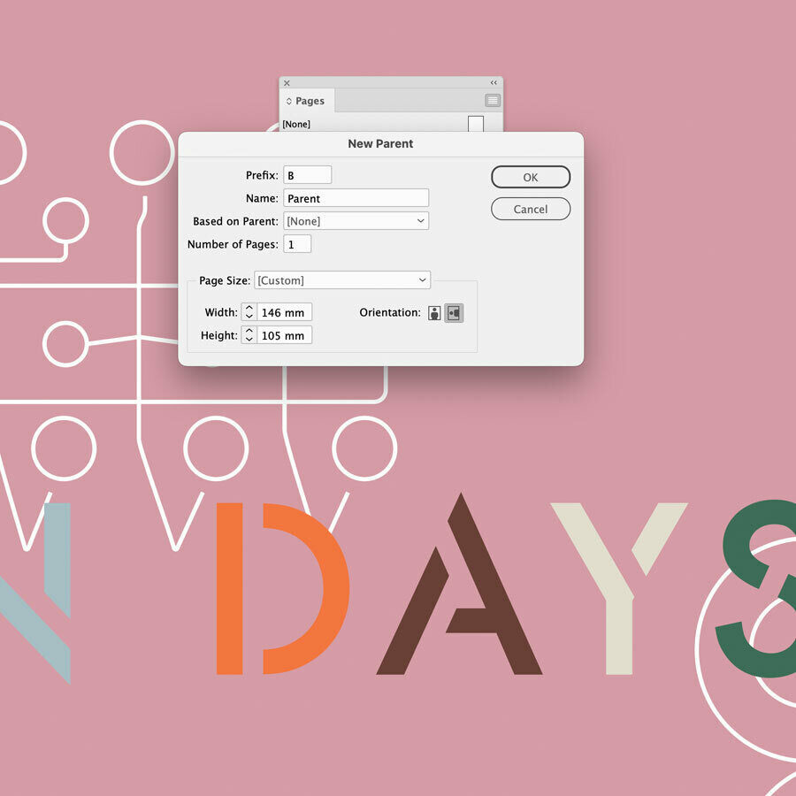
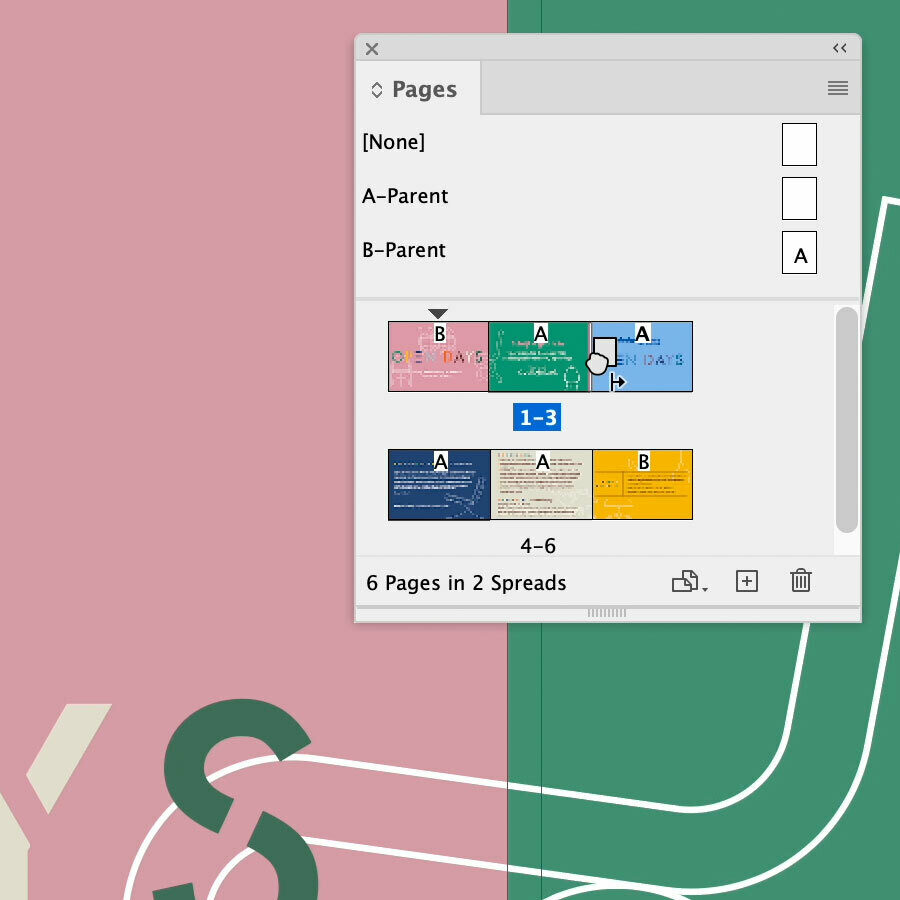
Set up your new document: A6 landscape + 1 mm extra for a perfect fold, and 3 mm of bleed. Next, you create 2 different parent pages via the Page panel. There is already an A-Parent in place which you can double click. This one will be for the front and back panel pages. Here you can place any elements that recur on all the pages (e.g. footer), set proper columns, margins etc. Now create another Parent page, based on the A-Parent page you just created and make the width 2 mm less wide. This Parent is for the flap page that folds in. Before you go to the next step, make sure that the 'Allow Document Pages to Shuffle' is unchecked (via the Pages panel fly-out main menu). Now you can start adding your actual pages.
Threefold Pages Setup
You'll be creating 6 pages in total, 3 panels for each side: inside and outside when folded open. Your first page is already in place. Double click this page to be sure you're not in Parent mode anymore. Add the 2nd one (click the plus button at the bottom of the Pages panel) and drag it very close to the 1st one (see cursor icon in the image above). Do the same for page 3 so pages 1, 2 and 3 are combined together. Then do the same for pages 4, 5 and 6. Next, right click on the A-Parent and choose Apply Pages and enter 2-5. Then do the same for the B-Parent and enter 1, 6. A warning message will appear that the size is different, click the 'Use parent page size' button. Now your document is set up and ready to add in your content.
]]>One of the most fun projects I've been working on a couple of months ago was this illustrative book project for one of my best longterm US clients, EmC Leaders. It was initially briefed to me as the creation of a series of 45 Instagram posts/images, where each image would be included as a collection of pages for a book.

Here's a little insight on my design process. I'll be sharing some practical steps in how I've used Adobe Illustrator in combination with InDesign, but also a little how I ended up with these different characters (see sample pages below).

The Characters Illustrations
It took me a bit to get to the exact character illustration style my client, Lola Gershfeld approved. Before I showed Lola some actual concepts, I did a bit doodling to explore potential compositions. Each of the images contained also text, and so one of the ideas I had in mind was to create a central container for the text and position the characters around it. Perhaps one or two characters could be depicted holding the container, or depict something collaborative so it is clear that they're an efficient team.

Preliminary sketches to explore some compositions for the EmC Instagram posts (or 'The Connected Culture' EmC book in a later stage of the project).
One of the ideas I tried out was using characters with a blue skin to represent people with any kind of ethnical roots. It was important to show a mix of different kind of people in terms of gender, age, ethnicity, etc.

One of the characters idea I tried out for the EmC book 'The Connected Culture' (the title wasn't final at this time)
While I was simultaneously working on the design for these illustration posts, I was also engaged in designing the EmC mobile app, which involved creating some icons (as depicted below). I felt it also worked very well with the EmC Leaders brand style I created before.
However Lola didn't really like this blue skin and the overal character style, though the simplicity and flat 2D style were approved.
To streamline the process and avoid unnecessary delays, I collaborated with my client to brainstorm ideas. By sharing examples of online illustrations from my own and from my Inspiration Gallery, I gained a clear understanding of my client's preferences.

Lola especially liked the cute characters from Fran Labuschagne (to the left), and the character I created for the cover of Smashing Magazine (in the middle)
Consequently, I adopted a slender character style. I began by crafting a single figure as a starting point and then used this as a reference to create additional figures, ensuring there was ample diversity in terms of clothing, gender, and ethnic backgrounds.

Using Adobe Illustrator in Combination With InDesign
All of the pages of the book were entirely created in Illustrator, ending up with only 3 different Illustrator documents:
- the book's full cover (including front, back and spine)
- the inside illustration pages
- title, copyright, dedication, author and company page
My InDesign document holds the entire book including the front and back cover which is perfect to share with my client as 1 PDF. However, once the documents were handed over for print, I had a separate document for the cover and inside pages. The front, back and spine were saved in a separate Illustrator document since the cover of a book is always a separate print job, and there is also the spine to take into account.
InDesign's biggest advantage is its Master Pages. They serve as my templates. Usually I have a Master Page that holds the pagination, sometimes with the title of book in small print as a header at the top. Then there is a Master Page for each chapter with the chapter title in small print, which is then based on the Master Page that has the pagination and book title header. This means that editing the pagination and book title Master Page will automatically update the chapter Master Page. For this book however, there are no chapters or anything. It's very simple and straight forward.

So I've only used 1 Master Page spread (left and right page) that holds the pagination styling. This Master Page is applied to all the illustration pages I created. Now I simply had to import all the separate Illustrator artboarts I created for each image as a separate page into InDesign. The only thing I had to take into account was that they're using a different dimension, and so when placing them in InDesign I need to scale them down to fit the page. To avoid having to redo this resizing after placing the image, I decided to place the images of the 1st left and right page spread. Then, I duplicated this spread for all subsequent pages and replaced each image through the Links panel with the appropriate one. Of course I ensured that the appropriate Master Page was applied to the spread beforehand. Additionally, after updating the illustration pages in Illustrator I only have to click the update icon in the Links panel (or the "update links" button when opening the document) to have my InDesign up-to-date again.

Page Numbering in InDesign
One of my client's last requests was to start the page numbering on page 10 of the book, because this is where the actual content starts. Your see, the preceding 9 pages contain light black & white content such as the credits, copyright info etc. and also the inside cover in full color. To accomplish this, you must begin by selecting the pages 10-11 spread in the Pages panel. Next, in the panel's fly-out options menu you have to make sure that 'Allow Selected Spread to Shuffle' is unchecked.
You see, page 10 which needs to be page 1 now is an even number. So making this page nr. 1 would shuffle the pages as by default uneven page numbers are always right-side pages. In my specific scenario, it's crucial to maintain page 10 on the left side. With the spread still selected you choose Numbering & Section Options... from the panel's fly-out menu. Here you enter 1 in the Start Page Numbering at field and now page 10 should have page number 1 assigned.

Resizing the Document Size in InDesign
Another development arose during this InDesign process. As I was preparing my files for the printer, my client mentioned that the size of the inside pages of the book should be 6x6 inch and the cover 6.25x6.25 inch. I used 6.25x6.25 inch for all pages. Somehow this got lost into our communication.
My initial reaction led me to believe that I was in for at least an hour of work. I anticipated having to fix each page individually, except for the page numbering, which had already been addressed in a master spread. Keeping all the pages' content created in Illustrator made applying edits very straightforward. Updating the InDesign file was as easy as pressing the 'Update Modified Links' button when opening the file, or the update link icon button at the bottom of the Links panel next to the image that needs updating. All the pages are represented as 1 linked image in the Link panel, with the number of placed images between brackets. Updating is only 1 click.

Interestingly, this approach also proved highly beneficial when adjusting the page size. While I was about to get my files prepared for the printer, my client was mentioning that the size of the inside pages of the book should be 6x6 inch and the cover 6.25x6.25 inch.
First thing I did was going to File > Document Setup where I changed the width and height settings from 6.25 to 6 inch. Then I noticed the Adjust Layout button further below. Reading the description to the left gave me hope. So I clicked the button and entered the new values there as well and hit OK. It seems this was all it takes! Big relief 😃 You can also find the Adjust Layout option directly under the File menu (File > Adjust Layout...).

The Final Printed Result
Designing for any digital media is always cool and fun. However, there's a unique thrill that comes with seeing your design materialize in physical form, especially a book. Needless to say I was very excited when I received the printed book in my mailbox. The book has a hard cover and the title shines with a glossy varnish finish. Below is a video of me wading through the pages of this little book.
In case you're interested in this book and its content, find out more here.
]]>