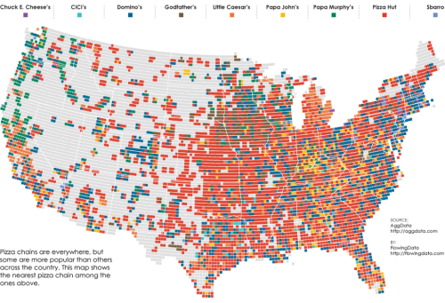
Thematic maps that display data over a surface normally map counts or rates (think census data…dot density, choropleths etc). Nathan Yau isn’t interested in how many pizza restaurants and take-aways there are near to him. He’s interested in how far away the nearest one is so that any order will get to him in the quickest time (road network and traffic allowing of course). Instead, he calculates which pizza chain has the nearest outlet for a grid, calculated as the nearest place within a 10 mile radius across the U.S.
The map creates a fascinating picture not of totality, because having the ‘most’ number of outlets isn’t necessarily optimum for someone wanting to get their dinner in good time, but of relative accessibility. It’s a simple idea but simple ideas often generate interesting work and he brings a good sense of design and a clean graphical approach to the map too.
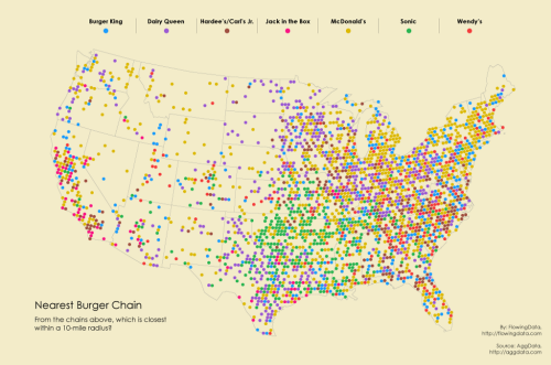
He’s used a similar approach to create a tesselated map of burger joints.
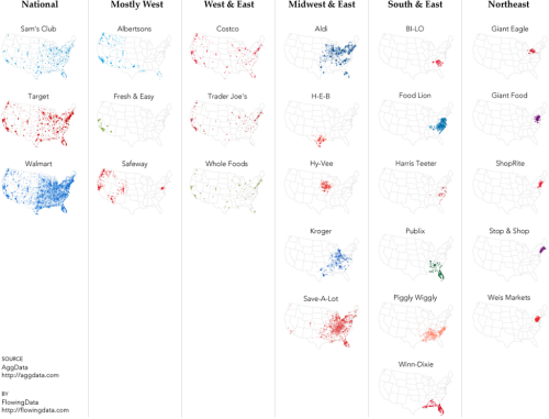
And has also played with small multiples in looking at the spatial preferences of supermarkets.
Exploring datasets using simple thematics is a great way of disentangling the data to eveal particular patterns but these examples show that clear thinking about the specific question you want to answer leads to a clarity in the output too.
There’s more discussion and examples of these maps on Nathan’s FlowingData blog here.


