When the first 3D transformations in CSS got support on Webkit browsers people got incredibly excited about them. Now that they have matured we also support 3D CSS in Firefox. To see it for yourself, check out one of the latest nightly builds.
You can see them in action in this demo of a rotating HTML5 logo and the screencast below:
This means now that we need your support in trying out CSS 3D examples in Firefox and add other extensions than -webkit- to your CSS 3D products and demos. To show that this is possible, we took the well-known webkit-only “poster circle” demo and made it work with Firefox nightly by adding the -moz- (and of course the other prefixes and one set of instructions without browser prefixes). Here is a slight excerpt:
-webkit-transform-style: preserve-3d;
-moz-transform-style: preserve-3d;
-o-transform-style: preserve-3d;
-ms-transform-style: preserve-3d;
transform-style: preserve-3d;
You can see this in action in the screencast below alongside Chrome and you try the demo out yourself. The slight jerkiness is actually my MacBook Air impersonating a starting jet every time I use ScreenFlow and not the browser.
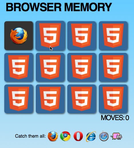
To celebrate the release and to show how CSS 3D can be applied as subtle effect, have a game of pairs using your favourite browsers (and a cat) :
Oleg Romashin also spent some time to convert a few CSS 3D demos to work with Mozilla and you can check the 3D city for more “wow”.
If you are new to CSS 3D transformations here’s a good beginner course and a tool to create them.
The rotating HTML5 logo demo also shows how you can check if the currently used browser supports 3D transforms. Instead of repeating the animation frames for all the prefixes we test in JavaScript and create the CSS on the fly:
function checksupport() {
  var props = ['perspectiveProperty', 'WebkitPerspective',
               'MozPerspective', 'OPerspective', 'msPerspective'],
      i = 0,
      support = false;
  while (props[i]) {
    if (props[i] in form.style) {
      support = true;
      pfx = props[i].replace('Perspective','');
      pfx = pfx.toLowerCase();
      break;
    }
    i++;
  }
  return support;
}
if (checksupport()) {
  var s = '';
  styles = document.createElement('style');
  s += '#stage{-'+ pfx +'-perspective: 300px;}'+
       '#logo{-'+ pfx +'-transform-style: preserve-3d;position:relative;}'+
       '#logo.spin{-'+ pfx +'-animation: spin 3s infinite linear;}'+
       '@-'+ pfx +'-keyframes spin {'+
       '0% {'+
       '-'+ pfx +'-transform: rotateX(0deg) rotateY(0deg) rotateZ(0deg);'+
       '}'+
       '100% {'+
       '-'+ pfx +'-transform: rotateX(0deg) rotateY(360deg)'+
       ' rotateZ(360deg);'+
       '}}';
  styles.innerHTML = s;
  document.querySelector('head').appendChild(styles);
}
For more information on creating your own pages that use 3D transformations, take a look at the draft specification
As always, If you find any bugs, please report them at bugzilla.mozilla.org!
So please reward our hard work bringing the third dimension to Firefox’s CSS engine by supporting and testing. Cheers!
About Chris Heilmann
Evangelist for HTML5 and open web. Let's fix this!


39 comments