How to Redesign a Tech Logo + Subtraction.com

I think Khoi might be on to something here …but I also think this change in priorities is no bad thing:

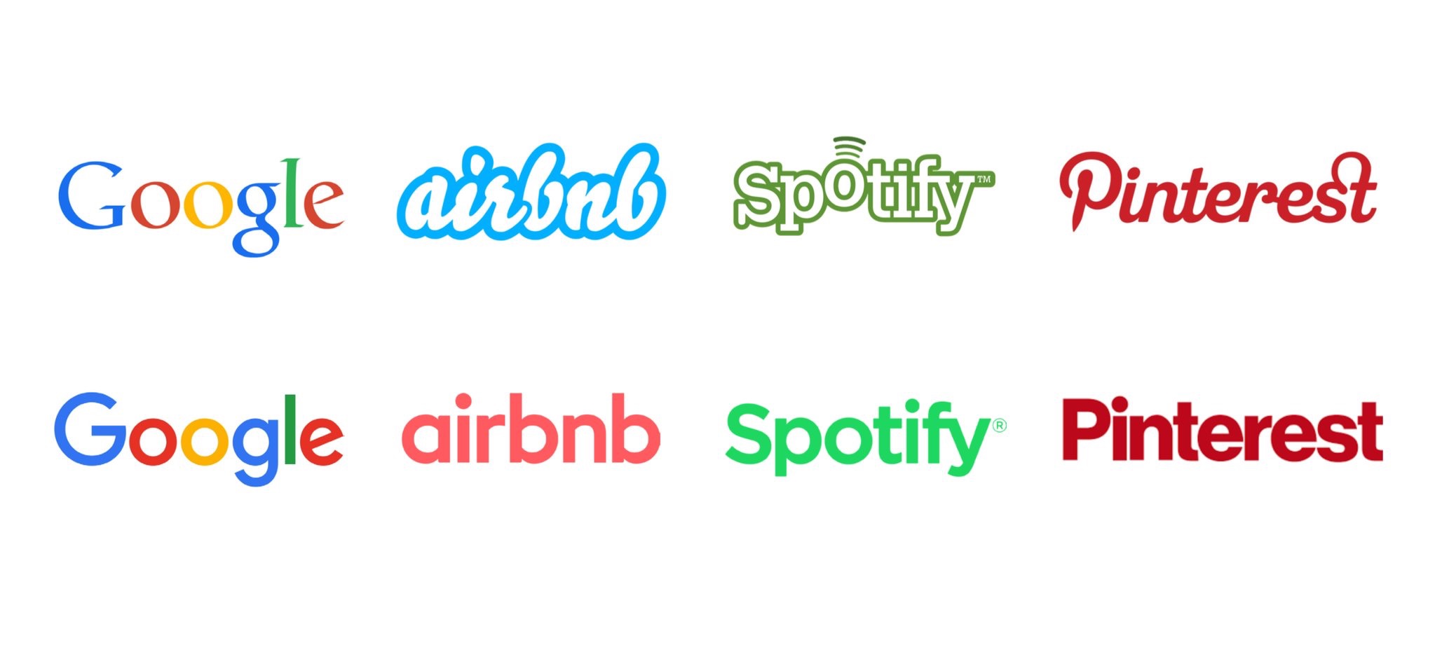
Consider the macro trend of these brands all visually converging alongside the industry’s current mania for design systems. That juxtaposition suggests that we’re far more interested in implementing ideas than we are in ideas themselves.

How to Redesign a Tech Logo + Subtraction.com

Tagged with

Related links

Evolving the Firefox Brand - Mozilla Open Design

I’m impressed by Mozilla’s commitment to designing in the open—one of the hardest parts of any kind of brand work is getting agreement, and this process must make that even more difficult.

I have to say, I quite like both options on display here.

Tagged with

Designing inspired style guides presentation slides and transcript | Stuff & Nonsense

Having spent half a decade encouraging people to make their pattern libraries public and doing my best to encourage openness and sharing, I find this kind of styleguide-shaming quite disheartening:

These all offer something different but more often than not they have something in common. They look ugly enough to have been designed by someone who enjoys configuring a router.

If a pattern library is intended to inspire, then make it inspiring. But if it’s intended to be an ever-changing codebase (made for and by the kind of people who enjoy configuring a router), then that’s where the effort and time should be concentrated.

But before designing anything—whether it’s a website or a pattern library—figure out who the audience is first.
Tagged with

Brand New Roman

A font made of corporate logos.

Tagged with