I love Formula 1, but the broadcast can be disorienting (and therefore boring) for newcomers. If you don’t know better, it just looks like cars driving around corners. The most interesting competitive dynamics are invisible.
To F1’s credit, they do have some data visualizations. Some of the new ones they introduced last year (like the ghost car) are amazing. But there’s still so much opportunity here for improvement and experimentation.
Over the years I’ve been collecting little ideas and have finally gotten around to prototyping them.
Here’s what I got.
Sense of Place
The first thing that bugged me when I started watching F1 was the feeling that I had no idea where the cars actually were on track. The commentators refer to turns by name and/or number, but unless you’ve been watching F1 for years, you probably have no idea what you’re looking at.
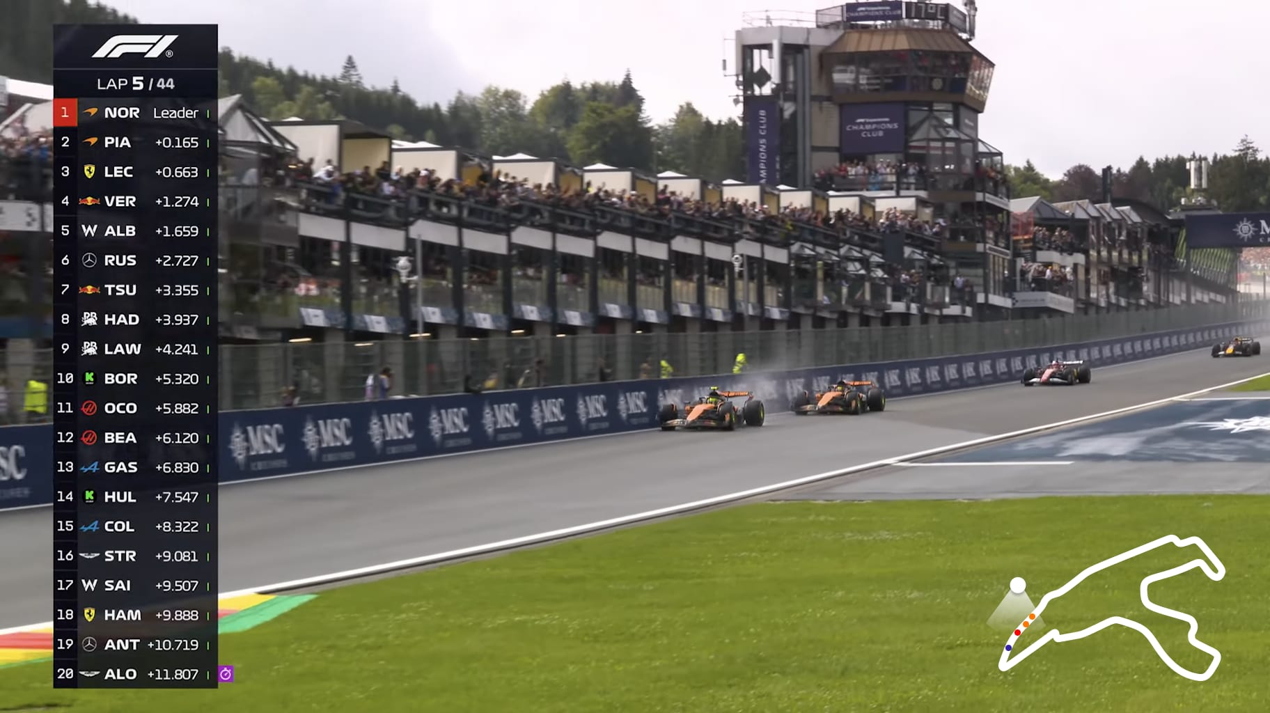
I would fix this by simply showing a little camera indicator on the track map, like this:

The F1 broadcast could show this as a mini-map in the bottom right corner, like this:
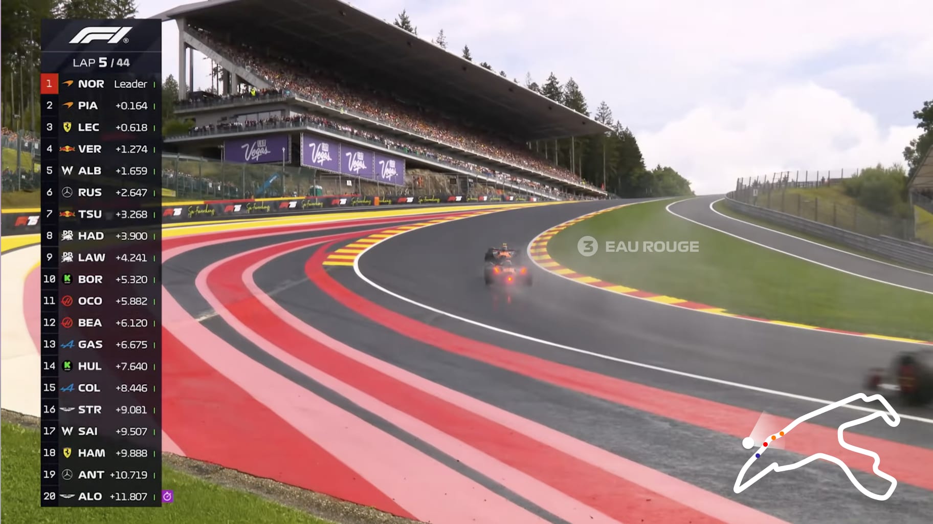
And then as the camera swivels left to follow the cars up through Eau Rouge (the name of the turn where this camera happens to be placed), you’d see the angle update in the mini-map in real time:

Speaking of “Eau Rouge,” I only know it’s called that because I’ve been watching F1 for several years now. If you’re new you probably have no idea which turn you’re looking at on the broadcast.
I’d fix that by occasionally putting in a graphic that just tells you the turn numbers and names, like this:
These are just two small things, but I think they’d go a long way towards helping viewers feel oriented, and like they can learn the tracks faster and understand what the commentators are talking about.
Sense of Pace
Almost every race in Formula 1, there are several moments when one driver is gradually catching up to another driver. And the question is if they will be able to overtake before the end of the race, or the next pit stop.
But it’s hard to get a sense of how quickly the gap between cars is shrinking. Anyone who’s watched F1 knows the feeling of glancing at the leaderboard every few seconds to see if a comically precise number (e.g. +1.489) seems to be growing or shrinking over time. It’s fun, but there are much better ways to present this information.
For example, F1 could simply show a line graph of “distance over time”:
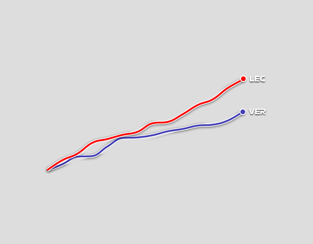
Here the Y-axis is “distance travelled” and the X-axis is time.
The story the above graph tells is pretty intuitive, I think: Verstappen almost overtook Leclerc but couldn’t, then Leclerc pulled away.
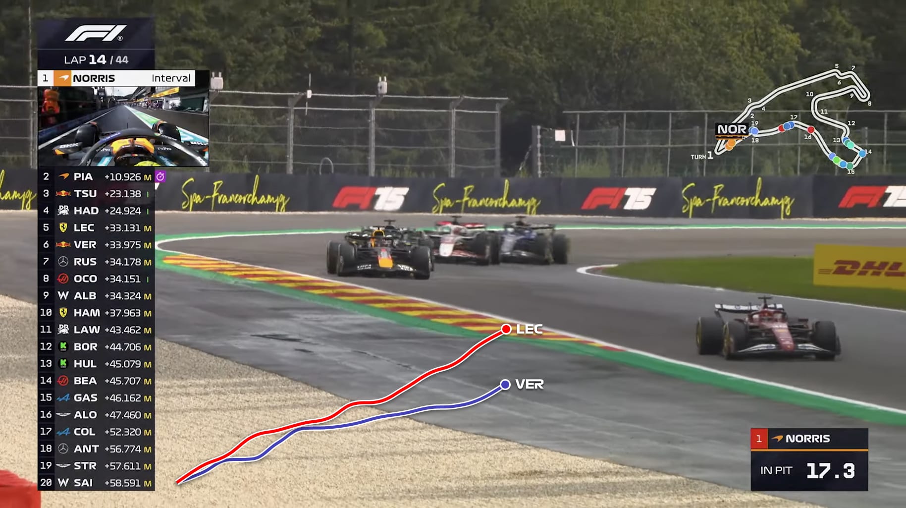
F1 could put it in their broadcast like this:
Would be even better if the commentators had the ability to draw on the graph and explain it in real time like this:
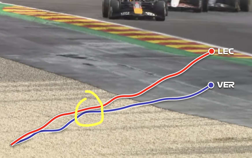
I can hear it now, “Crofty, this was the crucial moment when Max had his chance, it seems his tires have gone off now though.”
One of the best places to use this kind of graph would be qualifying. Right now the experience of watching qualifying is mostly one of waiting until the car crosses the finish line to see what the lap time was. But what if we could see in real time how a car is doing compared to a reference?
One thing I love about this graph is it would make the impact of little mistakes like lockups so much more clear. You can see the point on the graph where they lost time, and have some sense of how bad it was.
Sense of Track Position
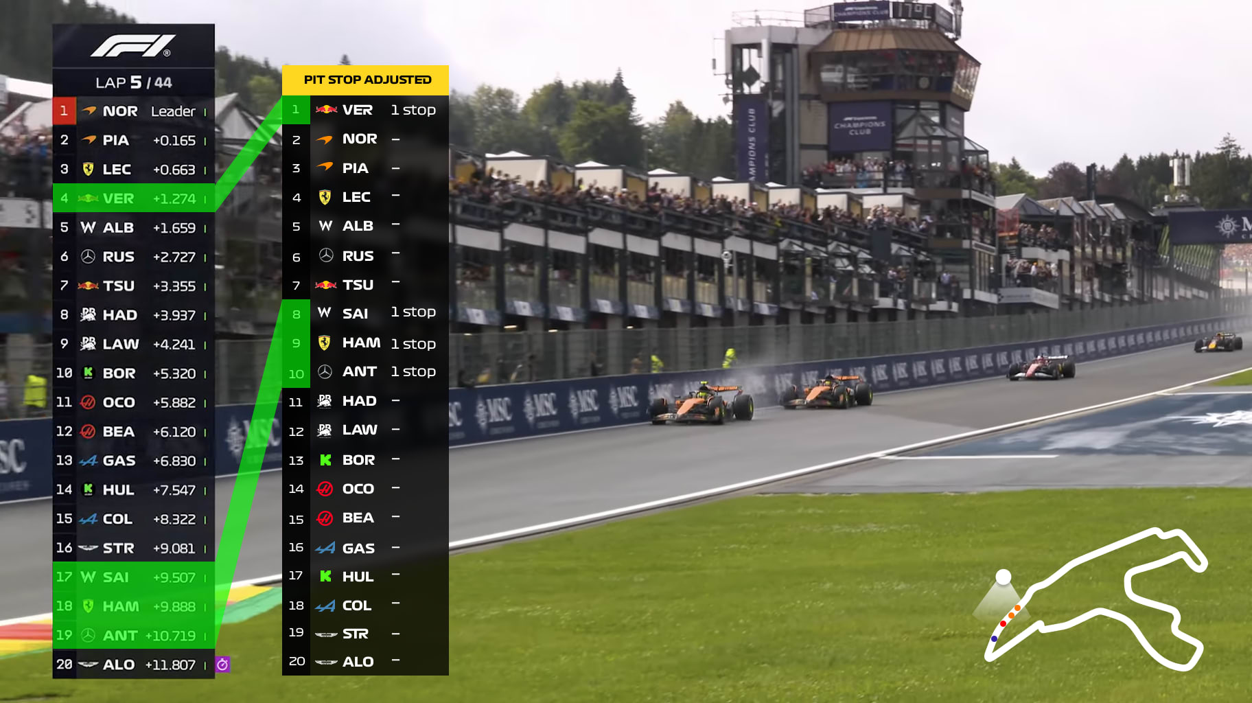
One of the most common “gotchas” in F1 is that the driver who is technically in 1st is not always actually in 1st. For instance, maybe the top 3 drivers all went into the pits, and the 4th place driver has yet to pit but is, for a brief shining moment, running in the lead.
F1 could do a lot to make this more clear, by showing us a “pit stop adjusted” leaderboard, like this:
These are just a few ideas I had to improve the broadcast, but you could imagine many more! Maybe I’ll do a part 2 of this post if there is demand.